
 資料結構
資料結構 網路
網路 關係型資料庫管理系統
 作業系統
作業系統 Java
Java iOS
iOS HTML
HTML CSS
CSS Android
 Python
 C 程式設計
 C++
C++ C#
C# MongoDB
 MySQL
MySQL Javascript
 PHP
PHPPython Plotly – 如何在散點圖中同時應用顏色/形狀/大小?
Plotly 是一個用於建立互動式基於 Web 的圖表開源 Python 庫。在本教程中,我們將展示如何使用 Plotly 在散點圖中應用顏色/形狀/大小。
在這裡,我們將使用 **plotly.graph_objects** 模組生成圖形。它包含許多生成圖表的方法。
此外,我們將使用 **add_trace()** 方法建立散點圖,然後使用 add_shape() 方法設定型別、形狀和線條顏色。
最後,我們將使用 **update_layout()** 方法設定圖表的寬度和高度。
請按照以下步驟在散點圖中應用顏色/形狀。
步驟 1
匯入 **plotly.graphs_objs** 模組並將其別名為 **go**。
import plotly.graphs_objs as go
步驟 2
使用 **add_trace()** 方法生成散點圖。
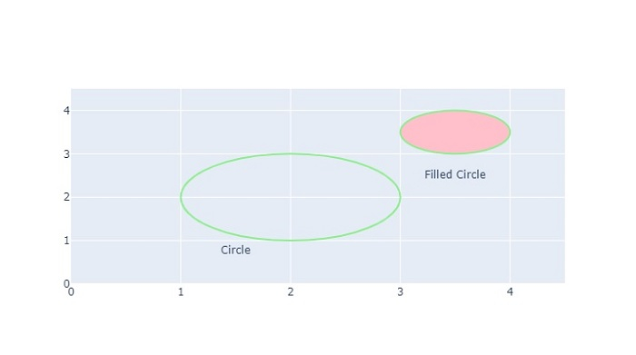
# Create scatter trace of text labels
fig.add_trace(go.Scatter(
   x=[1.5, 3.5],
   y=[0.75, 2.5],
   text=["Circle", "Filled Circle"],
   mode="text",
))
步驟 3
使用 **update_axes()** 方法更新散點圖的軌跡。
# Set axes properties
fig.update_xaxes(range=[0, 4.5], zeroline=False)
fig.update_yaxes(range=[0, 4.5])
步驟 4
使用 **add_shape()** 方法在圖表上新增兩個圓形。
# Add circles
fig.add_shape(type="circle", xref="x", yref="y", x0=1, y0=1, x1=3, y1=3, line_color="LightGreen", )
fig.add_shape(type="circle", xref="x", yref="y", fillcolor="pink", x0=3, y0=3, x1=4, y1=4, line_color="LightGreen",)
步驟 5
使用 **update_layout()** 方法設定圖表的寬度和高度 -
# Set figure size
fig.update_layout(width=800, height=800)
示例
應用顏色/形狀/大小的完整程式碼如下所示 -
import plotly.graph_objects as go
fig = go.Figure()
# Create scatter trace of text labels
fig.add_trace(go.Scatter(
   x=[1.5, 3.5],
   y=[0.75, 2.5],
   text=["Circle", "Filled Circle"],
   mode="text",
))

# Set axes properties
fig.update_xaxes(range=[0, 4.5], zeroline=False)
fig.update_yaxes(range=[0, 4.5])

# Add circles
fig.add_shape(type="circle", xref="x", yref="y", x0=1, y0=1, x1=3, y1=3, line_color="LightGreen",)

fig.add_shape(type="circle", xref="x", yref="y",
fillcolor="pink", x0=3, y0=3, x1=4, y1=4, line_color="LightGreen", )

# Set figure size
fig.update_layout(width=716, height=400)
fig.show()
輸出
執行後,它將在瀏覽器上顯示以下輸出 -
類似地,您可以嘗試建立不同型別的圖形作為影像。

更新於: 2022-10-21
1K+ 次檢視

廣告