
 資料結構
資料結構 網路
網路 關係資料庫管理系統(RDBMS)
 作業系統
作業系統 Java
Java iOS
iOS HTML
HTML CSS
CSS Android
 Python
 C語言程式設計
 C++
C++ C#
C# MongoDB
 MySQL
MySQL Javascript
 PHP
PHP如何在Python Matplotlib中繪製具有自定義顏色和自定義區域大小的4D散點圖?
介紹..
散點圖在用兩個維度表示資料以驗證兩個變數之間是否存在任何關係時非常有用。散點圖是一種圖表,其中資料以具有 X 和 Y 值的點表示。
操作方法..
1. 使用以下命令安裝 matplotlib。
pip install matplotlib
2. 匯入 matplotlib
import matplotlib.pyplot as plt
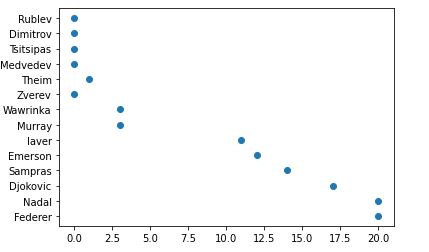
tennis_stats = (('Federer', 20),('Nadal', 20),('Djokovic', 17),('Sampras', 14),('Emerson', 12),('laver', 11),('Murray', 3),('Wawrinka', 3),('Zverev', 0),('Theim', 1),('Medvedev',0),('Tsitsipas', 0),('Dimitrov', 0),('Rublev', 0))3. 下一步是以任何陣列格式準備資料。我們也可以從資料庫或電子表格中讀取資料,並將資料格式化為如下格式。
titles = [title for player, title in tennis_stats]
players = [player for player, title in tennis_stats]
4. 與 matplotlib 的其他方法一樣,.scatter 的引數需要一個 X 和 Y 值陣列。
*注意* - X 和 Y 值都需要大小相同,並且資料預設轉換為浮點數。
plt.scatter(titles, players)
<matplotlib.collections.PathCollection at 0x28df3684ac0>
5. 哦,我的大滿貫冠軍頭銜繪製在 x 軸上是一個浮點數。我將把它們轉換為整數,並在下面的函式中新增 x 軸和 y 軸的標題。軸格式化程式將被 .set_major_formatter 覆蓋。
from matplotlib.ticker import FuncFormatter
def format_titles(title, pos):
return '{}'.format(int(title))

plt.gca().xaxis.set_major_formatter(FuncFormatter(format_titles))
plt.xlabel('Grandslam Titles')
plt.ylabel('Tennis Player')
plt.scatter(titles, players)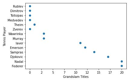
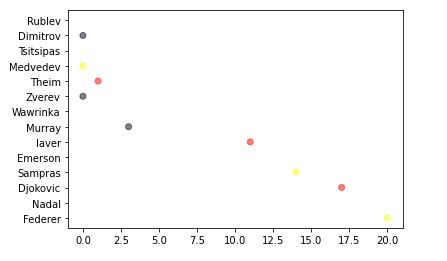
6. 不要將散點圖僅僅視為二維圖表,散點圖還可以新增第三維(面積)甚至第四維(顏色)。讓我稍微解釋一下我下面將要做什麼。
首先,我們將定義您選擇的顏色,然後迴圈遍歷它們,隨機選擇顏色並將其分配給您的值。
alpha 值使每個點都半透明,允許我們看到它們重疊的地方。此值越高,點的不透明度就越低。
import random

# define your own color scale.
random_colors = ['#FF0000', '#FFFF00', '#FFFFF0', '#FFFFFF', '#00000F']

# set the number of colors similar to our data values
color = [random.choice(random_colors) for _ in range(len(titles))]

plt.scatter(titles, players, c=color, alpha=0.5)
<matplotlib.collections.PathCollection at 0x28df2242d00>
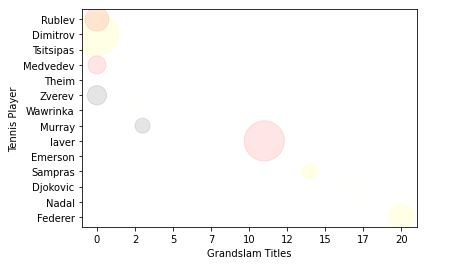
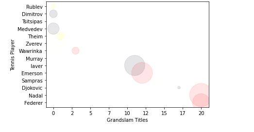
7. 現在,讓我們使表示的大小/面積更大一些。
import random

# define your own color scale.
random_colors = ['#FF0000', '#FFFF00', '#FFFFF0', '#FFFFFF', '#00000F']

# set the number of colors similar to our data values
color = [random.choice(random_colors) for _ in range(len(titles))]

# set the size
size = [(50 * random.random()) ** 2 for _ in range(len(titles))]

plt.gca().xaxis.set_major_formatter(FuncFormatter(format_titles))
plt.xlabel('Grandslam Titles')
plt.ylabel('Tennis Player')

plt.scatter(titles, players, c=color, s=size, alpha=0.1)
<matplotlib.collections.PathCollection at 0x28df22e2430>
記住,圖表的最終目標是使資料易於理解。
我已經展示了您可以使用散點圖進行的基本操作。您可以做得更多,例如,使顏色取決於大小以使所有相同大小的點都具有相同的顏色,這可以幫助我們區分資料。
瞭解更多 - https://matplotlib.org/。
最後,將所有內容放在一起。
示例
# imports
import matplotlib.pyplot as plt
import random

# preparing data..
tennis_stats = (('Federer', 20),('Nadal', 20),('Djokovic', 17),('Sampras', 14),('Emerson', 12),('laver', 11),('Murray', 3),('Wawrinka', 3),('Zverev', 0),('Theim', 1),('Medvedev',0),('Tsitsipas', 0),('Dimitrov', 0),('Rublev', 0))

titles = [title for player, title in tennis_stats]
players = [player for player, title in tennis_stats]

# custom function
from matplotlib.ticker import FuncFormatter
def format_titles(title, pos):
return '{}'.format(int(title))

# define your own color scale.
random_colors = ['#FF0000', '#FFFF00', '#FFFFF0', '#FFFFFF', '#00000F']

# set the number of colors similar to our data values
color = [random.choice(random_colors) for _ in range(len(titles))]

# set the size
size = [(50 * random.random()) ** 2 for _ in range(len(titles))]

plt.gca().xaxis.set_major_formatter(FuncFormatter(format_titles))
plt.xlabel('Grandslam Titles')
plt.ylabel('Tennis Player')

plt.scatter(titles, players, c=color, s=size, alpha=0.1)
<matplotlib.collections.PathCollection at 0x2aa7676b670>

更新於:2020年11月10日
742 次瀏覽

廣告