
 資料結構
資料結構 網路
網路 RDBMS
RDBMS 作業系統
作業系統 Java
Java iOS
iOS HTML
HTML CSS
CSS Android
 Python
 C 程式設計
 C++
C++ C#
C# MongoDB
 MySQL
MySQL Javascript
 PHP
PHPPython Plotly – 如何更改折線圖圖例中的變數/標籤名稱?
Plotly 是一個開源的、互動式的、基於瀏覽器的 Python 圖表庫。Python 使用者可以使用 Plotly 生成不同型別的圖表,包括科學圖表、3D 圖形、統計圖表、金融圖表等。
在本教程中,我們將展示如何使用 Plotly 更改折線圖圖例中的變數和標籤名稱。這裡我們將使用 **plotly.graph_objects** 模組生成圖形。它包含許多自定義圖表並將其呈現為 HTML 格式的方法。
請按照以下步驟為圖例生成變數或標籤名稱。
步驟 1
匯入 **plotly.graphs_objs** 模組並將其別名為 go。然後,使用 Figure() 方法建立一個圖形。
import plotly.graphs_objs as go
fig = go.Figure()
步驟 2
建立一個字典
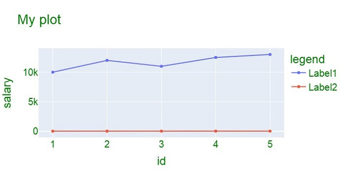
data = {
   'id':[1,2,3,4,5],
   'salary':[10000,12000,11000,12500,13000],
   'Age':[21,22,23,24,25]
}
步驟 3
使用 **add_trace()** 方法為兩個散點圖建立軌跡。
fig.add_trace(go.Scatter(
   x=data['id'],
   y=data['salary'],
   name="Label1"
))
fig.add_trace(go.Scatter(
   x=data['id'],
   y=data['Age'],
   name="Label2"
))
步驟 4
使用 **update_layout()** 方法更改 X 軸和 Y 軸標題以及圖例標題。更新 X 軸和 Y 軸的佈局,並使用 **dict** 座標設定圖例標題。
fig.update_layout(
   title="My plot",
   xaxis_title="id",
   yaxis_title="salary",
   legend_title="legend",
   font=dict(family="Arial", size=20, color="green")
)
示例
更改圖例變數/標籤名稱的完整程式碼如下:
import plotly.graph_objs as go
fig = go.Figure()
data = {
   'id':[1,2,3,4,5],
   'salary':[10000,12000,11000,12500,13000],
   'Age':[21,22,23,24,25]
}

fig.add_trace(go.Scatter(
   x=data['id'],
   y=data['salary'],
   name="Label1")
)

fig.add_trace(go.Scatter(
   x=data['id'],
   y=data['Age'],
   name="Label2")
)

fig.update_layout(
   title="My plot",
   xaxis_title="id",
   yaxis_title="salary",
   legend_title="legend",
   font=dict(
      family="Arial",
      size=20,
      color="green"
   )
)
fig.show()
輸出
它將在瀏覽器上顯示以下輸出:

更新於: 2022年10月21日
8K+ 瀏覽量

廣告