
 資料結構
資料結構 網路
網路 RDBMS
RDBMS 作業系統
作業系統 Java
Java iOS
iOS HTML
HTML CSS
CSS Android
 Python
 C 程式設計
 C++
C++ C#
C# MongoDB
 MySQL
MySQL Javascript
 PHP
PHP如何在 Python Plotly 中使用 Plotly Express 繪製多折線圖?
Plotly 是 Python 中的一個開放原始碼繪相簿。Python 使用者可以使用 Plotly 來生成不同型別的互動式網路圖表,包括科學圖表、3D 圖表、統計圖表、財務圖表等。
本教程將展示如何使用 Plotly 來生成多條折線圖。我們將在 plotly.express 中使用此方法來生成圖形。它包含了許多用於自定義圖表並將它們呈現為 HTML 格式的方法。
按照以下步驟使用 Plotly Express 生成一條多折線圖。
第一步
匯入plotly.express 模組並將其別名為px。
import plotly.express as px
第二步
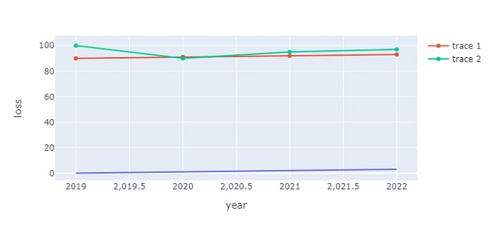
使用以下值建立一個數據集:
data = {
   'year':[2019,2020,2021,2022],
   'loss':[0,1,2,3],
   'gain':[90,91,92,93],
   'profit':[100,90,95,97]
}
df = pd.DataFrame(data)
第三步
使用px.line() 方法來建立一個折線圖。
fig = px.line(df, x='year', y='loss')
第四步
使用 add_scatter() 方法來生成兩張散點圖。
# generate scatter plot
fig.add_scatter(x=df['year'], y=df['gain'])
fig.add_scatter(x=df['year'], y=df['profit'])
示例
完整程式碼如下,用於建立多條折線圖:
import plotly.express as px
import pandas as pd

# Create a dataset
data = {
   'year':[2019,2020,2021,2022],
   'loss':[0,1,2,3],
   'gain':[90,91,92,93],
   'profit':[100,90,95,97]
}
df = pd.DataFrame(data)

# generate the line plot
fig = px.line(df, x='year', y='loss')

# generate scatter plot
fig.add_scatter(x=df['year'], y=df['gain'])
fig.add_scatter(x=df['year'], y=df['profit'])

# Set the size of the plot
fig.update_layout(width=716, height=350)
# show the plot
fig.show()
輸出
它將在瀏覽器上顯示以下輸出 -

更新於:2022 年 10 月 21 日
4K+ 檢視次數

廣告