
 資料結構
資料結構 網路
網路 關係資料庫管理系統 (RDBMS)
 作業系統
作業系統 Java
Java iOS
iOS HTML
HTML CSS
CSS Android
 Python
 C語言程式設計
 C++
C++ C#
C# MongoDB
 MySQL
MySQL Javascript
 PHP
PHP使用Plotly在Python中設定帶有分組圖例的多個子圖
多個子圖透過分配不同的圖形圖來定義。Plotly是一個強大的Python庫,用於建立用於資料研究和演示的互動式視覺化。它能夠建立多個子圖(即放置在一個圖形中的獨立圖)是其主要特性之一。此功能允許我們並排比較和顯示各種資料集或變數,從而簡單地概述資料。在Python中,我們有一些內建函式——add_trace、update_layout和show,可用於使用Plotly在Python中設定帶有分組圖例的多個子圖。
語法
以下語法用於示例:
add_trace()
這是Python的內建方法,遵循名為plotly的模組。它接受Scatter引數以建立新的軌跡到圖形。例如,散點圖可能有多個軌跡,每個軌跡代表一組不同的資料點。
update_layout()
update_layout() 方法用於更改 Plotly 圖形的佈局。
show()
show方法用於程式的結尾,以獲得圖形的所需圖形作為輸出。
示例1演算法
步驟如下:
步驟1:使用名為plotly.graph_objects的模組建立子圖資料點,並將物件引用作為go。
步驟2:從plotly.subplots模組中提及另一個物件引用make_subplots函式。
步驟3:然後使用物件引用make_subplots,透過使用subplot_titile設定每個圖的標題名稱。
步驟4:建立軌跡以設定分組圖例和資料點。
步驟5:圖形佈局已使用內建函式update_layout更新,該函式接受引數——寬度和高度。
步驟6:最後,使用show()方法顯示結果。
示例
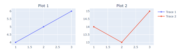
在以下示例中,我們將顯示包含分組圖例的兩個子圖的圖形,方法是使用內建方法add_trace。
import plotly.graph_objects as go
from plotly.subplots import make_subplots
# Create subplots with the shared legend
fig = make_subplots(rows=2, cols=2, subplot_titles=("Plot 1", "Plot 2"))
# Add traces to subplots
fig.add_trace(go.Scatter(x=[1, 2, 3], y=[4, 5, 6], name="Trace 1"), row=1, col=1)
fig.add_trace(go.Scatter(x=[1, 2, 3], y=[14, 13, 15], name="Trace 2"), row=1, col=2)
# Update layout for legend grouping
fig.update_layout(width=800, height=600)
# Show the plot
fig.show()
輸出
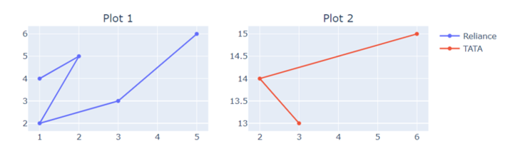
示例
在以下示例中,使用make_subplots,此程式碼生成一個2x2的子圖網格,並將兩個散點圖新增到網格中。佈局被更改以自定義圖例分組並顯示圖形。
import plotly.graph_objects as go
from plotly.subplots import make_subplots
# Create subplots with the shared legend
fig = make_subplots(rows=2, cols=2, subplot_titles=("Plot 1", "Plot 2"))
# Add traces to subplots
fig.add_trace(go.Scatter(x=[1, 2, 1, 3, 5], y=[4, 5, 2, 3, 6], name="Reliance"), row=1, col=1)
fig.add_trace(go.Scatter(x=[3, 2, 6], y=[13, 14, 15], name="TATA"), row=1, col=2)
# Update layout for customized legend grouping
fig.update_layout(width=800, height=600)
# Show the plot
fig.show()
輸出
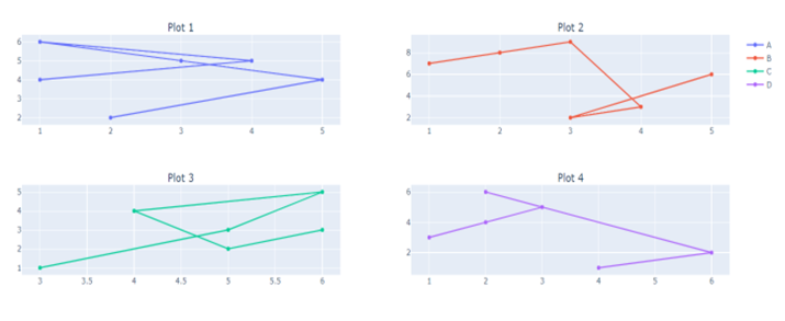
示例
在以下示例中,我們將顯示四個不同子圖的圖形,這些子圖包含指向資料、subplot_title和分別在內建函式add_trace和update_layout中的圖例。這將幫助我們構建帶有圖例名稱的多個子圖。
import plotly.graph_objects as go
from plotly.subplots import make_subplots
# Create subplots with the shared legend
fig = make_subplots(rows=2, cols=2, subplot_titles=("Plot 1", "Plot 2", "Plot 3", "Plot 4"))
# Add traces to subplots
fig.add_trace(go.Scatter(x=[1, 4, 1, 3, 5, 2], y=[4, 5, 6, 5, 4, 2], name="Trace 1"), row=1, col=1)
fig.add_trace(go.Scatter(x=[1, 2, 3, 4, 3, 5], y=[7, 8, 9, 3, 2, 6], name="Trace 2"), row=1, col=2)
fig.add_trace(go.Scatter(x=[3, 5, 6, 4, 5, 6], y=[1, 3, 5, 4, 2, 3], name="Trace 3"), row=2, col=1)
fig.add_trace(go.Scatter(x=[1, 2, 3, 2, 6, 4], y=[3, 4, 5, 6, 2, 1], name="Trace 4"), row=2, col=2)
# Update layout for customized legend grouping
fig.update_layout(legend=dict(tracegroupgap=70))
# Show the plot
fig.show()
輸出
結論
我們討論了使用名為Ploty的模組繪製帶有分組圖例的多個子圖的三種不同方法。這使我們可以輕鬆比較資料,資料科學家可以建立詳細的視覺化效果,從而提高對複雜資料集的理解和溝通。

815 次瀏覽
