
 資料結構
資料結構 網路
網路 RDBMS
RDBMS 作業系統
作業系統 Java
Java iOS
iOS HTML
HTML CSS
CSS Android
 Python
 C 程式設計
 C++
C++ C#
C# MongoDB
 MySQL
MySQL Javascript
 PHP
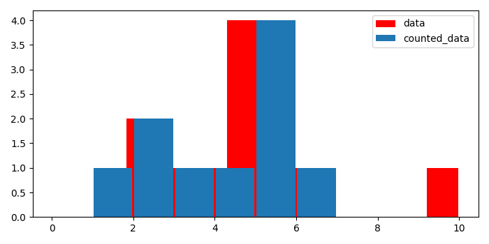
PHP使用 Matplotlib 繪製預統計資料的直方圖
要使用 matplotlib 繪製預統計資料的直方圖,我們可以採取以下步驟:
建立一個數字列表。
藉助輸入資料製作一個預統計列表。
使用 hist() 方法繪製一個數據直方圖,color=red 和 label=data。
使用 hist() 方法繪製另一個包含統計資料的直方圖,color=default 和 label=counted_data。
要放置圖例,請使用 legend() 方法。
要顯示圖形,請使用 show() 方法。
示例
from matplotlib import pyplot as plt
plt.rcParams["figure.figsize"] = [7.00, 3.50]
plt.rcParams["figure.autolayout"] = True
data = [1, 2, 2, 3, 4, 5, 5, 5, 5, 6, 10]
counted_data = {1: 1, 2: 2, 3: 1, 4: 1, 5: 4, 6: 1, 10: 1}
hh = plt.hist(data, bins=len(data), rwidth=.95, color='red', label="data")
hh1 = plt.hist(counted_data.keys(), weights=counted_data.values(),
   bins=range(10), rwidth=.95, label="counted_data")
plt.legend()
plt.show()
輸出

更新於:07-05-2021
2K+ 次觀看

廣告