- ngx-bootstrap 教程
- ngx-bootstrap - 首頁
- ngx-bootstrap - 概述
- ngx-bootstrap - 環境設定
- ngx-bootstrap - 手風琴
- ngx-bootstrap - 警報
- ngx-bootstrap - 按鈕
- ngx-bootstrap - 走馬燈
- ngx-bootstrap - 摺疊
- ngx-bootstrap - 日期選擇器
- ngx-bootstrap - 下拉選單
- ngx-bootstrap - 模態框
- ngx-bootstrap - 分頁
- ngx-bootstrap - 氣泡提示
- ngx-bootstrap - 進度條
- ngx-bootstrap - 評分
- ngx-bootstrap - 可排序
- ngx-bootstrap - 標籤頁
- ngx-bootstrap - 時間選擇器
- ngx-bootstrap - 工具提示
- ngx-bootstrap - 自動完成
- ngx-bootstrap 有用資源
- ngx-bootstrap - 快速指南
- ngx-bootstrap - 有用資源
- ngx-bootstrap - 討論
ngx-bootstrap - 標籤頁
ngx-bootstrap 標籤頁元件提供了一個易於使用且高度可配置的標籤元件。
TabsetComponent
選擇器
tabset
輸入
justified − 布林值,如果為真,則標籤填充容器並具有統一的寬度。
type − 字串,導航上下文類:'tabs' 或 'pills'。
vertical − 如果為真,則標籤將垂直放置。
TabDirective
選擇器
tab, [tab]
輸入
active − 布林值,標籤啟用狀態切換。
customClass − 字串,如果設定,將新增到標籤的 class 屬性。支援多個類。
disabled − 布林值,如果為真,則無法啟用標籤。
heading − 字串,標籤標題文字。
id − 字串,標籤 ID。相同的 ID 以及字尾 '-link' 將新增到相應的
- 元素。
removable − 布林值,如果為真,則標籤可以移除,將出現附加按鈕。
輸出
deselect − 當標籤變為非活動狀態時觸發,$event:Tab 等於 Tab 元件的取消選擇例項。
removed − 在標籤被移除之前觸發,$event:Tab 等於被移除標籤的例項。
selectTab − 當標籤變為活動狀態時觸發,$event:Tab 等於 Tab 元件的選擇例項。
示例
由於我們將使用標籤,因此我們必須更新在ngx-bootstrap 可排序章節中使用的 app.module.ts 以使用TabsModule 和 TabsetConfig。
更新 app.module.ts 以使用 TabsModule 和 TabsetConfig。
app.module.ts
import { BrowserModule } from '@angular/platform-browser';
import { NgModule } from '@angular/core';
import { BrowserAnimationsModule } from '@angular/platform-browser/animations';
import { AppComponent } from './app.component';
import { TestComponent } from './test/test.component';
import { AccordionModule } from 'ngx-bootstrap/accordion';
import { AlertModule,AlertConfig } from 'ngx-bootstrap/alert';
import { ButtonsModule } from 'ngx-bootstrap/buttons';
import { FormsModule } from '@angular/forms';
import { CarouselModule } from 'ngx-bootstrap/carousel';
import { CollapseModule } from 'ngx-bootstrap/collapse';
import { BsDatepickerModule, BsDatepickerConfig } from 'ngx-bootstrap/datepicker';
import { BsDropdownModule,BsDropdownConfig } from 'ngx-bootstrap/dropdown';
import { PaginationModule,PaginationConfig } from 'ngx-bootstrap/pagination';
import { PopoverModule, PopoverConfig } from 'ngx-bootstrap/popover';
import { ProgressbarModule,ProgressbarConfig } from 'ngx-bootstrap/progressbar';
import { RatingModule, RatingConfig } from 'ngx-bootstrap/rating';
import { SortableModule, DraggableItemService } from 'ngx-bootstrap/sortable';
import { TabsModule, TabsetConfig } from 'ngx-bootstrap/tabs';

@NgModule({
   declarations: [
      AppComponent,
      TestComponent
   ],
   imports: [
      BrowserAnimationsModule,
      BrowserModule,
      AccordionModule,
      AlertModule,
      ButtonsModule,
      FormsModule,
      CarouselModule,
      CollapseModule,
      BsDatepickerModule.forRoot(),
      BsDropdownModule,
      ModalModule,
      PaginationModule,
      PopoverModule,
      ProgressbarModule,
      RatingModule,
      SortableModule,
      TabsModule
   ],
   providers: [AlertConfig,
      BsDatepickerConfig,
      BsDropdownConfig,
      BsModalService,
      PaginationConfig,
      ProgressbarConfig,
      RatingConfig,
      DraggableItemService,
      TabsetConfig],
   bootstrap: [AppComponent]
})
export class AppModule { }
更新 test.component.html 以使用標籤元件。
test.component.html
<tabset>
   <tab heading="Home">Home</tab>
   <tab *ngFor="let tabz of tabs"
      [heading]="tabz.title"
      [active]="tabz.active"
      (selectTab)="tabz.active = true"
      [disabled]="tabz.disabled">
      {{tabz?.content}}
   </tab>
</tabset>
更新 test.component.ts 以對應變數和方法。
test.component.ts
import { Component, OnInit } from '@angular/core';

@Component({
   selector: 'app-test',
   templateUrl: './test.component.html',
   styleUrls: ['./test.component.css']
})
export class TestComponent implements OnInit {
   tabs = [
      { title: 'First', content: 'First Tab Content' },
      { title: 'Second', content: 'Second Tab Content', active: true },
      { title: 'Third', content: 'Third Tab Content', removable: true },
      { title: 'Four', content: 'Fourth Tab Content', disabled: true }
   ];
   constructor() {}
   ngOnInit(): void {
   }
}
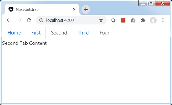
構建和執行
執行以下命令啟動 Angular 伺服器。
ng serve
伺服器啟動並執行後。開啟 https://:4200。單擊“開啟模態”按鈕並驗證以下輸出。