- Ngx-Bootstrap 教程
- Ngx-Bootstrap - 首頁
- Ngx-Bootstrap - 概述
- Ngx-Bootstrap - 環境設定
- Ngx-Bootstrap - 手風琴
- Ngx-Bootstrap - 警報
- Ngx-Bootstrap - 按鈕
- Ngx-Bootstrap - 走馬燈
- Ngx-Bootstrap - 摺疊
- Ngx-Bootstrap - 日期選擇器
- Ngx-Bootstrap - 下拉選單
- Ngx-Bootstrap - 模態框
- Ngx-Bootstrap - 分頁
- Ngx-Bootstrap - 氣泡提示
- Ngx-Bootstrap - 進度條
- Ngx-Bootstrap - 評分
- Ngx-Bootstrap - 可排序
- Ngx-Bootstrap - 標籤頁
- Ngx-Bootstrap - 時間選擇器
- Ngx-Bootstrap - 工具提示
- Ngx-Bootstrap - 自動完成
- Ngx-Bootstrap 有用資源
- Ngx-Bootstrap - 快速指南
- Ngx-Bootstrap - 有用資源
- Ngx-Bootstrap - 討論
Ngx-Bootstrap - 摺疊
ngx-bootstrap Collapse 指令有助於顯示/隱藏容器內容。
CollapseDirective
選擇器
[collapse]
輸入
collapse − 布林值,指示內容可見性(顯示或隱藏)的標誌
display − 字串
isAnimated − 布林值,開啟/關閉動畫。預設值:false
輸出
collapsed − 內容摺疊後立即觸發此事件
collapses − 開始摺疊時觸發此事件
expanded − 內容可見後立即觸發此事件
expands − 開始展開時觸發此事件
方法
toggle() − 允許手動切換內容可見性
hide − 允許手動隱藏內容
show − 允許手動顯示已摺疊的內容
示例
由於我們將使用摺疊功能,因此需要更新 ngx-bootstrap 走馬燈 章節中使用的 app.module.ts 檔案,以使用 CollapseModule。
更新 app.module.ts 以使用 CollapseModule。
app.module.ts
import { BrowserModule } from '@angular/platform-browser';
import { NgModule } from '@angular/core';
import { BrowserAnimationsModule } from '@angular/platform-browser/animations';
import { AppComponent } from './app.component';
import { TestComponent } from './test/test.component';
import { AccordionModule } from 'ngx-bootstrap/accordion';
import { AlertModule,AlertConfig } from 'ngx-bootstrap/alert';
import { ButtonsModule } from 'ngx-bootstrap/buttons';
import { FormsModule } from '@angular/forms';
import { CarouselModule } from 'ngx-bootstrap/carousel';
import { CollapseModule } from 'ngx-bootstrap/collapse';

@NgModule({
   declarations: [
      AppComponent,
      TestComponent
   ],
   imports: [
      BrowserAnimationsModule,
      BrowserModule,
      AccordionModule,
      AlertModule,
      ButtonsModule,
      FormsModule,
      CarouselModule,
      CollapseModule
   ],
   providers: [AlertConfig],
   bootstrap: [AppComponent]
})
export class AppModule { }
更新 test.component.html 以使用 Collapse。
test.component.html
<div>
   <div class="checkbox">
      <label><input type="checkbox" [(ngModel)]="isCollapsed">Collapse</label>
   </div>
</div>
<div [collapse]="isCollapsed" [isAnimated]="true">
   <div class="well well-lg card card-block card-header">Welcome to Tutorialspoint.</div>
</div>
更新 test.component.ts 以對應變數和方法。
test.component.ts
import { Component, OnInit } from '@angular/core';

@Component({
   selector: 'app-test',
   templateUrl: './test.component.html',
   styleUrls: ['./test.component.css']
})
export class TestComponent implements OnInit {
   isCollapsed: boolean = false;
   constructor() { }

   ngOnInit(): void {
   }
}
構建和執行
執行以下命令啟動 Angular 伺服器。
ng serve
伺服器啟動並執行後,開啟 https://:4200 並驗證以下輸出。
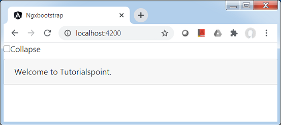
選中摺疊複選框,然後內容將被摺疊。

廣告