- ngx-bootstrap 教程
- ngx-bootstrap - 首頁
- ngx-bootstrap - 概述
- ngx-bootstrap - 環境設定
- ngx-bootstrap - 手風琴
- ngx-bootstrap - 警報
- ngx-bootstrap - 按鈕
- ngx-bootstrap - 走馬燈
- ngx-bootstrap - 摺疊面板
- ngx-bootstrap - 日期選擇器
- ngx-bootstrap - 下拉選單
- ngx-bootstrap - 模態框
- ngx-bootstrap - 分頁
- ngx-bootstrap - 氣泡提示框
- ngx-bootstrap - 進度條
- ngx-bootstrap - 評分
- ngx-bootstrap - 可排序列表
- ngx-bootstrap - 標籤頁
- ngx-bootstrap - 時間選擇器
- ngx-bootstrap - 工具提示框
- ngx-bootstrap - 自動完成
- ngx-bootstrap 有用資源
- ngx-bootstrap - 快速指南
- ngx-bootstrap - 有用資源
- ngx-bootstrap - 討論
ngx-bootstrap - 氣泡提示框
ngx-bootstrap popover 元件提供了一個小的覆蓋層元件,用於提供關於元件的小資訊。
PopoverDirective
選擇器
popover
輸入
adaptivePosition − 布林值,設定停用自適應位置。
container − 字串,指定應將氣泡提示框附加到的元素的選擇器。
containerClass − 字串,氣泡提示框容器的 CSS 類。
delay − 數字,顯示工具提示之前的延遲。
isOpen − 布林值,返回氣泡提示框當前是否正在顯示。
outsideClick − 布林值,單擊外部時關閉氣泡提示框,預設值:false。
placement − "top" | "bottom" | "left" | "right" | "auto" | "top left" | "top right" | "right top" | "right bottom" | "bottom right" | "bottom left" | "left bottom" | "left top",氣泡提示框的位置。接受:"top","bottom","left","right"。
popover − 字串 | TemplateRef<any>,要顯示為氣泡提示框的內容。
popoverContext − any,如果氣泡提示框是模板,則要使用的上下文。
popoverTitle − 字串,氣泡提示框的標題。
triggers − 字串,指定應觸發的事件。支援以空格分隔的事件名稱列表。
輸出
onHidden − 當氣泡提示框隱藏時發出事件。
onShown − 當氣泡提示框顯示時發出事件。
方法
setAriaDescribedBy() − 為元素指令設定 aria-describedBy 屬性,併為氣泡提示框設定 ID。
show() − 開啟元素的氣泡提示框。這被認為是氣泡提示框的“手動”觸發。
hide() − 關閉元素的氣泡提示框。這被認為是氣泡提示框的“手動”觸發。
toggle() − 切換元素的氣泡提示框。這被認為是氣泡提示框的“手動”觸發。
示例
由於我們將使用氣泡提示框,因此我們必須更新在ngx-bootstrap 分頁章節中使用的 app.module.ts,以使用PopoverModule 和 PopoverConfig。
更新 app.module.ts 以使用 PopoverModule 和 PopoverConfig。
app.module.ts
import { BrowserModule } from '@angular/platform-browser';
import { NgModule } from '@angular/core';
import { BrowserAnimationsModule } from '@angular/platform-browser/animations';
import { AppComponent } from './app.component';
import { TestComponent } from './test/test.component';
import { AccordionModule } from 'ngx-bootstrap/accordion';
import { AlertModule,AlertConfig } from 'ngx-bootstrap/alert';
import { ButtonsModule } from 'ngx-bootstrap/buttons';
import { FormsModule } from '@angular/forms';
import { CarouselModule } from 'ngx-bootstrap/carousel';
import { CollapseModule } from 'ngx-bootstrap/collapse';
import { BsDatepickerModule, BsDatepickerConfig } from 'ngx-bootstrap/datepicker';
import { BsDropdownModule,BsDropdownConfig } from 'ngx-bootstrap/dropdown';
import { PaginationModule,PaginationConfig } from 'ngx-bootstrap/pagination';
import { PopoverModule, PopoverConfig } from 'ngx-bootstrap/popover';

@NgModule({
   declarations: [
      AppComponent,
      TestComponent
   ],
   imports: [
      BrowserAnimationsModule,
      BrowserModule,
      AccordionModule,
      AlertModule,
      ButtonsModule,
      FormsModule,
      CarouselModule,
      CollapseModule,
      BsDatepickerModule.forRoot(),
      BsDropdownModule,
      ModalModule,
      PaginationModule,
      PopoverModule
   ],
   providers: [AlertConfig,
      BsDatepickerConfig,
      BsDropdownConfig,
      BsModalService,
      PaginationConfig],
   bootstrap: [AppComponent]
})
export class AppModule { }
更新 test.component.html 以使用模態框。
test.component.html
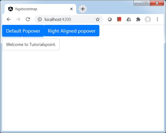
<button type="button" class="btn btn-default btn-primary"
   popover="Welcome to Tutorialspoint." [outsideClick]="true">
   Default Popover
</button>
<button type="button" class="btn btn-default btn-primary"
   popover="Welcome to Tutorialspoint."
   popoverTitle="Tutorialspoint"
   [outsideClick]="true"
   placement="right">
   Right Aligned popover
</button>
更新 test.component.ts 以對應變數和方法。
test.component.ts
import { Component, OnInit } from '@angular/core';
import { BsModalService } from 'ngx-bootstrap/modal';
import { PageChangedEvent } from 'ngx-bootstrap/pagination';

@Component({
   selector: 'app-test',
   templateUrl: './test.component.html',
   styleUrls: ['./test.component.css']
})
export class TestComponent implements OnInit {
   constructor() {}
   ngOnInit(): void {
   }
}
構建和執行
執行以下命令啟動 Angular 伺服器。
ng serve
伺服器啟動並執行後。開啟 https://:4200。單擊“開啟模態框”按鈕並驗證以下輸出。