- NativeScript 教程
- NativeScript - 首頁
- NativeScript - 簡介
- NativeScript - 安裝
- NativeScript - 架構
- NativeScript - Angular 應用
- NativeScript - 模板
- NativeScript - 小部件
- NativeScript - 佈局容器
- NativeScript - 導航
- NativeScript - 事件處理
- NativeScript - 資料繫結
- NativeScript - 模組
- NativeScript - 外掛
- NativeScript - 使用 JavaScript 的原生 API
- NativeScript - 在 Android 中建立應用
- NativeScript - 在 iOS 中建立應用
- NativeScript - 測試
- NativeScript 有用資源
- NativeScript - 快速指南
- NativeScript - 有用資源
- NativeScript - 討論
NativeScript - 佈局容器
NativeScript 提供了一組容器元件,其唯一目的是佈局 UI 小部件元件。佈局容器充當父元件,可以擁有一個或多個子元件。佈局容器的所有子元件都可以根據其父佈局容器提供的技術進行排列。
NativeScript 支援六種佈局容器,它們分別是:
絕對佈局容器
停靠佈局容器
網格佈局容器
堆疊佈局容器
換行佈局容器
FlexBox 佈局容器
讓我們在本節中詳細瞭解所有佈局容器的概念。
絕對佈局
AbsoluteLayout 容器是 NativeScript 中最簡單的佈局容器。AbsoluteLayout 不會對其子元素施加任何約束,並將使用以左上角為原點的二維座標系在其內部放置其子元素。
AbsoluteLayout 使用其子元素的四個屬性來定位它們,它們分別是:
top - 定義子元素從原點向下(y 方向)的放置位置。
left - 定義子元素從原點向右(x 方向)的放置位置。
width - 定義子元素的寬度。
height - 定義子元素的高度。
讓我們在應用程式的首頁新增 AbsoluteLayout 容器,如下所示:
<ActionBar>
   <Label text="Home"></Label>
</ActionBar>

<AbsoluteLayout width="200" height="300" backgroundColor="blue">
   <Label text="Top Left" left="0" top="0" width="100" height="150" backgroundColor="green">
   </Label>
   <Label text="Top Right" left="100" top="0" width="100" height="150" backgroundColor="blue"></Label>
   <Label text="Bottom Left" left="0" top="150" width="100" height="150" backgroundColor="orange">
   </Label>
   <Label text="Bottom Right" left="100" top="150" width="100" height="150" backgroundColor="red"></Label>
</AbsoluteLayout>
輸出
AbsoluteLayout 的輸出如下所示:

停靠佈局
DockLayout 容器元件允許其子元件在其內部停靠。容器的每一側(頂部、底部、左側、右側)都可以停靠一個子元件。DockLayout 容器使用其子元件的 dock 屬性來正確停靠它們。
dock 屬性的可能值如下:
top - 佈局容器將子元件停靠在頂部角落。
bottom - 佈局容器將子元件停靠在底部角落。
left - 佈局容器將子元件停靠在左側角落。
right - 佈局容器將子元件停靠在右側角落。
預設情況下,DockLayout 容器停靠其最後一個子元件。可以透過將其 stretchLastChild 屬性設定為零來覆蓋此行為。
讓我們在應用程式的首頁新增 DockLayout 容器,如下所示:
<ActionBar>
   <Label text="Home"></Label>
</ActionBar>
<DockLayout width="250" height="300" backgroundColor="blue" stretchLastChild="false">
   <Label text="left" dock="left" width="50" backgroundColor="green"></Label>
   <Label text="top" dock="top" height="50" backgroundColor="orange"></Label>
   <Label text="right" dock="right" width="50" backgroundColor="red"></Label<
   <Label text="bottom" dock="bottom" height="50"
   backgroundColor="orange"></Label>
</DockLayout>
輸出
以下是 DockLayout 的輸出:

網格佈局
GridLayout 容器元件是一個複雜的佈局容器,它以表格形式(帶有行和列)排列子元素。預設情況下,它有一行一列。它具有以下屬性:
columns - 用於表示每列的預設寬度,由逗號分隔。可能的值是數字、* 和 auto 關鍵字。
其中:
數字表示絕對列寬。
* 表示相對於其他列的列寬。它可以前面加上數字來表示列寬應該是其他列寬的多少倍。例如,2* 表示列寬應該是最小列寬的兩倍。
auto 表示列寬與其最寬子元素一樣寬。
例如,*,2* 表示兩列,第二列是第一列的兩倍大小。
rows - 用於表示每行的預設高度,由逗號分隔。值的表示方式與 columns 相同。
GridLayout 使用其子元素的以下指定屬性來佈局它們:
row - 行號
rowSpan - 子內容在一個佈局中跨越的行數。
colSpan - 子內容在一個佈局中跨越的列數。
讓我們在應用程式的首頁新增 GridLayout 容器,如下所示:
<ActionBar>
   <Label text="Home"></Label>
</ActionBar>
<GridLayout columns="50, auto, *" rows="50, auto, *" width="210" height="210"
   backgroundColor="blue">
   <Label text="Row: 0; Column 0" row="0" col="0" backgroundColor="green"></Label>
   <Label text="Row: 0; Column 1" row="0" col="1" colSpan="1" backgroundColor="brown"></Label>
   <Label text="Row: 1; Column 0" row="1" col="0" rowSpan="1" backgroundColor="red"></Label>
   <Label text="Row: 1; Column 1" row="1" col="1" backgroundColor="orange"></Label>
</GridLayout>
輸出
以下是 GridLayout 的輸出:

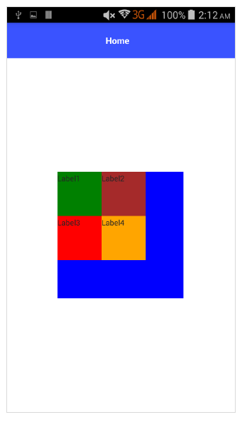
堆疊佈局
StackLayout 以一維線(水平或垂直)組織其子元素。它可以使用佈局選項根據佈局中的空間進行大小調整。它具有 orientation 屬性,可用於指定方向,水平或垂直。
讓我們在應用程式的首頁新增 StackLayout 容器,如下所示:
<ActionBar>
   <Label text="Home"></Label>
</ActionBar>
<StackLayout orientation="vertical" width="200" height="200" backgroundColor="blue">
   <Label text="Label1" width="50" height="50" backgroundColor="green"></Label>
   <Label text="Label2" width="50" height="50" backgroundColor="brown"></Label>
   <Label text="Label3" width="50" height="50" backgroundColor="red"></Label>
   <Label text="Label4" width="50" height="50" backgroundColor="orange"></Label>
</StackLayout>
輸出
StackLayout 的輸出如下所示:

換行佈局
WrapLayout 用於在新行或新列中換行內容。
它具有以下三個屬性:
orientation - 水平或垂直顯示。
itemWidth - 每個子元素的佈局寬度。
itemHeight - 每個子元素的佈局高度。
讓我們在應用程式的首頁新增 WrapLayout 容器,如下所示:
<ActionBar>
   <Label text="Home"></Label>
</ActionBar> <WrapLayout orientation="horizontal" width="200" height="200" backgroundColor="blue">
   <Label text="Label1" width="70" height="70" backgroundColor="green"></Label>
   <Label text="Label2" width="70" height="70" backgroundColor="brown"></Label
   <Label text="Label3" width="70" height="70" backgroundColor="red"></Label>
   <Label text="Label4" width="70" height="70" backgroundColor="orange"></Label>
</WrapLayout>
輸出
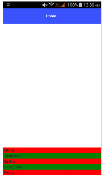
Flexbox 佈局
FlexboxLayout 容器元件是一個高階佈局容器。它提供了從簡單的佈局到非常複雜和複雜的佈局的渲染選項。它基於 CSS Flexbox。
FlexboxLayout 元件有很多屬性,它們如下:
flexDirection
它表示排列子元件的方向。flexDirection 的可能值如下:
row - 子元件並排排列。
row-reverse - 子元件並排排列,但方向相反。
column - 子元件一個接一個地排列。
column-reverse - 子元件一個接一個地排列,但方向相反。
讓我們在應用程式的首頁新增 FlexLayout 容器,如下所示:
<ActionBar>
   <Label text="Home"></Label>
</ActionBar>
<FlexboxLayout flexDirection="row">
   <Label text="First Item" backgroundColor="red"></Label>
   <Label text="Second Item" backgroundColor="green"></Label>
   <Label text="Third Item" backgroundColor="red"></Label>
   <Label text="Fourth Item" backgroundColor="green"></Label>
   <Label text="Fifth Item" backgroundColor="red"></Label>
</FlexboxLayout>
輸出
以下是 FlexLayout – Row 的輸出:

現在,讓我們將 flexDirection 值從 row 更改為 row-reverse,並檢查它如何影響佈局。
<ActionBar>
   <Label text="Home"></Label>
</ActionBar> <FlexboxLayout flexDirection="row-reverse">
   <Label text="First Item" backgroundColor="red"></Label>
   <Label text="Second Item" backgroundColor="green"></Label>
   <Label text="Third Item" backgroundColor="red"></Label>
   <Label text="Fourth Item" backgroundColor="green"></Label>
   <Label text="Fifth Item" backgroundColor="red"></Label>
</FlexboxLayout>
輸出
以下是 Flex 佈局 - Row Reverse 的輸出:

讓我們將 flexDirection 值從 row-reverse 更改為 column,並檢查它如何影響佈局。
<ActionBar>
   <Label text="Home"></Label>
</ActionBar>
<FlexboxLayout flexDirection="column">
   <Label text="First Item" backgroundColor="red"></Label>
   <Label text="Second Item" backgroundColor="green"></Label>
   <Label text="Third Item" backgroundColor="red"></Label>
   <Label text="Fourth Item" backgroundColor="green"></Label>
   <Label text="Fifth Item" backgroundColor="red"></Label>
</FlexboxLayout>
輸出
以下是 FlexLayout – Column 的輸出:

讓我們將 flexDirection 值從 column 更改為 column-reverse,並檢查它如何影響佈局。
<ActionBar>
   <Label text="Home"></Label>
</ActionBar>
<FlexboxLayout flexDirection="column-reverse">
   <Label text="First Item" backgroundColor="red"></Label>
   <Label text="Second Item" backgroundColor="green"></Label>
   <Label text="Third Item" backgroundColor="red"></Label>
   <Label text="Fourth Item" backgroundColor="green"></Label>
   <Label text="Fifth Item" backgroundColor="red"></Label>
</FlexboxLayout>
輸出
以下是 FlexLayout – Column Reverse 的輸出:
flexWrap
它表示子元件是在單行/單列中渲染,還是透過在 flexDirection 設定的方向上換行流入多行。
可能的值如下:
wrap - 如果給定方向 (flexDirection) 沒有空間,則換行子元件。
wrap-reverse - 與 wrap 相同,只是元件流向相反。
讓我們新增 flexWrap 屬性,然後將其值設定為 wrap。還要新增三個如下所示的子元素:
<ActionBar>
   <Label text="Home"></Label>
&tl;/ActionBar>
<FlexboxLayout flexDirection="row" flexWrap="wrap">
   <Label text="First Item" backgroundColor="red"></Label>
   <Label text="Second Item" backgroundColor="green"></Label>
   <Label text="Third Item" backgroundColor="red"></Label>
   <Label text="Fourth Item" backgroundColor="green"></Label>
   <Label text="Fifth Item" backgroundColor="red"></Label>
   <Label text="Sixth Item" backgroundColor="green"></Label>
   <Label text="Seventh Item" backgroundColor="red"></Label>
   <Label text="Eighth Item" backgroundColor="green"></Label>
</FlexboxLayout>
輸出
以下是 flexWrap 的輸出:

JustifyContent
它表示子元件相對於彼此和整體結構如何排列。它具有如下所示的三個屬性:
flex-end - 它將子元件打包到結束行。
space-between - 它透過在行中均勻分佈來打包子元件。
space-around - 與 space-between 類似,但它透過在行中均勻分佈以及子元件周圍的相等空間來打包子元件。
讓我們也新增 justifyContent 並檢查它的行為:
<ActionBar>
   <Label text="Home"></Label>
</ActionBar>
<FlexboxLayout flexDirection="row" flexWrap="wrap" justifyContent="space-around">
   <Label text="First Item" backgroundColor="red"></Label>
   <Label text="Second Item" backgroundColor="green"></Label>
   <Label text="Third Item" backgroundColor="red"></Label>
   <Label text="Fourth Item" backgroundColor="green"></Label>
   <Label text="Fifth Item" backgroundColor="red"></Label>
   <Label text="Sixth Item" backgroundColor="green"></Label>
   <Label text="Seventh Item" backgroundColor="red"></Label>
   <Label text="Eighth Item" backgroundColor="green"></Label>
</FlexboxLayout>
輸出
以下是 Flex 佈局 - JustifyContent 的輸出:

FlexLayout 容器為其子元素提供了另外兩個屬性來指定順序和收縮能力。它們分別是:
order - 它確定 FlexLayout 容器的子元素的渲染順序。
flexShrink - 它決定子元素收縮到 0 的能力。