
 資料結構
資料結構 網路
網路 關係型資料庫管理系統 (RDBMS)
 作業系統
作業系統 Java
Java MS Excel
 iOS
iOS HTML
HTML CSS
CSS Android
 Python
 C 程式設計
 C++
C++ C#
C# MongoDB
 MySQL
MySQL Javascript
 PHP
PHP 物理
物理 化學
化學 生物
生物 數學
數學 英語
英語 經濟學
經濟學 心理學
心理學 社會學
社會學 服裝設計
服裝設計 法律研究
法律研究如何在 ReactJS 中使用 Paper 元件?
在 Material UI 中,Paper 元件與卡片元件非常相似,基本上它也建立了所需尺寸的卡片。
Card 和 Paper 元件的主要區別在於“Elevation”屬性。Elevation 屬性允許設定 Paper 元件的陰影以新增 3D 效果。
語法
使用者可以按照以下語法使用 Material UI 的 Paper 元件。
<Paper/>
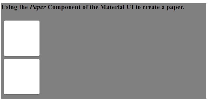
示例 1(Paper 元件的基本用法)
在下面的示例中,我們在 Material UI 的 Box 元件內添加了 Paper 元件。此外,我們透過將屬性傳遞給 Box 元件來設定 Paper 元件的尺寸。
import React from "react";
import Paper from "@mui/material/Paper";
import Box from "@mui/material/Box";
const App = () => {
   return (
      <div style = {{ backgroundColor: "grey" }}>
         <h3>
            {" "}
            Using the <i> Paper </i> Component of the Material UI to create a paper.{" "}
         </h3>
         <Box
            sx={{
               display: "inline-block", "& > :not(style)": {
                  m: 1,
                  width: 200,
                  height: 200,
               },
            }}
            >
            <Paper />
            <Paper />
         </Box>
      </div>
   );
};
export default App;
輸出
在輸出中,使用者可以看到類似於卡片的 Paper。
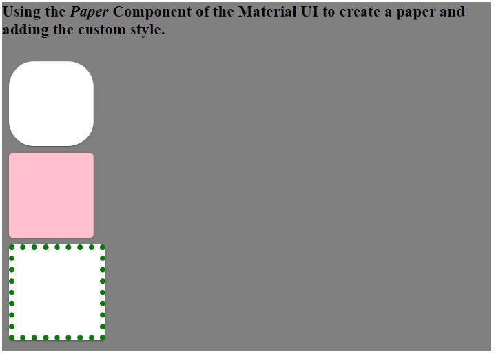
示例 2(向 Paper 元件新增自定義 CSS)
在下面的示例中,我們將樣式作為 Paper 元件的屬性傳遞。我們更改了第一個 Paper 元件的圓角。此外,我們更改了第二個 Paper 元件的背景顏色和第三個 Paper 元件的邊框。
import React from "react";
import Paper from "@mui/material/Paper";
import Box from "@mui/material/Box";
const App = () => {
   return (
      <div style = {{ backgroundColor: "blue" }}>
         <h3>
            {" "}
            Using the <i> Paper </i> Component of the Material UI to create a paper and adding the custom style.{" "}
         </h3>
         <Box
            sx={{
               display: "inline-block", "& > :not(style)": {
                  m: 1,
                  width: 100,
                  height: 100,
               },
            }}
            >
            <Paper style = {{ borderRadius: "30px" }} />
            <Paper style = {{ backgroundColor: "pink" }} />
            <Paper style = {{ border: "7px dotted green" }} />
         </Box>
      </div>
   );
};
export default App;
輸出
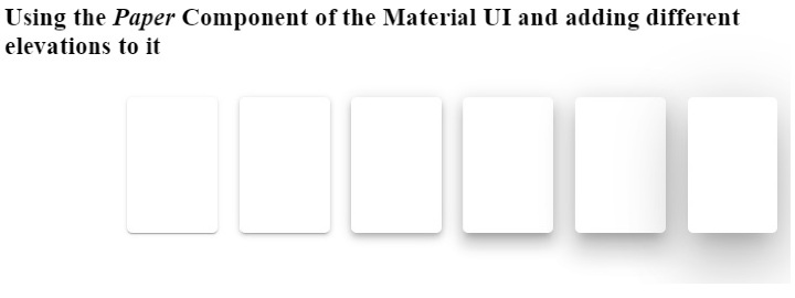
示例 3(使用 Elevation 屬性)
在下面的示例中,我們使用了 elevation 作為 Paper 元件的屬性。elevation 屬性表示陰影,並接受 0,1,2,3,4,8,12,16,24 作為值。根據深色和淺色主題,elevation 將為 0 值應用 0px 陰影,為 24 elevation 值應用 40px 陰影。
增加 elevation 值會增加 Paper 元件的 3D 效果,因為陰影會增加。
import React from "react";
import Paper from "@mui/material/Paper";
import Box from "@mui/material/Box";
const App = () => {
   return (
      <div>
         <h3>
            {" "}
            Using the <i> Paper </i> Component of the Material UI and adding different elevations to it {" "}
         </h3>
         <Box
            sx = {{
               display: "flex", "& > :not(style)": {
                  m: 1,
                  width: 100,
                  height: 100,
               },
            }}
            >
            <Paper elevation = {0} />
            <Paper elevation = {1} />
            <Paper elevation = {2} />
            <Paper elevation = {4} />
            <Paper elevation = {8} />
            <Paper elevation = {12} />
            <Paper elevation = {24} />
         </Box>
      </div>
   );
};
export default App;
輸出
本教程中,使用者學習瞭如何使用 Material UI 的 Paper 元件。在第一個示例中,我們看到了 Paper 元件的基本用法。在第二個示例中,我們學習瞭如何將自定義 CSS 作為 Paper 元件的屬性傳遞,在最後一個示例中,我們學習瞭如何將 elevation 屬性與 Paper 元件一起使用。

更新於:2023年3月7日
瀏覽量 1K+

廣告