
 資料結構
資料結構 網路
網路 RDBMS
RDBMS 作業系統
作業系統 Java
Java iOS
iOS HTML
HTML CSS
CSS Android
 Python
 C 程式設計
 C++
C++ C#
C# MongoDB
 MySQL
MySQL Javascript
 PHP
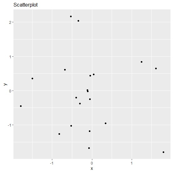
PHP如何使用 R 中的 `ggplot2` 將圖表標題放置在圖表內?
通常情況下,我們會把圖表標題放在圖表的頂部,但我們也可以把它放在圖表內部。當然,這會改變圖表的外觀,但也會吸引觀眾的目光。要實現這一點,我們可以使用 `ggplot2` 軟體包的 `theme` 函式,其中圖表標題的 `margin` 引數將改變標題的位置。
考慮以下資料框 -
示例
x<-rnorm(20)
y<-rnorm(20)
df<-data.frame(x,y)
df
輸出
       x           y
1  -0.30662899  -0.37957405
2  -0.82615057  -1.26477881
3  -0.11692952   0.01427444
4  -0.34331938   2.03706444
5  -1.49544241   0.35632086
6  -0.07656434  -1.68049294
7  -0.05300648  -0.24720322
8   1.24363223   0.84503405
9  -0.05653599  -1.18044286
10 -0.04502879   0.43735809
11  0.04637793   0.47158401
12 -0.52382139  -1.02630948
13  1.60555319   0.64673159
14  1.80033105  -1.79870479
15 -0.10558775  -0.02166056
16 -0.68224275   0.61533007
17 -1.79128676  -0.45239927
18  0.34083402  -0.95344404
19 -0.39968860  -0.20690004
20 -0.53267410   2.17089520
載入 `ggplot2` 軟體包,並在 x 和 y 之間建立一個散點圖 -
示例
library(ggplot2)
ggplot(df,aes(x,y))+geom_point()+ggtitle("Scatterplot")
輸出
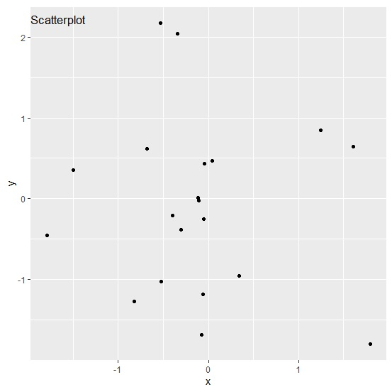
在圖表區域內建立 x 和 y 之間的散點圖,圖表標題位於內部 -
示例
ggplot(df,aes(x,y))+geom_point()+ggtitle("Scatterplot")+theme(plot.title=element_text(margin=margin(t=10,b=-20)))輸出

更新於: 06-Feb-2021
704 次瀏覽

廣告