
 資料結構
資料結構 網路
網路 關係型資料庫管理系統
 作業系統
作業系統 Java
Java iOS
iOS HTML
HTML CSS
CSS Android
 Python
 C 程式設計
 C++
C++ C#
C# MongoDB
 MySQL
MySQL Javascript
 PHP
PHP如何在 MATLAB 中繪製直方圖?
直方圖是一種資料圖形表示,顯示資料點的頻率分佈。MATLAB 提供了一個內建函式“histogram”來繪製資料集的直方圖。
什麼是 MATLAB 中的直方圖?
在 MATLAB 中,直方圖是一種以圖形方式表示一組資料點頻率分佈的方法。它顯示了資料點在稱為 bin 的特定區間內的頻率分佈。
在直方圖中,區間或 bin 在 x 軸上表示,資料點的頻率在 y 軸上表示。在 MATLAB 中,直方圖是圖形化表示和分析資料的一種有效方法。
有一個名為“histogram”的內建函式,我們可以使用它來繪製 MATLAB 中資料集的直方圖。此函式具有不同的語法格式,可以根據需要繪製各種型別的直方圖。
現在讓我們討論 MATLAB 中“histogram”函式的各種語法格式。
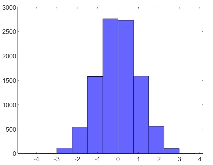
(1). 使用預設屬性繪製直方圖
在 MATLAB 中,以下“histogram”函式的語法用於使用預設屬性繪製資料集的直方圖。
histogram(X);
這裡,X 是資料點的向量。
以下示例演示瞭如何使用此函式建立直方圖。
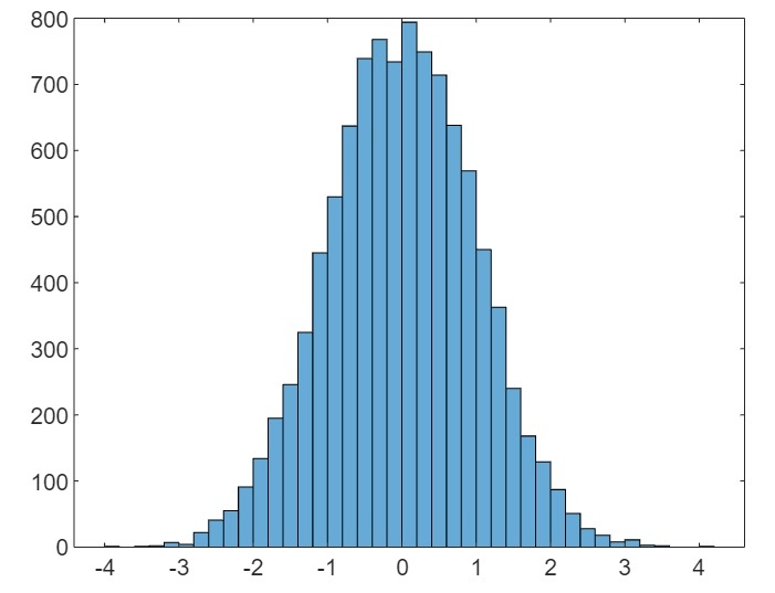
示例(1)
% MATLAB code to plot default histogram
% Create a sample data set
X = randn(5000, 2);

% Plot the histogram for the data set
histogram(X);
輸出
(2). 使用指定的 bin 數繪製直方圖
以下“histogram”函式的語法用於繪製具有指定 bin 數或區間的直方圖。
histogram(X, bins);
這裡,X 是資料集的向量,“bins”指定直方圖的區間數。
以下 MATLAB 程式碼顯示了此函式的實現,
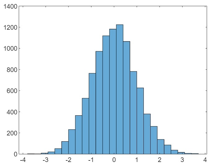
示例(2)
% MATLAB code to plot histogram with specified number of bins
% Create a sample data set
X = randn(5000, 2);

% Plot the histogram for the data set
histogram(X, 25);
輸出
(3). 使用指定的 bin 邊界繪製直方圖
要繪製具有指定 bin 邊界的直方圖,請使用以下“histogram”函式的語法。
histogram(X, edges);
這裡,X 是包含資料集的向量,“edges”是包含 bin 邊界的向量。
讓我們看一個示例來了解此函式的實現。
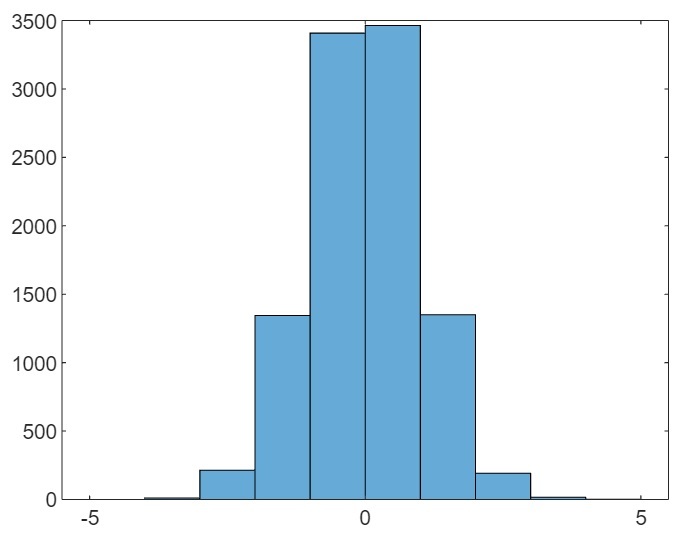
示例(3)
% MATLAB code to plot histogram with specified edges of the bins
% Create a sample data set
X = randn(5000, 2);

% Create a vector containing edges of bins
edges = [-5 -4 -3 -2 -1 0 1 2 3 4 5];

% Plot the histogram for the data set
histogram(X, edges);
輸出
(4). 繪製分類資料的直方圖
以下“histogram”函式的語法用於繪製分類資料的直方圖。
histogram(C);
這裡,C 是分類資料。
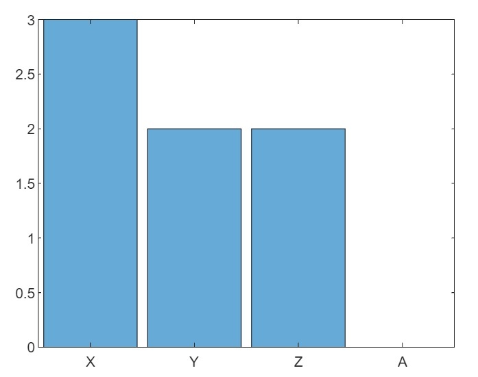
示例(4)
以下示例演示了此函式的實現。
% MATLAB code to plot histogram of categorical data
% Create a sample array of categories
cat = {'X', 'Y', 'Z', 'X', 'Y', 'X', 'Z'};

% Create categorical data
C = categorical(cat);

% Plot the histogram for the categorical data
histogram(C);
輸出
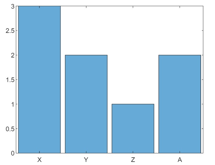
(5). 使用指定的類別繪製分類資料的直方圖
以下“histogram”函式的語法用於繪製具有指定類別的分類資料的直方圖。
histogram(C, Categories);
讓我們看一個基於此函式的示例。
示例(5)
% MATLAB code to plot histogram of categorical data with specified categories
% Create a sample array of categories
cat = {'X', 'Y', 'Z', 'X', 'Y', 'X', 'Z'};

% Create categorical data
C = categorical(cat);

% Plot the histogram for the categorical data
histogram(C,{'X', 'Y', 'Z', 'A'});
輸出
(6). 使用指定的類別和預計算的 bin 計數繪製分類資料的直方圖
以下“histogram”函式的語法用於繪製具有指定類別和預計算的 bin 計數的分類資料的直方圖。
histogram('Categories', Categories, 'BinCounts', counts);
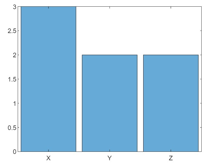
示例(6)
這是一個演示此函式實現的示例。
% MATLAB program to plot categorical histogram with prespecified categories and bin counts
% Create sample categories
cat = {'X', 'Y', 'Z', 'X', 'Y', 'X', 'Z'};

% Calculate bin counts for each category
counts = [3, 2, 1, 2];

% Plot the histogram
histogram('Categories', {'X', 'Y', 'Z', 'A'}, 'BinCounts', counts);
輸出
(7). 使用自定義屬性繪製直方圖
以下“histogram”函式的語法用於使用自定義屬性繪製直方圖。
histogram(___, Name, Value);
這裡,直方圖的自定義屬性使用名稱-值對指定。
示例(7)
讓我們看一個示例來了解如何實現此函式。
% MATLAB program to plot a histogram with customized properties
% Create a sample data set
X = randn(5000, 2);

% Plot the histogram with customized properties
histogram(X, 'FaceColor', 'blue', 'BinWidth', 0.75);
輸出
(8). 使用指定的軸繪製直方圖
以下“histogram”函式的語法用於使用指定的軸繪製直方圖。
histogram(ax, ___);
示例(8)
以下 MATLAB 示例演示瞭如何使用此函式繪製直方圖。
% MATLAB code to plot a histogram with specified axes
% Create a sample data set
X = randn(5000, 2);

% Specify the subplot axes
ax = subplot(1, 1, 1);

% Plot the histogram in the subplot
histogram(ax, X);
輸出

結論
MATLAB 有一個內建函式“histogram”來繪製資料集的直方圖。在本教程中,我已經解釋了“histogram”函式的不同語法格式,具體取決於不同型別的資料和輸出要求。

326 次檢視
