
 資料結構
資料結構 網路
網路 RDBMS
RDBMS 作業系統
作業系統 Java
Java iOS
iOS HTML
HTML CSS
CSS Android
 Python
 C 程式設計
 C++
C++ C#
C# MongoDB
 MySQL
MySQL JavaScript
 PHP
PHP在 Matplotlib 中繪製作圖中的平均線
我們可以使用 hist 方法繪製一些表示式。然後,我們將使用 plot 方法和在建立 hist 時返回的 bin 來繪製表示式的平均圖。
步驟
使用一些方程式獲取 x 的資料,設定 num_bins = 50。
使用 subplots 方法建立 fig 和 ax 變數,其中預設 nrows 和 ncols 為 1。
使用 ax.hist() 方法獲取 n、bin、patches 值。
使用 bin 和透過一些方程式獲得的 y 資料繪製平均線。
使用 plt.xlabel() 方法設定 X 軸標籤。
使用 plt.ylabel() 方法設定 Y 軸標籤。
設定軸標題。
使用 tight_layout(),我們可以調整子圖之間以及周圍的留白。
要顯示圖片,請使用 plt.show() 方法。
示例
import numpy as np
import matplotlib.pyplot as plt

np.random.seed(19680801)

# example data
mu = 100 # mean of distribution
sigma = 15 # standard deviation of distribution
x = mu + sigma * np.random.randn(437)

num_bins = 50

fig, ax = plt.subplots()

# the histogram of the data
n, bins, patches = ax.hist(x, num_bins, density=True)

# add a 'best fit' line
y = ((1 / (np.sqrt(2 * np.pi) * sigma)) *
np.exp(-0.5 * (1 / sigma * (bins - mu))**2))
ax.plot(bins, y, '--')
ax.set_xlabel('Smarts')
ax.set_ylabel('Probability density')
ax.set_title(r'Histogram of IQ: $\mu=100$, $\sigma=15$')

fig.tight_layout()
plt.show()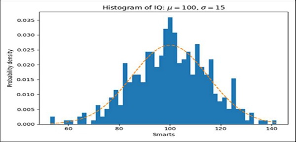

更新時間:17-Mar-2021
2K+ 瀏覽量

廣告