- Angular Highcharts 教程
- Angular Highcharts - 主頁
- Angular Highcharts - 概述
- 環境配置
- 配置語法
- Angular Highcharts - 折線圖
- Angular Highcharts - 面積圖
- Angular Highcharts - 條形圖
- Angular Highcharts - 柱形圖
- Angular Highcharts - 餅狀圖
- Angular Highcharts - 散點圖
- Angular Highcharts - 動態圖表
- Angular Highcharts - 組合圖
- Angular Highcharts - 3D 圖表
- Angular Highcharts - 地圖圖表
- Angular Highcharts 資源
- Angular Highcharts - 快速指南
- Angular Highcharts - 資源
- Angular Highcharts - 討論
Angular Highcharts - 基本餅狀圖
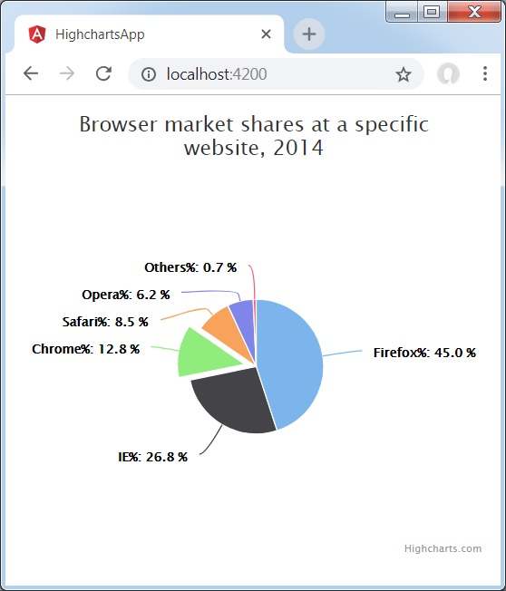
以下是餅狀圖示例。
我們已經在 Highcharts 配置語法 章節看到了用於繪製圖表的配置。現在,我們來看看一個基本餅狀圖的示例。我們還將瞭解其他配置。我們已更改圖表中的鍵入屬性。
圖表
將圖表型別配置為基於“pie”。chart.type 決定圖表的資料序列型別。此處,預設值為“line”。
var series = {
   type: 'pie'
};
示例
app.component.ts
import { Component } from '@angular/core';
import * as Highcharts from 'highcharts';
@Component({
  selector: 'app-root',
  templateUrl: './app.component.html',
  styleUrls: ['./app.component.css']
})
export class AppComponent {
   highcharts = Highcharts;
   chartOptions = {
      chart : {
         plotBorderWidth: null,
         plotShadow: false
      },
      title : {
         text: 'Browser market shares at a specific website, 2014'
      },
      tooltip : {
         pointFormat: '{series.name}: <b>{point.percentage:.1f}%</b>'
      },
      plotOptions : {
         pie: {
            allowPointSelect: true,
            cursor: 'pointer',
            dataLabels: {
               enabled: true,
               format: '<b>{point.name}%</b>: {point.percentage:.1f} %',
               style: {
                  color: (Highcharts.theme && Highcharts.theme.contrastTextColor)||
                  'black'
               }
            }
         }
      },
      series : [{
         type: 'pie',
         name: 'Browser share',
         data: [
            ['Firefox',   45.0],
            ['IE',       26.8],
            {
               name: 'Chrome',
               y: 12.8,
               sliced: true,
               selected: true
            },
            ['Safari',    8.5],
            ['Opera',     6.2],
            ['Others',      0.7]
         ]
      }]
   };
}
結果
驗證結果。
angular_highcharts_pie_charts.htm
廣告