- Angular Highcharts 教程
- Angular Highcharts - 首頁
- Angular Highcharts - 概述
- 環境設定
- 配置語法
- Angular Highcharts - 線形圖
- Angular Highcharts - 面積圖
- Angular Highcharts - 條形圖
- Angular Highcharts - 柱形圖
- Angular Highcharts - 餅圖
- Angular Highcharts - 散點圖
- Angular Highcharts - 動態圖表
- Angular Highcharts - 組合圖表
- Angular Highcharts - 3D 圖表
- Angular Highcharts - 地圖圖表
- Angular Highcharts 資源
- Angular Highcharts - 快速指南
- Angular Highcharts - 資源
- Angular Highcharts - 討論
Angular Highcharts - 配置語法
在本章中,我們將展示使用 Angular 中的 Highcharts API 繪製圖表所需的配置。
步驟 1 - 建立 Angular 應用程式
請按照以下步驟更新我們在 *Angular 6 - 專案設定* 章節中建立的 Angular 應用程式:
| 步驟 | 描述 |
|---|---|
| 1 | 建立一個名為 *highchartsApp* 的專案,如 *Angular 6 - 專案設定* 章節中所述。 |
| 2 | 修改 *app.module.ts*、*app.component.ts* 和 *app.component.html*,如下所述。保持其餘檔案不變。 |
| 3 | 編譯並執行應用程式以驗證已實現邏輯的結果。 |
以下是修改後的模組描述符 **app.module.ts** 的內容。
import { BrowserModule } from '@angular/platform-browser';
import { NgModule } from '@angular/core';
import { AppComponent } from './app.component';
import { HighchartsChartComponent } from 'highcharts-angular';
@NgModule({
   declarations: [
      AppComponent,
      HighchartsChartComponent
   ],
   imports: [
      BrowserModule,
   ],
   providers: [],
   bootstrap: [AppComponent]
})
export class AppModule { }
以下是修改後的 HTML 主機檔案 **app.component.html** 的內容。
<highcharts-chart
   [Highcharts] = "highcharts"
   [options] = "chartOptions"
   style = "width: 100%; height: 400px; display: block;">
</highcharts-chart>
在理解配置後,我們將在最後看到更新後的 app.component.ts。
步驟 2 - 使用配置
建立 Highcharts 並建立 chartOptions
highcharts = Highcharts;
   chartOptions = {
}
建立圖表
使用 chartOptions 配置圖表的型別、標題和副標題。
chart: {
   type: "spline"
},
xAxis
使用 chartOptions 配置要在 X 軸上顯示的刻度。
xAxis:{
   categories:["Jan", "Feb", "Mar", "Apr", "May", "Jun", "Jul", "Aug", "Sep", "Oct", "Nov", "Dec"]
},
yAxis
使用 chartOptions 配置要在 Y 軸上顯示的標題。
yAxis: {
   title:{
      text:"Temperature °C"
   }
},
tooltip
配置工具提示。使用 chartOptions 將字尾新增到值(y 軸)之後。
tooltip: {
   valueSuffix:" °C"
},
series
使用 chartOptions 配置要在圖表上顯示的資料。Series 是一個數組,其中此陣列的每個元素代表圖表上的一條線。
series: [
   {
      name: 'Tokyo',
      data: [7.0, 6.9, 9.5, 14.5, 18.2, 21.5, 25.2,26.5, 23.3, 18.3, 13.9, 9.6]
   },
   {
      name: 'New York',
      data: [-0.2, 0.8, 5.7, 11.3, 17.0, 22.0, 24.8,24.1, 20.1, 14.1, 8.6, 2.5]
   },
   {
      name: 'Berlin',
      data: [-0.9, 0.6, 3.5, 8.4, 13.5, 17.0, 18.6, 17.9, 14.3, 9.0, 3.9, 1.0]
   },
   {
      name: 'London',
      data: [3.9, 4.2, 5.7, 8.5, 11.9, 15.2, 17.0, 16.6, 14.2, 10.3, 6.6, 4.8]
   }
]
示例
請考慮以下示例以進一步瞭解配置語法:
app.component.ts
import { Component } from '@angular/core';
import * as Highcharts from 'highcharts';
@Component({
   selector: 'app-root',
   templateUrl: './app.component.html',
   styleUrls: ['./app.component.css']
})
export class AppComponent {
   highcharts = Highcharts;
   chartOptions = {
      chart: {
         type: "spline"
      },
      title: {
         text: "Monthly Average Temperature"
      },
      subtitle: {
         text: "Source: WorldClimate.com"
      },
      xAxis:{
         categories:["Jan", "Feb", "Mar", "Apr", "May", "Jun",
            "Jul", "Aug", "Sep", "Oct", "Nov", "Dec"]
      },
      yAxis: {
         title:{
            text:"Temperature °C"
         }
      },
      tooltip: {
         valueSuffix:" °C"
      },
      series: [
         {
            name: 'Tokyo',
            data: [7.0, 6.9, 9.5, 14.5, 18.2, 21.5, 25.2,26.5, 23.3, 18.3, 13.9, 9.6]
         },
         {
            name: 'New York',
            data: [-0.2, 0.8, 5.7, 11.3, 17.0, 22.0, 24.8,24.1, 20.1, 14.1, 8.6, 2.5]
         },
         {
            name: 'Berlin',
            data: [-0.9, 0.6, 3.5, 8.4, 13.5, 17.0, 18.6, 17.9, 14.3, 9.0, 3.9, 1.0]
         },
         {
            name: 'London',
            data: [3.9, 4.2, 5.7, 8.5, 11.9, 15.2, 17.0, 16.6, 14.2, 10.3, 6.6, 4.8]
         }
      ]
   };
}
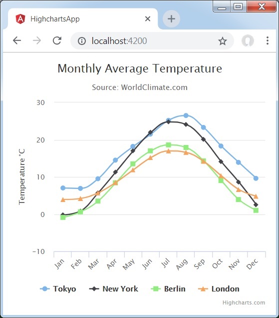
結果
驗證結果。
廣告