- Angular Highcharts 教程
- Angular Highcharts - 主頁
- Angular Highcharts - 概述
- 環境設定
- 配置語法
- Angular Highcharts - 折線圖
- Angular Highcharts - 區域圖
- Angular Highcharts - 條形圖
- Angular Highcharts - 柱狀圖
- Angular Highcharts - 餅狀圖
- Angular Highcharts - 散點圖
- Angular Highcharts - 動態圖表
- Angular Highcharts - 組合
- Angular Highcharts - 三維圖表
- Angular Highcharts - 地圖圖表
- Angular Highcharts 資源
- Angular Highcharts - 快速指南
- Angular Highcharts - 資源
- Angular Highcharts - 討論
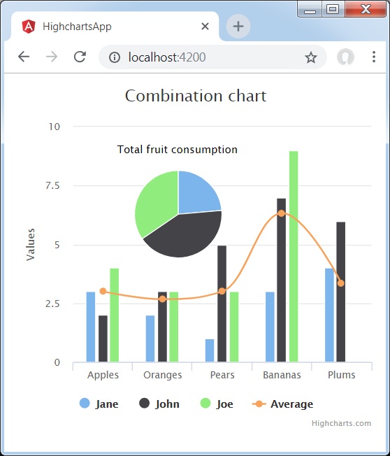
柱狀圖、折線圖和餅狀圖
以下是柱狀圖、折線圖和餅狀圖的示例。
我們已經在 Highcharts 配置語法 章節中看到了繪製圖表所用的配置。
下面給出一個由柱狀圖、折線圖和餅狀圖組合而成的圖表示例。
配置
現在讓我們看看採取的其他配置/步驟。
系列
將圖表型別配置為基於散點的型別。series.type 決定圖表系列的型別。在此,預設值為“折線”。
series : [{
   type: 'column',
   name: 'Jane',
   data: [3, 2, 1, 3, 4]
}]
示例
app.component.ts
import { Component } from '@angular/core';
import * as Highcharts from 'highcharts';
@Component({
   selector: 'app-root',
   templateUrl: './app.component.html',
   styleUrls: ['./app.component.css']
})
export class AppComponent {
   highcharts = Highcharts;
   chartOptions = {
      title : {
         text: 'Combination chart'
      },
      xAxis : {
         categories: ['Apples', 'Oranges', 'Pears', 'Bananas', 'Plums']
      },
      labels : {
         items: [{
            html: 'Total fruit consumption',
            style: {
               left: '50px',
               top: '18px',
               color: (Highcharts.theme && Highcharts.theme.textColor) || 'black'
            }
         }]
      },
      series : [
         {
            type: 'column',
            name: 'Jane',
            data: [3, 2, 1, 3, 4]
         },
         {
            type: 'column',
            name: 'John',
            data: [2, 3, 5, 7, 6]
         },
         {
            type: 'column',
            name: 'Joe',
            data: [4, 3, 3, 9, 0]
         },
         {
            type: 'spline',
            name: 'Average',
            data: [3, 2.67, 3, 6.33, 3.33]
         },
         {
            type: 'pie',
            name: 'Total consumption',
            data: [
               {
                  name: 'Jane',
                  y: 13,
                  color: Highcharts.getOptions().colors[0] // Jane's color
               },
               {
                  name: 'John',
                  y: 23,
                  color: Highcharts.getOptions().colors[1] // John's color
               },
               {
                  name: 'Joe',
                  y: 19,
                  color: Highcharts.getOptions().colors[2] // Joe's color
               }
            ],
            center: [100, 80],
            size: 100,
            showInLegend: false,
            dataLabels: {
               enabled: false
            }
         },
      ]
   };
}
結果
驗證結果。
angular_highcharts_combinations.htm
廣告