
 資料結構
資料結構 網路
網路 關係資料庫管理系統
 作業系統
作業系統 Java
Java iOS
iOS HTML
HTML CSS
CSS Android
 Python
 C 程式設計
 C++
C++ C#
C# MongoDB
 MySQL
MySQL Javascript
 PHP
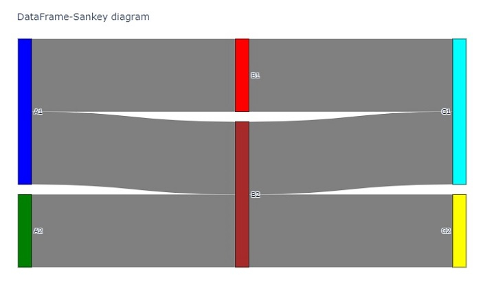
PHPPython Plotly:如何使用 Pandas 資料框定義 Sankey 圖的結構?
Sankey 圖用於透過定義“源”來表示源節點和“目標”來表示目標節點來視覺化流程。它用於表示物件在不同資料點之間的流動。
在本教程中,讓我們瞭解如何使用資料框定義 Sankey 圖的結構。在這裡,我們將使用plotly.graph_objects模組生成圖形。它包含許多生成圖表的方法。
步驟 1
匯入plotly.graphs_objs模組並將其別名為go。
import plotly.graphs_objs as go
步驟 2
匯入 Pandas 模組並將其別名為pd。
import pandas as pd
步驟 3
建立具有“id”、“label”和“color”座標的二維節點列表 -
nodes = [
   ['id', 'label', 'color'],
   [ 0,    'A1',    'blue'],
   [ 1,    'A2',    'green'],
   [ 2,    'B1',    'red'],
   [ 3,    'B2',    'brown'],
   [ 4,    'C1',    'cyan'],
   [ 5,    'C2',    'yellow']
]
步驟 4
建立具有“source”、“target”、“value”和“link color”的二維連結列表,如下所示 -
links = [
   ['Source', 'Target', 'Value', 'Link Color'],
   [  0,          2,       4,       'grey'],
   [  0,          3,       4,       'grey'],
   [  1,          3,       4,       'grey'],
   [  2,          4,       4,       'grey'],
   [  3,          4,       4,       'grey'],
   [  3,          5,       4,       'grey']
]
步驟 5
計算節點和連結標題,併為節點和連結生成兩個資料框。
nodes_headers = nodes.pop(0)
links_headers = links.pop(0)

df_nodes = pd.DataFrame(nodes, columns = nodes_headers)
df_links = pd.DataFrame(links, columns = links_headers)
步驟 6
接下來,建立 Sankey 圖。將資料框節點新增到 Sankey 圖中,並設定其顏色和粗細值。
fig = go.Figure(data=[go.Sankey(
   node = dict(
      pad = 15,
      thickness = 20,
      line = dict(color = "black", width = 0.5),
      label = df_nodes['label'].dropna(axis=0, how='any'),
      color = df_nodes['color']),
步驟 7
生成“source”、“target”、“value”和“link colors”的連結,如下所示 -
link = dict(
   source = df_links['Source'].dropna(axis=0, how='any'),
   target = df_links['Target'].dropna(axis=0, how='any'),
   value = df_links['Value'].dropna(axis=0, how='any'),
   color = df_links['Link Color'].dropna(axis=0, how='any'),
)
步驟 8
使用update_layout()方法設定 Sankey 圖的標題。最後,使用fig.show()顯示圖表。
fig.update_layout(
   title_text="DataFrame-Sankey diagram",
   font_size=10
)
fig.show()
示例
使用 Pandas 資料框定義 Sankey 圖結構的完整程式碼如下所示 -
import plotly.graph_objects as go
import pandas as pd
nodes = [
   ['id', 'label', 'color'],
   [0, 'A1', 'blue'],
   [1, 'A2', 'green'],
   [2, 'B1', 'red'],
   [3, 'B2', 'brown'],
   [4, 'C1', 'cyan'],
   [5, 'C2', 'yellow']
]
links = [
   ['Source', 'Target', 'Value', 'Link Color'],
   [0, 2, 4, 'grey'],
   [0, 3, 4, 'grey'],
   [1, 3, 4, 'grey'],
   [2, 4, 4, 'grey'],
   [3, 4, 4, 'grey'],
   [3, 5, 4, 'grey']
]

# Retrieve headers and build dataframes
nodes_headers = nodes.pop(0)
links_headers = links.pop(0)

df_nodes = pd.DataFrame(nodes, columns=nodes_headers)
df_links = pd.DataFrame(links, columns=links_headers)

fig = go.Figure(data=[go.Sankey(
   node = dict(
      pad = 15,
      thickness = 20,
      line = dict(color = "black", width = 0.5),
      label = df_nodes['label'].dropna(axis=0, how='any'),
      color = df_nodes['color']
   ),

   link = dict(
      source=df_links['Source'].dropna(axis=0, how='any'),
      target=df_links['Target'].dropna(axis=0, how='any'),
      value=df_links['Value'].dropna(axis=0, how='any'),
      color=df_links['Link Color'].dropna(axis=0, how='any'),
   )
)])

fig.update_layout(
   title_text="DataFrame-Sankey diagram",
   font_size=10
)

fig.show()
輸出
執行後,它將在瀏覽器上顯示以下輸出 -

更新於:2022 年 10 月 21 日
3K+ 瀏覽量

廣告