
 資料結構
資料結構 網路
網路 關係資料庫管理系統 (RDBMS)
 作業系統
作業系統 Java
Java iOS
iOS HTML
HTML CSS
CSS Android
 Python
 C語言程式設計
 C++
C++ C#
C# MongoDB
 MySQL
MySQL Javascript
 PHP
PHP如何在Matplotlib中為所有子圖設定單個主標題?
多個子圖由一系列不同的繪圖圖表定義。Matplotlib是一個模組的名稱,它提供Python中的動畫和互動式視覺化。在Python中,我們有一些名為`suptitle()`的內建函式,可用於在Matplotlib中為所有子圖設定單個主標題。
語法
以下語法用於示例中:
array()
Python的陣列方法透過返回具有特定值的元素數量來定義。
suptitle()
這是Python中的內建方法,可用於設定所有子圖的主標題。
add_subplot()
此方法遵循包裝器模組,即matplotlib.pyplot,並在使用影像視窗API時提供附加行為。
imshow()
這是Python中的一個內建函式,可用於在視窗中顯示影像。
set_ylabel()
set_xlabel()
這兩個內建函式遵循matplotlib模組,用於設定垂直和水平兩側的標籤或文字。
show()
這是Python中的內建方法,用於在程式結束時以圖形的形式獲取結果。
figure()
figure是Python中的內建方法,用於建立一個新圖形。
示例1
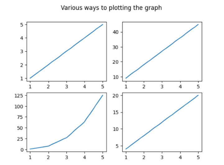
在下面的示例中,我們將從匯入名為numpy和matplotlib.pyplot的模組開始程式。然後使用內建方法`array()`設定陣列列表並將其儲存在變數x中。然後初始化fig,ax(表示名為fig的類的物件)並透過建立遵循名為matplotlib.pyplot的包裝器模組的子圖來儲存值。接下來,使用內建方法`subplot()`設定4個不同的子圖。然後使用內建方法`suptitle()`設定主標題,該標題代表所有繪圖圖表的標題。接下來,使用`show()`方法獲得所需的結果。
import numpy as np
import matplotlib.pyplot as plt
# create data
x=np.array([1, 2, 3, 4, 5])

# making subplots
fig, ax = plt.subplots(2, 2)

# Set data with subplots and plot
ax[0, 0].plot(x, x)
ax[0, 1].plot(x, x*9)
ax[1, 0].plot(x, x*x*x)
ax[1, 1].plot(x, x*4)
plt.suptitle('Various ways to plotting the graph')
plt.show()
輸出
示例2
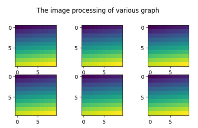
在下面的示例中,我們將顯示所有不同繪圖圖表的標題。然後開始匯入名為matplotlib.pyplot的包裝器模組。然後使用名為`figure()`的方法建立新圖形。接下來,使用`arange()`[定義陣列中包含的區間值]和`reshape()`函式與numpy模組(即np)。開始迭代for迴圈以使用內建方法`add_subplot()`和`imshow()`基於影像處理設定6個圖形。接下來使用內建方法`suptitle()`設定所有繪圖圖表的標題,並藉助`show()`方法獲得結果。
import matplotlib.pyplot as pl
import numpy as np
fig=pl.figure()
ax_range=np.arange(100).reshape((10,10))
for i in range(1,7):
   ax=fig.add_subplot(3,3,i)
   ax.imshow(ax_range)
# Set the main title of all the subplots
fig.suptitle('The image processing of various graph ')
pl.show()
輸出
示例3
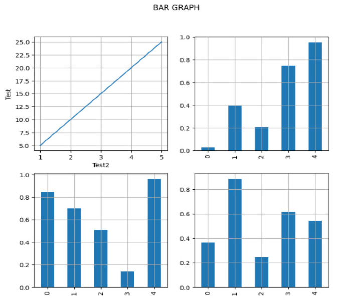
在下面的示例中,我們將開始實現必要的庫pandas、numpy和matplotlib.pyplot,並將物件引用分別作為pd、np和plt。然後建立遵循pandas模組的DataFrame並接受引數-`np.random.rand()`[為特定形狀建立陣列並填充其值]和`columns`[以列表的形式設定列的總數]。接下來,在變數x和y中設定x軸和y軸的資料。然後使用`subplot()`將子圖分成兩行兩列,具有相同的寬度和高度,即`figsize(8,8)`。現在使用內建方法`plot()`繪製軸,並使用內建方法`grid()`在圖形上設定網格線。為了在圖形上顯示一些獨特性,它將在圖形的第一行和第一列上使用x軸和y軸上的標籤。接下來設定主要任務,即設定所有繪圖條形圖的主標題。最後,我們藉助`show()`列印結果。
import pandas as pd
import numpy as np
import matplotlib.pyplot as plt

# create the data
df=pd.DataFrame(np.random.rand(5, 5), columns=['a', 'b', 'c', 'd','e'])

# create the data
x=[1,2,3,4,5]
y=[5,10,15,20,25]

fig, axes = plt.subplots(figsize=(8,8),nrows=2, ncols=2)
ax1=plt.subplot(2,2,1)
plt.plot(x,y)

# plot the axes
df["b"].plot(ax=axes[1,0], kind='bar', grid=True)
df["c"].plot(ax=axes[1,1], kind='bar', grid=True)
df["d"].plot(ax=axes[0,1], kind='bar', grid=True)

# Set the gridlines on all the plotting graph
ax1.grid(True)

# Set the horizontal and vertical text
ax1.set_ylabel('Test')
ax1.set_xlabel('Test2')
fig.suptitle('BAR GRAPH')
plt.show()
輸出
示例4
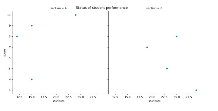
在下面的示例中,我們透過使用Seaborn模組建立散點圖來啟動程式,以視覺化兩個不同部分(A和B)中學生人數和分數之間的關係。然後我們使用`replot()`透過設定一些引數來建立散點圖- data、x、y和col。接下來,使用名為`rel.fig.suptitle()`的內建方法設定主標題並獲得最終結果。
import pandas as pd
import seaborn as sns
import matplotlib.pyplot as plt

#create the fake data
df = pd.DataFrame({'students': [15, 12, 15, 24, 19, 23, 25, 29],
   'score': [4, 8, 9, 10, 7, 5, 8, 3],
   'section': ['A', 'A', 'A', 'A', 'B', 'B', 'B', 'B']})

#create relplot
rel = sns.relplot(data=df, x='students', y='score', col='section')

#add the main title
rel.fig.suptitle('Status of student performance')
輸出
結論
我們討論了在單個框架內繪製不同圖形的不同方法。`suptitle()`是Python中重要的一個方法,它為Matplotlib中的所有子圖設定單個主標題。我們看到了新的概念,即圖形上的影像處理,而其他示例則顯示了條形圖、散點圖和線圖等圖形。

4K+瀏覽量
