
 資料結構
資料結構 網路
網路 關係資料庫管理系統
 作業系統
作業系統 Java
Java iOS
iOS HTML
HTML CSS
CSS Android
 Python
 C 程式設計
 C++
C++ C#
C# MongoDB
 MySQL
MySQL Javascript
 PHP
PHP如何在 Matplotlib 中調整座標軸標籤的位置?
當我們使用 Matplotlib 的子圖或繪圖進行資料視覺化時,正確地標記座標軸並根據需要調整座標軸標籤的位置非常重要,以避免它們與繪圖中的其他元素重疊。這可以幫助使用者輕鬆理解正在呈現的資料。
為了建立和調整標籤,我們將使用 Matplotlib 庫,該庫用於建立高質量的資料視覺化。本文將討論在 Matplotlib 中調整座標軸標籤位置的各種方法。我們將使用子圖來實現這一點。
Matplotlib
Matplotlib 是一個主要用於為 Python 程式語言及其數值數學擴充套件 NumPy 繪製圖形和圖表的庫。Tkinter、wxPython、Qt 和 GTK GUI 工具包可能包含使用其面向物件 API 的圖表。
matplotlib.pyplot 是一個命令式方法的集合,它允許 matplotlib 的功能類似於 MATLAB。每個 pyplot 函式都以某種方式更改圖形,無論是新增繪圖區域、繪製線條、新增標籤等。matplotlib.pyplot 在函式呼叫之間儲存當前圖形和繪圖區域,並且繪圖函式始終應用於活動的座標軸集。
子圖
Matplotlib 中的子圖允許在一個圖形中顯示多個繪圖或圖表。藉助子圖,我們可以同時比較和分析多組資料。這使得發現或識別趨勢、模式和關係變得更容易。
子圖是較大繪圖的一部分,由較小的繪圖網格組成。每個子圖在網格中都有自己的位置,該位置基於網格的行數和列數以及子圖在該網格中的位置。
Matplotlib 的“subplots”方法允許我們建立子圖。此函式返回一個圖形物件和一個子圖物件陣列。我們可以使用這些子圖物件在每個子圖中繪製我們的資料。
語法
fig,ax=plt.subplots(nrows,ncolumns,index)
解釋
nrows − 此引數指定網格中子圖的行數。
ncolumns − 此引數指定網格中子圖的列數。
index − 此引數指定當前子圖的索引。索引從 1 開始,並按行遞增。
調整座標軸標籤的位置
在 Matplotlib 中,有多種方法或函式可用於調整 Matplotlib 圖表中座標軸標籤的位置,它們是:-
.set_label_coords() 函式
set_label_position() 函式
set_pad() 函式
.set_label_coords()
此方法用於設定子圖標籤的座標。
刻度標籤邊界框確定 y 標籤的 x 座標和 x 標籤的 y 座標的預設值。但是,當有多個座標軸並且必須跨這些座標軸對齊標籤時,就會出現問題。
標籤的座標也可以指定到轉換中。如果指定 None,則使用座標軸座標系,其中 (0, 0) 為左下角,(0.5, 0.5) 為中間等。
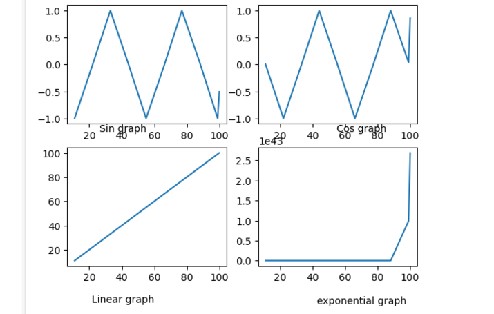
示例 1
import matplotlib.pyplot as p
import numpy as n

# generate some data
x=n.array([11, 22,33, 44, 55,66,77,88,99,100])

# create a subplot and plot the data
f, a = p.subplots(2,2)
a[0,0].plot(x, n.sin(x))
a[0,1].plot(x,n.cos(x))
a[1, 0].plot(x, x)
a[1, 1].plot(x, n.exp(x))
# set the x-axis label and adjust the position
a[0,0].set_xlabel('Sin graph')
a[0,0].xaxis.set_label_coords(0.35, 0)

a[0,1].set_xlabel('Cos graph')
a[0,1].xaxis.set_label_coords(0.65,0)
a[1, 0].set_xlabel('Linear graph')
a[1,0].xaxis.set_label_coords(0.35,-0.24)
a[1, 1].set_xlabel('exponential graph')
a[1,1].xaxis.set_label_coords(0.65,-0.25)

# display the plot
p.show()
輸出

set_label_position() 函式
set_position() 函式用於設定子圖中座標軸標籤的位置。此方法接受以下引數:-
Position − ‘left’、‘right’、‘top’、‘bottom’。
示例 2
import matplotlib.pyplot as p
import numpy as n

# generate some data
x=n.array([11, 22,33, 44, 55,66,77,88,99,100])

# create a subplot and plot the data
f, a = p.subplots(2,2)
a[0,0].plot(x, n.sin(x))
a[0,1].plot(x,n.cos(x))
a[1, 0].plot(x, x)
a[1, 1].plot(x, n.exp(x))
# set the x-axis label and y label and adjust the position
a[0,0].set_xlabel('Sin graph')
a[0,0].xaxis.set_label_position('bottom')
a[0,0].yaxis.set_label_position('left')
a[0,0].xaxis.set_label_coords(0.35, 0)
a[0,0].yaxis.set_label_coords(0.35, 0)
a[0,1].set_xlabel('Cos graph')
a[0,1].xaxis.set_label_position('bottom')
a[0,0].yaxis.set_label_position('left')
a[0,1].xaxis.set_label_coords(0.65,0)
a[0,1].yaxis.set_label_coords(0.65,0)
a[1, 0].set_xlabel('Linear graph')
a[1,0].xaxis.set_label_position('bottom')
a[0,0].yaxis.set_label_position('left')
a[1,0].xaxis.set_label_coords(0.35,-0.24)
a[1,0].yaxis.set_label_coords(0.35,-0.24)
a[1, 1].set_xlabel('exponential graph')
a[1,1].xaxis.set_label_position('bottom')
a[0,0].yaxis.set_label_position('left')
a[1,1].xaxis.set_label_coords(0.65,-0.25)
a[1,1].yaxis.set_label_coords(0.65,-0.25)


# display the plot
p.show()
輸出
set_pad(),set_label 函式的 labelpad 引數
使用 set_pad() 函式,我們可以更改座標軸標籤和座標軸刻度標籤之間的間距。
例如,我們可以使用以下程式碼更改子圖中 x 座標軸標籤周圍的空間:-
示例 3
import matplotlib.pyplot as plt
import numpy as np

# generate some data
x=np.array([11, 22,33, 44, 55,66,77,88,99,100])

# create a subplot and plot the data
fig, ax = plt.subplots(2,2)
ax[0,0].plot(x, np.sin(x))
ax[0,1].plot(x,np.cos(x))
ax[1, 0].plot(x, x)
ax[1, 1].plot(x, np.exp(x))
# set the x-axis label and adjust the position

ax[1, 0].set_xlabel('Linear graph',labelpad=10)

ax[1, 1].set_xlabel('exponential graph',labelpad=10)


# display the plot
plt.show()
輸出

結論
總之,調整座標軸標籤的位置是使用 Matplotlib 建立清晰準確的繪圖的重要組成部分。Set_label_coords()、set_position() 和 set_pad() 是我們可以用來更改繪圖或子圖中座標軸標籤位置的一些方法。

7K+ 閱讀量
