
 資料結構
資料結構 網路
網路 關係資料庫管理系統(RDBMS)
 作業系統
作業系統 Java
Java iOS
iOS HTML
HTML CSS
CSS Android
 Python
 C語言程式設計
 C++
C++ C#
C# MongoDB
 MySQL
MySQL Javascript
 PHP
PHP如何調整Matplotlib顏色條的位置?
調整Matplotlib顏色條的位置對於生成精確且易於理解的圖表至關重要。本文介紹了一些調整Matplotlib顏色條位置的常用方法。顏色條對於理解子圖或圖的意義至關重要。有時,顏色條可能會與圖表的其他元素重疊,從而難以準確解釋資料。我們將討論兩種修改Matplotlib顏色條位置的方法,這將包括使用pad、aspect和reduce引數。
Matplotlib
Matplotlib是一個主要用於為Python程式語言及其數值數學擴充套件庫NumPy繪製圖表和圖表的庫。Tkinter、wxPython、Qt和GTK GUI工具包可能包含使用其面向物件API的圖表。matplotlib.pyplot是一組命令式方法,允許matplotlib的功能類似於MATLAB。每個pyplot函式都會以某種方式更改圖形,無論是新增繪圖區域、繪製線條、新增標籤等等。
Pyplot是Python matplotlib實用程式的子模組。它是一個Python庫,包含一組用於繪製二維圖表的函式和方法。
顏色條
顏色條是水平條,沿著Matplotlib圖表的一側延伸,用作圖表中顯示顏色的圖例。matplotlib的pyplot模組中的colorbar()函式向圖中新增顏色比例尺條。Matplotlib提供了廣泛的顏色條自定義選項。顏色條是plt.Axes的一個例項,因此所有軸和標記格式化技術都適用。我們可以透過設定extend屬性來縮小顏色限制,並用頂部和底部的三角形箭頭指定超出範圍的值。
語法
matplotlib.pyplot.colorbar(mappable=None, cax=None, ax=None)
解釋
mappable − 它將預設值設定為當前影像,但預設值為None。
cax − 它定義了繪製顏色條的軸。
ax − 從中獲取父軸以騰出空間以建立新的顏色條軸。如果給定軸列表,則會縮小它們以騰出空間用於顏色條軸。
調整Matplotlib顏色條的位置
主要有三種方法可以調整matplotlib顏色條的位置,我們將看到所有四個位置:左、右、下和上,它們是:
方法1 − 使用pad和aspect引數。
方法2 − 使用location引數和cax引數。
方法3 − 使用cax引數。
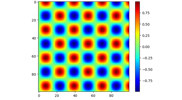
預設情況下,顏色條位於左側。讓我們來看一個普通顏色條的示例。
示例
import matplotlib.pyplot as p
import numpy as n

# generate some data
x = n.linspace(0, 20, 100)
y = n.linspace(0, 20, 100)
X, Y = n.meshgrid(x, y)
Z = n.sin(X) * n.cos(Y)

# create a horizontal subplot and plot the data
f, a = p.subplots()
i = a.imshow(Z, cmap='jet')

# add a colorbar and adjust the position
cbar = fig.colorbar(i, ax=a)

# display the plot
p.show()
輸出
使用pad和aspect引數
pad引數允許我們更改顏色條與繪圖的距離。aspect引數設定顏色條的寬度和高度。透過更改這些引數,我們可以更改顏色條的位置。
例如,我們可以使用以下程式碼來更改顏色條在水平子圖中的位置,這裡顏色條位置位於圖表下方:
顏色條是表示圖表中顯示顏色的線條,在本例中,我們將看到如何使用pad引數和orientation引數來設定顏色條在圖表下方的位置,其中orientation引數的值將為水平。
示例
import matplotlib.pyplot as p
import numpy as n

# generate some data
x = n.linspace(0, 20, 100)
y = n.linspace(0, 20, 100)
X, Y = n.meshgrid(x, y)
Z = n.sin(X) * n.cos(Y)

# create a horizontal subplot and plot the data
f, a = p.subplots()
i = a.imshow(Z, cmap='jet')

# add a colorbar and adjust the position
cbar = fig.colorbar(i, ax=a, orientation='horizontal', pad=0.3, aspect=35)

# display the plot
p.show()
輸出
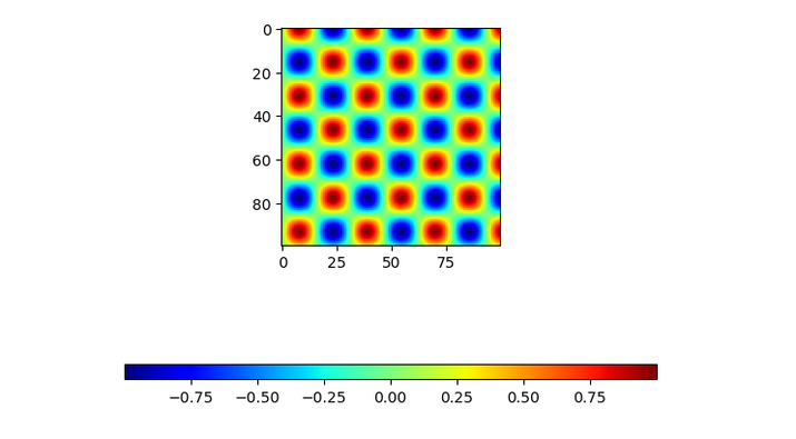
在上面的程式中,我們使用ax.imshow()繪製資料並建立了一個水平子圖。之後,我們使用f.colorbar()函式添加了一個顏色條,並使用pad和aspect引數調整其位置。
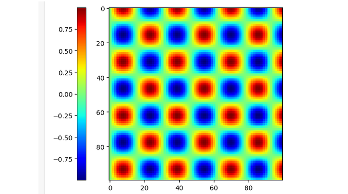
使用location引數
軸的位置由使用者指定,顏色條透過“location”引數與當前顯示的軸關聯。在對列表中的多個軸著色時,location引數用於顏色條。
示例
import matplotlib.pyplot as p
import numpy as n

# generate some data
x = n.linspace(0, 20, 100)
y = n.linspace(0, 20, 100)
X, Y = n.meshgrid(x, y)
Z = n.sin(X) * n.cos(Y)

# create a horizontal subplot and plot the data
f, a = p.subplots()
i = a.imshow(Z, cmap='jet')

# add a colorbar and adjust the position
cbar = fig.colorbar(i, ax = [a], location = 'left')

# display the plot
p.show()
輸出
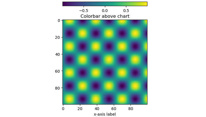
使用cax引數
它定義了將繪製顏色條的軸。
以下是將顏色條位置設定為頂部的程式。
示例
import matplotlib.pyplot as p

from mpl_toolkits.axes_grid1 import make_axes_locatable
import numpy as n

# generate some data
x = n.linspace(0, 20, 100)

y = n.linspace(0, 20, 100)
X, Y = n.meshgrid(x, y)
Z = n.sin(X) * n.cos(Y)
# create chart
fig, ax = p.subplots()
im = ax.imshow(Z)
ax.set_xlabel('x-axis label')
ax.set_title('Colorbar above chart')

# add color bar below chart
divider = make_axes_locatable(ax)
cax = divider.new_vertical(size = '5%', pad = 0.5)
fig.add_axes(cax)
fig.colorbar(im, cax = cax, orientation = 'horizontal')

plt.show()
輸出
結論
總之,調整Matplotlib顏色條是製作清晰準確圖表的關鍵部分。我們已經瞭解到,我們可以透過使用不同的引數(例如pad、location和cax)來移動圖表或子圖中的顏色條,具體取決於我們的需求。

2K+ 次瀏覽
