
 資料結構
資料結構 網路
網路 關係資料庫管理系統 (RDBMS)
 作業系統
作業系統 Java
Java iOS
iOS HTML
HTML CSS
CSS Android
 Python
 C語言程式設計
 C++
C++ C#
C# MongoDB
 MySQL
MySQL Javascript
 PHP
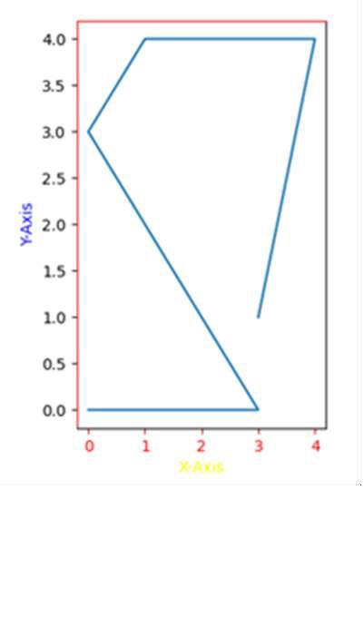
PHP如何在 matplotlib 中更改繪圖的軸、刻度和標籤顏色?
我們可以使用 ax.spines['left'].set_color('red') 和 ax.spines['top'].set_color('red') 語句更改軸、刻度和標籤的顏色。
要更改 matplotlib 繪圖中軸、刻度和標籤的顏色,我們可以採取以下步驟:
使用 plt.figure() 建立一個新圖形或啟用現有圖形。
使用 plt.add_subplot(xyz) 將軸新增到圖形作為子圖排列的一部分,其中 x 為行數,y 為列數,z 為索引。這裡取 x = 1(行),y = 2(列),z = 1(位置)。
使用 set_xlabel 和 set_ylabel 方法為使用 add_subplot() 建立的 ax 設定 X 軸和 Y 軸標籤。
要設定 X 軸和 Y 軸的顏色,我們可以使用 set_color() 方法(設定 edgecolor 和 facecolor)。
要設定刻度顏色,請對 axes 使用 tick_params 方法。使用的引數是 axis =’x’(或 y 或 both)和 color = ‘red’(或 green 或 yellow 或…等等)。
要設定軸的顏色,即頂部、左側、底部和右側,我們可以使用 ax.spines[‘top’],ax.spines[left]。
現在,使用 plt.plot() 方法繪製線條。
要顯示圖形,請使用 plt.show() 方法。
示例
import matplotlib.pyplot as plt

fig = plt.figure()

ax = fig.add_subplot(121)

ax.set_xlabel('X-axis ')
ax.set_ylabel('Y-axis ')

ax.xaxis.label.set_color('yellow')        #setting up X-axis label color to yellow
ax.yaxis.label.set_color('blue')          #setting up Y-axis label color to blue

ax.tick_params(axis='x', colors='red')    #setting up X-axis tick color to red
ax.tick_params(axis='y', colors='black')  #setting up Y-axis tick color to black

ax.spines['left'].set_color('red')        # setting up Y-axis tick color to red
ax.spines['top'].set_color('red')         #setting up above X-axis tick color to red

plt.plot([3, 4, 1, 0, 3, 0], [1, 4, 4, 3, 0, 0])

plt.show()
輸出

更新於:2023年10月7日
33K+ 次瀏覽

廣告