
 資料結構
資料結構 網路
網路 關係型資料庫管理系統
 作業系統
作業系統 Java
Java iOS
iOS HTML
HTML CSS
CSS Android
 Python
 C 程式設計
 C++
C++ C#
C# MongoDB
 MySQL
MySQL Javascript
 PHP
PHP如何在 Bokeh 中新增顏色條
在 Python 中,Bokeh 是一個功能強大的資料視覺化庫,它超越了傳統的繪圖方式。它遵循獨特的“圖形語法”架構,允許開發者透過管理圖形元素來構建互動式視覺化。Bokeh 圖表透過與 Pandas、NumPy 和 SciPy 的無縫整合,使您的資料栩栩如生。
什麼是顏色條?
顏色條是一種視覺化工具,使用顏色來表示連續變數,例如熱圖。顏色條的主要目的是讓使用者瞭解資料值與用於表示它們的顏色之間的關係。讓我們學習如何在 Bokeh 中新增顏色條。
在 Bokeh 中新增顏色條的分步過程
步驟 1:匯入必要的庫
我們將匯入 numpy 和 bokeh.plotting、bokeh.models 以及 bokeh.io 庫來建立基本圖表。如果您使用 Google Collab 或 Jupyter Notebook,則必須使用 bokeh.io 和 output_notebook 函式來顯示圖表。
示例
# import NumPy library
import numpy as np

# from bokeh.plot import figure and show for creating and displaying plot
from bokeh.plotting import figure, show

# from bokeh.models import LinearColorMapper and ColorBar to generate a color bar
from bokeh.models import LinearColorMapper, ColorBar
from bokeh.io import output_notebook
output_notebook()
步驟 2:生成或匯入資料以建立圖表
我們可以使用 NumPy 的 random.rand 函式生成所需長度的隨機陣列
示例
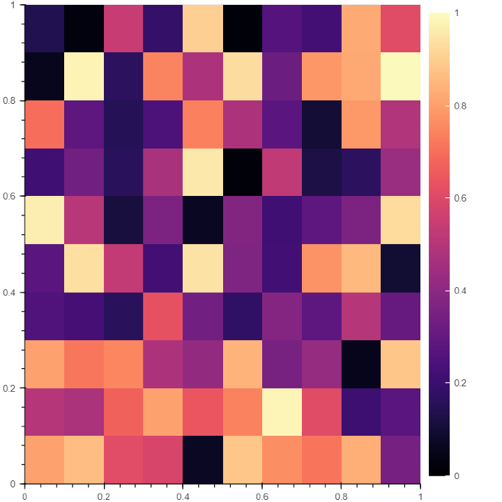
# Generate a random array of size 10 to plot
data = np.random.rand(10,10)
步驟 3:為顏色條確定調色盤
#使用線性顏色對映函式選擇顏色條的調色盤
#指定顏色圖的低值和高值以確定值的範圍。
color = LinearColorMapper(palette = "Magma256", low = 0, high = 1)
在這裡,我們使用 palette 屬性確定了顏色條的調色盤。我們使用了 Magma256 作為調色盤,但您可以隨時嘗試其他調色盤,例如 Greys256、Inferno256、Plasma256、Viridis256、Cividis256、Turbo256
步驟 4:定義 X 軸和 Y 軸的限制
# Defining X axis and Y axis limits
plot = figure(x_range = (0, 1), y_range = (0,1))
步驟 5:生成圖表的影像
#Add the plot's width and height, scalar data, and a color mapper to generate a plot image
plot.image(image = [data], color_mapper = color, dh = [1], dw = [1], x = [0], y = [0])
步驟 6:建立顏色條
使用 ColorBar 函式建立顏色條。
# Creating the color bar and setting the color bar position at (0,0)
color_bar = ColorBar(color_mapper = color, location = (0,0))
步驟 7:放置顏色條並顯示圖表
請注意,在 Bokeh 中,您可以將顏色條放置在任何位置,例如右側、左側、上方或下方。因此,在程式碼中必須指定顏色條的位置。
# Incorporating the color bar on the right
plot.add_layout(color_bar, 'right')
# display the plot
show(plot)
輸出
結論
顏色條是關聯資料之間關係的有用工具之一。Bokeh 還提供了更多工具來使您的圖表具有互動性,例如顏色選擇器、新增日期、表格等。

274 次瀏覽
