
 資料結構
資料結構 網路
網路 關係資料庫管理系統 (RDBMS)
 作業系統
作業系統 Java
Java iOS
iOS HTML
HTML CSS
CSS Android
 Python
 C語言程式設計
 C++
C++ C#
C# MongoDB
 MySQL
MySQL Javascript
 PHP
PHP如何使用 Python 和 TensorFlow 來視覺化訓練結果?
可以使用 Python 和 TensorFlow 結合 ‘matplotlib’ 庫來視覺化訓練結果。 ‘plot’ 方法用於在控制檯上繪製資料。
閱讀更多: 什麼是 TensorFlow 以及 Keras 如何與 TensorFlow 協作建立神經網路?
我們將使用 Keras Sequential API,它有助於構建一個順序模型,用於處理簡單的層堆疊,其中每一層只有一個輸入張量和一個輸出張量。
包含至少一層卷積層的神經網路被稱為卷積神經網路。我們可以 使用卷積神經網路來構建學習模型。
使用 keras.Sequential 模型建立一個影像分類器,並使用 preprocessing.image_dataset_from_directory 載入資料。資料可以高效地從磁碟載入。可以識別過擬合併應用技術來減輕它。這些技術包括資料增強和 dropout。有 3700 張花卉影像。此資料集包含 5 個子目錄,每個子目錄對應一個類別。它們是:雛菊、蒲公英、玫瑰、向日葵和鬱金香。
我們使用 Google Colaboratory 來執行以下程式碼。Google Colab 或 Colaboratory 幫助在瀏覽器上執行 Python 程式碼,無需任何配置,並且可以免費訪問 GPU(圖形處理單元)。Colaboratory 是基於 Jupyter Notebook 構建的。
示例
print("Calculating the accuracy")
acc = history.history['accuracy']
val_acc = history.history['val_accuracy']
print("Calculating the loss")
loss = history.history['loss']
val_loss = history.history['val_loss']

epochs_range = range(epochs)
print("The results are being visualized")
plt.figure(figsize=(8, 8))
plt.subplot(1, 2, 1)
plt.plot(epochs_range, acc, label='Training Accuracy')
plt.plot(epochs_range, val_acc, label='Validation Accuracy')
plt.legend(loc='lower right')
plt.title('Training and Validation Accuracy')
plt.subplot(1, 2, 2)

plt.plot(epochs_range, loss, label='Training Loss')
plt.plot(epochs_range, val_loss, label='Validation Loss')
plt.legend(loc='upper right')
plt.title('Training and Validation Loss')
plt.show()
程式碼來源 −https://www.tensorflow.org/tutorials/images/classification
輸出
Calculating the accuracy
Calculating the loss
The results are being visualized
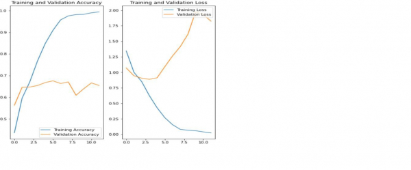
解釋
以上圖表表明訓練精度和驗證精度並不一致。
該模型在驗證資料集上僅達到了大約 60% 的精度。
這被稱為過擬合。
訓練精度隨時間線性增加,但驗證精度在訓練過程中停滯在 60% 左右。
當訓練樣本數量較少時,模型會從訓練樣本中的噪聲或不需要的細節中學習。
這會對模型在新樣本上的效能產生負面影響。
由於過擬合,模型將無法在新資料集上很好地泛化。
有很多方法可以避免過擬合。我們將使用資料增強來克服過擬合。

802 次瀏覽
