
 資料結構
資料結構 網路
網路 關係資料庫管理系統 (RDBMS)
 作業系統
作業系統 Java
Java iOS
iOS HTML
HTML CSS
CSS Android
 Python
 C語言程式設計
 C++
C++ C#
C# MongoDB
 MySQL
MySQL Javascript
 PHP
PHP如何使用Tkinter視覺化時間序列資料?
資料視覺化是理解和解釋複雜資訊的有力工具。在分析時間序列資料時,清晰的視覺表示可以極大地增強我們對隨時間推移的趨勢、模式和異常的理解。Tkinter是Python的標準GUI工具包,它提供了一個方便且通用的平臺來建立互動式資料視覺化。在本文中,我們將探討如何有效地利用Tkinter來視覺化時間序列資料。
理解時間序列資料
在我們深入研究Tkinter及其功能之前,讓我們首先明確瞭解時間序列資料。時間序列資料是在一段時間內以規則間隔收集的一系列資料點。它通常用於各種領域,例如金融、天氣預報和股票市場分析。時間序列中的每個資料點都對應於特定的時間戳或時間段,這使其非常適合分析隨時間的趨勢、模式和關係。
現在,讓我們探索如何有效地利用Tkinter來視覺化時間序列資料。
步驟1:準備資料
首先,我們需要載入和預處理時間序列資料。這包括從檔案或資料庫讀取資料,解析時間戳,並將資料組織成適合視覺化的格式。根據資料的具體要求,您可能需要執行資料清理、聚合或轉換步驟。
步驟2:設計GUI
接下來,我們使用Tkinter設計圖形使用者介面 (GUI)。這包括建立主視窗,定義佈局,並新增視覺化所需的元件,例如標籤、按鈕和畫布。
import tkinter as tk

# Create the main window
window = tk.Tk()
window.geometry("720x500")

window.title("Time-Series Data Visualization")

# Create components for visualization
label = tk.Label(window, text="Time-Series Data Visualization")
label.pack()

canvas = tk.Canvas(window, width=800, height=400)
canvas.pack()

# Add other GUI components and configure layout

# Start the Tkinter event loop
window.mainloop()
步驟3:繪製時間序列資料
現在,讓我們透過將時間序列資料繪製在畫布上,將其整合到我們的Tkinter視覺化中。我們可以使用各種Tkinter繪圖方法,例如create_line、create_rectangle或create_polygon,具體取決於所選的視覺化技術。
# Assuming 'data' is a list of (timestamp, value) tuples

# Convert timestamps to canvas coordinates
x_scale = canvas.winfo_width() / (max_timestamp - min_timestamp)
y_scale = canvas.winfo_height() / (max_value - min_value)

# Plot the time-series data
for i in range(len(data) - 1):
   x1 = (data[i][0] - min_timestamp) * x_scale
   y1 = canvas.winfo_height() - (data[i][1] - min_value) * y_scale
   x2 = (data[i + 1][0] - min_timestamp) * x_scale
   y2 = canvas.winfo_height() - (data[i + 1][1] - min_value) * y_scale

   canvas.create_line(x1, y1, x2, y2, fill="blue", width=2)
步驟4:新增互動性
為了增強視覺化效果,我們可以向Tkinter應用程式新增互動式功能。例如,我們可以包含按鈕或滑塊來控制時間範圍或粒度,或者包含工具提示以便在將滑鼠懸停在資料點上時顯示其他資訊。
步驟5:增強視覺化效果
為了使時間序列資料視覺化更具資訊量和視覺吸引力,我們可以加入其他元素,例如軸標籤、圖例、顏色對映、註釋或互動式功能,如縮放或平移。
步驟6:完成和改進
一旦實現了基本的時間序列視覺化,務必根據反饋和測試來審查和改進視覺化效果。這包括確保資料表示的準確性,最佳化視覺化的效能,以及改進視覺元素以提高畫質晰度和美觀性。
在此階段,請考慮收集使用者或領域專家的反饋,以確保視覺化效果有效地傳達時間序列資料的預期資訊和見解。
示例
下面是一個完整的實現示例,其中包含上面提到的所有六個步驟:
import tkinter as tk
import random

# Step 1: Prepare the Data
data = []
timestamp = 0
for _ in range(100):
   data.append((timestamp, random.randint(0, 100)))
   timestamp += 1

# Step 2: Design the GUI
window = tk.Tk()
window.geometry("720x500")
window.title("Time-Series Data Visualization")

label = tk.Label(window, text="Time-Series Data Visualization")
label.pack()

canvas_width = 800
canvas_height = 400
canvas = tk.Canvas(window, width=canvas_width, height=canvas_height, bg="white")
canvas.pack()

# Step 3: Plotting the Time-Series Data
def plot_data():
   x_scale = canvas_width / len(data)
   y_scale = canvas_height / 100

   for i in range(len(data) - 1):
      x1 = i * x_scale
      y1 = canvas_height - data[i][1] * y_scale
      x2 = (i + 1) * x_scale
      y2 = canvas_height - data[i + 1][1] * y_scale

      canvas.create_line(x1, y1, x2, y2, fill="blue", width=2)

plot_data()

# Step 4: Adding Interactivity
def update_data():
   # Generate new random data
   data.clear()
   timestamp = 0
   for _ in range(100):
      data.append((timestamp, random.randint(0, 100)))
      timestamp += 1

   # Clear the canvas and replot the data
   canvas.delete("all")
   plot_data()

button = tk.Button(window, text="Update Data", command=update_data)
button.pack()

# Step 5: Enhancing the Visualization
x_label = tk.Label(window, text="Time")
x_label.pack()

y_label = tk.Label(window, text="Value")
y_label.pack()

# Step 6: Finalize and Refine
# Additional refinements can be made here based on specific requirements

# Start the Tkinter event loop
window.mainloop()
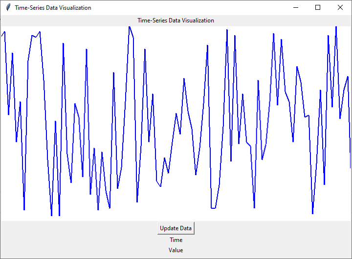
輸出
結論
在本文中,我們探討了使用Tkinter視覺化時間序列資料的步驟。我們介紹了準備資料、設計GUI、繪製時間序列資料、新增互動性和增強視覺化效果等方面。透過遵循這些步驟,您可以建立自定義的互動式時間序列視覺化效果,從而從資料中獲得有價值的見解。
使用Tkinter進行資料視覺化開闢了探索和理解時間序列資料的無限可能性,使您能夠做出資料驅動的決策並發現有價值的見解。因此,請繼續利用Tkinter的功能以有意義且引人入勝的方式視覺化您的時間序列資料。

464 次瀏覽
