
 資料結構
資料結構 網路
網路 關係型資料庫管理系統
 作業系統
作業系統 Java
Java iOS
iOS HTML
HTML CSS
CSS Android
 Python
 C 程式設計
 C++
C++ C#
C# MongoDB
 MySQL
MySQL Javascript
 PHP
PHP如何使用 Estimators 在 TensorFlow 中視覺化資料和 ROC 曲線?
泰坦尼克號資料集模型可以透過 'matplotlib' 和 'roc_curve'(位於 'sklearn.metrics' 模組中)方法分別進行視覺化,從而瞭解模型的效能。
閱讀更多: 什麼是 TensorFlow 以及 Keras 如何與 TensorFlow 協作建立神經網路?
我們將使用 Keras 順序 API,它有助於構建一個用於處理簡單層堆疊的順序模型,其中每一層都只有一個輸入張量和一個輸出張量。
包含至少一層卷積層的神經網路被稱為卷積神經網路。我們可以使用卷積神經網路構建學習模型。
我們正在使用 Google Colaboratory 來執行以下程式碼。Google Colab 或 Colaboratory 幫助在瀏覽器中執行 Python 程式碼,無需任何配置,並且可以免費訪問 GPU(圖形處理單元)。Colaboratory 是建立在 Jupyter Notebook 之上的。
Estimator 是 TensorFlow 對完整模型的高階表示。它旨在實現輕鬆擴充套件和非同步訓練。
Estimator 使用特徵列來描述模型如何解釋原始輸入特徵。Estimator 期望一個數值輸入向量,特徵列將有助於描述模型應該如何轉換資料集中每個特徵。
示例
from sklearn.metrics import roc_curve
from matplotlib import pyplot as plt
print("The ROC curve, the true positive rate, and the false positive rate are plotted")
fpr, tpr, _ = roc_curve(y_eval, probs)
plt.plot(fpr, tpr)
plt.title('ROC curve')
plt.xlabel('false positive rate')
plt.ylabel('true positive rate')
plt.xlim(0,)
plt.ylim(0,)
程式碼來源 -https://www.tensorflow.org/tutorials/estimator/linear
輸出
The ROC curve, the true positive rate, and the false positive rate are plotted
(0.0, 1.05)
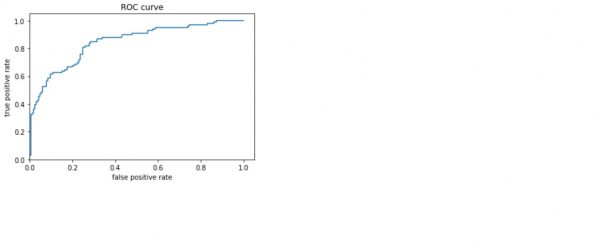
解釋
- 視覺化接收者操作特徵 (ROC) 曲線。
- 這提供了關於真陽性率和假陽性率之間權衡的思路。

更新於: 2021 年 2 月 25 日
131 次瀏覽

廣告