
 資料結構
資料結構 網路
網路 關係資料庫管理系統 (RDBMS)
 作業系統
作業系統 Java
Java iOS
iOS HTML
HTML CSS
CSS Android
 Python
 C語言程式設計
 C++
C++ C#
C# MongoDB
 MySQL
MySQL Javascript
 PHP
PHP使用pcolor在matplotlib中建立熱力圖
首先,我們可以使用imshow方法建立一個影像,使用收穫矩陣。之後,我們可以用一些值標記這些影像畫素。
步驟
建立一個科目列表。
建立一個學生列表。
建立一個收穫矩陣。
使用subplots方法建立fig和ax變數,其中預設的nrows和ncols為1。
將資料顯示為影像,即在二維規則光柵上,使用步驟1中的資料。
獲取或設定X軸的當前刻度位置和標籤,長度為學生數量。
獲取或設定Y軸的當前刻度位置和標籤,長度為科目數量。
設定網格的X軸刻度標籤,使用學生列表。
設定網格的Y軸刻度標籤,使用科目列表。
設定藝術物件上的屬性,包括旋轉、水平對齊和rotation_mode="anchor"。
使用text方法向繪圖新增文字。
使用set_title()方法為座標軸設定標題。
要顯示圖形,請使用plt.show()方法。
示例
import numpy as np
import matplotlib.pyplot as plt
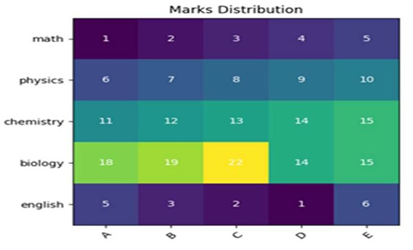
subjects = ["math", "physics", "chemistry", "biology", "english"]
students = ["A", "B", "C", "D", "E"]
harvest = np.array([
[1, 2, 3, 4, 5],
[6, 7, 8, 9, 10],
[11, 12, 13, 14, 15],
[18, 19, 22, 14, 15],
[5, 3, 2, 1, 6]
])
fig, ax = plt.subplots()
im = ax.imshow(harvest)
ax.set_xticks(np.arange(len(students)))
ax.set_yticks(np.arange(len(subjects)))
ax.set_xticklabels(students)
ax.set_yticklabels(subjects)
plt.setp(ax.get_xticklabels(), rotation=45, ha="right", rotation_mode="anchor")
for i in range(len(subjects)):
for j in range(len(students)):
text = ax.text(j, i, harvest[i, j], ha="center", va="center", color="w")
ax.set_title("Marks Distribution")
plt.show()輸出

更新於:2021年3月15日
410 次檢視

廣告