- Chart.js 教程
- Chart.js - 主頁
- Chart.js - 介紹
- Chart.js - 安裝
- Chart.js - 語法
- Chart.js - 基礎
- Chart.js - 顏色
- Chart.js - 選項
- Chart.js - 互動
- Chart.js - 圖例
- Chart.js - 標題
- Chart.js - 動畫
- Chart.js - 工具提示
- Chart.js - 折線圖
- Chart.js - 條形圖
- Chart.js - 雷達圖
- Chart.js - 甜甜圈圖
- Chart.js - 餅圖
- Chart.js - 極地區域圖
- Chart.js - 氣泡圖
- Chart.js - 散點圖
- Chart.js - 混合圖
- Chart.js - Cartesian 軸
- Chart.js - 分類軸
- Chart.js - 徑向軸
- Chart.js 有用的資源
- Chart.js - 快速指南
- Chart.js - 有用資源
- Chart.js - 討論
Chart.js - Cartesian 軸
對於任何圖表或圖形,軸都是一個組成部分。基本上,軸用於確定我們的資料如何對映到圖表上的畫素值。笛卡爾圖使用 1 個或多個 X 軸和 1 個或多個 Y 軸將資料點對映到二維 (2-D) 畫布。這些軸稱為笛卡爾軸。
笛卡爾軸使用“options.scales.axis”名稱空間。使用笛卡爾軸的語法如下所示 −
scales: {
   x: {
      grid: {
         color: 'orange',
         borderColor: 'orange',
      }
   }
}
示例
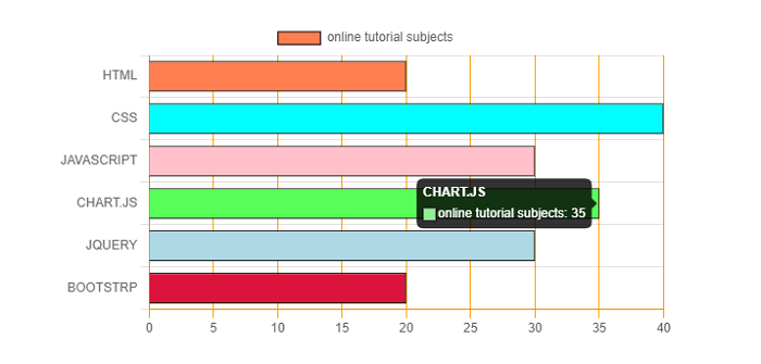
我們來看一個使用笛卡爾軸建立圖表的示例 −
<!DOCTYPE>
<html>
<head>
   <meta charset- "UTF-8" />
   <meta name="viewport" content="width=device-width, initial-scale=1" />
   <title>chart.js</title>
</head>
<body>
   <canvas id="chartId" aria-label="chart" height="300" width="580"></canvas>
   <script src="https://cdnjs.cloudflare.com/ajax/libs/Chart.js/3.1.1/chart.min.js"></script>
   </script>
   <script>
      var chrt = document.getElementById("chartId").getContext("2d");
      var chartId = new Chart(chrt, {
         type: 'bar',
         data: {
            labels: ["HTML", "CSS", "JAVASCRIPT", "CHART.JS", "JQUERY", "BOOTSTRP"],
            datasets: [{
               label: "online tutorial subjects",
               data: [20, 40, 30, 35, 30, 20],
               backgroundColor: ['coral', 'aqua', 'pink', 'lightgreen', 'lightblue', 'crimson'],
               borderColor: ['black'],
               borderWidth: 1,
               pointRadius: 4,
            }],
         },
         options: {
            responsive: false,
            indexAxis: 'y',
            scales: {
               x: {
                  grid: {
                     color: 'orange',
                     borderColor: 'orange',
                  }
               }
            }
         },
      });
   </script>
</body>
</html>
輸出
廣告