
 資料結構
資料結構 網路
網路 關係資料庫管理系統
 作業系統
作業系統 Java
Java iOS
iOS HTML
HTML CSS
CSS Android
 Python
 C 語言程式設計
 C++
C++ C#
C# MongoDB
 MySQL
MySQL Javascript
 PHP
PHP使用 Python 繪製不同國家新冠病毒增長曲線
"透過 Python 探索新冠疫情的動態世界,我們將分析、視覺化並預測病毒在不同國家的增長曲線。在本文中,透過利用資料預處理、清洗以及 pandas 和 matplotlib 等強大的庫,我們深入到繪製和預測疫情影響的互動領域,提供對其軌跡和全球影響的見解。"
使用 Python 繪製不同國家新冠病毒增長曲線
我們將透過圖表視覺化給定國家(由使用者提供)的累計確診病例總數和累計死亡總數的增長情況,並列印可用國家/地區的列表。本文中使用的資料集可以從此處下載 - https://ourworldindata.org/。
以下是我們將遵循的步驟,以使用 Python 繪製不同國家的新冠病毒增長曲線:
匯入所需的庫 -
我們首先匯入必要的庫:pandas 和 plotly.express。
pandas 用於資料操作和預處理。
plotly.express 用於建立互動式視覺化。
載入資料 -
程式使用 pandas 庫中的 pd.read_csv() 函式從 'owid-covid-data.csv' 檔案載入新冠疫情資料。
資料包含有關日期、地點和累計確診病例的資訊。
資料預處理和清洗 -
我們執行資料預處理和清洗,以準備用於分析的資料。
我們選擇用於分析的相關列,包括 'date'、'location' 和 'total_cases'。
使用 dropna() 函式刪除任何包含缺失值的行。
獲取可用國家/地區的列表 -
我們使用 unique() 函式從資料的 'location' 列中提取唯一的國家/地區名稱。
這將建立一個可用國家/地區的列表,以供以後使用。
分析資料 -
我們使用 groupby() 函式按地點對資料進行分組,並使用 max() 函式計算每個地點的累計確診病例總數的最大值。
生成的已分組資料根據累計確診病例總數降序排序。
繪製增長曲線 -
我們提示使用者使用 input() 函式輸入國家/地區名稱。
如果輸入的國家/地區名稱有效(即存在於可用國家/地區列表中),我們將繼續繪製該國家/地區的增長曲線。
我們過濾資料以提取使用布林索引 (data['location'] == country_name) 對應於指定國家/地區的行。
過濾後的資料傳遞給 plotly.express 中的 px.line() 函式以建立折線圖。
x 引數設定為 'date',y 引數設定為 'total_cases'。
顯示和儲存圖表 -
我們使用 fig.show() 函式顯示互動式增長曲線圖。
要將圖表另存為 HTML 檔案,我們使用 fig.write_html() 函式並提供所需的檔名 ('growth_curve.html')。
列印確認訊息,指示圖表已成功儲存。
顯示可用國家/地區的列表 -
最後,我們顯示可用國家/地區的列表,供使用者參考。
每個國家/地區名稱都使用一個迴圈列印,該迴圈遍歷 'countries' 列表。
圖表的標題設定為包含所選國家/地區名稱。
示例
以下是使用上述步驟的程式示例 -
import pandas as pd
import plotly.express as px

# Step 1: Load the data
data = pd.read_csv('owid-covid-data.csv')

# Step 2: Data preprocessing and cleaning
# Select the relevant columns for analysis
data = data[['date', 'location', 'total_cases']]

# Remove rows with missing values
data = data.dropna()

# Get the list of available countries
countries = data['location'].unique()

# Step 3: Analyzing the data
# Group the data by location and calculate the total cases for each location
grouped_data = data.groupby('location')['total_cases'].max()

# Sort the data in descending order
sorted_data = grouped_data.sort_values(ascending=False)

# Step 4: Data prediction
# Fit a curve to the data using polynomial regression or any other suitable method

# Step 5: Plotting the growth curve
# Prompt the user to enter a country name
country_name = input("Enter a country name: ")

if country_name in countries:
   # Plot the growth curve for the specified country
   country_data = data[data['location'] == country_name]

   # Create the plot using Plotly
   fig = px.line(country_data, x='date', y='total_cases', title=f'COVID-19 Growth Curve in {country_name}')
   fig.show()

   # Save the plot as an HTML file
   fig.write_html('growth_curve.html')

   print(f"Graph saved as 'growth_curve.html'")
else:
   print("Invalid country name. Please try again.")

# Display the list of available countries
print("Available countries:")
for country in countries:
   print(country)
輸出
當我們執行上述程式碼時,它會要求我們輸入國家/地區名稱 -

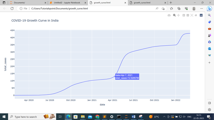
假設我們提供的國家/地區名稱為印度,然後按下回車鍵,它將給我們以下輸出 -
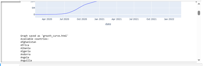
它將向我們顯示圖表和可用國家/地區的列表,從中我們可以選擇任何國家/地區,並且圖表將儲存為“growth_curve.html”。
以下是包含印度增長曲線的“growth_curve.html” -
結論
總之,Python 以及 pandas 和 matplotlib 等庫為分析和視覺化不同國家的新冠疫情增長曲線提供了一個多功能平臺。透過利用資料預處理、清洗和視覺化技術,我們獲得了對疫情全球影響的寶貴見解,使我們能夠做出明智的決策並採取必要的行動。

129 次瀏覽
