
 資料結構
資料結構 網路
網路 關係資料庫管理系統
 作業系統
作業系統 Java
Java iOS
iOS HTML
HTML CSS
CSS Android
 Python
 C 程式設計
 C++
C++ C#
C# MongoDB
 MySQL
MySQL Javascript
 PHP
PHP使用 Python 中的 Seaborn 繪製圖形。
Plotly 的 Python 製圖庫可以線上製作互動式出版級圖表。此圖表主要用於繪製折線圖、散點圖、面積圖、條形圖、誤差棒圖、箱線圖、直方圖、熱力圖、子圖、多軸、極座標圖和氣泡圖。
Seaborn 是一個用於在 Python 中製作統計圖形的庫。它建立在 matplotlib 之上且整合到 Pandas 資料結構中。
1. 我們匯入 Seaborn,這是此簡單示例所必需的唯一庫。
import seaborn as sns
2. 我們應用預設的 Seaborn 主題、縮放和調色盤。
sns.set()
3. 我們載入其中一個示例資料集。
tips = sns.load_dataset("tips")
4. 我們繪製一個分面散點圖,其中包含多個語義變數。
示例程式碼
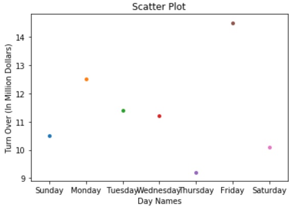
# This Python program will illustrate scatter plot with Seaborn
# importing modules
import matplotlib.pyplot as plt
import seaborn as sns
# values for x-axis
x=['Sunday', 'Monday', 'Tuesday', 'Wednesday', 'Thursday', 'Friday', 'Saturday']
# valueds for y-axis
y=[10.5, 12.5, 11.4, 11.2, 9.2, 14.5, 10.1]
# plotting with seaborn
my_plot = sns.stripplot(x, y);
# assigning x-axis and y-axis labels
my_plot.set(xlabel ='Day Names', ylabel ='Turn Over (In Million Dollars)')
# assigning plot title
plt.title('Scatter Plot');
# function to show plot
plt.show()
輸出

更新時間:30-7-2019
578 次瀏覽

廣告