- 網頁設計中的視差滾動
- 首頁
- 背景和介紹
- 概念
- 網頁設計與視差滾動
- CSS技巧
- JavaScript技巧
- jQuery技巧
- Bootstrap技巧
- 結論
CSS技巧
對於網頁開發者來說,在建立視差滾動效果時,有多種技術可用。其中一種技術是使用**層疊樣式表 (CSS)**。
CSS 解釋瞭如何在螢幕上顯示 HTML 元素。可以建立一個 CSS 檔案,並將其用於整個網站。新增 CSS 檔案比向每個 HTML 元素新增樣式並在網頁的不同部分管理它們更簡單。
**注意** - 本章下面討論的一些方法特定於臺式計算機,不適用於移動裝置。當特定技術不適用於移動裝置時,將在步驟中提及。
考慮到 CSS 將所有額外的繪製工作解除安裝到文件物件模型 (DOM),因此可以更好地利用硬體加速,並獲得流暢的效果,而不會給 CPU 帶來負擔。
絕對定位方法
此方法經常用於建立視差效果,因為它與其他可用選項相比相對輕量級。背景影像的位置相對於螢幕上的其他內容保持固定。在下面討論的示例中,您將看到如何使用 CSS 的魔力來實現它。
在本節中,我們將介紹絕對定位方法的兩種方法:
- 單一背景
- 多個背景
單一背景方法
在此方法中,我們將在同一個資料夾中建立兩個檔案。請觀察下面給出的步驟:
步驟 1
我們必須在同一個資料夾中建立兩個檔案:第一個檔案包含 HTML 標記,第二個檔案包含 CSS 程式碼。
步驟 2
現在,讓我們定義我們的 HTML 標記。請觀察以下程式碼:
<html>
   <head>
      <link rel = "stylesheet" href = "styles.css">
   </head>
   <body>
      <div class = "BgContainer">
         <div class = "Parallax">
            <h1> Welcome! </h1>
         </div>
         <div class = "FgContainer">
            <div class = "MainContent">
               <p>
                  Here we will go ahead with some content which will really vary
                  according to the content on your site. I am just typing out this
                  content as it is sometimes good to engage user than the usual lorem
                  ipsum text!
                  <br/>
                  <br/>

                  Lorem ipsum dolor sit amet, consectetur adipiscing elit, sed do
                  eiusmod tempor incididunt ut labore et dolore magna aliqua. Ut enim
                  ad minim veniam, quis nostrud exercitation ullamco laboris nisi ut
                  aliquip ex ea commodo consequat. Duis aute irure dolor in
                  reprehenderit in voluptate velit esse cillum dolore eu fugiat nulla
                  pariatur. Excepteur sint occaecat cupidatat non proident, sunt in
                  culpa qui officia deserunt mollit anim id est laborum.
                  <br/>
                  <br/>

                  Lorem ipsum dolor sit amet, consectetur adipiscing elit, sed do
                  eiusmod tempor incididunt ut labore et dolore magna aliqua. Ut enim
                  ad minim veniam, quis nostrud exercitation ullamco laboris nisi ut
                  aliquip ex ea commodo consequat. Duis aute irure dolor in
                  reprehenderit in voluptate velit esse cillum dolore eu fugiat nulla
                  pariatur. Excepteur sint occaecat cupidatat non proident, sunt in
                  culpa qui officia deserunt mollit anim id est laborum.
               </p>
            </div>
         </div>
      </div>
   </body>

</html>
步驟 3
開啟記事本。複製並貼上上面的程式碼片段。
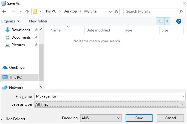
儲存檔案時,在**儲存型別**下選擇**所有檔案**。根據需要輸入檔名,但檔名後需要新增副檔名 **.html**,如下面的螢幕截圖所示。
步驟 4
儲存檔案後,在記事本中建立另一個檔案,並貼上以下程式碼:
html, body {
   font-size: 18px;
   line-height: 28px;
}

h1 {
   letter-spacing: -15px;
   color: white;
   text-align: center;
   font-size: 200px;
   font-weight: 800;
   line-height: 200px;
}

BgContainer {
   perspective: 1px;
   transform-style: preserve-3d;
   height: 100vh;
   overflow-x: hidden;
   overflow-y: scroll;
}

FgContainer {
   position: relative;
   display: block;
   background-color: white;
   z-index: 1;
}

MainContent {
   max-width: 750px;
   margin: 0 auto;
   padding: 75px 0;
}

p {
   margin: 75px 0;
}

.Parallax {
   display: flex;
   flex: 1 0 auto;
   position: relative;
   z-index: -1;
   height: 100vh;
   justify-content: center;
   align-items: center;
   transform: translateZ(-1px) scale(2);
   background: url(https://cdn.pixabay.com/photo/2017/02/07/09/02/background-2045380_640.jpg);
   background-color: rgb(250,228, 216);
}
正如您在上一步中看到的,儲存檔案時,在**儲存型別**下選擇**所有檔案**。根據需要輸入檔名,並新增副檔名 **.css**。
程式碼分析
讓我們瞭解程式碼的哪個部分負責視差效果。視差效果最重要的工作是透過使用透視和變換規則完成的。請參考以上程式碼片段中的**第 15 行**。首先為我們的**BgContainer** 建立透視。這為變換規則啟動了一個平臺。
在從第 40 行開始的**視差**容器中,第 48 行的**變換**規則使用 translate(-1px) 將 BgContainer div 推送到背景中。
您可以修改 translate 和 scale 引數的值來修改視差的深度。
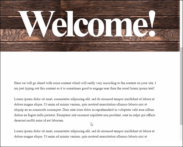
開啟 html 檔案後,將顯示如下所示的視差效果:
**注意** - 在本教程的其餘部分,我們將假設讀者能夠根據上述方法中提供的資料夾結構建立 HTML 和 CSS 檔案。
多個背景方法
在此方法中,我們將有不同的影像在使用者向下滾動頁面時出現。這裡有一個帶有鉛筆的影像,使用不同的顏色組合來說明這種效果。
請觀察以下 HTML 頁面程式碼:
<html>
   <head>
      <link rel = "stylesheet" href = "styles.css">
   </head>

   <body>
      <h1>Multiple Background Example</h1>
      <div class = "parallax">
         <div class = "bg__First">First</div>
         <div class = "bg__Second">Second</div>
         <div class = "bg__Third">Third</div>
         <div class = "bg__Fourth">Fourth</div>
      </div>
   </body>

</html>
與之前的示例類似,我們將使用儲存在與該 HTML 檔案相同位置的**styles.css**。我們有三個不同的 div,分別命名為 First、Second、Third 和 Fourth。
視差滾動的 CSS 程式碼如下:
body, html {
   height : 100%;
   font-family : sans-serif;
}

.parallax [class*="bg__"] {
   position : relative;
   height : 50vh;
   text-indent : -9999px;
   background-attachment : fixed;
   background-position   : top center;
   background-size       : cover;
}
.parallax [class*="bg__"]:nth-child( 2n) {
   box-shadow : inset 0 0 1em #111;
}
.parallax .bg__First, .bg__Fourth {
   height : 100vh;
}
.parallax .bg__First {
   background-image : url("parallax0.png");
}
.parallax .bg__Second {
   background-image : url("parallax1.png");
}
.parallax .bg__Third {
   background-image : url("parallax2.png");
}
.parallax .bg__Fourth {
   background-image : url("parallax1.png");
}
在這裡,我們從第 7 行建立視差效果,這裡重要的屬性是**background-attachment:fixed**。
使用此屬性,帶有彩色鉛筆的第一個影像將始終保留在頂部。向下滾動時,將開始顯示從第 28 行描述的不同影像。
因此,您將能夠看到如下所示的 gif 中的視差效果。下圖是我們為多個背景考慮的示例的螢幕截圖。

純 CSS 視差
讓我們結合前面兩種方法的知識,建立一個高階的純 CSS 視差效果。
不同之處在於我們排列**image** 元素和**z-transform** 屬性的方式。該屬性的解釋將在 CSS 程式碼之後提供。
使用通常的記事本方法建立包含以下程式碼的 HTML 檔案。
<html>
<head>
<link rel = "stylesheet" href = "styles.css">
</head>
<body>
<div class = "wrapParallax">
<div class = "parallax_one">
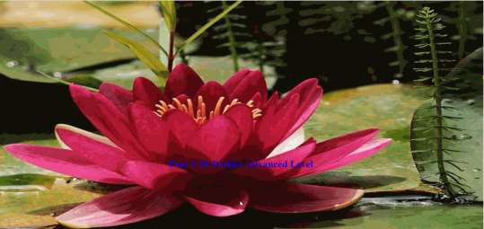
<img src = "https://cdn.pixabay.com/photo/2018/06/16/15/36/water-lily-3478924_640.jpg" alt = "">
</div>
<div class = "parallax_two">
<h1>Pure CSS Parllax Advanced Level</h1>
</div>
<div class = "parallax_three">
<img src = "https://cdn.pixabay.com/photo/2016/11/29/04/19/beach-1867285_640.jpg" alt = "">
</div>
</div>
</body>
</html>
CSS 檔案的程式碼如下:
body, html {
   padding: 0;
   margin: 0;
}

h1 {
   color: blue;
   text-align: center;
   padding: 20px;
   text-shadow: 0px 0px 10px #fffff;
}

img {
   width:100vw;
   height:100vh;
}

.wrapParallax {
   perspective: 100px;
   height: 100vh;
   overflow-x: hidden;
   overflow-y: auto;
}

.parallax {
   position: absolute;
   top: 0;
   bottom: 0;
   right: 0;
   left: 0;
}

.parallax_one {
   transform: translateZ(-100px) scale(2)
}

.parallax_two {
   z-index: 10;
   transform: translateZ(-200px) scale(3)
}

.parallax_three {
   margin-top: 100vh;
}
程式碼分析
我們透過使用**position:absolute** 屬性來固定**第 26 行**中第一層的 position。位置也硬編碼為 0。
在**parallax_two**(即帶有標題的圖層)中,我們應用了**z-index: 10** 以使標題具有浮動效果。圖層**parallax_three** 透過提供 margin-top 屬性被移動到底部。
因此,我們可以提高視差效果的複雜程度。
請觀察下圖所示的效果。