
 資料結構
資料結構 網路
網路 關係資料庫管理系統 (RDBMS)
 作業系統
作業系統 Java
Java iOS
iOS HTML
HTML CSS
CSS Android
 Python
 C語言程式設計
 C++
C++ C#
C# MongoDB
 MySQL
MySQL Javascript
 PHP
PHP如何在R的ggplot2中使用包含顏色的列來更改點的顏色?
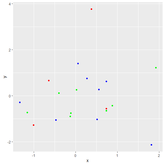
如果我們在R資料框中有一個顏色列,並且想要使用該列在ggplot2中更改點的顏色,則將使用color引數。例如,如果我們有一個名為df的資料框,包含三個列x、y和color,則可以使用命令ggplot(df,aes(x,y))+geom_point(colour=df$color)建立x和y之間的散點圖,並使用color列設定點的顏色。
示例
考慮以下資料框:
> x<-rnorm(20)
> y<-rnorm(20)
> col<-sample(c("blue","red","green"),20,replace=T)
> df<-data.frame(x,y,col)
> df
輸出
             x          y   col
1   1.92321342  1.2183501 green
2   0.73342537 -0.6477975 green
3  -1.00606105 -1.2697246   red
4   0.73504980 -0.5593899   red
5  -0.39976314  0.1185340 green
6  -1.15940677 -0.7219141 green
7   1.81313147 -2.1268507  blue
8  -0.47278398 -1.0414317  blue
9  -1.33914777 -0.2756125  blue
10  0.05742411  1.4000877  blue
11 -0.13134085 -0.8916141 green
12  0.87743445 -0.4291995 green
13  0.55897765  0.2815842  blue
14  0.51374603 -1.0219416  blue
15  0.27037163  0.7545370  blue
16  0.02100292  0.2674216 green
17  0.73620835  0.6262369  blue
18 -0.11391829 -0.7456059 green
19 -0.64697468  0.6713425   red
20  0.37972640  3.7717047   red
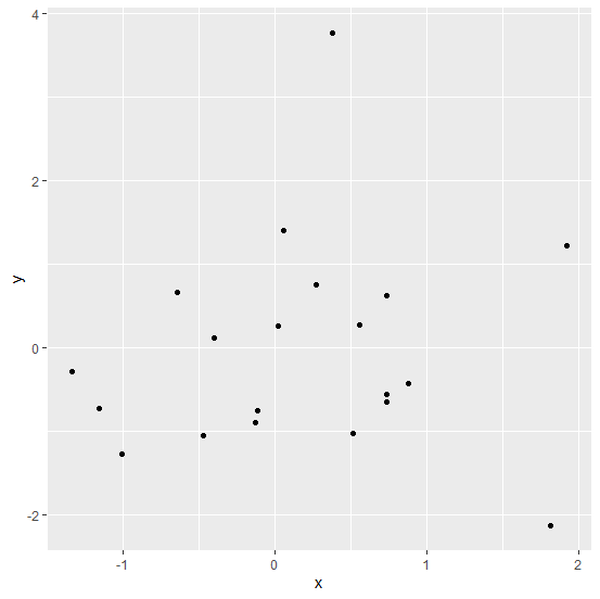
載入ggplot2包並在x和y之間建立散點圖:
> library(ggplot2)
> ggplot(df,aes(x,y))+geom_point()
輸出
建立x和y之間的散點圖,點的顏色使用col列:
> ggplot(df,aes(x,y))+geom_point(colour=df$col)
輸出

更新於:2021年3月5日
2K+ 瀏覽量

廣告