
 資料結構
資料結構 網路
網路 RDBMS
RDBMS 作業系統
作業系統 Java
Java iOS
iOS HTML
HTML CSS
CSS Android
 Python
 C 程式設計
 C++
C++ C#
C# MongoDB
 MySQL
MySQL Javascript
 PHP
PHP如何使用 R 中的 ggplot2 更改刻度大小?
要使用 ggplot2 更改刻度大小,我們可以將 theme 函式與引數 axis.ticks.length 一起使用。例如,如果我們有一個名為 df 的資料幀,其中包含兩列 x 和 y,那麼可以透過使用以下命令建立 x 和 y 之間的散點圖,並將刻度標記的大小增大 −
ggplot(df,aes(x,y))+geom_point()+theme(axis.ticks.length=unit(0.8,"inch"))
示例
請考慮以下資料幀 −
x<-rnorm(20)
y<-rnorm(20)
df<-data.frame(x,y)
df
輸出
      x              y
1   2.5494830  -0.587904992
2  -0.5864972   0.006669457
3   0.9554755  -3.925291145
4   0.6686948  -2.326550523
5  -0.3267310   0.738981444
6  -0.8751193  -0.438232843
7   0.5477108   0.214512133
8  -0.4767738   0.451001999
9  -0.5364709   0.335897135
10   0.5853087 -0.665692002
11 -1.7818255   0.944527193
12 -0.9670748   0.639372414
13  0.4873353   0.466036727
14  0.3669196   2.732934553
15  0.9450203  -0.201909686
16 -1.1646289  -0.533447384
17 -1.8637459   1.186856615
18 -1.5751590  -1.154048208
19 -0.2266776   1.813758654
20 -0.7125976   0.251823020
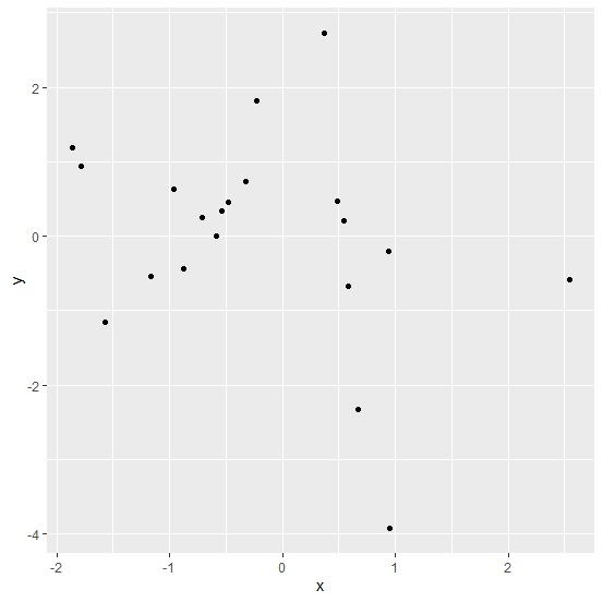
載入 ggplot2 軟體包並建立具有預設刻度標記大小的 x 和 y 之間的散點圖 −
示例
library(ggplot2)
ggplot(df,aes(x,y))+geom_point()
輸出
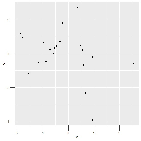
建立具有較大刻度標記大小的 x 和 y 之間的散點圖 −
示例
ggplot(df,aes(x,y))+geom_point()+theme(axis.ticks.length=unit(0.2,"inch"))
輸出
示例
ggplot(df,aes(x,y))+geom_point()+theme(axis.ticks.length=unit(0.50,"cm"))
輸出


更新於: 2021 年 3 月 16 日
2K+ 精選

廣告