
 資料結構
資料結構 網路
網路 關係型資料庫管理系統 (RDBMS)
 作業系統
作業系統 Java
Java iOS
iOS HTML
HTML CSS
CSS Android
 Python
 C語言程式設計
 C++
C++ C#
C# MongoDB
 MySQL
MySQL Javascript
 PHP
PHP如何在R的ggplot2中更改Facet標題的顏色?
要更改R中ggplot2中facet標題的顏色,我們可以使用帶有`strip.text.x`引數的`theme`函式。
例如,如果我們有一個名為df的資料框,它包含三列,例如X、Y和F,其中F是一個因子列,那麼我們可以使用下面提到的命令為F中不同值的X和Y之間建立分面散點圖,並使分面標題具有不同的顏色:
ggplot(df,aes(X,Y))+geom_point()+facet_wrap(~F)+theme(strip.text.x=element_text(colour="red"))
示例
以下程式碼片段建立了一個示例資料框:
Price<-sample(1:10,20,replace=TRUE)
Demand<-sample(50:100,20)
Region<-sample(c("Plane","Hill"),20,replace=TRUE)
df<-data.frame(Price,Demand,Region)
df
建立了以下資料框:
  Price Demand Region
 1 3    62     Plane
 2 4    78     Plane
 3 5    75     Hill
 4 10   64     Hill
 5 2    54     Plane
 6 1    58     Plane
 7 3    81     Plane
 8 6    91     Plane
 9 4    50     Plane
10 5    76     Plane
11 1    63     Hill
12 9    72     Hill
13 9    93     Plane
14 3    88     Plane
15 10   84     Hill
16 1    89     Plane
17 2    82     Plane
18 6    55     Plane
19 7    98     Hill
20 4    67     Hill
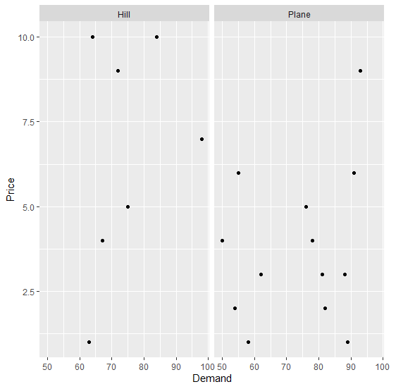
要在上面建立的資料框上基於區域建立需求和價格之間的散點圖,並使用分面,請將以下程式碼新增到上面的程式碼片段中:
Price<-sample(1:10,20,replace=TRUE)
Demand<-sample(50:100,20)
Region<-sample(c("Plane","Hill"),20,replace=TRUE)
df<-data.frame(Price,Demand,Region)
library(ggplot2)
ggplot(df,aes(Demand,Price))+geom_point()+facet_wrap(~Region)
輸出
如果您將上面給出的所有程式碼片段作為一個程式執行,它將生成以下輸出:
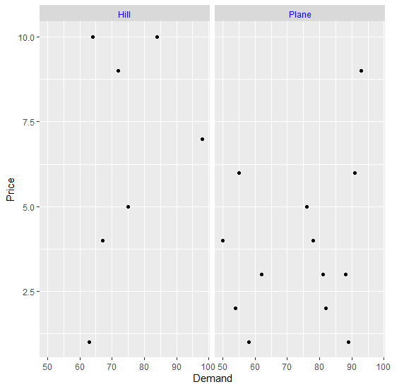
要在上面建立的資料框上基於區域建立需求和價格之間的散點圖,並使用藍色分面,請將以下程式碼新增到上面的程式碼片段中:
Price<-sample(1:10,20,replace=TRUE)
Demand<-sample(50:100,20)
Region<-sample(c("Plane","Hill"),20,replace=TRUE)
df<-data.frame(Price,Demand,Region)
library(ggplot2)
ggplot(df,aes(Demand,Price))+geom_point()+facet_wrap(~Region)+theme(strip.text.x=element_text(colour="blue"))
輸出
如果您將上面給出的所有程式碼片段作為一個程式執行,它將生成以下輸出:

更新於:2021年11月9日
576 次瀏覽

廣告