
 資料結構
資料結構 網路
網路 關係型資料庫管理系統
 作業系統
作業系統 Java
Java iOS
iOS HTML
HTML CSS
CSS Android
 Python
 C 程式設計
 C++
C++ C#
C# MongoDB
 MySQL
MySQL Javascript
 PHP
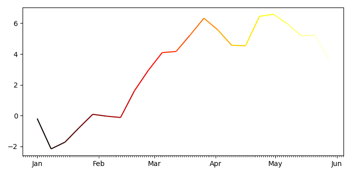
PHP如果 Pandas 的 X 軸是日期時間索引,如何繪製多色線?
如果 Pandas 的 X 軸是日期時間索引,要繪製多色線,我們可以執行以下步驟 -
- 設定影像尺寸並調整子圖之間和周圍的邊距。
- 使用 numpy 建立 d、y 和 s 資料點。
- 建立一個影像和一組子圖。
- 使用 numpy 獲取 xval、p 和 s 資料點。
- 獲取具有熱色彩對映和 s 資料點的線集合例項。
- 設定主要軸和次要軸定位器,並設定軸格式化程式。
- 使用資料限制自動縮放檢視限制。
- 要顯示影像,請使用 show() 方法。
示例
import pandas as pd
from matplotlib import pyplot as plt, dates as mdates, collections as c
import numpy as np

plt.rcParams["figure.figsize"] = [7.00, 3.50]
plt.rcParams["figure.autolayout"] = True

d = pd.date_range("2021-01-01", "2021-06-01", freq="7D")
y = np.cumsum(np.random.normal(size=len(d)))
s = pd.Series(y, index=d)

fig, ax = plt.subplots()

xval = mdates.date2num(s.index.to_pydatetime())
p = np.array([xval, s.values]).T.reshape(-1, 1, 2)
s = np.concatenate([p[:-1], p[1:]], axis=1)
lc = c.LineCollection(s, cmap="hot")
lc.set_array(xval)

ax.add_collection(lc)
ax.xaxis.set_major_locator(mdates.MonthLocator())
ax.xaxis.set_minor_locator(mdates.DayLocator())
m = mdates.DateFormatter("%b")
ax.xaxis.set_major_formatter(m)
ax.autoscale_view()

plt.show()
輸出
它將生成以下輸出


更新於: 22-9-2021
455 views

廣告