
 資料結構
資料結構 網路
網路 關係型資料庫管理系統
 作業系統
作業系統 Java
Java iOS
iOS HTML
HTML CSS
CSS Android
 Python
 C 程式設計
 C++
C++ C#
C# MongoDB
 MySQL
MySQL Javascript
 PHP
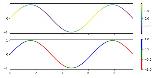
PHP如何在 matplotlib 中使用資料索引改變線圖的線條顏色?
為了使線圖中的線條顏色隨資料索引變化,我們可以採取以下步驟:
步驟
設定圖形大小並調整子圖之間和周圍的填充。
使用 numpy 建立 x 和 y 資料點。
獲取較小的限制,**dydx**。
使用 numpy 獲取**點**和**線段**資料點。
建立一個圖形和一組子圖。
建立一個類,當被呼叫時,將資料線性歸一化到某個範圍內。
從 numpy 陣列**A**設定影像陣列。
設定集合的線寬(s)。
設定軸 1 的顏色條。
從顏色列表(即 r、g 和 b)生成顏色對映物件。
重複步驟 6、7、8、9 和 10。
設定 X 軸和 Y 軸的限制。
要顯示圖形,請使用**show()**方法。
示例
import numpy as np
import matplotlib.pyplot as plt
from matplotlib.collections import LineCollection
from matplotlib.colors import ListedColormap, BoundaryNorm

plt.rcParams["figure.figsize"] = [7.50, 3.50]
plt.rcParams["figure.autolayout"] = True

x = np.linspace(0, 3 * np.pi, 500)
y = np.sin(x)

dydx = np.cos(0.5 * (x[:-1] + x[1:]))
points = np.array([x, y]).T.reshape(-1, 1, 2)
segments = np.concatenate([points[:-1], points[1:]], axis=1)

fig, axs = plt.subplots(2, 1, sharex=True, sharey=True)
norm = plt.Normalize(dydx.min(), dydx.max())

lc = LineCollection(segments, cmap='viridis', norm=norm)
lc.set_array(dydx)
lc.set_linewidth(2)

line = axs[0].add_collection(lc)
fig.colorbar(line, ax=axs[0])
cmap = ListedColormap(['r', 'g', 'b'])
norm = BoundaryNorm([-1, -0.5, 0.5, 1], cmap.N)

lc = LineCollection(segments, cmap=cmap, norm=norm)
lc.set_array(dydx)
lc.set_linewidth(2)

line = axs[1].add_collection(lc)
fig.colorbar(line, ax=axs[1])

axs[0].set_xlim(x.min(), x.max())
axs[0].set_ylim(-1.1, 1.1)

plt.show()
輸出
它將產生以下輸出:

更新於:2022年2月2日
2K+ 次檢視

廣告