
 資料結構
資料結構 網路
網路 關係型資料庫管理系統
 作業系統
作業系統 Java
Java iOS
iOS HTML
HTML CSS
CSS Android
 Python
 C 語言程式設計
 C++
C++ C#
C# MongoDB
 MySQL
MySQL Javascript
 PHP
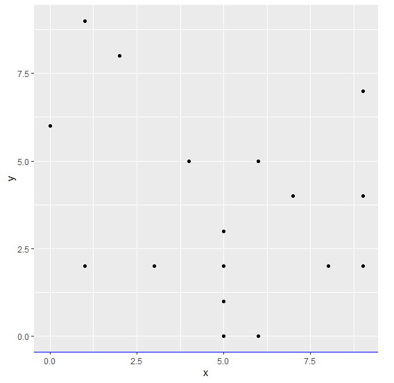
PHP使用 ggplot2 更改圖形中 X 軸線的顏色。
要使用 ggplot2 更改圖形中 X 軸線的顏色,我們可以使用 theme 函式,其中我們可以將 axis.line.x.bottom 引數顏色設定為所需的顏色,並使用 element_line。
檢視下面的示例以瞭解如何操作。當我們希望突出顯示 X 軸以供檢視者檢視時,可能需要這樣做。
示例
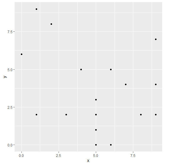
以下程式碼片段建立了一個示例資料框 -
x<-sample(0:9,20,replace=TRUE)
y<-sample(0:9,20,replace=TRUE)
df<-data.frame(x,y)
df
建立了以下資料框
   x y
1  4 5
2  5 0
3  5 3
4  7 4
5  1 9
6  0 6
7  6 0
8  9 7
9  6 5
10 5 3
11 2 8
12 3 2
13 5 1
14 1 2
15 8 2
16 6 5
17 5 2
18 1 2
19 9 4
20 9 2
要建立 ggplot2 包並在上述建立的資料框上建立 x 和 y 之間的散點圖,請將以下程式碼新增到上述程式碼片段中 -
x<-sample(0:9,20,replace=TRUE)
y<-sample(0:9,20,replace=TRUE)
df<-data.frame(x,y)
library(ggplot2)
ggplot(df,aes(x,y))+geom_point()
輸出
如果您將以上所有給定的程式碼片段作為單個程式執行,它將生成以下輸出 -
要在上述建立的資料框上建立 x 和 y 之間的散點圖,並使用藍色 X 軸線,請將以下程式碼新增到上述程式碼片段中 -
x<-sample(0:9,20,replace=TRUE)
y<-sample(0:9,20,replace=TRUE)
df<-data.frame(x,y)
library(ggplot2)
ggplot(df,aes(x,y))+geom_point()+theme(axis.line.x.bottom=element_line(color="blue"))
輸出
如果您將以上所有給定的程式碼片段作為單個程式執行,它將生成以下輸出 -

更新於: 2021年11月3日
6K+ 次檢視

廣告