
 資料結構
資料結構 網路
網路 RDBMS
RDBMS 作業系統
作業系統 Java
Java iOS
iOS HTML
HTML CSS
CSS Android
 Python
 C 程式設計
 C++
C++ C#
C# MongoDB
 MySQL
MySQL Javascript
 PHP
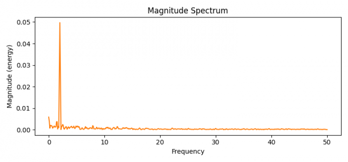
PHP如何在 Python 中用 Matplotlib 繪製幅度頻譜?
可以採取以下步驟繪製幅度頻譜:-
- 設定圖形大小,並調整子圖間和周圍的邊距。
- 獲取隨機種子值。
- 初始化取樣間隔 dt 並找出取樣頻率。
- 為 t 建立隨機資料點。
- 若要生成噪聲,請使用 numpy 獲取 nse、r、cnse 和 s
- 使用 subplots() 方法建立一個圖形及其子圖。
- 設定繪圖示題。
- 繪製幅度頻譜。
- 若要顯示圖形,請使用 show() 方法。
示例
import matplotlib.pyplot as plt
import numpy as np

plt.rcParams["figure.figsize"] = [7.50, 3.50]
plt.rcParams["figure.autolayout"] = True

np.random.seed(0)

dt = 0.01 # sampling interval
Fs = 1 / dt # sampling frequency
t = np.arange(0, 10, dt)

# generate noise:
nse = np.random.randn(len(t))
r = np.exp(-t / 0.05)
cnse = np.convolve(nse, r) * dt
cnse = cnse[:len(t)]
s = 0.1 * np.sin(4 * np.pi * t) + cnse

fig, axs = plt.subplots()

axs.set_title("Magnitude Spectrum")
axs.magnitude_spectrum(s, Fs=Fs, color='C1')

plt.show()
輸出

更新時間:2021 年 6 月 16 日
3K+ 次瀏覽

廣告