
 資料結構
資料結構 網路
網路 關係資料庫管理系統 (RDBMS)
 作業系統
作業系統 Java
Java iOS
iOS HTML
HTML CSS
CSS Android
 Python
 C 語言程式設計
 C++
C++ C#
C# MongoDB
 MySQL
MySQL Javascript
 PHP
PHP如何在 Seaborn 中將圖形樣式更改為 Darkgrid?
Seaborn 提供多種內建圖形樣式,我們可以從中選擇來增強繪圖的視覺效果。這些樣式會影響各種元素,例如顏色、網格線、背景和字型。要在 Seaborn 中設定圖形樣式,我們可以使用 **`sns.set_style()`** 函式。以下是 Seaborn 庫中可用的圖形樣式。
**Darkgrid** - 此樣式具有深灰色背景和網格線,有助於將注意力集中在資料點上。
**Whitegrid** - 此樣式類似於“**darkgrid**”,但具有白色背景,使其適合具有較淺顏色方案的繪圖。
**Dark** - 此樣式具有深色背景,沒有網格線,使繪圖看起來簡潔明瞭。
**White** - 此樣式類似於“**dark**”,但具有白色背景,對於具有較淺顏色的繪圖非常有用。
**Ticks** - 此樣式刪除背景網格,僅顯示軸上的刻度標記。
在本文中,我們將瞭解如何在 seaborn 中將圖形樣式更改為 Dark Grid。要在 Seaborn 中將圖形樣式更改為“**darkgrid**”,我們可以按照以下步驟操作。
安裝 Seaborn
我們應該確保已在 Python 環境中安裝 Seaborn。我們可以在 Python 工作環境中使用 **pip** 命令安裝它。
pip install seaborn
匯入必要的庫
在我們的 Python 指令碼或 Jupyter Notebook 中,接下來我們必須匯入所需的庫,例如 Seaborn 和 Matplotlib.pyplot。
import seaborn as sns
import matplotlib.pyplot as plt
設定圖形樣式
使用 **`sns.set_style()`** 函式將圖形樣式設定為“**darkgrid**”。此函式修改 Matplotlib 的預設樣式。
sns.set_style("darkgrid")
這行程式碼將圖形樣式設定為“**darkgrid**”。
繪製資料
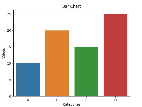
現在我們可以使用 Seaborn 和 Matplotlib 建立和自定義我們的繪圖。這是一個繪製條形圖的簡單示例。
示例
在此示例中,**`sns.barplot()`** 使用 Seaborn 建立條形圖。以下幾行使用 Matplotlib 設定 x 軸標籤、y 軸標籤和標題。最後,**`plt.show()`** 顯示繪圖。
import seaborn as sns
import matplotlib.pyplot as plt

x = ["A", "B", "C", "D"]
y = [10, 20, 15, 25]
# Create a bar plot
sns.barplot(x=x, y=y)
# Set labels and title
plt.xlabel("Categories")
plt.ylabel("Values")
plt.title("Bar Chart")
# Display the plot
plt.show()
輸出
自定義
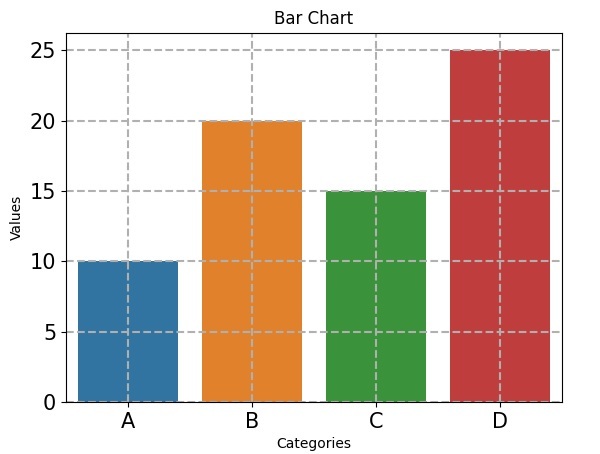
我們可以使用各種 Seaborn 函式和 Matplotlib 選項進一步自定義我們的繪圖。例如,我們可以調整調色盤、字型大小、網格線等。有關更多自定義選項,請參閱 Seaborn 文件。
以下幾行程式碼演示了一些額外的自定義,其中 **`sns.set_palette()`** 將調色盤更改為“**husl**”。**`plt.xticks()`** 和 **`plt.yticks()`** 分別設定 x 軸和 y 軸刻度的字型大小。**`plt.grid()`** 使用虛線樣式和 0.5 的線寬向繪圖新增網格線。
示例
import seaborn as sns
import matplotlib.pyplot as plt

x = ["A", "B", "C", "D"]
y = [10, 20, 15, 25]
# Create a bar plot
sns.barplot(x=x, y=y)
sns.set_palette("husl")  # Change the color palette
plt.xticks(fontsize=15)  # Set x-axis tick font size
plt.yticks(fontsize=15)  # Set y-axis tick font size
plt.grid(True, linestyle="--", linewidth=1.5)  # Add grid lines
# Set labels and title
plt.xlabel("Categories")
plt.ylabel("Values")
plt.title("Bar Chart")
# Display the plot
plt.show()
輸出

瀏覽量:382
