
 資料結構
資料結構 網路
網路 關係型資料庫管理系統
 作業系統
作業系統 Java
Java iOS
iOS HTML
HTML CSS
CSS Android
 Python
 C 語言程式設計
 C++
C++ C#
C# MongoDB
 MySQL
MySQL Javascript
 PHP
PHP如何在 Seaborn 中將圖形樣式轉換為 Whitegrid?
Seaborn 是 Python 中一個流行的資料視覺化庫,它提供各種樣式來增強繪圖的視覺效果。其中一個可用的樣式是“whitegrid”,它提供了一個帶有網格線的白色背景。在 Seaborn 中更改圖形樣式是一個簡單的過程,它可以極大地影響我們視覺化的美觀性。
在這篇文章中,我們將瞭解如何在 seaborn 中將圖形樣式更改為白色網格。要在 Seaborn 中將圖形樣式更改為“whitegrid”,我們可以按照以下步驟操作。
安裝 Seaborn
首先,我們應該檢查我們的 Python 環境中是否已安裝 Seaborn。我們可以使用 Python 工作環境中的pip命令安裝它。
pip install seaborn
匯入必要的庫
在我們的 Python 指令碼或 Jupyter Notebook 中,接下來我們必須匯入所需的庫,例如 Seaborn 和 Matplotlib.pyplot。
import seaborn as sns
import matplotlib.pyplot as plt
設定圖形樣式
接下來,我們必須使用'sns.set_style()'函式將圖形樣式設定為“whitegrid”。此函式修改了 Matplotlib 的預設樣式。
sns.set_style("whitegrid")
這行程式碼將圖形樣式設定為“whitegrid”。
繪製資料
現在,我們可以使用 Seaborn 和 Matplotlib 建立和自定義我們的繪圖。這是一個繪製條形圖的簡單示例。
示例
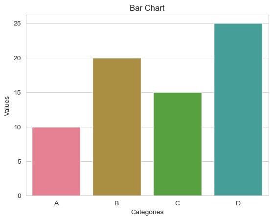
在此示例中,'sns.barplot()' 使用 Seaborn 建立條形圖。以下幾行使用 Matplotlib 設定 x 軸標籤、y 軸標籤和標題。最後,'plt.show()' 顯示繪圖。
import seaborn as sns
import matplotlib.pyplot as plt

sns.set_style("whitegrid")
x = ["A", "B", "C", "D"]
y = [10, 20, 15, 25]
# Create a bar plot
sns.barplot(x=x, y=y)
# Set labels and title
plt.xlabel("Categories")
plt.ylabel("Values")
plt.title("Bar Chart")
# Display the plot
plt.show()
輸出
自定義
我們可以使用各種 Seaborn 函式和 Matplotlib 選項進一步自定義我們的繪圖。例如,我們可以調整調色盤、字型大小、網格線等。有關更多自定義選項,請參閱 Seaborn 文件。
以下幾行程式碼演示了一些額外的自定義,其中'sns.set_palette()' 將調色盤更改為“husl”。'plt.xticks()' 和 'plt.yticks()' 分別設定 x 軸和 y 軸刻度的字型大小。'plt.grid()' 以虛線樣式和 0.5 的線寬向繪圖新增網格線。
示例
import seaborn as sns
import matplotlib.pyplot as plt

sns.set_style("whitegrid")
x = ["A", "B", "C", "D"]
y = [10, 20, 15, 25]
# Create a bar plot
sns.barplot(x=x, y=y)
# Set labels and title
plt.xlabel("Categories")
plt.ylabel("Values")
plt.title("Bar Chart")

# Customizing the Chart
sns.set_palette("husl")  # Change the color palette
plt.xticks(fontsize=10)  # Set x-axis tick font size
plt.yticks(fontsize=10)  # Set y-axis tick font size
plt.grid(True, linestyle="--", linewidth=0.1)

# Display the plot
plt.show()
輸出


171 次檢視
