- GWT Highcharts 教程
- GWT Highcharts - 主頁
- GWT Highcharts - 概覽
- 環境設定
- 配置語法
- GWT Highcharts - 折線圖
- GWT Highcharts - 區域圖
- GWT Highcharts - 條形圖
- GWT Highcharts - 柱形圖
- GWT Highcharts - 餅圖
- GWT Highcharts - 散點圖
- GWT Highcharts - 動態圖表
- GWT Highcharts - 組合
- GWT Highcharts - 3D 圖表
- GWT Highcharts - 地圖圖表
- GWT Highcharts 有用的資源
- GWT Highcharts - 快速指南
- GWT Highcharts - 有用的資源
- GWT Highcharts - 討論
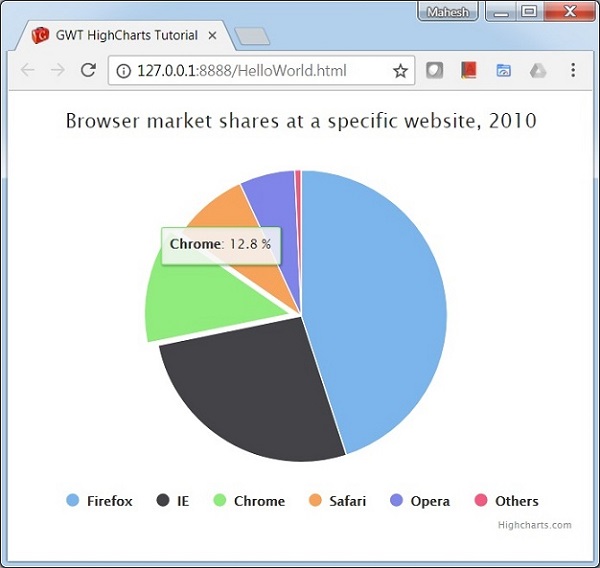
GWT Highcharts - 帶圖例的餅圖
以下是一個帶圖例的餅圖示例。
我們已經在 GWT Highcharts 配置語法章節中看到了用於繪製圖表的一些配置。
下面是一個帶圖例的餅圖示例。
配置
現在,讓我們看看採取的其他配置/步驟。
圖表
將圖表型別配置為基於“餅圖”。chart.type 決定了圖表的序列型別。此處,預設值為“折線”。
chart.setType(Type.PIE);
plotOptions
配置 plotOptions,以便可以使用 plotOptions.pie.showInLegend 屬性在餅圖中載入圖例。
chart.setPiePlotOptions(new PiePlotOptions()
   .setAllowPointSelect(true)
   .setCursor(Cursor.POINTER)
   .setPieDataLabels(new PieDataLabels()
      .setEnabled(false)
   )
   .setShowInLegend(true)
)
示例
HelloWorld.java
package com.tutorialspoint.client;

import org.moxieapps.gwt.highcharts.client.Chart;
import org.moxieapps.gwt.highcharts.client.Legend;
import org.moxieapps.gwt.highcharts.client.Point;
import org.moxieapps.gwt.highcharts.client.Series.Type;
import org.moxieapps.gwt.highcharts.client.Style;

import org.moxieapps.gwt.highcharts.client.ToolTip;
import org.moxieapps.gwt.highcharts.client.ToolTipData;
import org.moxieapps.gwt.highcharts.client.ToolTipFormatter;

import org.moxieapps.gwt.highcharts.client.labels.DataLabels;
import org.moxieapps.gwt.highcharts.client.labels.DataLabelsData;
import org.moxieapps.gwt.highcharts.client.labels.DataLabelsFormatter;
import org.moxieapps.gwt.highcharts.client.labels.PieDataLabels;
import org.moxieapps.gwt.highcharts.client.labels.Labels.Align;
import org.moxieapps.gwt.highcharts.client.labels.XAxisLabels;

import org.moxieapps.gwt.highcharts.client.plotOptions.ColumnRangePlotOptions;
import org.moxieapps.gwt.highcharts.client.plotOptions.PiePlotOptions;
import org.moxieapps.gwt.highcharts.client.plotOptions.PlotOptions.Cursor;

import com.google.gwt.core.client.EntryPoint;
import com.google.gwt.i18n.client.NumberFormat;
import com.google.gwt.user.client.ui.RootPanel;

public class HelloWorld implements EntryPoint {
   public void onModuleLoad() {
      final Chart chart = new Chart()
         .setType(Type.PIE)
         .setChartTitleText("Browser market shares at a specific website, 2010")
         .setPlotBackgroundColor((String)null)
         .setPlotBorderWidth(null)
         .setPlotShadow(false)
         .setPiePlotOptions(new PiePlotOptions()
            .setAllowPointSelect(true)
            .setCursor(Cursor.POINTER)
            .setPieDataLabels(new PieDataLabels()
               .setEnabled(false)
            )
            .setShowInLegend(true)
         )
         .setToolTip(new ToolTip()
            .setFormatter(new ToolTipFormatter() {
               @Override
               public String format(ToolTipData toolTipData) {
                  return "<b>" + toolTipData.getPointName() + "</b>: " + toolTipData.getYAsDouble() + " %";
               }
            })
         );

         chart.addSeries(chart.createSeries()
            .setName("Browser share")
            .setPoints(new Point[]{
               new Point("Firefox", 45.0),
               new Point("IE", 26.8),
               new Point("Chrome", 12.8)
                  .setSliced(true)
                  .setSelected(true),
               new Point("Safari", 8.5),
               new Point("Opera", 6.2),
               new Point("Others", 0.7)
            })
         );
      RootPanel.get().add(chart);
   }
}
結果
驗證結果。
gwt_highcharts_pie_charts.htm
廣告