- GWT Highcharts 教程
- GWT Highcharts - 首頁
- GWT Highcharts - 概述
- 設定環境
- 配置語法
- GWT Highcharts - 線形圖
- GWT Highcharts - 區域圖
- GWT Highcharts - 條形圖
- GWT Highcharts - 柱形圖
- GWT Highcharts - 餅圖
- GWT Highcharts - 散佈圖
- GWT Highcharts - 動態圖表
- GWT Highcharts - 組合圖
- GWT Highcharts - 3D 圖表
- GWT Highcharts - 地圖圖表
- GWT Highcharts 的有用資源
- GWT Highcharts - 快速指南
- GWT Highcharts - 有用資源
- GWT Highcharts - 討論
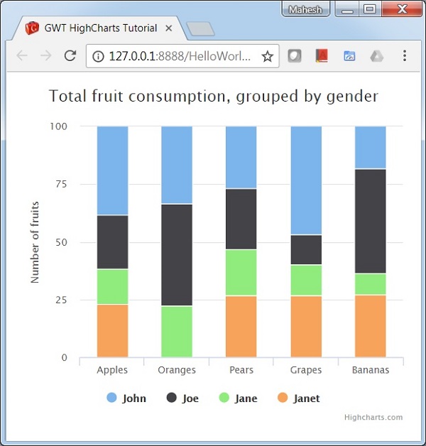
使用疊加百分比的柱形圖
以下是一個使用百分比的疊加柱形圖示例。
在 Highcharts 配置語法 章節中,我們已經看到了用於繪製圖表的配置。現在,讓我們檢視額外的配置,以及如何在 plotoptions 中新增堆疊屬性。
下面給出了一個使用百分比的疊加柱形圖的示例。
plotOptions
plotOptions 是每個系列型別的配置物件的包裝物件。每個系列的配置物件也可以在系列陣列中指定的每個系列專案中進行覆蓋。這是將每個系列的值相互疊加。這是將每個系列的值相互疊加。
使用 plotOptions.column.stacking 將圖表堆疊配置為“percent”。可能的值為 null(停用堆疊)、“normal”(按值堆疊)和“percent”(按百分比堆疊圖表)。
chart.setColumnPlotOptions(new ColumnPlotOptions()
   .setStacking(Stacking.PERCENT)
);
示例
HelloWorld.java
package com.tutorialspoint.client;

import org.moxieapps.gwt.highcharts.client.Chart;
import org.moxieapps.gwt.highcharts.client.Series.Type;
import org.moxieapps.gwt.highcharts.client.ToolTip;
import org.moxieapps.gwt.highcharts.client.ToolTipData;
import org.moxieapps.gwt.highcharts.client.ToolTipFormatter;
import org.moxieapps.gwt.highcharts.client.plotOptions.ColumnPlotOptions;
import org.moxieapps.gwt.highcharts.client.plotOptions.PlotOptions.Stacking;

import com.google.gwt.core.client.EntryPoint;
import com.google.gwt.user.client.ui.RootPanel;

public class HelloWorld implements EntryPoint {
   public void onModuleLoad() {
      final Chart chart = new Chart()
         .setType(Type.COLUMN)
         .setChartTitleText("Total fruit consumption, grouped by gender")
         .setColumnPlotOptions(new ColumnPlotOptions()
            .setStacking(Stacking.PERCENT)
         )
         .setToolTip(new ToolTip()
            .setFormatter(new ToolTipFormatter() {
               @Override
               public String format(ToolTipData toolTipData) {
                  return toolTipData.getSeriesName() + ": " + toolTipData.getYAsLong() +
	                  " ("+ Math.round(toolTipData.getPercentage()) + "%)";
               }
            })
         );

         chart.getXAxis()
            .setCategories("Apples", "Oranges", "Pears", "Grapes", "Bananas");

         chart.getYAxis()
            .setAllowDecimals(false)
            .setMin(0)
            .setAxisTitleText("Number of fruits");

         chart.addSeries(chart.createSeries()
            .setName("John")
            .setPoints(new Number[] {5, 3, 4, 7, 2})
         );
         chart.addSeries(chart.createSeries()
            .setName("Joe")
            .setPoints(new Number[] {3, 4, 4, 2, 5})
         );
         chart.addSeries(chart.createSeries()
            .setName("Jane")
            .setPoints(new Number[] {2, 2, 3, 2, 1})
         );
         chart.addSeries(chart.createSeries()
            .setName("Janet")
            .setPoints(new Number[] {3, 0, 4, 4, 3})
         );
      RootPanel.get().add(chart);
   }
}
結果
驗證結果。
gwt_highcharts_column_charts.htm
廣告