
 資料結構
資料結構 網路
網路 關係資料庫管理系統 (RDBMS)
 作業系統
作業系統 Java
Java iOS
iOS HTML
HTML CSS
CSS Android
 Python
 C語言程式設計
 C++
C++ C#
C# MongoDB
 MySQL
MySQL Javascript
 PHP
PHPPython中的資料分析和視覺化?
Python提供了許多用於資料分析和視覺化的庫,主要包括numpy、pandas、matplotlib、seaborn等。在本節中,我們將討論pandas庫用於資料分析和視覺化,它是一個基於numpy構建的開源庫。
它允許我們進行快速分析以及資料清洗和準備。Pandas還提供了許多內建的視覺化功能,我們將在下面看到。
安裝
要安裝pandas,請在終端中執行以下命令:
pipinstall pandas
或者如果您有anaconda,您可以使用
condainstall pandas
Pandas-DataFrame
當我們使用pandas時,DataFrame是主要的工具。
程式碼:
import numpy as np
import pandas as pd
from numpy.random import randn
np.random.seed(50)
df = pd.DataFrame(randn(6,4), ['a','b','c','d','e','f'],['w','x','y','z'])
df
輸出
| w | x | y | z | |
|---|---|---|---|---|
| a | -1.560352 | -0.030978 | -0.620928 | -1.464580 |
| b | 1.411946 | -0.476732 | -0.780469 | 1.070268 |
| c | -1.282293 | -1.327479 | 0.126338 | 0.862194 |
| d | 0.696737 | -0.334565 | -0.997526 | 1.598908 |
| e | 3.314075 | 0.987770 | 0.123866 | 0.742785 |
| f | -0.393956 | 0.148116 | -0.412234 | -0.160715 |
Pandas-缺失資料
我們將看到一些方便的方法來處理pandas中的缺失資料,這些資料會自動填充為零或NaN。
import numpy as np
import pandas as pd
from numpy.random import randn
d = {'A': [1,2,np.nan], 'B': [9, np.nan, np.nan], 'C': [1,4,9]}
df = pd.DataFrame(d)
df
輸出
| A | B | C | |
|---|---|---|---|
| 0 | 1.0 | 9.0 | 1 |
| 1 | 2.0 | NaN | 4 |
| 2 | NaN | NaN | 9 |
因此,我們上面有3個缺失值。
df.dropna()
| A | B | C | |
|---|---|---|---|
| 0 | 1.0 | 9.0 | 1 |
df.dropna(axis = 1)
| C | |
|---|---|
| 0 | 1 |
| 1 | 4 |
| 2 | 9 |
df.dropna(thresh = 2)
| A | B | C | |
|---|---|---|---|
| 0 | 1.0 | 9.0 | 1 |
| 1 | 2.0 | NaN | 4 |
df.fillna(value = df.mean())
| A | B | C | |
|---|---|---|---|
| 0 | 1.0 | 9.0 | 1 |
| 1 | 2.0 | 9.0 | 4 |
| 2 | 1.5 | 9.0 | 9 |
Pandas-匯入資料
我們將讀取csv檔案,該檔案儲存在我的本地機器上(在我的例子中),或者我們可以直接從網上獲取。
#import pandas library
import pandas as pd
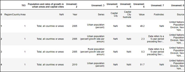
#Read csv file and assigned it to dataframe variable
df = pd.read_csv("SYB61_T03_Population Growth Rates in Urban areas and Capital cities.csv",encoding = "ISO-8859-1")
#Read first five element from the dataframe
df.head()輸出
讀取DataFrame或csv檔案中行數和列數。
#Countthe number of rows and columns in our dataframe.
df.shape
輸出
(4166,9)
Pandas-DataFrame數學運算
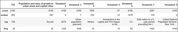
可以使用pandas的各種統計工具對DataFrame進行運算。
#To computes various summary statistics, excluding NaN values
df.describe()
輸出
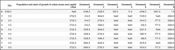
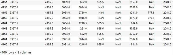
# computes numerical data ranks
df.rank()
輸出
.....
.....
Pandas-繪製圖表
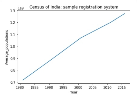
import matplotlib.pyplot as plt
years = [1981, 1991, 2001, 2011, 2016]

Average_populations = [716493000, 891910000, 1071374000, 1197658000, 1273986000]

plt.plot(years, Average_populations)
plt.title("Census of India: sample registration system")
plt.xlabel("Year")
plt.ylabel("Average_populations")
plt.show()
輸出
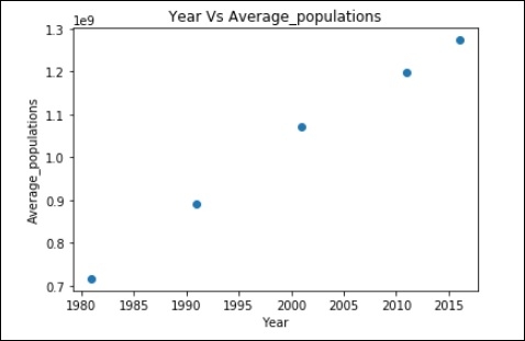
上述資料的散點圖
plt.scatter(years,Average_populations)
直方圖
import matplotlib.pyplot as plt

Average_populations = [716493000, 891910000, 1071374000, 1197658000, 1273986000]

plt.hist(Average_populations, bins = 10)
plt.xlabel("Average_populations")
plt.ylabel("Frequency")

plt.show()
輸出


更新於:2019年7月30日
1K+ 瀏覽量

廣告