
 資料結構
資料結構 網路
網路 關係資料庫管理系統
 作業系統
作業系統 Java
Java iOS
iOS HTML
HTML CSS
CSS Android
 Python
 C 程式設計
 C++
C++ C#
C# MongoDB
 MySQL
MySQL Javascript
 PHP
PHPPython - 使用 Bokeh 進行資料視覺化
Bokeh 是一個用於 Web 瀏覽器的 Python 資料視覺化庫。它可以建立優雅、簡潔的多功能圖形。它用於快速輕鬆地建立互動式圖表、儀表板和資料應用程式。在本文中,我們將瞭解如何使用 Bokeh 建立各種基本圖形型別。
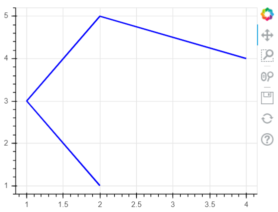
繪製線條
我們可以使用點座標的 x 和 y 座標作為兩個列表來建立線形圖。透過指定圖形的高度和寬度,我們直接在瀏覽器中顯示輸出。我們還可以提供其他引數,例如線的寬度和線的顏色。
示例
from bokeh.io import show
from bokeh.plotting import figure
p = figure(plot_width=300, plot_height=300)
# add a line renderer
p.line([ 2, 1, 2, 4], [ 1, 3, 5, 4],
      line_width=2, color="blue")
# show the results
show(p)
輸出
執行以上程式碼將得到以下結果:
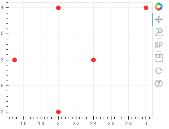
繪製圓形
在此示例中,我們使用 circle() 函式以列表的形式為圓心的 x 和 y 座標提供值。同樣,我們可以將圓的顏色和大小作為引數提供給此函式。我們將結果輸出到瀏覽器視窗。
示例
from bokeh.io import show
from bokeh.plotting import figure
p = figure(plot_width=400, plot_height=300)
# add a line renderer
p.circle([ 2, 1.5, 2, 3,2.4], [ 2, 3, 4, 4,3],
         size = 10, color = "red", alpha = 0.8)
# show the results
show(p)
輸出
執行以上程式碼將得到以下結果:
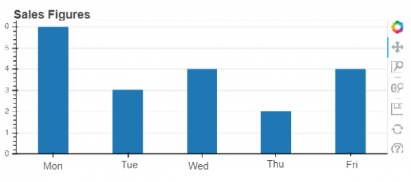
繪製條形圖
條形圖是透過使用 vbar 函式繪製的。在下面的示例中,我們取一個值的列表,這些值是工作日的名稱,然後將每個條形的值作為列表傳遞給名為 top 的引數。當然,使用更復雜的程式,我們可以從檔案或 API 匯入外部資料,並將這些值提供給這些引數。
示例
from bokeh.io import show
from bokeh.plotting import figure
sales_qty = ['Mon', 'Tue', 'Wed', 'Thu', 'Fri']
# Set the x_range to the list of categories above
p = figure(x_range=sales_qty , plot_height=250, title="Sales Figures")
# Categorical values can also be used as coordinates
p.vbar(x=sales_qty , top=[6, 3, 4, 2, 4], width=0.4)
# Set some properties to make the plot look better
p.xgrid.grid_line_color = None
p.y_range.start = 0
show(p)
輸出
執行以上程式碼將得到以下結果:

更新於: 2021-01-25
217 次瀏覽

廣告