
 資料結構
資料結構 網路
網路 關係資料庫管理系統
 作業系統
作業系統 Java
Java iOS
iOS HTML
HTML CSS
CSS Android
 Python
 C 程式設計
 C++
C++ C#
C# MongoDB
 MySQL
MySQL Javascript
 PHP
PHPPython 中使用不同圖表進行資料視覺化?
Python 提供了各種易於使用的庫用於資料視覺化。好訊息是這些庫可以處理小資料集或大資料集。
一些最常用的用於資料視覺化的 Python 庫包括:
Matplotlib
Pandas
Plotly
Seaborn
下面我們將針對一組固定資料繪製不同型別的視覺化圖表,以便更好地分析這些資料。
我們將分析以下資料集,並透過不同的圖表進行視覺化:
| 國家或地區 | 年份 | 變數 | 值 |
|---|---|---|---|
| 印度 | 2019 | 中等 | 1368737.513 |
| 印度 | 2019 | 高 | 1378419.072 |
| 印度 | 2019 | 低 | 1359043.965 |
| 印度 | 2019 | 恆定生育率 | 1373707.838 |
| 印度 | 2019 | 即時替代 | 1366687.871 |
| 印度 | 2019 | 零遷移 | 1370868.782 |
| 印度 | 2019 | 恆定死亡率 | 1366282.778 |
| 印度 | 2019 | 無變化 | 1371221.64 |
| 印度 | 2019 | 勢頭 | 1367400.614 |
基本繪圖
讓我們建立一些基本圖表:線形圖、散點圖和直方圖
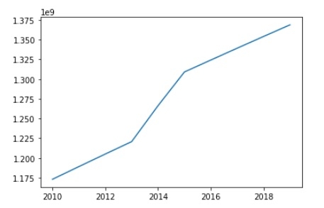
線形圖
線形圖是一種繪製圖表,其中繪製一條線來指示一組特定的 x 和 y 值之間的關係。
import matplotlib.pyplot as plt
Year = [2010, 2011, 2012, 2013, 2014, 2015, 2016, 2017, 2018, 2019]
India_Population = [1173108018,1189172906,1205073612,1220800359,1266344631,1309053980,1324171354,1339180127,1354051854,1368737513]
plt.plot(Year, India_Population)
plt.show()
輸出
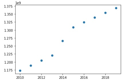
散點圖
或者,您可能希望將數量繪製為資料點中的 2 個位置。
考慮與線形圖相同的資料,要建立散點圖,我們只需要修改上面程式碼中的一行:
plt.plot(Year, India_Population,'o')
輸出
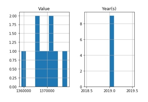
直方圖
直方圖在科學應用中非常常用,並且您很有可能需要在某些時候繪製它們。它們對於繪製分佈非常有用。
import pandas as pd
import matplotlib.pyplot as plt
data = [
['India', 2019, 'Medium', 1368737.513],
['India', 2019, 'High', 1378419.072],
['India', 2019, 'Low', 1359043.965],
['India', 2019, 'Constant fertility', 1373707.838],
['India', 2019,'Instant replacement', 1366687.871],
['India', 2019, 'Zero migration', 1370868.782],
['India', 2019,'Constant mortality', 1366282.778],
['India', 2019, 'No change', 1371221.64],
['India', 2019, 'Momentum', 1367400.614],]
df = pd.DataFrame(data, columns = ([ 'Country or Area', 'Year(s)', 'Variant', 'Value']))
df.hist()
plt.show()
輸出
餅圖
import numpy as np
import matplotlib.pyplot as plt

n = 25
Z = np.ones(n)
Z[-1] *= 2.5

plt.axes([0.05, 0.05, 0.95, 0.95])
plt.pie(Z, explode = Z*.05, colors = ['%f' % (i/float(n)) for i in range(n)],
   wedgeprops = {"linewidth": 1, "edgecolor": "green"})
plt.gca().set_aspect('equal')
plt.xticks([]), plt.yticks([])
plt.show()
輸出

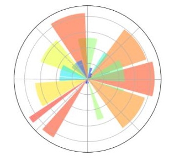
極座標圖
程式碼
import numpy as np
import matplotlib.pyplot as plt

ax = plt.axes([0.5,0.05,0.95,0.95], polar=True)

N = 25
theta = np.arange(0.0, 2.5*np.pi, 2.5*np.pi/N)
radii = 10*np.random.rand(N)
width = np.pi/4*np.random.rand(N)
bars = plt.bar(theta, radii, width=width, bottom=0.0)

for r,bar in zip(radii, bars):
bar.set_facecolor( plt.cm.jet(r/10.))
bar.set_alpha(0.5)

ax.set_xticklabels([])
ax.set_yticklabels([])

plt.show()
輸出

更新於: 2019年7月30日
263 次檢視

廣告