- Bootstrap 教程
- Bootstrap - 首頁
- Bootstrap - 概覽
- Bootstrap - 環境設定
- Bootstrap - RTL
- Bootstrap - CSS 變數
- Bootstrap - 色彩模式
- Bootstrap 佈局
- Bootstrap - 斷點
- Bootstrap - 容器
- Bootstrap - 網格系統
- Bootstrap - 列
- Bootstrap - 間距
- Bootstrap - 實用工具
- Bootstrap - CSS 網格
- Bootstrap 元件
- Bootstrap - 手風琴
- Bootstrap - 警報
- Bootstrap - 徽章
- Bootstrap - 麵包屑
- Bootstrap - 按鈕
- Bootstrap - 按鈕組
- Bootstrap - 卡片
- Bootstrap - 走馬燈
- Bootstrap - 關閉按鈕
- Bootstrap - 摺疊
- Bootstrap - 下拉選單
- Bootstrap - 列表組
- Bootstrap - 模態框
- Bootstrap - 導航欄
- Bootstrap - 導航和選項卡
- Bootstrap - 側邊欄
- Bootstrap - 分頁
- Bootstrap - 佔位符
- Bootstrap - 氣泡提示
- Bootstrap - 進度條
- Bootstrap - 滾動監聽
- Bootstrap - 載入動畫
- Bootstrap - 提示框
- Bootstrap - 工具提示
- Bootstrap 表單
- Bootstrap - 表單
- Bootstrap - 表單控制元件
- Bootstrap - 選擇框
- Bootstrap - 複選框和單選按鈕
- Bootstrap - 範圍滑塊
- Bootstrap - 輸入組
- Bootstrap - 浮動標籤
- Bootstrap - 佈局
- Bootstrap - 驗證
- Bootstrap 輔助類
- Bootstrap - 清除浮動
- Bootstrap - 顏色和背景
- Bootstrap - 彩色連結
- Bootstrap - 聚焦環
- Bootstrap - 圖示連結
- Bootstrap - 定位
- Bootstrap - 比例
- Bootstrap - 堆疊
- Bootstrap - 拉伸連結
- Bootstrap - 文字截斷
- Bootstrap - 垂直線
- Bootstrap - 隱藏
- Bootstrap 實用工具
- Bootstrap - 背景
- Bootstrap - 邊框
- Bootstrap - 顏色
- Bootstrap - 顯示
- Bootstrap - 彈性盒
- Bootstrap - 浮動
- Bootstrap - 互動
- Bootstrap - 連結
- Bootstrap - 物件適應
- Bootstrap - 不透明度
- Bootstrap - 溢位
- Bootstrap - 定位
- Bootstrap - 陰影
- Bootstrap - 大小
- Bootstrap - 間距
- Bootstrap - 文字
- Bootstrap - 垂直對齊
- Bootstrap - 可見性
- Bootstrap 演示
- Bootstrap - 網格演示
- Bootstrap - 按鈕演示
- Bootstrap - 導航演示
- Bootstrap - 部落格演示
- Bootstrap - 滑塊演示
- Bootstrap - 走馬燈演示
- Bootstrap - 頁首演示
- Bootstrap - 頁尾演示
- Bootstrap - 英雄區演示
- Bootstrap - 特色演示
- Bootstrap - 側邊欄演示
- Bootstrap - 下拉選單演示
- Bootstrap - 列表組演示
- Bootstrap - 模態框演示
- Bootstrap - 徽章演示
- Bootstrap - 麵包屑演示
- Bootstrap - 縱向大標題演示
- Bootstrap-粘性頁尾演示
- Bootstrap-相簿演示
- Bootstrap-登入演示
- Bootstrap-定價演示
- Bootstrap-結賬演示
- Bootstrap-產品演示
- Bootstrap-封面演示
- Bootstrap-儀表盤演示
- Bootstrap-粘性頁尾導航欄演示
- Bootstrap-砌體佈局演示
- Bootstrap-啟動模板演示
- Bootstrap-相簿 RTL 演示
- Bootstrap-結賬 RTL 演示
- Bootstrap-走馬燈 RTL 演示
- Bootstrap-部落格 RTL 演示
- Bootstrap-儀表盤 RTL 演示
- Bootstrap 有用資源
- Bootstrap - 常見問題解答
- Bootstrap - 快速指南
- Bootstrap - 有用資源
- Bootstrap - 討論
Bootstrap - 快速指南
Bootstrap - 概覽
什麼是 Twitter Bootstrap?
Bootstrap 是一款簡潔、直觀且功能強大的移動優先前端框架,用於更快、更輕鬆地進行 Web 開發。它使用 HTML、CSS 和 Javascript。
歷史
Bootstrap 由Mark Otto 和Jacob Thornton 在Twitter 開發。它於 2011 年 8 月在 GitHub 上作為開源產品釋出。
為什麼要使用 Bootstrap?
移動優先方法 - Bootstrap 3 框架在整個庫中都包含移動優先樣式,而不是在單獨的檔案中。
瀏覽器支援 - 它受所有主流瀏覽器支援。

易於上手 - 只要掌握 HTML 和 CSS 的知識,任何人都可以開始使用 Bootstrap。此外,Bootstrap 官方網站提供了良好的文件。
響應式設計 - Bootstrap 的響應式 CSS 可適應桌面電腦、平板電腦和手機。有關響應式設計的更多資訊,請參閱章節Bootstrap 響應式設計。

為開發人員構建介面提供了一個乾淨且統一的解決方案。
它包含美觀且功能強大的內建元件,這些元件易於自定義。
它還提供基於 Web 的自定義。
最棒的是它是開源的。
Bootstrap 包含哪些內容?
腳手架 - Bootstrap 提供了一個基本結構,包括網格系統、連結樣式和背景。這將在Bootstrap 基本結構部分詳細介紹。
CSS - Bootstrap 帶有全域性 CSS 設定、經過樣式化和增強的基本 HTML 元素以及可擴充套件類以及高階網格系統。這將在Bootstrap 與 CSS部分詳細介紹。
元件 - Bootstrap 包含十幾個可重複使用的元件,旨在提供圖示、下拉選單、導航、警報、彈出視窗等等。這將在佈局元件部分詳細介紹。
JavaScript 外掛 - Bootstrap 包含十幾個自定義 jQuery 外掛。您可以輕鬆地全部包含它們,或逐個包含。這將在Bootstrap 外掛部分詳細介紹。
自定義 - 您可以自定義 Bootstrap 的元件、LESS 變數和 jQuery 外掛以獲得您自己的版本。
Bootstrap - 環境設定
設定和開始使用 Bootstrap 非常容易。本章將解釋如何下載和設定 Bootstrap。我們還將討論 Bootstrap 檔案結構,並透過示例演示其用法。
下載 Bootstrap
您可以從https://bootstrap.tw/下載最新版本的 Bootstrap。當您單擊此連結時,您將看到如下所示的螢幕 -

在這裡您可以看到兩個按鈕 -
下載 Bootstrap - 單擊此按鈕,您可以下載 Bootstrap CSS、JavaScript 和字型的預編譯和壓縮版本。不包括任何文件或原始原始碼檔案。
下載原始碼 - 單擊此按鈕,您可以直接從 GitHub 獲取最新的 Bootstrap LESS 和 JavaScript 原始碼。
如果您使用 Bootstrap 的未編譯原始碼,則需要編譯 LESS 檔案以生成可用的 CSS 檔案。為了將 LESS 檔案編譯成 CSS,Bootstrap 官方僅支援 Recess,它是基於less.js的 Twitter CSS 助手。
為了更好地理解和方便使用,我們將在整個教程中使用 Bootstrap 的預編譯版本。由於檔案已編譯和壓縮,因此您不必每次都費心包含各個功能的單獨檔案。在編寫本教程時,下載了最新版本(Bootstrap 3)。
檔案結構
預編譯 Bootstrap
下載編譯後的 Bootstrap 版本後,解壓縮 ZIP 檔案,您將看到以下檔案/目錄結構 -
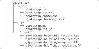
如您所見,有編譯後的 CSS 和 JS(bootstrap.*),以及編譯和壓縮後的 CSS 和 JS(bootstrap.min.*)。包含 Glyphicons 的字型,因為它是可選的 Bootstrap 主題。
Bootstrap 原始碼
如果您下載了 Bootstrap 原始碼,則檔案結構如下 -
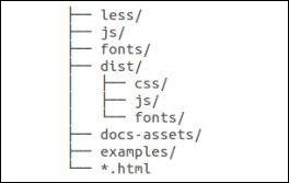
less/、js/ 和fonts/下的檔案分別是 Bootstrap CSS、JS 和圖示字型的原始碼。
dist/資料夾包含上面預編譯下載部分列出的所有內容。
docs-assets/、examples/ 和所有 *.html 檔案都是 Bootstrap 文件。
HTML 模板
使用 Bootstrap 的基本 HTML 模板如下所示 -
<!DOCTYPE html>
<html>

   <head>
      <title>Bootstrap 101 Template</title>
      <meta name = "viewport" content = "width = device-width, initial-scale = 1.0">

      <!-- Bootstrap -->
      <link href = "css/bootstrap.min.css" rel = "stylesheet">

      <!-- HTML5 Shim and Respond.js IE8 support of HTML5 elements and media queries -->
      <!-- WARNING: Respond.js doesn't work if you view the page via file:// -->

      <!--[if lt IE 9]>
      <script src = "https://oss.maxcdn.com/libs/html5shiv/3.7.0/html5shiv.js"></script>
      <script src = "https://oss.maxcdn.com/libs/respond.js/1.3.0/respond.min.js"></script>
      <![endif]-->

   </head>

   <body>
      <h1>Hello, world!</h1>

      <!-- jQuery (necessary for Bootstrap's JavaScript plugins) -->
      <script src = "https://code.jquery.com/jquery.js"></script>

      <!-- Include all compiled plugins (below), or include individual files as needed -->
      <script src = "js/bootstrap.min.js"></script>

   </body>
</html>
在這裡您可以看到包含的jquery.js、bootstrap.min.js 和bootstrap.min.css 檔案,它們將一個普通的 HTM 檔案轉換為 Bootstrapped 模板。只需確保在包含 Bootstrap 庫之前包含 jQuery 庫即可。
有關上面程式碼片段中每個元素的更多詳細資訊將在章節Bootstrap CSS 概覽中討論。
示例
現在讓我們嘗試一個使用上面模板的示例。嘗試使用我們網站上以下示例程式碼框右上角提供的“即時演示”選項嘗試以下示例 -
<h1>Hello, world!</h1>
在所有後續章節中,我們使用了來自網站https://www.lipsum.com/的虛擬文字。
Bootstrap - 網格系統
在本章中,我們將討論 Bootstrap 網格系統。
什麼是網格?
正如維基百科所說 -
在圖形設計中,網格是由一系列相交的直線(垂直、水平)構成的結構(通常是二維的),用於構建內容結構。它被廣泛用於印刷設計中的版式和內容結構設計。在網頁設計中,它是一種非常有效的方法,可以使用 HTML 和 CSS 快速有效地建立一致的佈局。
簡單來說,網頁設計中的網格可以組織和構建內容,使網站易於瀏覽並減少使用者認知負擔。
什麼是 Bootstrap 網格系統?
正如 Bootstrap 網格系統的官方文件所說 -
Bootstrap 包含一個響應式、移動優先的流體網格系統,隨著裝置或視口尺寸的增加,該系統會適當地擴充套件到 12 列。它包含用於輕鬆佈局選項的預定義類,以及用於生成更多語義佈局的功能強大的混合。
讓我們理解以上陳述。Bootstrap 3 採用移動優先的方式,這意味著 Bootstrap 的程式碼現在首先針對較小的螢幕(如移動裝置、平板電腦),然後“擴充套件”元件和網格以適應較大的螢幕(如筆記型電腦、臺式電腦)。
移動優先策略
內容
- 確定哪些最重要。
佈局
- 首先針對較小的寬度進行設計。
- 基本 CSS 首先解決移動裝置問題;媒體查詢解決平板電腦和臺式電腦問題。
漸進增強
- 隨著螢幕尺寸的增加新增元素。
Bootstrap 網格系統的運作方式
網格系統用於透過一系列包含內容的行和列來建立頁面佈局。以下是 Bootstrap 網格系統的運作方式 -
行必須放置在.container 類中才能正確對齊和填充。
使用行建立列的水平組。
內容應放置在列中,並且只有列可以作為行的直接子元素。
預定義的網格類(如.row 和 .col-xs-4)可用於快速建立網格佈局。LESS 混合也可用於更語義化的佈局。
列透過填充建立間距(列內容之間的間隙)。該填充在.rows 上透過負邊距在第一列和最後一列的行中進行抵消。
網格列是透過指定您希望跨越的十二個可用列中的數量來建立的。例如,三個相等的列將使用三個.col-xs-4。
媒體查詢
媒體查詢是一個非常花哨的術語,指的是“條件 CSS 規則”。它只是根據規定的某些條件應用一些 CSS。如果滿足這些條件,則應用樣式。
Bootstrap 中的媒體查詢允許您根據視口大小移動、顯示和隱藏內容。以下媒體查詢用於 LESS 檔案中,以在 Bootstrap 網格系統中建立關鍵斷點。
/* Extra small devices (phones, less than 768px) */
/* No media query since this is the default in Bootstrap */

/* Small devices (tablets, 768px and up) */
@media (min-width: @screen-sm-min) { ... }

/* Medium devices (desktops, 992px and up) */
@media (min-width: @screen-md-min) { ... }

/* Large devices (large desktops, 1200px and up) */
@media (min-width: @screen-lg-min) { ... }
有時,這些會被擴充套件以包含一個max-width,將CSS限制在更窄的裝置集上。
@media (max-width: @screen-xs-max) { ... }
@media (min-width: @screen-sm-min) and (max-width: @screen-sm-max) { ... }
@media (min-width: @screen-md-min) and (max-width: @screen-md-max) { ... }
@media (min-width: @screen-lg-min) { ... }
媒體查詢有兩個部分,一個裝置規範,然後是一個尺寸規則。在上面的例子中,設定了以下規則:
讓我們考慮這一行:
@media (min-width: @screen-sm-min) and (max-width: @screen-sm-max) { ... }
對於所有裝置,無論什麼型別,如果螢幕寬度小於@screen-sm-max,則在min-width: @screen-sm-min時,執行某些操作。
網格選項
下表總結了Bootstrap網格系統在多個裝置上工作方式的各個方面:
| 超小型裝置 手機 (<768px) | 小型裝置 平板電腦 (≥768px) | 中型裝置 桌上型電腦 (≥992px) | 大型裝置 桌上型電腦 (≥1200px) | |
|---|---|---|---|---|
| 網格行為 | 始終水平 | 開始時摺疊,在斷點以上水平顯示 | 開始時摺疊,在斷點以上水平顯示 | 開始時摺疊,在斷點以上水平顯示 |
| 最大容器寬度 | 無 (自動) | 750px | 970px | 1170px |
| 類字首 | .col-xs- | .col-sm- | .col-md- | .col-lg- |
| 列數 | 12 | 12 | 12 | 12 |
| 最大列寬 | 自動 | 60px | 78px | 95px |
| 間距寬度 |
30px (每列兩側各15px) |
30px (每列兩側各15px) |
30px (每列兩側各15px) |
30px (每列兩側各15px) |
| 可巢狀 | 是 | 是 | 是 | 是 |
| 偏移量 | 是 | 是 | 是 | 是 |
| 列排序 | 是 | 是 | 是 | 是 |
基本網格結構
以下是Bootstrap網格的基本結構:
<div class = "container">

   <div class = "row">
      <div class = "col-*-*"></div>
      <div class = "col-*-*"></div>
   </div>

   <div class = "row">...</div>

</div>

<div class = "container">
   ....
</div>
讓我們看一些簡單的網格示例:
響應式列重置
使用四個網格層級,您可能會遇到在某些斷點處列無法正確清除的問題,因為其中一個列比另一個列更高。要解決此問題,請結合使用.clearfix類和響應式實用程式類,如下例所示:
<div class = "container">
   <div class = "row" >

      <div class = "col-xs-6 col-sm-3" style = "background-color: #dedef8;
         box-shadow: inset 1px -1px 1px #444, inset -1px 1px 1px #444;">

         <p>Lorem ipsum dolor sit amet, consectetur adipisicing elit.</p>
      </div>

      <div class = "col-xs-6 col-sm-3" style = "background-color: #dedef8;
         box-shadow: inset 1px -1px 1px #444, inset -1px 1px 1px #444;">

         <p>Lorem ipsum dolor sit amet, consectetur adipisicing elit, sed do
            eiusmod tempor incididunt ut labore et dolore magna aliqua. Ut
            enim ad minim veniam, quis nostrud exercitation ullamco laboris
            nisi ut aliquip ex ea commodo consequat.</p>

         <p>Lorem ipsum dolor sit amet, consectetur adipisicing elit, sed do
            eiusmod tempor incididunt ut.</p>
      </div>

      <div class = "clearfix visible-xs"></div>

      <div class = "col-xs-6 col-sm-3" style = "background-color: #dedef8;
         box-shadow: inset 1px -1px 1px #444, inset -1px 1px 1px #444;">

         <p>Ut enim ad minim veniam, quis nostrud exercitation ullamco
            laboris nisi ut aliquip ex ea commodo consequat.</p>
      </div>

      <div class = "col-xs-6 col-sm-3" style = "background-color: #dedef8;
         box-shadow: inset 1px -1px 1px #444, inset -1px 1px 1px #444;">

         <p>Lorem ipsum dolor sit amet, consectetur adipisicing elit, sed do
            eiusmod tempor incididunt ut labore et dolore magna aliqua. Ut
            enim ad minim</p>
      </div>

   </div>
</div>
這將產生以下結果:
調整您的視口或在手機上檢視它,以獲得此示例的所需結果。
偏移列
偏移量對於更專業的佈局是一個有用的功能。它們可用於將列推開以獲得更多間距(例如)。.col-xs = * 類不支援偏移量,但可以透過使用空單元格輕鬆複製它們。
要在大型顯示器上使用偏移量,請使用.col-md-offset-*類。這些類將列的左邊距增加*列,其中*的範圍為1到11。
在以下示例中,我們有<div class = "col-md-6">..</div>,我們將使用.col-md-offset-3類將其居中。
<div class = "container">

   <h1>Hello, world!</h1>

   <div class = "row" >
      <div class = "col-xs-6 col-md-offset-3" style = "background-color: #dedef8;
         box-shadow: inset 1px -1px 1px #444, inset -1px 1px 1px #444;">

         <p>Lorem ipsum dolor sit amet, consectetur adipisicing elit.</p>
      </div>

   </div>

</div>
這將產生以下結果:
巢狀列
要使用預設網格巢狀內容,請在現有的.col-md-*列中新增一個新的.row和一組.col-md-*列。巢狀的行應包含一組加起來為12的列。
在以下示例中,佈局有兩列,第二列在兩行上分成四個框。
<div class = "container">
   <h1>Hello, world!</h1>

   <div class = "row">

      <div class = "col-md-3" style = "background-color: #dedef8;
         box-shadow: inset 1px -1px 1px #444, inset -1px 1px 1px #444;">

         <h4>First Column</h4>
         <p>Lorem ipsum dolor sit amet, consectetur adipisicing elit.</p>
      </div>

      <div class = "col-md-9" style = "background-color: #dedef8;
         box-shadow: inset 1px -1px 1px #444, inset -1px 1px 1px #444;">

         <h4>Second Column- Split into 4 boxes</h4>
         <div class = "row">

            <div class = "col-md-6" style = "background-color: #B18904;
               box-shadow: inset 1px -1px 1px #444, inset -1px 1px 1px #444;">

               <p>Consectetur art party Tonx culpa semiotics.
                  Pinterest assumenda minim organic quis.</p>
            </div>

            <div class = "col-md-6" style = "background-color: #B18904;
               box-shadow: inset 1px -1px 1px #444, inset -1px 1px 1px #444;">

               <p>sed do eiusmod tempor incididunt ut labore et dolore magna
                  aliqua. Ut enim ad minim veniam, quis nostrud exercitation
                  ullamco laboris nisi ut aliquip ex ea commodo consequat.</p>
            </div>

         </div>

         <div class = "row">

            <div class = "col-md-6" style = "background-color: #B18904;
               box-shadow: inset 1px -1px 1px #444, inset -1px 1px 1px #444;">

               <p>quis nostrud exercitation ullamco laboris nisi ut aliquip
                  ex ea commodo consequat.</p>
            </div>

            <div class = "col-md-6" style = "background-color: #B18904;
               box-shadow: inset 1px -1px 1px #444, inset -1px 1px 1px #444;">

               <p>Lorem ipsum dolor sit amet, consectetur adipisicing elit,
                  sed do eiusmod tempor incididunt ut labore et dolore magna
                  aliqua. Ut enim ad minim.</p>
            </div>

         </div>

      </div>

   </div>

</div>
這將產生以下結果:
列排序
Bootstrap網格系統的另一個不錯的功能是,您可以輕鬆地按順序編寫列,並以另一種順序顯示它們。您可以使用.col-md-push-*和.col-md-pull-*修飾符類輕鬆更改內建網格列的順序,其中*的範圍為1到11。
在以下示例中,我們有兩個列的佈局,左側列最窄,充當側邊欄。我們將使用.col-md-push-*和.col-md-pull-*類交換這些列的順序。
<div class = "container">
   <h1>Hello, world!</h1>

   <div class = "row">
      <p>Before Ordering</p>

      <div class = "col-md-4" style = "background-color: #dedef8;
         box-shadow: inset 1px -1px 1px #444, inset -1px 1px 1px #444;">

         I am on left
      </div>

      <div class = "col-md-8" style = "background-color: #dedef8;
         box-shadow: inset 1px -1px 1px #444, inset -1px 1px 1px #444;">

         I am on right
      </div>

   </div>

   <br>

   <div class = "row">
      <p>After Ordering</p>

      <div class = "col-md-4 col-md-push-8" style = "background-color: #dedef8;
         box-shadow: inset 1px -1px 1px #444, inset -1px 1px 1px #444;">

         I was on left
      </div>

      <div class = "col-md-8 col-md-pull-4" style = "background-color: #dedef8;
         box-shadow: inset 1px -1px 1px #444, inset -1px 1px 1px #444;">

         I was on right
      </div>

   </div>

</div>
這將產生以下結果:
Bootstrap - CSS概述
本章概述了Bootstrap基礎架構的關鍵部分,包括Bootstrap在實現更好、更快、更強大的Web開發方面的方法。
HTML5文件型別
Bootstrap使用某些HTML元素和CSS屬性,這些屬性需要使用HTML5文件型別。因此,在所有使用Bootstrap的專案開頭包含以下程式碼段,用於HTML5文件型別。
<!DOCTYPE html>
<html>
   ....
</html>
移動優先
自Bootstrap 3釋出以來,Bootstrap已成為移動優先。這意味著“移動優先”樣式可以在整個庫中找到,而不是在單獨的檔案中。您需要將視口元標記新增到<head>元素中,以確保在移動裝置上正確呈現和觸控縮放。
<meta name = "viewport" content = "width = device-width, initial-scale = 1.0">
width屬性控制裝置的寬度。將其設定為device-width將確保它在各種裝置(手機、桌上型電腦、平板電腦等)上正確呈現。
initial-scale = 1.0確保網頁載入時以1:1的比例呈現,並且不會自動應用縮放。
將user-scalable = no新增到content屬性中以停用移動裝置上的縮放功能,如下所示。使用此更改後,使用者只能滾動而不能縮放,這使您的網站感覺更像是一個原生應用程式。
<meta name = "viewport" content = "width = device-width, initial-scale = 1.0, maximum-scale = 1.0, user-scalable = no">
通常,maximum-scale = 1.0與user-scalable = no一起使用。如上所述,user-scalable = no可能會為使用者提供更像原生應用程式的體驗,因此Bootstrap不建議使用此屬性。
響應式影像
Bootstrap 3允許您透過向<img>標籤新增.img-responsive類來使影像具有響應性。此類將max-width: 100%;和height: auto;應用於影像,以便它可以很好地縮放至父元素。
<img src = "..." class = "img-responsive" alt = "Responsive image">
排版和連結
Bootstrap設定了基本的全域性顯示(背景)、排版和連結樣式:
基本全域性顯示 - 在<body>元素上設定background-color: #fff;。
排版 - 使用@font-family-base、@font-size-base和@line-height-base屬性作為排版基礎。
連結樣式 - 透過@link-color屬性設定全域性連結顏色,並且僅在:hover上應用連結下劃線。
如果您打算使用LESS程式碼,您可以在scaffolding.less中找到所有這些。
規範化
Bootstrap使用Normalize來建立跨瀏覽器一致性。
Normalize.css是CSS重置的現代、支援HTML5的替代方案。它是一個小型CSS檔案,可以提高HTML元素預設樣式的跨瀏覽器一致性。
容器
使用.container類來包裝頁面內容並輕鬆居中內容,如下所示。
<div class = "container">
   ...
</div>
檢視bootstrap.css檔案中的.container類:
.container {
   padding-right: 15px;
   padding-left: 15px;
   margin-right: auto;
   margin-left: auto;
}
請注意,由於填充和固定寬度,容器預設情況下不可巢狀。
檢視bootstrap.css檔案:
@media (min-width: 768px) {
   .container {
      width: 750px;
   }
}
在這裡您可以看到CSS具有帶width的容器的媒體查詢。這有助於應用響應性,並且在這些響應性中,容器類會相應地修改以正確呈現網格系統。
Bootstrap - 排版
Bootstrap在其預設字型堆疊中使用Helvetica Neue、Helvetica、Arial和sans-serif。使用Bootstrap的排版功能,您可以建立標題、段落、列表和其他內聯元素。讓我們在以下部分學習每個元素。
標題
Bootstrap中所有HTML標題(h1到h6)都已設定樣式。以下是一個示例:
<h1>I'm Heading1 h1</h1>
<h2>I'm Heading2 h2</h2>
<h3>I'm Heading3 h3</h3>
<h4>I'm Heading4 h4</h4>
<h5>I'm Heading5 h5</h5>
<h6>I'm Heading6 h6</h6>
使用Bootstrap的上述程式碼段將產生以下結果:
內聯副標題
要向任何標題新增內聯副標題,只需在任何元素周圍新增<small>或新增.small類,您將獲得顏色較淺的較小文字,如下例所示:
<h1>I'm Heading1 h1. <small>I'm secondary Heading1 h1</small></h1>
<h2>I'm Heading2 h2. <small>I'm secondary Heading2 h2</small></h2>
<h3>I'm Heading3 h3. <small>I'm secondary Heading3 h3</small></h3>
<h4>I'm Heading4 h4. <small>I'm secondary Heading4 h4</small></h4>
<h5>I'm Heading5 h5. <small>I'm secondary Heading5 h5</small></h5>
<h6>I'm Heading6 h6. <small>I'm secondary Heading1 h6</small></h6>
使用Bootstrap的上述程式碼段將產生以下結果:
主要正文內容
要強調段落,請新增class = "lead"。這將為您提供更大的字型大小、更輕的字型重量和更高的行高,如下例所示:
<h2>Lead Example</h2>
<p class = "lead">This is an example paragraph demonstrating
   the use of lead body copy. This is an example paragraph
   demonstrating the use of lead body copy.This is an example
   paragraph demonstrating the use of lead body copy.This is an
   example paragraph demonstrating the use of lead body copy.
   This is an example paragraph demonstrating the use of lead body copy.</p>
強調
HTML的預設強調標籤,如<small>將文字大小設定為父元素的85%,<strong>以更重的字型加粗強調文字,<em>以斜體強調文字。
Bootstrap提供了一些類,可用於在文字上提供強調,如下例所示:
<small>This content is within tag</small><br>
<strong>This content is within tag</strong><br>
<em>This content is within tag and is rendered as italics</em><br>

<p class = "text-left">Left aligned text.</p>
<p class = "text-center">Center aligned text.</p>
<p class = "text-right">Right aligned text.</p>
<p class = "text-muted">This content is muted</p>
<p class = "text-primary">This content carries a primary class</p>
<p class = "text-success">This content carries a success class</p>
<p class = "text-info">This content carries a info class</p>
<p class = "text-warning">This content carries a warning class</p>
<p class = "text-danger">This content carries a danger class</p>
縮寫
HTML <abbr>元素為縮寫或首字母縮略詞(如WWW或HTTP)提供標記。Bootstrap使用底部帶淺點邊框的樣式設定<abbr>元素,並在懸停時顯示完整文字(只要您將該文字新增到<abbr>標題屬性中)。要獲得稍微較小的字型大小,請將.initialism新增到<abbr>中。
<abbr title = "World Wide Web">WWW</abbr><br>
<abbr title = "Real Simple Syndication" class = "initialism">RSS</abbr>
地址
使用<address>標籤,您可以在網頁上顯示聯絡資訊。由於<address>預設為display: block;,因此您需要使用
標籤向包含的地址文字新增換行符。
<address>
   <strong>Some Company, Inc.</strong><br>
   007 street<br>
   Some City, State XXXXX<br>
   <abbr title = "Phone">P:</abbr> (123) 456-7890
</address>

<address>
   <strong>Full Name</strong><br>
   <a href = "mailto:#">mailto@somedomain.com</a>
</address>
塊引用
您可以在任何HTML文本週圍使用預設的<blockquote>。其他選項包括,新增<small>標籤以識別引用的來源,並使用class .pull-right將塊引用右對齊。以下示例演示了所有這些功能:
<blockquote>
   <p>This is a default blockquote example. This is a default
      blockquote example. This is a default blockquote
      example.This is a default blockquote example. This is a
      default blockquote example.</p>
</blockquote>

<blockquote>
   This is a blockquote with a source title.
   <small>Someone famous in <cite title = "Source Title">Source Title</cite></small>
</blockquote>

<blockquote class = "pull-right">This is a blockquote aligned to the right.
   <small>Someone famous in <cite title = "Source Title">Source Title</cite></small>
</blockquote>
列表
Bootstrap支援有序列表、無序列表和定義列表。
有序列表 - 有序列表是按某種順序排列的列表,前面是數字。
無序列表 - 無序列表是沒有特定順序的列表,傳統上以專案符號樣式顯示。如果您不想顯示專案符號,則可以使用.list-unstyled類刪除樣式。您還可以使用.list-inline類將所有列表項放在一行上。
定義列表 - 在這種型別的列表中,每個列表項都可以包含<dt>和<dd>元素。<dt>代表定義術語,就像字典一樣,這是正在定義的術語(或短語)。隨後,<dd>是<dt>的定義。您可以使用dl-horizontal類使<dl>中的術語和描述並排排列。
以下示例演示了每種型別:
<h4>Example of Ordered List</h4>
<ol>
   <li>Item 1</li>
   <li>Item 2</li>
   <li>Item 3</li>
   <li>Item 4</li>
</ol>

<h4>Example of UnOrdered List</h4>

<ul>
   <li>Item 1</li>
   <li>Item 2</li>
   <li>Item 3</li>
   <li>Item 4</li>
</ul>

<h4>Example of Unstyled List</h4>

<ul class = "list-unstyled">
   <li>Item 1</li>
   <li>Item 2</li>
   <li>Item 3</li>
   <li>Item 4</li>
</ul>

<h4>Example of Inline List</h4>

<ul class = "list-inline">
   <li>Item 1</li>
   <li>Item 2</li>
   <li>Item 3</li>
   <li>Item 4</li>
</ul>

<h4>Example of Definition List</h4>

<dl>
   <dt>Description 1</dt>
   <dd>Item 1</dd>
   <dt>Description 2</dt>
   <dd>Item 2</dd>
</dl>

<h4>Example of Horizontal Definition List</h4>

<dl class = "dl-horizontal">
   <dt>Description 1</dt>
   <dd>Item 1</dd>
   <dt>Description 2</dt>
   <dd>Item 2</dd>
</dl>
Bootstrap - 程式碼
Bootstrap允許您以兩種不同的主要方式顯示程式碼:
第一個是<code>標籤。如果您要內聯顯示程式碼,則應使用<code>標籤。
第二個是<pre>標籤。如果程式碼需要作為獨立的塊級元素顯示,或者如果它有多行,則應使用<pre>標籤。
確保在使用<pre>和<code>標籤時,使用unicode變體表示開始和結束標籤:<和>。
讓我們看下面的例子:
<p><code><header></code> is wrapped as an inline element.</p>
<p>To display code as a standalone block element use <pre> tag as:</p>
<pre>
<article>
<h1>Article Heading</h1>
</article>
</pre>
Bootstrap - 表格
Bootstrap提供了一個乾淨的佈局來構建表格。Bootstrap支援的一些表格元素包括:
| 序號 | 標籤和描述 |
|---|---|
| 1 | <table> 用於以表格格式顯示資料的包裝元素 |
| 2 | <thead> 用於表頭行(<tr>)的容器元素,用於標記表列。 |
| 3 | <tbody> 用於表主體中表行(<tr>)的容器元素。 |
| 4 | <tr> 用於一組表單元格(<td>或<th>)的容器元素,這些單元格出現在同一行上。 |
| 5 | <td> 預設表單元格。 |
| 6 | <th> 用於列(或行,取決於範圍和位置)標籤的特殊表單元格。必須在<thead>內使用。 |
| 7 | <caption> 對錶格包含內容的描述或摘要。 |
基本表格
如果您想要一個漂亮的、基本的表格樣式,只需使用一些輕微的填充和水平分隔線,請將.table的基本類新增到任何表格中,如下例所示:
<table class = "table">
   <caption>Basic Table Layout</caption>

   <thead>
      <tr>
         <th>Name</th>
         <th>City</th>
      </tr>
   </thead>

   <tbody>
      <tr>
         <td>Tanmay</td>
         <td>Bangalore</td>
      </tr>

      <tr>
         <td>Sachin</td>
         <td>Mumbai</td>
      </tr>
   </tbody>
</table>
可選表格類
除了基本表格標記和.table類之外,您還可以使用一些其他類來設定標記的樣式。以下部分將讓您一窺所有這些類。
帶條紋的表格
透過新增.table-striped類,您將在<tbody>內的行上獲得條紋,如下例所示:
<table class = "table table-striped">
   <caption>Striped Table Layout</caption>

   <thead>
      <tr>
         <th>Name</th>
         <th>City</th>
         <th>Pincode</th>
      </tr>
   </thead>

   <tbody>
      <tr>
         <td>Tanmay</td>
         <td>Bangalore</td>
         <td>560001</td>
      </tr>

      <tr>
         <td>Sachin</td>
         <td>Mumbai</td>
         <td>400003</td>
      </tr>

      <tr>
         <td>Uma</td>
         <td>Pune</td>
         <td>411027</td>
      </tr>
   </tbody>
</table>
帶邊框的表格
透過新增.table-bordered類,您將在每個元素周圍獲得邊框,並在整個表格周圍獲得圓角,如下例所示:
<table class = "table table-bordered">
   <caption>Bordered Table Layout</caption>

   <thead>
      <tr>
         <th>Name</th>
         <th>City</th>
         <th>Pincode</th>
      </tr>
   </thead>

   <tbody>
      <tr>
         <td>Tanmay</td>
         <td>Bangalore</td>
         <td>560001</td>
      </tr>

      <tr>
         <td>Sachin</td>
         <td>Mumbai</td>
         <td>400003</td>
      </tr>

      <tr>
         <td>Uma</td>
         <td>Pune</td>
         <td>411027</td>
      </tr>
   </tbody>

</table>
懸停表格
透過新增.table-hover類,當游標懸停在行上時,會為行新增淺灰色的背景,如下例所示:
<table class = "table table-hover">
   <caption>Hover Table Layout</caption>

   <thead>
      <tr>
         <th>Name</th>
         <th>City</th>
         <th>Pincode</th>
      </tr>
   </thead>

   <tbody>
      <tr>
         <td>Tanmay</td>
         <td>Bangalore</td>
         <td>560001</td>
      </tr>

      <tr>
         <td>Sachin</td>
         <td>Mumbai</td>
         <td>400003</td>
      </tr>

      <tr>
         <td>Uma</td>
         <td>Pune</td>
         <td>411027</td>
      </tr>
   </tbody>
</table>
緊湊表格
透過新增.table-condensed類,行填充將減半以壓縮表格,如下例所示。如果您希望獲得更密集的資訊,這將非常有用。
<table class = "table table-condensed">
   <caption>Condensed Table Layout</caption>

   <thead>
      <tr>
         <th>Name</th>
         <th>City</th>
         <th>Pincode</th>
      </tr>
   </thead>

   <tbody>
      <tr>
         <td>Tanmay</td>
         <td>Bangalore</td>
         <td>560001</td>
      </tr>

      <tr>
         <td>Sachin</td>
         <td>Mumbai</td>
         <td>400003</td>
      </tr>

      <tr>
         <td>Uma</td>
         <td>Pune</td>
         <td>411027</td>
      </tr>
   </tbody>
</table>
上下文類
下表中顯示的上下文類允許您更改表格行或單個單元格的背景顏色。
| 序號 | 類 & 描述 |
|---|---|
| 1 | .active 將懸停顏色應用於特定行或單元格 |
| 2 | .success 指示成功或積極的操作 |
| 3 | .warning 指示可能需要關注的警告 |
| 4 | .danger 指示危險或潛在的負面操作 |
這些類可以應用於<tr>、<td>或<th>。
<table class = "table">
   <caption>Contextual Table Layout</caption>

   <thead>
      <tr>
         <th>Product</th>
         <th>Payment Date</th>
         <th>Status</th>
      </tr>
   </thead>

   <tbody>
      <tr class = "active">
         <td>Product1</td>
         <td>23/11/2013</td>
         <td>Pending</td>
      </tr>

      <tr class = "success">
         <td>Product2</td>
         <td>10/11/2013</td>
         <td>Delivered</td>
      </tr>

      <tr class = "warning">
         <td>Product3</td>
         <td>20/10/2013</td>
         <td>In Call to confirm</td>
      </tr>

      <tr class = "danger">
         <td>Product4</td>
         <td>20/10/2013</td>
         <td>Declined</td>
      </tr>
   </tbody>
</table>
響應式表格
透過將任何.table包裝在.table-responsive類中,您可以使表格水平滾動到小型裝置(小於768px)。在寬度大於768px的任何裝置上檢視時,您將不會在這些表格中看到任何差異。
<div class = "table-responsive">
   <table class = "table">
      <caption>Responsive Table Layout</caption>

      <thead>
         <tr>
            <th>Product</th>
            <th>Payment Date</th>
            <th>Status</th>
         </tr>
      </thead>

      <tbody>
         <tr>
            <td>Product1</td>
            <td>23/11/2013</td>
            <td>Pending</td>
         </tr>

         <tr>
            <td>Product2</td>
            <td>10/11/2013</td>
            <td>Delivered</td>
         </tr>

         <tr>
            <td>Product3</td>
            <td>20/10/2013</td>
            <td>In Call to confirm</td>
         </tr>

         <tr>
            <td>Product4</td>
            <td>20/10/2013</td>
            <td>Declined</td>
         </tr>
      </tbody>
   </table>
</div>
Bootstrap - 表單
在本節中,我們將學習如何使用Bootstrap輕鬆建立表單。Bootstrap透過簡單的HTML標記和不同表單樣式的擴充套件類使其變得簡單。在本節中,我們將學習如何使用Bootstrap輕鬆建立表單。
表單佈局
Bootstrap為您提供了以下型別的表單佈局:
- 垂直(預設)表單
- 內聯表單
- 水平表單
垂直或基本表單
基本表單結構隨Bootstrap一起提供;各個表單控制元件會自動接收一些全域性樣式。要建立基本表單,請執行以下操作:
向父<form>元素新增角色form。
將標籤和控制元件包裝在具有.form-group類的<div>中。這對於最佳間距是必要的。
為所有文字<input>、<textarea>和<select>元素新增.form-control類。
<form role = "form">

   <div class = "form-group">
      <label for = "name">Name</label>
      <input type = "text" class = "form-control" id = "name" placeholder = "Enter Name">
   </div>

   <div class = "form-group">
      <label for = "inputfile">File input</label>
      <input type = "file" id = "inputfile">
      <p class = "help-block">Example block-level help text here.</p>
   </div>

   <div class = "checkbox">
      <label><input type = "checkbox"> Check me out</label>
   </div>

   <button type = "submit" class = "btn btn-default">Submit</button>
</form>
內聯表單
要建立一個所有元素都內聯、左對齊且標籤位於旁邊的表單,請向<form>標籤新增.form-inline類。
<form class = "form-inline" role = "form">

   <div class = "form-group">
      <label class = "sr-only" for = "name">Name</label>
      <input type = "text" class = "form-control" id = "name" placeholder = "Enter Name">
   </div>

   <div class = "form-group">
      <label class = "sr-only" for = "inputfile">File input</label>
      <input type = "file" id = "inputfile">
   </div>

   <div class = "checkbox">
      <label><input type = "checkbox"> Check me out</label>
   </div>

   <button type = "submit" class = "btn btn-default">Submit</button>
</form>
預設情況下,輸入、選擇和文字區域在Bootstrap中具有100%的寬度。在使用內聯表單時,需要在表單控制元件上設定寬度。
使用.sr-only類,您可以隱藏內聯表單的標籤。
水平表單
水平表單不僅在標記數量上與其他表單有所區別,而且在表單的呈現方式上也與眾不同。要建立使用水平佈局的表單,請執行以下操作:
向父<form>元素新增.form-horizontal類。
將標籤和控制元件包裝在具有.form-group類的<div>中。
為標籤新增.control-label類。
<form class = "form-horizontal" role = "form">

   <div class = "form-group">
      <label for = "firstname" class = "col-sm-2 control-label">First Name</label>

      <div class = "col-sm-10">
         <input type = "text" class = "form-control" id = "firstname" placeholder = "Enter First Name">
      </div>
   </div>

   <div class = "form-group">
      <label for = "lastname" class = "col-sm-2 control-label">Last Name</label>

      <div class = "col-sm-10">
         <input type = "text" class = "form-control" id = "lastname" placeholder = "Enter Last Name">
      </div>
   </div>

   <div class = "form-group">
      <div class = "col-sm-offset-2 col-sm-10">
         <div class = "checkbox">
            <label><input type = "checkbox"> Remember me</label>
         </div>
      </div>
   </div>

   <div class = "form-group">
      <div class = "col-sm-offset-2 col-sm-10">
         <button type = "submit" class = "btn btn-default">Sign in</button>
      </div>
   </div>

</form>
支援的表單控制元件
Bootstrap 本身支援最常見的表單控制元件,主要是input、textarea、checkbox、radio和select。
輸入
最常見的表單文字欄位是輸入欄位。使用者將在其中輸入大部分基本表單資料。Bootstrap 支援所有原生 HTML5 輸入型別:text、password、datetime、datetime-local、date、month、time、week、number、email、url、search、tel和color。需要正確的type宣告才能使Inputs完全設定樣式。
<form role = "form">

   <div class = "form-group">
      <label for = "name">Label</label>
      <input type = "text" class = "form-control" placeholder = "Text input">
   </div>

</form>
文字區域
當您需要多行輸入時,使用textarea。根據需要更改rows屬性(行數越少,框越小,行數越多,框越大)。
<form role = "form">

   <div class = "form-group">
      <label for = "name">Text Area</label>
      <textarea class = "form-control" rows = "3"></textarea>
   </div>

</form>
複選框和單選按鈕
當您希望使用者從預設選項列表中進行選擇時,複選框和單選按鈕非常有用。
在構建表單時,如果希望使用者從列表中選擇任意數量的選項,請使用checkbox。如果希望將使用者限制為只選擇一個選項,請使用radio。
要使一系列複選框或單選按鈕的控制元件出現在同一行上,請使用.checkbox-inline或.radio-inline類。
以下示例演示了這兩種(預設和內聯)型別:
<label for = "name">Example of Default Checkbox and radio button </label>

<div class = "checkbox">
   <label>
      <input type = "checkbox" value = "">Option 1
   </label>
</div>

<div class = "checkbox">
   <label>
      <input type = "checkbox" value = "">Option 2
   </label>
</div>

<div class = "radio">
   <label>
      <input type = "radio" name = "optionsRadios" id = "optionsRadios1" value = "option1" checked> Option 1
   </label>
</div>

<div class = "radio">
   <label>
      <input type = "radio" name = "optionsRadios" id = "optionsRadios2" value = "option2">
      Option 2 - selecting it will deselect option 1
   </label>
</div>

<label for = "name">Example of Inline Checkbox and radio button </label>

<div>
   <label class = "checkbox-inline">
      <input type = "checkbox" id = "inlineCheckbox1" value = "option1"> Option 1
   </label>

   <label class = "checkbox-inline">
      <input type = "checkbox" id = "inlineCheckbox2" value = "option2"> Option 2
   </label>

   <label class = "checkbox-inline">
      <input type = "checkbox" id = "inlineCheckbox3" value = "option3"> Option 3
   </label>

   <label class = "checkbox-inline">
      <input type = "radio" name = "optionsRadiosinline" id = "optionsRadios3" value = "option1" checked> Option 1
   </label>

   <label class = "checkbox-inline">
      <input type = "radio" name = "optionsRadiosinline" id = "optionsRadios4" value = "option2"> Option 2
   </label>
</div>
選擇
當您希望允許使用者從多個選項中進行選擇時,使用選擇,但預設情況下它只允許選擇一個。
對於使用者熟悉的列表選項(例如州或數字),請使用<select>。
使用multiple = "multiple"允許使用者選擇多個選項。
以下示例演示了這兩種(選擇和多選)型別:
<form role = "form">

   <div class = "form-group">
      <label for = "name">Select list</label>

      <select class = "form-control">
         <option>1</option>
         <option>2</option>
         <option>3</option>
         <option>4</option>
         <option>5</option>
      </select>

      <label for = "name">Mutiple Select list</label>

      <select multiple class = "form-control">
         <option>1</option>
         <option>2</option>
         <option>3</option>
         <option>4</option>
         <option>5</option>
      </select>

   </div>

</form>
靜態控制元件
當您需要在水平表單中將純文字放在表單標籤旁邊時,請在<p>上使用.form-control-static類。
<form class = "form-horizontal" role = "form">
   <div class = "form-group">
      <label class = "col-sm-2 control-label">Email</label>

      <div class = "col-sm-10">
         <p class = "form-control-static">email@example.com</p>
      </div>

   </div>

   <div class = "form-group">
      <label for = "inputPassword" class = "col-sm-2 control-label">Password</label>

      <div class = "col-sm-10">
         <input type = "password" class = "form-control" id = "inputPassword" placeholder = "Password">
      </div>

   </div>
</form>
表單控制元件狀態
除了:focus(即,使用者點選輸入或使用Tab鍵切換到輸入)狀態之外,Bootstrap還提供停用輸入的樣式和表單驗證的類。
輸入焦點
當輸入接收:focus時,輸入的輪廓將被移除,並應用box-shadow。
停用輸入
如果您需要停用輸入,只需新增disabled屬性不僅會停用它;它還會在游標懸停在元素上時更改樣式和滑鼠游標。
停用欄位集
向<fieldset>新增disabled屬性以一次停用<fieldset>內的所有控制元件。
驗證狀態
Bootstrap 包括用於錯誤、警告和成功訊息的驗證樣式。要使用,只需將相應的類(.has-warning、.has-error或.has-success)新增到父元素即可。
以下示例演示了所有表單控制元件狀態:
<form class = "form-horizontal" role = "form">
   <div class = "form-group">
      <label class = "col-sm-2 control-label">Focused</label>
      <div class = "col-sm-10">
         <input class = "form-control" id = "focusedInput" type = "text" value = "This is focused...">
      </div>
   </div>

   <div class = "form-group">
      <label for = "inputPassword" class = "col-sm-2 control-label">
         Disabled
      </label>
      <div class = "col-sm-10">
         <input class = "form-control" id = "disabledInput" type = "text" placeholder = "Disabled input here..." disabled>
      </div>
   </div>

   <fieldset disabled>
      <div class = "form-group">
         <label for = "disabledTextInput" class = "col-sm-2 control-label">
            Disabled input (Fieldset disabled)
         </label>
         <div class = "col-sm-10">
            <input type = "text" id = "disabledTextInput" class = "form-control" placeholder = "Disabled input">
         </div>
      </div>

      <div class = "form-group">
         <label for = "disabledSelect" class = "col-sm-2 control-label">
            Disabled select menu (Fieldset disabled)
         </label>
         <div class = "col-sm-10">
            <select id = "disabledSelect" class = "form-control">
               <option>Disabled select</option>
            </select>
         </div>
      </div>
   </fieldset>

   <div class = "form-group has-success">
      <label class = "col-sm-2 control-label" for = "inputSuccess">
         Input with success
      </label>
      <div class = "col-sm-10">
         <input type = "text" class = "form-control" id = "inputSuccess">
      </div>
   </div>

   <div class = "form-group has-warning">
      <label class = "col-sm-2 control-label" for = "inputWarning">
         Input with warning
      </label>
      <div class = "col-sm-10">
         <input type = "text" class = "form-control" id = "inputWarning">
      </div>
   </div>

   <div class = "form-group has-error">
      <label class = "col-sm-2 control-label" for = "inputError">
         Input with error
      </label>
      <div class = "col-sm-10">
         <input type = "text" class = "form-control" id = "inputError">
      </div>
   </div>
</form>
表單控制元件大小
您可以分別使用.input-lg和.col-lg-*之類的類設定表單的高度和寬度。以下示例演示了這一點:
<form role = "form">

   <div class = "form-group">
      <input class = "form-control input-lg" type = "text" placeholder =".input-lg">
   </div>

   <div class = "form-group">
      <input class = "form-control" type = "text" placeholder = "Default input">
   </div>

   <div class = "form-group">
      <input class = "form-control input-sm" type = "text" placeholder = ".input-sm">
   </div>

   <div class = "form-group"></div>

   <div class = "form-group">
      <select class = "form-control input-lg">
         <option value = "">.input-lg</option>
      </select>
   </div>

   <div class = "form-group">
      <select class = "form-control">
         <option value = "">Default select</option>
      </select>
   </div>

   <div class = "form-group">
      <select class = "form-control input-sm">
         <option value = "">.input-sm</option>
      </select>
   </div>

   <div class = "row">
      <div class = "col-lg-2">
         <input type = "text" class = "form-control" placeholder = ".col-lg-2">
      </div>

      <div class = "col-lg-3">
         <input type = "text" class = "form-control" placeholder = ".col-lg-3">
      </div>

      <div class = "col-lg-4">
         <input type = "text" class = "form-control" placeholder = ".col-lg-4">
      </div>

   </div>
</form>
幫助文字
Bootstrap表單控制元件可以具有與輸入一起流動的塊級幫助文字。要新增完整寬度的內容塊,請在<input>之後使用.help-block。以下示例演示了這一點:
<form role = "form">
   <span>Example of Help Text</span>
   <input class = "form-control" type = "text" placeholder = "">

   <span class = "help-block">
      A longer block of help text that breaks onto a new line and may extend beyond one line.
   </span>

</form>
Bootstrap - 按鈕
本章介紹了帶有示例的Bootstrap按鈕的使用。任何具有.btn類的元素都將繼承預設的灰色按鈕外觀,並帶有圓角。但是,Bootstrap提供了一些樣式化按鈕的選項,這些選項在下表中進行了總結:
| 序號 | 類 & 描述 |
|---|---|
| 1 | btn 預設/標準按鈕。 |
| 2 | btn-primary 提供額外的視覺權重,並識別一組按鈕中的主要操作。 |
| 3 | btn-success 指示成功或積極的操作。 |
| 4 | btn-info 用於資訊警報訊息的上下文按鈕。 |
| 5 | btn-warning 指示應謹慎執行此操作。 |
| 6 | btn-danger 指示危險或潛在的負面操作。 |
| 7 | btn-link 透過使按鈕看起來像連結來淡化按鈕,同時保持按鈕行為。 |
以下示例演示了以上所有按鈕類:
<!-- Standard button -->
<button type = "button" class = "btn btn-default">Default Button</button>

<!-- Provides extra visual weight and identifies the primary action in a set of buttons -->
<button type = "button" class = "btn btn-primary">Primary Button</button>

<!-- Indicates a successful or positive action -->
<button type = "button" class = "btn btn-success">Success Button</button>

<!-- Contextual button for informational alert messages -->
<button type = "button" class = "btn btn-info">Info Button</button>

<!-- Indicates caution should be taken with this action -->
<button type = "button" class = "btn btn-warning">Warning Button</button>

<!-- Indicates a dangerous or potentially negative action -->
<button type = "button" class = "btn btn-danger">Danger Button</button>

<!-- Deemphasize a button by making it look like a link while maintaining button behavior -->
<button type = "button" class = "btn btn-link">Link Button</button>
按鈕大小
下表總結了用於獲取各種尺寸按鈕的類:
| 序號 | 類 & 描述 |
|---|---|
| 1 | .btn-lg 這使按鈕尺寸變大。 |
| 2 | .btn-sm 這使按鈕尺寸變小。 |
| 3 | .btn-xs 這使按鈕尺寸變得更小。 |
| 4 | .btn-block 這建立塊級按鈕——那些跨越父元素整個寬度的按鈕。 |
以下示例演示了這一點:
<p>
   <button type = "button" class = "btn btn-primary btn-lg">
      Large Primary button
   </button>

   <button type = "button" class = "btn btn-default btn-lg">
      Large button
   </button>
</p>

<p>
   <button type = "button" class = "btn btn-primary">
      Default size Primary button
   </button>

   <button type = "button" class = "btn btn-default">
      Default size button
   </button>
</p>

<p>
   <button type = "button" class = "btn btn-primary btn-sm">
      Small Primary button
   </button>

   <button type = "button" class = "btn btn-default btn-sm">
      Small button
   </button>
</p>

<p>
   <button type = "button" class = "btn btn-primary btn-xs">
      Extra small Primary button
   </button>

   <button type = "button" class = "btn btn-default btn-xs">
      Extra small button
   </button>
</p>

<p>
   <button type = "button" class = "btn btn-primary btn-lg btn-block">
      Block level Primary button
   </button>

   <button type = "button" class = "btn btn-default btn-lg btn-block">
      Block level button
   </button>
</p>
按鈕狀態
Bootstrap提供了一些類,允許您將按鈕狀態更改為活動、停用等,每個狀態將在以下部分中進行討論。
活動狀態
當處於活動狀態時,按鈕將顯示為按下(具有較深的背景、較深的邊框和內陰影)。下表總結了用於使按鈕元素和錨元素處於活動狀態的類:
| 元素 | 類 |
|---|---|
| 按鈕元素 | 使用.active類顯示它已啟用。 |
| 錨元素 | 使用.active類為<a>按鈕顯示它已啟用。 |
以下示例演示了這一點:
<p>
   <button type = "button" class = "btn btn-default btn-lg ">
      Default Button
   </button>

   <button type = "button" class = "btn btn-default btn-lg active">
      Active Button
   </button>
</p>

<p>
   <button type = "button" class = "btn btn-primary btn-lg">
      Primary button
   </button>

   <button type = "button" class = "btn btn-primary btn-lg active">
      Active Primary button
   </button>
</p>
停用狀態
停用按鈕時,其顏色會淡化50%,並失去漸變。
下表總結了用於使按鈕元素和錨元素停用的類:
| 元素 | 類 |
|---|---|
| 按鈕元素 | 向<button>按鈕新增disabled屬性。 |
| 錨元素 | 向<a>按鈕新增disabled類。 注意 - 此類只會更改<a>的外觀,不會更改其功能。您需要在這裡使用自定義JavaScript來停用連結。 |
以下示例演示了這一點:
<p>
   <button type = "button" class = "btn btn-default btn-lg">
      Default Button
   </button>

   <button type = "button" class = "btn btn-default btn-lg" disabled = "disabled">
      Disabled Button
   </button>
</p>

<p>
   <button type = "button" class = "btn btn-primary btn-lg">
      Primary button
   </button>

   <button type = "button" class = "btn btn-primary btn-lg" disabled = "disabled">
      Disabled Primary button
   </button>
</p>

<p>
   <a href = "#" class = "btn btn-default btn-lg" role = "button">
      Link
   </a>

   <a href = "#" class = "btn btn-default btn-lg disabled" role = "button">
      Disabled Link
   </a>
</p>

<p>
   <a href = "#" class = "btn btn-primary btn-lg" role = "button">
      Primary link
   </a>

   <a href = "#" class = "btn btn-primary btn-lg disabled" role = "button">
      Disabled Primary link
   </a>
</p>
按鈕標籤
您可以將按鈕類與<a>、<button>或<input>元素一起使用。但建議您主要將其與<button>元素一起使用,以避免跨瀏覽器不一致問題。
以下示例演示了這一點:
<a class = "btn btn-default" href = "#" role = "button">Link</a>
<button class = "btn btn-default" type = "submit">Button</button>
<input class = "btn btn-default" type = "button" value = "Input">
<input class = "btn btn-default" type = "submit" value = "Submit">
Bootstrap - 圖片
本章介紹了Bootstrap對影像的支援。Bootstrap提供了三個類,可用於為影像應用一些簡單的樣式:
.img-rounded - 新增border-radius:6px以使影像具有圓角。
.img-circle - 透過新增border-radius:500px使整個影像變圓。
.img-thumbnail - 新增一些填充和灰色邊框:
以下示例演示了這一點:
<img src = "/bootstrap/images/download.png" class = "img-rounded">
<img src = "/bootstrap/images/download.png" class = "img-circle">
<img src = "/bootstrap/images/download.png" class = "img-thumbnail">
Bootstrap - 輔助類
本章討論了Bootstrap中的一些可能派上用場的輔助類。
關閉圖示
使用通用關閉圖示來關閉模態和警報等內容。使用close類獲取關閉圖示。
<p>Close Icon Example
<button type = "button" class = "close" aria-hidden = "true">
×
</button>
</p>
插入符號
使用插入符號指示下拉功能和方向。要獲得此功能,請將caret類與<span>元素一起使用。
<p>Caret Example<span class = "caret"></span></p>
快速浮動
您可以分別使用pull-left或pull-right類將元素浮動到左側或右側,以下示例演示了這一點。
<div class = "pull-left">Quick Float to left</div>
<div class = "pull-right">Quick Float to right</div>
要使用實用程式類對齊導航欄中的元件,請改用.navbar-left或.navbar-right。有關詳細資訊,請參閱導航欄章節。
居中內容塊
使用center-block類將元素設定為居中。
<div class = "row">
   <div class = "center-block" style = "width:200px; background-color:#ccc;">
      This is an example for center-block
   </div>
</div>
清除浮動
要清除任何元素的浮動,請使用.clearfix類。
<div class = "clearfix" style = "background: #D8D8D8;border: 1px solid #000; padding: 10px;">

   <div class = "pull-left" style = "background:#58D3F7;">
      Quick Float to left
   </div>

   <div class = "pull-right" style = "background: #DA81F5;">
      Quick Float to right
   </div>

</div>
顯示和隱藏內容
您可以使用.show和.hidden類強制顯示或隱藏元素(包括螢幕閱讀器)。
<div class = "row" style = "padding: 91px 100px 19px 50px;">

   <div class = "show" style = "left-margin:10px; width:300px; background-color:#ccc;">
      This is an example for show class
   </div>

   <div class = "hidden" style = "width:200px; background-color:#ccc;">
      This is an example for hide class
   </div>

</div>
螢幕閱讀器內容
您可以使用.sr-only類隱藏對所有裝置不可見的元素,但螢幕閱讀器除外。
<div class = "row" style = "padding: 91px 100px 19px 50px;">
   <form class = "form-inline" role = "form">

      <div class = "form-group">
         <label class = "sr-only" for = "email">Email address</label>
         <input type = "email" class = "form-control" placeholder = "Enter email">
      </div>

      <div class = "form-group">
         <label class = "sr-only" for = "pass">Password</label>
         <input type = "password" class = "form-control" placeholder = "Password">
      </div>

   </form>
</div>
在這裡我們可以看到,兩種輸入型別的標籤都分配了sr-only類,因此標籤僅對螢幕閱讀器可見。
Bootstrap - 響應式實用程式
Bootstrap提供了一些方便的輔助類,用於更快地進行移動友好開發。這些類可用於透過媒體查詢根據裝置顯示和隱藏內容,並結合大型、小型和中型裝置。
謹慎使用這些類,並避免建立同一網站的完全不同版本。響應式實用程式目前僅適用於塊和表格切換。
| 類 | 裝置 |
|---|---|
| .visible-xs | 超小(小於768px)可見 |
| .visible-sm | 小(最多768px)可見 |
| .visible-md | 中(768px到991px)可見 |
| .visible-lg | 更大(992px及以上)可見 |
| .hidden-xs | 超小(小於768px)隱藏 |
| .hidden-sm | 小(最多768px)隱藏 |
| .hidden-md | 中(768px到991px)隱藏 |
| .hidden-lg | 大螢幕(992畫素及以上)隱藏 |
列印類
下表列出了列印類。使用這些類來切換列印內容。
| 類 | 列印 |
|---|---|
| .visible-print | 可見 |
| .hidden-print | 僅瀏覽器可見,列印時不可見。 |
示例
以下示例演示了上述輔助類的用法。調整瀏覽器大小或在不同裝置上載入示例以測試響應式實用程式類。
<div class = "container" style = "padding: 40px;">
   <div class = "row visible-on">

      <div class = "col-xs-6 col-sm-3" style = "background-color: #dedef8;
         box-shadow: inset 1px -1px 1px #444, inset -1px 1px 1px #444;">

         <span class = "hidden-xs">Extra small</span>
         <span class = "visible-xs">✔ Visible on x-small</span>
      </div>

      <div class = "col-xs-6 col-sm-3" style = "background-color: #dedef8;
         box-shadow: inset 1px -1px 1px #444, inset -1px 1px 1px #444;">

         <span class = "hidden-sm">Small</span>
         <span class = "visible-sm">✔ Visible on small</span>
      </div>

      <div class = "clearfix visible-xs"></div>

      <div class = "col-xs-6 col-sm-3" style = "background-color: #dedef8;
         box-shadow: inset 1px -1px 1px #444, inset -1px 1px 1px #444;">

         <span class = "hidden-md">Medium</span>
         <span class = "visible-md">✔ Visible on medium</span>
      </div>

      <div class = "col-xs-6 col-sm-3" style = "background-color: #dedef8;
         box-shadow: inset 1px -1px 1px #444, inset -1px 1px 1px #444;">

         <span class = "hidden-lg">Large</span>
         <span class = "visible-lg">✔ Visible on large</span>
      </div>

   </div>
</div>
勾選標記表示元素在您當前的視口中可見。
Bootstrap - Glyphicons
本章將討論 Glyphicons,其用法和一些示例。Bootstrap 以字型格式捆綁了 200 個 Glyph。現在讓我們瞭解一下什麼是 Glyphicons。
什麼是 Glyphicons?
Glyphicons 是可以在 Web 專案中使用的圖示字型。 Glyphicons Halflings 不是免費的,需要許可,但是其建立者已將其免費提供用於 Bootstrap 專案。
“建議您作為感謝,在實際情況下,請務必包含一個可選的連結回到 GLYPHICONS”。— Bootstrap 文件
在哪裡可以找到 Glyphicons?
現在我們已經下載了 Bootstrap 3.x 版本,並從 環境設定 一章瞭解了其目錄結構,可以在 fonts 資料夾中找到 glyphicons。其中包含以下檔案:
- glyphicons-halflings-regular.eot
- glyphicons-halflings-regular.svg
- glyphicons-halflings-regular.ttf
- glyphicons-halflings-regular.woff
關聯的 CSS 規則存在於 dist 資料夾的 css 資料夾中的 bootstrap.css 和 bootstrap-min.css 檔案中。您可以在此連結 GLYPHICONS 中檢視可用的 glyphicons。
用法
要使用圖示,只需在程式碼中的任何位置使用以下程式碼即可。在圖示和文字之間留一個空格以進行適當的填充。
<span class = "glyphicon glyphicon-search"></span>
以下示例演示了這一點:
<p>
   <button type = "button" class = "btn btn-default">
      <span class = "glyphicon glyphicon-sort-by-attributes"></span>
   </button>

   <button type = "button" class = "btn btn-default">
      <span class = "glyphicon glyphicon-sort-by-attributes-alt"></span>
   </button>

   <button type = "button" class = "btn btn-default">
      <span class = "glyphicon glyphicon-sort-by-order"></span>
   </button>

   <button type = "button" class = "btn btn-default">
      <span class = "glyphicon glyphicon-sort-by-order-alt"></span>
   </button>
</p>

<button type = "button" class = "btn btn-default btn-lg">
   <span class = "glyphicon glyphicon-user"></span>

   User
</button>

<button type = "button" class = "btn btn-default btn-sm">
   <span class = "glyphicon glyphicon-user"></span>

   User
</button>

<button type ="button" class = "btn btn-default btn-xs">
   <span class = "glyphicon glyphicon-user"></span>

   User
</button>
Bootstrap - 下拉選單
本章將重點介紹 Bootstrap 下拉選單。下拉選單是可切換的上下文選單,用於以列表格式顯示連結。這可以透過 下拉 JavaScript 外掛 變得互動式。
要使用下拉選單,只需將下拉選單包含在類 .dropdown 中。以下示例演示了一個基本的下拉選單:
<div class = "dropdown">

   <button type = "button" class = "btn dropdown-toggle" id = "dropdownMenu1" data-toggle = "dropdown">
      Topics
      <span class = "caret"></span>
   </button>

   <ul class = "dropdown-menu" role = "menu" aria-labelledby = "dropdownMenu1">
      <li role = "presentation">
         <a role = "menuitem" tabindex = "-1" href = "#">Java</a>
      </li>

      <li role = "presentation">
         <a role = "menuitem" tabindex = "-1" href = "#">Data Mining</a>
      </li>

      <li role = "presentation">
         <a role = "menuitem" tabindex = "-1" href = "#">
            Data Communication/Networking
         </a>
      </li>

      <li role = "presentation" class = "divider"></li>

      <li role = "presentation">
         <a role = "menuitem" tabindex = "-1" href = "#">Separated link</a>
      </li>
   </ul>

</div>
選項
對齊
透過向 .dropdown-menu 新增類 .pull-right 將下拉菜單向右對齊。以下示例演示了這一點:
<div class = "dropdown">

   <button type = "button" class = "btn dropdown-toggle" id = "dropdownMenu1" data-toggle = "dropdown">
      Topics
      <span class = "caret"></span>
   </button>

   <ul class = "dropdown-menu pull-right" role = "menu" aria-labelledby = "dropdownMenu1">
      <li role = "presentation">
         <a role = "menuitem" tabindex = "-1" href = "#">Java</a>
      </li>

      <li role = "presentation">
         <a role = "menuitem" tabindex = "-1" href = "#">Data Mining</a>
      </li>

      <li role = "presentation">
         <a role = "menuitem" tabindex = "-1" href = "#">
            Data Communication/Networking
         </a>
      </li>

      <li role = "presentation" class = "divider"></li>

      <li role = "presentation">
         <a role = "menuitem" tabindex = "-1" href = "#">Separated link</a>
      </li>
   </ul>

</div>
標題
您可以透過使用類 dropdown-header 新增標題來標記任何下拉選單中的操作部分。以下示例演示了這一點:
<div class = "dropdown">

   <button type = "button" class = "btn dropdown-toggle" id = "dropdownMenu1" data-toggle = "dropdown">
      Topics
      <span class = "caret"></span>
   </button>

   <ul class = "dropdown-menu" role = "menu" aria-labelledby = "dropdownMenu1">
      <li role = "presentation" class = "dropdown-header">Dropdown header</li>

      <li role = "presentation" >
         <a role = "menuitem" tabindex = "-1" href = "#">Java</a>
      </li>

      <li role = "presentation">
         <a role = "menuitem" tabindex = "-1" href = "#">Data Mining</a>
      </li>

      <li role = "presentation">
         <a role = "menuitem" tabindex = "-1" href = "#">
            Data Communication/Networking
         </a>
      </li>

      <li role = "presentation" class = "divider"></li>
      <li role = "presentation" class = "dropdown-header">Dropdown header</li>

      <li role = "presentation">
         <a role = "menuitem" tabindex = "-1" href = "#">Separated link</a>
      </li>
   </ul>

</div>
Bootstrap - 按鈕組
按鈕組允許將多個按鈕堆疊在同一行上。當您想將對齊按鈕之類的專案放在一起時,這很有用。您可以使用 Bootstrap 按鈕外掛 新增可選的 JavaScript 單選按鈕和複選框樣式行為。
下表總結了 Bootstrap 提供的重要類以使用按鈕組:
| 類 | 描述 | 程式碼示例 |
|---|---|---|
| .btn-group | 此類用於基本按鈕組。將一系列帶有類 .btn 的按鈕包裝在 .btn-group 中。 |
<div class = "btn-group"> <button type = "button" class = "btn btn-default">Button1</button> <button type = "button" class = "btn btn-default">Button2</button> </div> |
| .btn-toolbar | 這有助於將一組 <div class = "btn-group"> 組合到 <div class = "btn-toolbar"> 中,以建立更復雜的元件。 |
<div class = "btn-toolbar" role = "toolbar"> <div class = "btn-group">...</div> <div class = "btn-group">...</div> </div> |
| .btn-group-lg, .btn-group-sm, .btn-group-xs | 這些類可以應用於按鈕組,而不是調整每個按鈕的大小。 |
<div class = "btn-group btn-group-lg">...</div> <div class = "btn-group btn-group-sm">...</div> <div class = "btn-group btn-group-xs">...</div> |
| .btn-group-vertical | 此類使一組按鈕垂直堆疊而不是水平排列。 |
<div class = "btn-group-vertical"> ... </div> |
基本按鈕組
以下示例演示了上表中討論的類 .btn-group 的用法:
<div class = "btn-group">

   <button type = "button" class = "btn btn-default">Button 1</button>
   <button type = "button" class = "btn btn-default">Button 2</button>
   <button type = "button" class = "btn btn-default">Button 3</button>

</div>
按鈕工具欄
以下示例演示了上表中討論的類 .btn-toolbar 的用法:
<div class = "btn-toolbar" role = "toolbar">

   <div class = "btn-group">
      <button type = "button" class = "btn btn-default">Button 1</button>
      <button type = "button" class = "btn btn-default">Button 2</button>
      <button type = "button" class = "btn btn-default">Button 3</button>
   </div>

   <div class = "btn-group">
      <button type = "button" class = "btn btn-default">Button 4</button>
      <button type = "button" class = "btn btn-default">Button 5</button>
      <button type = "button" class = "btn btn-default">Button 6</button>
   </div>

   <div class = "btn-group">
      <button type = "button" class = "btn btn-default">Button 7</button>
      <button type = "button" class = "btn btn-default">Button 8</button>
      <button type = "button" class = "btn btn-default">Button 9</button>
   </div>

</div>
按鈕大小
以下示例演示了上表中討論的類 .btn-group-* 的用法:
<div class = "btn-group btn-group-lg">
   <button type = "button" class = "btn btn-default">Button 1</button>
   <button type = "button" class = "btn btn-default">Button 2</button>
   <button type = "button" class = "btn btn-default">Button 3</button>
</div>

<div class = "btn-group btn-group-sm">
   <button type = "button" class = "btn btn-default">Button 4</button>
   <button type = "button" class = "btn btn-default">Button 5</button>
   <button type = "button" class = "btn btn-default">Button 6</button>
</div>

<div class = "btn-group btn-group-xs">
   <button type = "button" class = "btn btn-default">Button 7</button>
   <button type = "button" class = "btn btn-default">Button 8</button>
   <button type = "button" class = "btn btn-default">Button 9</button>
</div>
巢狀
您可以將按鈕組巢狀在另一個按鈕組中,即,將 .btn-group 放置在另一個 .btn-group 中。當您希望下拉選單與一系列按鈕混合使用時,就會這樣做。
<div class = "btn-group">
   <button type = "button" class = "btn btn-default">Button 1</button>
   <button type = "button" class = "btn btn-default">Button 2</button>

   <div class = "btn-group">
      <button type = "button" class = "btn btn-default dropdown-toggle" data-toggle = "dropdown">
         Dropdown
         <span class = "caret"></span>
      </button>

      <ul class = "dropdown-menu">
         <li><a href = "#">Dropdown link 1</a></li>
         <li><a href = "#">Dropdown link 2</a></li>
      </ul>
   </div>

</div>
垂直按鈕組
以下示例演示了上表中討論的類 .btn-group-vertical 的用法:
<div class = "btn-group-vertical">
   <button type = "button" class = "btn btn-default">Button 1</button>
   <button type = "button" class = "btn btn-default">Button 2</button>

   <div class = "btn-group-vertical">
      <button type = "button" class = "btn btn-default dropdown-toggle" data-toggle = "dropdown">
         Dropdown
         <span class = "caret"></span>
      </button>

      <ul class = "dropdown-menu">
         <li><a href = "#">Dropdown link 1</a></li>
         <li><a href = "#">Dropdown link 2</a></li>
      </ul>
   </div>

</div>
Bootstrap - 按鈕下拉選單
本章將討論如何使用 Bootstrap 類將下拉選單新增到按鈕。要向按鈕新增下拉選單,只需將按鈕和下拉選單包裝在 .btn-group 中即可。您還可以使用 <span class = "caret"></span> 作為指示器,表明該按鈕是下拉選單。
以下示例演示了一個基本的單個按鈕下拉選單:
<div class = "btn-group">

   <button type = "button" class = "btn btn-default dropdown-toggle" data-toggle = "dropdown">
      Default
      <span class = "caret"></span>
   </button>

   <ul class = "dropdown-menu" role = "menu">
      <li><a href = "#">Action</a></li>
      <li><a href = "#">Another action</a></li>
      <li><a href = "#">Something else here</a></li>

      <li class = "divider"></li>
      <li><a href = "#">Separated link</a></li>
   </ul>
</div>

<div class = "btn-group">
   <button type = "button" class = "btn btn-primary dropdown-toggle" data-toggle = "dropdown">
      Primary
      <span class = "caret"></span>
   </button>

   <ul class = "dropdown-menu" role = "menu">
      <li><a href = "#">Action</a></li>
      <li><a href = "#">Another action</a></li>
      <li><a href = "#">Something else here</a></li>

      <li class = "divider"></li>
      <li><a href = "#">Separated link</a></li>
   </ul>

</div>
分割按鈕下拉選單
分割按鈕下拉選單使用與下拉按鈕相同的通用樣式,但添加了主要操作以及下拉選單。分割按鈕在左側具有主要操作,在右側具有切換按鈕,該按鈕顯示下拉選單。
<div class = "btn-group">
   <button type = "button" class = "btn btn-default">Default</button>

   <button type = "button" class = "btn btn-default dropdown-toggle" data-toggle = "dropdown">
      <span class = "caret"></span>
      <span class = "sr-only">Toggle Dropdown</span>
   </button>

   <ul class = "dropdown-menu" role = "menu">
      <li><a href = "#">Action</a></li>
      <li><a href = "#">Another action</a></li>
      <li><a href = "#">Something else here</a></li>

      <li class = "divider"></li>
      <li><a href = "#">Separated link</a></li>
   </ul>
</div>

<div class = "btn-group">
   <button type = "button" class = "btn btn-primary">Primary</button>

   <button type = "button" class = "btn btn-primary dropdown-toggle" data-toggle = "dropdown">
      <span class = "caret"></span>
      <span class = "sr-only">Toggle Dropdown</span>
   </button>

   <ul class = "dropdown-menu" role = "menu">
      <li><a href = "#">Action</a></li>
      <li><a href = "#">Another action</a></li>
      <li><a href = "#">Something else here</a></li>

      <li class = "divider"></li>
      <li><a href = "#">Separated link</a></li>
   </ul>
</div>
按鈕下拉選單大小
您可以將下拉選單與任何按鈕大小一起使用:.btn-large, .btn-sm, 或 .btn-xs。
<div class = "btn-group">

   <button type = "button" class = "btn btn-default dropdown-toggle btn-lg" data-toggle = "dropdown">
      Default
      <span class = "caret"></span>
   </button>

   <ul class = "dropdown-menu" role = "menu">
      <li><a href = "#">Action</a></li>
      <li><a href = "#">Another action</a></li>
      <li><a href = "#">Something else here</a></li>

      <li class = "divider"></li>
      <li><a href = "#">Separated link</a></li>
   </ul>
</div>

<div class = "btn-group">
   <button type = "button" class = "btn btn-primary dropdown-toggle btn-sm" data-toggle = "dropdown">
      Primary
      <span class = "caret"></span>
   </button>

   <ul class = "dropdown-menu" role = "menu">
      <li><a href = "#">Action</a></li>
      <li><a href = "#">Another action</a></li>
      <li><a href = "#">Something else here</a></li>

      <li class = "divider"></li>
      <li><a href = "#">Separated link</a></li>
   </ul>
</div>

<div class = "btn-group">
   <button type = "button" class = "btn btn-success dropdown-toggle btn-xs" data-toggle = "dropdown">
      Success
      <span class = "caret"></span>
   </button>

   <ul class = "dropdown-menu" role = "menu">
      <li><a href = "#">Action</a></li>
      <li><a href = "#">Another action</a></li>
      <li><a href = "#">Something else here</a></li>

      <li class = "divider"></li>
      <li><a href = "#">Separated link</a></li>
   </ul>

</div>
向上彈出變化
選單也可以向上彈出而不是向下彈出。要實現此目的,只需向父 .btn-group 容器新增 .dropup 即可。
<div class = "row" style = "margin-left:50px; margin-top:200px">

   <div class = "btn-group dropup">
      <button type = "button" class = "btn btn-default dropdown-toggle" data-toggle = "dropdown">
         Default
         <span class = "caret"></span>
      </button>

      <ul class = "dropdown-menu" role = "menu">
         <li><a href = "#">Action</a></li>
         <li><a href = "#">Another action</a></li>
         <li><a href = "#">Something else here</a></li>

         <li class = "divider"></li>
         <li><a href = "#">Separated link</a></li>
      </ul>
   </div>

   <div class = "btn-group dropup">
      <button type = "button" class = "btn btn-primary dropdown-toggle" data-toggle = "dropdown">
         Primary
         <span class = "caret"></span>
      </button>

      <ul class = "dropdown-menu" role = "menu">
         <li><a href = "#">Action</a></li>
         <li><a href = "#">Another action</a></li>
         <li><a href = "#">Something else here</a></li>

         <li class = "divider"></li>
         <li><a href = "#">Separated link</a></li>
      </ul>
   </div>

</div>
Bootstrap - 輸入組
本章解釋了 Bootstrap 支援的另一個功能,即輸入組。輸入組是擴充套件的 表單控制元件。使用輸入組,您可以輕鬆地將文字或按鈕新增到基於文字的輸入之前和之後。
透過向輸入欄位新增前置和後置內容,您可以向用戶的輸入新增常見元素。例如,您可以新增美元符號、Twitter 使用者名稱的 @ 或任何可能對您的應用程式介面常見的其他內容。
要將元素新增到 .form-control 的前面或後面:
將其包裝在一個帶有類 .input-group 的 <div> 中
下一步,在同一個 <div> 中,將您的額外內容放在帶有類 .input-group-addon 的 <span> 中。
現在將此 <span> 放置在 <input> 元素之前或之後。
為了跨瀏覽器相容性,請避免在此處使用 <select> 元素,因為它們不能在 WebKit 瀏覽器中完全設定樣式。此外,不要將輸入組類直接應用於表單組。輸入組是一個獨立的元件。
基本輸入組
以下示例演示了基本輸入組:
<div style = "padding: 100px 100px 10px;">

   <form class = "bs-example bs-example-form" role = "form">
      <div class = "input-group">
         <span class = "input-group-addon">@</span>
         <input type = "text" class = "form-control" placeholder = "twitterhandle">
      </div>

      <br>

      <div class = "input-group">
         <input type = "text" class = "form-control">
         <span class = "input-group-addon">.00</span>
      </div>

      <br>

      <div class = "input-group">
         <span class = "input-group-addon">$</span>
         <input type = "text" class =" form-control">
         <span class = "input-group-addon">.00</span>
      </div>
   </form>

</div>
輸入組大小
您可以透過向 .input-group 本身新增相關的表單大小類(如 .input-group-lg, input-group-sm, input-group-xs)來更改輸入組的大小。其中的內容會自動調整大小。
以下示例演示了這一點:
<div style = "padding: 100px 100px 10px;">

   <form class = "bs-example bs-example-form" role = "form">
      <div class = "input-group input-group-lg">
         <span class = "input-group-addon">@</span>
         <input type = "text" class = "form-control" placeholder = "Twitterhandle">
      </div>

      <br>

      <div class = "input-group">
         <span class = "input-group-addon">@</span>
         <input type = "text" class = "form-control" placeholder = "Twitterhandle">
      </div>

      <br>

      <div class = "input-group input-group-sm">
         <span class = "input-group-addon">@</span>
         <input type = "text" class = "form-control" placeholder = "Twitterhandle">
      </div>
   </form>

</div>
複選框和單選按鈕載入項
您可以新增單選按鈕和複選框而不是文字作為前置或後置,如下例所示:
<div style = "padding: 100px 100px 10px;">

   <form class = "bs-example bs-example-form" role = "form">
      <div class = "row">

         <div class = "col-lg-6">
            <div class = "input-group">

               <span class = "input-group-addon">
                  <input type = "checkbox">
               </span>

               <input type = "text" class = "form-control">
            </div><!-- /input-group -->
         </div><!-- /.col-lg-6 --><br>

         <div class = "col-lg-6">
            <div class = "input-group">

               <span class = "input-group-addon">
                  <input type = "radio">
               </span>

               <input type = "text" class = "form-control">
            </div><!-- /input-group -->
         </div><!-- /.col-lg-6 -->

      </div><!-- /.row -->
   </form>

</div>
按鈕載入項
您甚至可以在輸入組中新增前置或後置按鈕。您需要使用類 .input-group-btn 來包裝按鈕,而不是 .input-group-addon 類。這是由於無法覆蓋預設的瀏覽器樣式。以下示例演示了這一點:
<div style = "padding: 100px 100px 10px;">

   <form class = "bs-example bs-example-form" role = "form">
      <div class = "row">

         <div class = "col-lg-6">
            <div class = "input-group">

               <span class = "input-group-btn">
                  <button class = "btn btn-default" type = "button">
                     Go!
                  </button>
               </span>

               <input type = "text" class = "form-control">

            </div><!-- /input-group -->
         </div><!-- /.col-lg-6 --><br>

         <div class = "col-lg-6">
            <div class = "input-group">
               <input type = "text" class = "form-control">

               <span class = "input-group-btn">
                  <button class = "btn btn-default" type = "button">
                     Go!
                  </button>
               </span>

            </div><!-- /input-group -->
         </div><!-- /.col-lg-6 -->

      </div><!-- /.row -->
   </form>

</div>
帶有下拉選單的按鈕
透過簡單地將按鈕和下拉選單包裝在 .input-group-btn 類中,即可在輸入組中新增帶有下拉選單的按鈕,如下例所示:
<div style = "padding: 100px 100px 10px;">

   <form class = "bs-example bs-example-form" role = "form">
      <div class = "row">

         <div class = "col-lg-6">
            <div class = "input-group">

               <div class = "input-group-btn">
                  <button type = "button" class = "btn btn-default dropdown-toggle"
                     data-toggle = "dropdown">
                     DropdownMenu
                     <span class = "caret"></span>
                  </button>

                  <ul class = "dropdown-menu">
                     <li><a href = "#">Action</a></li>
                     <li><a href = "#">Another action</a></li>
                     <li><a href = "#">Something else here</a></li>

                     <li class = "divider"></li>
                     <li><a href = "#">Separated link</a></li>
                  </ul>
               </div><!-- /btn-group -->

               <input type = "text" class = "form-control">
            </div><!-- /input-group -->
         </div><!-- /.col-lg-6 --><br>

         <div class = "col-lg-6">
            <div class = "input-group">

               <input type = "text" class = "form-control">
               <div class = "input-group-btn">

                  <button type = "button" class = "btn btn-default dropdown-toggle"
                     data-toggle = "dropdown">
                     DropdownMenu
                     <span class = "caret"></span>
                  </button>

                  <ul class = "dropdown-menu pull-right">
                     <li><a href = "#">Action</a></li>
                     <li><a href = "#">Another action</a></li>
                     <li><a href = "#">Something else here</a></li>

                     <li class = "divider"></li>
                     <li><a href = "#">Separated link</a></li>
                  </ul>
               </div><!-- /btn-group -->

            </div><!-- /input-group -->
         </div><!-- /.col-lg-6 -->

      </div><!-- /.row -->
   </form>

</div>
分段按鈕
要分割輸入組中的按鈕下拉選單,請使用與下拉按鈕相同的通用樣式,但新增主要操作以及下拉選單,如下例所示:
<div style = "padding: 100px 100px 10px;">

   <form class = "bs-example bs-example-form" role = "form">
      <div class = "row">

         <div class = "col-lg-6">
            <div class = "input-group">

               <div class = "input-group-btn">
                  <button type = "button" class = "btn btn-default"
                     tabindex = "-1">Dropdown Menu</button>

                  <button type = "button" class = "btn btn-default dropdown-toggle"
                     data-toggle = "dropdown" tabindex = "-1">
                     <span class = "caret"></span>
                     <span class = "sr-only">Toggle Dropdown</span>
                  </button>

                  <ul class = "dropdown-menu">
                     <li><a href = "#">Action</a></li>
                     <li><a href ="#">Another action</a></li>
                     <li><a href = "#">Something else here</a></li>

                     <li class = "divider"></li>
                     <li><a href = "#">Separated link</a></li>
                  </ul>

               </div><!-- /btn-group -->
               <input type = "text" class = "form-control">

            </div><!-- /input-group -->
         </div><!-- /.col-lg-6 --><br>

         <div class = "col-lg-6">
            <div class = "input-group">
               <input type = "text" class = "form-control">
               <div class = "input-group-btn">

                  <button type = "button" class = "btn btn-default" tabindex = "-1">
                     Dropdown Menu
                  </button>

                  <button type = "button" class = "btn btn-default dropdown-toggle"
                     data-toggle = "dropdown" tabindex = "-1">

                     <span class = "caret"></span>
                     <span class = "sr-only">Toggle Dropdown</span>
                  </button>

                  <ul class = "dropdown-menu pull-right">
                     <li><a href = "#">Action</a></li>
                     <li><a href = "#">Another action</a></li>
                     <li><a href = "#">Something else here</a></li>

                     <li class = "divider"></li>
                     <li><a href = "#">Separated link</a></li>
                  </ul>

               </div><!-- /btn-group -->
            </div><!-- /input-group -->
         </div><!-- /.col-lg-6 -->

      </div><!-- /.row -->
   </form>

</div>
Bootstrap - 導航元素
Bootstrap 提供了一些用於設定導航元素樣式的不同選項。它們都共享相同的標記和基本類 .nav。Bootstrap 還提供了一個輔助類,用於共享標記和狀態。交換修飾符類以在每種樣式之間切換。
表格導航或選項卡
要建立選項卡式導航選單:
從帶有基本類 .nav 的基本無序列表開始
新增類 .nav-tabs。
以下示例演示了這一點:
<p>Tabs Example</p>

<ul class = "nav nav-tabs">
   <li class = "active"><a href = "#">Home</a></li>
   <li><a href = "#">SVN</a></li>
   <li><a href = "#">iOS</a></li>
   <li><a href = "#">VB.Net</a></li>
   <li><a href = "#">Java</a></li>
   <li><a href = "#">PHP</a></li>
</ul>
藥丸導航
基本藥丸
要將選項卡轉換為藥丸,請按照上述步驟操作,使用類 .nav-pills 而不是 .nav-tabs。
以下示例演示了這一點:
<p>Pills Example</p>

<ul class = "nav nav-pills">
   <li class = "active"><a href = "#">Home</a></li>
   <li><a href = "#">SVN</a></li>
   <li><a href = "#">iOS</a></li>
   <li><a href = "#">VB.Net</a></li>
   <li><a href = "#">Java</a></li>
   <li><a href = "#">PHP</a></li>
</ul>
垂直藥丸
您可以使用類 .nav-stacked 以及類 .nav, .nav-pills 將藥丸垂直堆疊。
以下示例演示了這一點:
<p>Vertical Pills Example</p>

<ul class = "nav nav-pills nav-stacked">
   <li class = "active"><a href = "#">Home</a></li>
   <li><a href = "#">SVN</a></li>
   <li><a href = "#">iOS</a></li>
   <li><a href = "#">VB.Net</a></li>
   <li><a href = "#">Java</a></li>
   <li><a href = "#">PHP</a></li>
</ul>
兩端對齊導航
您可以使用類 .nav-justified 以及 .nav, .nav-tabs 或 .nav, .nav-pills 分別使選項卡或藥丸與其父元素具有相同的寬度,螢幕寬度大於 768px。在較小的螢幕上,導航連結會堆疊。
以下示例演示了這一點:
<p>Justified Nav Elements Example</p>

<ul class = "nav nav-pills nav-justified">
   <li class = "active"><a href = "#">Home</a></li>
   <li><a href = "#">SVN</a></li>
   <li><a href = "#">iOS</a></li>
   <li><a href = "#">VB.Net</a></li>
   <li><a href = "#">Java</a></li>
   <li><a href = "#">PHP</a></li>
</ul>

<br>
<br>
<br>

<ul class = "nav nav-tabs nav-justified">
   <li class = "active"><a href = "#">Home</a></li>
   <li><a href = "#">SVN</a></li>
   <li><a href = "#">iOS</a></li>
   <li><a href = "#">VB.Net</a></li>
   <li><a href = "#">Java</a></li>
   <li><a href = "#">PHP</a></li>
</ul>
停用連結
對於每個 .nav 類,如果您新增 .disabled 類,它將建立一個灰色連結,並且還會停用 :hover 狀態,如下例所示:
<p>Disabled Link Example</p>

<ul class = "nav nav-pills">
   <li class = "active"><a href = "#">Home</a></li>
   <li><a href = "#">SVN</a></li>

   <li class = "disabled"><a href = "#">iOS(disabled link)</a></li>
   <li><a href = "#">VB.Net</a></li>
   <li><a href = "#">Java</a></li>
   <li><a href = "#">PHP</a></li>
</ul>

<br>
<br>

<ul class = "nav nav-tabs">
   <li class = "active"><a href = "#">Home</a></li>
   <li><a href = "#">SVN</a></li>
   <li><a href = "#">iOS</a></li>

   <li class = "disabled"><a href = "#">VB.Net(disabled link)</a></li>
   <li><a href = "#">Java</a></li>
   <li><a href = "#">PHP</a></li>
</ul>
此類只會更改 <a> 的外觀,而不是其功能。在此處使用自定義 JavaScript 停用連結。
下拉選單
導航選單與下拉選單共享類似的語法。預設情況下,您有一個列表項,該列表項具有一個錨點,該錨點與一些資料屬性一起工作以觸發一個帶有 .dropdown-menu 類的無序列表。
帶有下拉選單的選項卡
要向選項卡新增下拉選單:
從帶有基本類 .nav 的基本無序列表開始
新增類 .nav-tabs。
現在新增一個帶有 .dropdown-menu 類的無序列表。
<p>Tabs With Dropdown Example</p>

<ul class = "nav nav-tabs">
   <li class = "active"><a href = "#">Home</a></li>
   <li><a href = "#">SVN</a></li>
   <li><a href = "#">iOS</a></li>
   <li><a href = "#">VB.Net</a></li>

   <li class = "dropdown">
      <a class = "dropdown-toggle" data-toggle = "dropdown" href = "#">
         Java
         <span class = "caret"></span>
      </a>

      <ul class = "dropdown-menu">
         <li><a href = "#">Swing</a></li>
         <li><a href = "#">jMeter</a></li>
         <li><a href = "#">EJB</a></li>
         <li class = "divider"></li>
         <li><a href = "#">Separated link</a></li>
      </ul>

   </li>

   <li><a href = "#">PHP</a></li>
</ul>
帶有下拉選單的藥丸
要對藥丸執行相同的操作,只需將 .nav-tabs 類替換為 .nav-pills,如下例所示。
<p>Pills With Dropdown Example</p>

<ul class = "nav nav-pills">
   <li class = "active"><a href = "#">Home</a></li>
   <li><a href = "#">SVN</a></li>
   <li><a href = "#">iOS</a></li>
   <li><a href = "#">VB.Net</a></li>

   <li class = "dropdown">
      <a class = "dropdown-toggle" data-toggle = "dropdown" href = "#">
         Java <span class = "caret"></span>
      </a>

      <ul class = "dropdown-menu">
         <li><a href = "#">Swing</a></li>
         <li><a href = "#">jMeter</a></li>
         <li><a href = "#">EJB</a></li>

         <li class = "divider"></li>
         <li><a href = "#">Separated link</a></li>
      </ul>

   </li>

   <li><a href = "#">PHP</a></li>
</ul>
Bootstrap - 導航欄
導航欄是 Bootstrap 站點的重要功能之一。導航欄是響應式的“元”元件,用作應用程式或站點的導航標題。導航欄在移動檢視中摺疊,並隨著可用視口寬度的增加而變為水平。從根本上講,導航欄包括站點名稱和基本導航的樣式。
預設導航欄
要建立預設導航欄:
向 <nav> 標籤新增類 .navbar, .navbar-default。
向上述元素新增 role = "navigation",以幫助提高可訪問性。
向 <div> 元素新增標題類 .navbar-header。包含一個帶有類 navbar-brand 的 <a> 元素。這將使文字略微增大。
要嚮導航欄新增連結,只需新增一個帶有類 .nav, .navbar-nav 的無序列表即可。
以下示例演示了這一點:
<nav class = "navbar navbar-default" role = "navigation">

   <div class = "navbar-header">
      <a class = "navbar-brand" href = "#">TutorialsPoint</a>
   </div>

   <div>
      <ul class = "nav navbar-nav">
         <li class = "active"><a href = "#">iOS</a></li>
         <li><a href = "#">SVN</a></li>

         <li class = "dropdown">
            <a href = "#" class = "dropdown-toggle" data-toggle = "dropdown">
               Java
               <b class = "caret"></b>
            </a>

            <ul class = "dropdown-menu">
               <li><a href = "#">jmeter</a></li>
               <li><a href = "#">EJB</a></li>
               <li><a href = "#">Jasper Report</a></li>

               <li class = "divider"></li>
               <li><a href = "#">Separated link</a></li>

               <li class = "divider"></li>
               <li><a href = "#">One more separated link</a></li>
            </ul>
         </li>
      </ul>
   </div>
</nav>
響應式導航欄
為了給導航欄新增響應式特性,需要將要摺疊的內容包裹在一個帶有類.collapse, .navbar-collapse的<div>中。摺疊功能由一個帶有類.navbar-toggle的按鈕觸發,該按鈕包含兩個data-屬性。第一個data-toggle用於告訴JavaScript如何處理按鈕,第二個data-target指示要切換哪個元素。然後
以下示例演示了這一點:
<nav class = "navbar navbar-default" role = "navigation">

   <div class = "navbar-header">
      <button type = "button" class = "navbar-toggle"
         data-toggle = "collapse" data-target = "#example-navbar-collapse">
         <span class = "sr-only">Toggle navigation</span>
         <span class = "icon-bar"></span>
         <span class = "icon-bar"></span>
         <span class = "icon-bar"></span>
      </button>

      <a class = "navbar-brand" href = "#">TutorialsPoint</a>
   </div>

   <div class = "collapse navbar-collapse" id = "example-navbar-collapse">

      <ul class = "nav navbar-nav">
         <li class = "active"><a href = "#">iOS</a></li>
         <li><a href = "#">SVN</a></li>

         <li class = "dropdown">
            <a href = "#" class = "dropdown-toggle" data-toggle = "dropdown">
               Java
               <b class = "caret"></b>
            </a>

            <ul class = "dropdown-menu">
               <li><a href = "#">jmeter</a></li>
               <li><a href = "#">EJB</a></li>
               <li><a href = "#">Jasper Report</a></li>

               <li class = "divider"></li>
               <li><a href = "#">Separated link</a></li>

               <li class = "divider"></li>
               <li><a href = "#">One more separated link</a></li>
            </ul>
         </li>
      </ul>
   </div>
</nav>
導航欄中的表單
在導航欄中使用表單時,不要使用第Bootstrap表單章中介紹的預設基於類的表單,而是使用.navbar-form類。這可以確保表單在窄視口中正確垂直對齊並具有摺疊行為。使用對齊選項(在元件對齊部分中解釋)來決定它在導航欄內容中的位置。
以下示例演示了這一點:
<nav class = "navbar navbar-default" role = "navigation">

   <div class = "navbar-header">
      <a class = "navbar-brand" href = "#">TutorialsPoint</a>
   </div>

   <div>
      <form class = "navbar-form navbar-left" role = "search">

         <div class = "form-group">
            <input type = "text" class = "form-control" placeholder = "Search">
         </div>
         <button type = "submit" class = "btn btn-default">Submit</button>

      </form>
   </div>

</nav>
導航欄中的按鈕
您可以使用類.navbar-btn新增到不在<form>中的<button>元素上,以便在導航欄中垂直居中它們。.navbar-btn可以用於<a>和<input>元素。
不要在.navbar-nav內的<a>元素上使用.navbar-btn或標準的按鈕類。
以下示例演示了這一點:
<nav class = "navbar navbar-default" role = "navigation">

   <div class = "navbar-header">
      <a class = "navbar-brand" href = "#">TutorialsPoint</a>
   </div>

   <div>
      <form class = "navbar-form navbar-left" role = "search">
         <div class = "form-group">
            <input type = "text" class = "form-control" placeholder = "Search">
         </div>

         <button type = "submit" class = "btn btn-default">Submit Button</button>
      </form>

      <button type = "button" class = "btn btn-default navbar-btn">Navbar Button</button>
   </div>
</nav>
導航欄中的文字
要將文字字串包裹在元素中,請使用類.navbar-text。這通常與<p>標籤一起使用,以獲得正確的行間距和顏色。以下示例演示了這一點:
<nav class = "navbar navbar-default" role = "navigation">
   <div class = "navbar-header">
      <a class = "navbar-brand" href = "#">TutorialsPoint</a>
   </div>

   <div>
      <p class = "navbar-text">Signed in as Thomas</p>
   </div>
</nav>
非導航連結
如果要使用不在常規導航欄導航元件內的標準連結,則使用類navbar-link為預設和反向導航欄選項新增正確的顏色,如下例所示:
<nav class = "navbar navbar-default" role = "navigation">
   <div class = "navbar-header">
      <a class = "navbar-brand" href = "#">TutorialsPoint</a>
   </div>

   <div>
      <p class = "navbar-text navbar-right">
         Signed in as
         <a href = "#" class = "navbar-link">Thomas</a>
      </p>
   </div>
</nav>
元件對齊
您可以使用實用程式類.navbar-left或.navbar-right將元件(如導航連結、表單、按鈕或文字)在導航欄中向左或向右對齊。這兩個類都將在指定方向新增CSS浮動。以下示例演示了這一點:
<nav class = "navbar navbar-default" role = "navigation">

   <div class = "navbar-header">
      <a class = "navbar-brand" href = "#">TutorialsPoint</a>
   </div>

   <div>

      <!--Left Align-->
      <ul class = "nav navbar-nav navbar-left">
         <li class = "dropdown">
            <a href = "#" class = "dropdown-toggle" data-toggle = "dropdown">
               Java
               <b class = "caret"></b>
            </a>

            <ul class = "dropdown-menu">
               <li><a href = "#">jmeter</a></li>
               <li><a href = "#">EJB</a></li>
               <li><a href = "#">Jasper Report</a></li>

               <li class = "divider"></li>
               <li><a href = "#">Separated link</a></li>

               <li class = "divider"></li>
               <li><a href = "#">One more separated link</a></li>
            </ul>

         </li>
      </ul>

      <form class = "navbar-form navbar-left" role = "search">
         <button type = "submit" class = "btn btn-default">Left align-Submit Button</button>
      </form>

      <p class = "navbar-text navbar-left">Left align-Text</p>

      <!--Right Align-->
      <ul class = "nav navbar-nav navbar-right">
         <li class = "dropdown">
            <a href = "#" class = "dropdown-toggle" data-toggle = "dropdown">
               Java
               <b class = "caret"></b>
            </a>

            <ul class = "dropdown-menu">
               <li><a href = "#">jmeter</a></li>
               <li><a href = "#">EJB</a></li>
               <li><a href = "#">Jasper Report</a></li>

               <li class = "divider"></li>
               <li><a href = "#">Separated link</a></li>

               <li class = "divider"></li>
               <li><a href = "#">One more separated link</a></li>
            </ul>

         </li>
      </ul>

      <form class = "navbar-form navbar-right" role = "search">
         <button type = "submit" class = "btn btn-default">
            Right align-Submit Button
         </button>
      </form>

      <p class = "navbar-text navbar-right">Right align-Text</p>

   </div>
</nav>
固定到頂部
Bootstrap導航欄可以在其定位方面具有動態性。預設情況下,它是一個塊級元素,其定位基於其在HTML中的位置。透過一些輔助類,您可以將其放置在頁面頂部或底部,或者使其與頁面一起靜態滾動。
如果要將導航欄固定到頂部,請在.navbar類中新增類.navbar-fixed-top。以下示例演示了這一點:
為了防止導航欄位於頁面主體中其他內容的頂部,請至少在<body>標籤中新增50畫素的填充,或者嘗試使用您自己的值。
<nav class = "navbar navbar-default navbar-fixed-top" role = "navigation">

   <div class = "navbar-header">
      <a class = "navbar-brand" href = "#">TutorialsPoint</a>
   </div>

   <div>
      <ul class = "nav navbar-nav">
         <li class = "active"><a href = "#">iOS</a></li>
         <li><a href = "#">SVN</a></li>

         <li class = "dropdown">
            <a href = "#" class = "dropdown-toggle" data-toggle = "dropdown">
               Java
               <b class = "caret"></b>
            </a>

            <ul class = "dropdown-menu">
               <li><a href = "#">jmeter</a></li>
               <li><a href = "#">EJB</a></li>
               <li><a href = "#">Jasper Report</a></li>

               <li class = "divider"></li>
               <li><a href = "#">Separated link</a></li>

               <li class = "divider"></li>
               <li><a href = "#">One more separated link</a></li>
            </ul>

         </li>
      </ul>
   </div>

</nav>
固定到底部
如果要將導航欄固定到頁面底部,請在.navbar類中新增類.navbar-fixed-bottom。以下示例演示了這一點:
<nav class = "navbar navbar-default navbar-fixed-bottom" role = "navigation">

   <div class = "navbar-header">
      <a class = "navbar-brand" href = "#">TutorialsPoint</a>
   </div>

   <div>
      <ul class = "nav navbar-nav">
         <li class = "active"><a href = "#">iOS</a></li>
         <li><a href="#">SVN</a></li>

         <li class = "dropdown">
            <a href = "#" class = "dropdown-toggle" data-toggle = "dropdown">
               Java
               <b class ="caret"></b>
            </a>

            <ul class = "dropdown-menu">
               <li><a href = "#">jmeter</a></li>
               <li><a href = "#">EJB</a></li>
               <li><a href = "#">Jasper Report</a></li>

               <li class = "divider"></li>
               <li><a href = "#">Separated link</a></li>

               <li class = "divider"></li>
               <li><a href = "#">One more separated link</a></li>
            </ul>

         </li>
      </ul>
   </div>
</nav>
靜態頂部
要建立一個隨頁面滾動的導航欄,請新增.navbar-static-top類。此類不需要向<body>新增填充。
<nav class = "navbar navbar-default navbar-static-top" role = "navigation">

   <div class = "navbar-header">
      <a class = "navbar-brand" href = "#">TutorialsPoint</a>
   </div>

   <div>
      <ul class = "nav navbar-nav">
         <li class = "active"><a href = "#">iOS</a></li>
         <li><a href = "#">SVN</a></li>

         <li class = "dropdown">
            <a href = "#" class = "dropdown-toggle" data-toggle = "dropdown">
               Java
               <b class = "caret"></b>
            </a>

            <ul class = "dropdown-menu">
               <li><a href = "#">jmeter</a></li>
               <li><a href = "#">EJB</a></li>
               <li><a href = "#">Jasper Report</a></li>

               <li class = "divider"></li>
               <li><a href = "#">Separated link</a></li>

               <li class = "divider"></li>
               <li><a href = "#">One more separated link</a></li>
            </ul>

         </li>
      </ul>
   </div>
</nav>
反向導航欄
要建立一個具有黑色背景和白色文字的反向導航欄,只需在.navbar類中新增.navbar-inverse類,如下例所示:
為了防止導航欄位於頁面主體中其他內容的頂部,請至少在<body>標籤中新增50畫素的填充,或者嘗試使用您自己的值。
<nav class = "navbar navbar-inverse" role = "navigation">

   <div class = "navbar-header">
      <a class = "navbar-brand" href = "#">TutorialsPoint</a>
   </div>

   <div>
      <ul class = "nav navbar-nav">
         <li class = "active"><a href = "#">iOS</a></li>
         <li><a href = "#">SVN</a></li>
         <li class = "dropdown">
            <a href = "#" class = "dropdown-toggle" data-toggle = "dropdown">
               Java
               <b class = "caret"></b>
            </a>

            <ul class = "dropdown-menu">
               <li><a href = "#">jmeter</a></li>
               <li><a href = "#">EJB</a></li>
               <li><a href = "#">Jasper Report</a></li>

               <li class = "divider"></li>
               <li><a href = "#">Separated link</a></li>

               <li class = "divider"></li>
               <li><a href = "#">One more separated link</a></li>
            </ul>

         </li>
      </ul>
   </div>
</nav>
Bootstrap - 麵包屑
麵包屑是顯示站點基於層次結構的資訊的好方法。在部落格的情況下,麵包屑可以顯示釋出日期、類別或標籤。它們指示當前頁面在導航層次結構中的位置。
Bootstrap中的麵包屑只是一個帶有類.breadcrumb的無序列表。分隔符透過以下類由CSS(bootstrap.min.css)自動新增:
.breadcrumb > li + li:before {
   color: #CCCCCC;
   content: "/ ";
   padding: 0 5px;
}
以下示例演示了麵包屑:
<ol class = "breadcrumb">
   <li><a href = "#">Home</a></li>
   <li><a href = "#">2013</a></li>
   <li class = "active">November</li>
</ol>
Bootstrap - 分頁
本章討論Bootstrap支援的分頁功能。分頁,一個無序列表,由Bootstrap像許多其他介面元素一樣處理。
分頁
下表列出了Bootstrap提供的用於處理分頁的類。
| 類 | 描述 | 示例程式碼 |
|---|---|---|
| .pagination | 新增此類以在頁面上獲取分頁。 |
<ul class = "pagination"> <li><a href = "#">«</a></li> <li><a href = "#">1</a></li> ....... </ul> |
| .disabled, .active | 您可以使用.disabled自定義連結以用於不可點選的連結,並使用.active指示當前頁面。 |
<ul class = "pagination"> <li class = "disabled"><a href = "#">«</a></li> <li class = "active"><a href = "#">1<span class = "sr-only">(current)</span></a></li> ....... </ul> |
| .pagination-lg, .pagination-sm | 使用這些類獲取不同大小的專案。 |
<ul class = "pagination pagination-lg">...</ul> <ul class = "pagination">...</ul> <ul class = "pagination pagination-sm">...</ul> |
預設分頁
以下示例演示了上表中討論的類.pagination的使用:
<ul class = "pagination"> <li><a href = "#">«</a></li> <li><a href = "#">1</a></li> <li><a href = "#">2</a></li> <li><a href = "#">3</a></li> <li><a href = "#">4</a></li> <li><a href = "#">5</a></li> <li><a href = "#">»</a></li> </ul>
狀態
以下示例演示了上表中討論的類.disabled, .active的使用:
<ul class = "pagination"> <li><a href = "#">«</a></li> <li class = "active"><a href = "#">1</a></li> <li class = "disabled"><a href = "#">2</a></li> <li><a href = "#">3</a></li> <li><a href = "#">4</a></li> <li><a href = "#">5</a></li> <li><a href = "#">»</a></li> </ul>
大小
以下示例演示了用於大小的類的使用,.pagination-*上表中討論的類:
<ul class = "pagination pagination-lg"> <li><a href = "#">«</a></li> <li><a href = "#">1</a></li> <li><a href = "#">2</a></li> <li><a href = "#">3</a></li> <li><a href = "#">4</a></li> <li><a href = "#">5</a></li> <li><a href = "#">»</a></li> </ul> <br> <ul class = "pagination"> <li><a href = "#">«</a></li> <li><a href = "#">1</a></li> <li><a href = "#">2</a></li> <li><a href = "#">3</a></li> <li><a href = "#">4</a></li> <li><a href = "#">5</a></li> <li><a href = "#">»</a></li> </ul> <br> <ul class = "pagination pagination-sm"> <li><a href = "#">«</a></li> <li><a href = "#">1</a></li> <li><a href = "#">2</a></li> <li><a href = "#">3</a></li> <li><a href = "#">4</a></li> <li><a href = "#">5</a></li> <li><a href = "#">»</a></li> </ul>
翻頁器
如果您需要建立簡單的分頁連結以超越文字,則翻頁器可以很好地工作。與分頁連結一樣,翻頁器也是一個無序列表。預設情況下,連結居中。下表列出了Bootstrap為翻頁器提供的類。
| 類 | 描述 | 示例程式碼 |
|---|---|---|
| .pager | 新增此類以獲取翻頁器連結。 |
<ul class = "pager"> <li><a href = "#">Previous</a></li> <li><a href = "#">Next</a></li> </ul> |
| .previous, .next | 使用類.previous左對齊,使用.next右對齊連結。 |
<ul class = "pager"> <li class = "previous"><a href = "#">← Older</a></li> <li class = "next"><a href = "#">Newer →</a></li> </ul> |
| .disabled | 新增此類以獲得柔和的外觀。 |
<ul class = "pager"> <li class = "previous disabled"><a href = "#">← Older</a></li> <li class = "next"><a href = "#">Newer →</a></li> </ul> |
預設翻頁器
以下示例演示了上表中討論的類.pager的使用:
<ul class = "pager">
   <li><a href = "#">Previous</a></li>
   <li><a href = "#">Next</a></li>
</ul>
對齊連結
以下示例演示了用於對齊的類的使用,.previous, .next上表中討論的類:
<ul class = "pager"> <li class = "previous"><a href = "#">← Older</a></li> <li class = "next"><a href = "#">Newer →</a></li> </ul>
狀態
以下示例演示了上表中討論的類.disabled的使用:
<ul class = "pager"> <li class = "previous disabled"><a href = "#">← Older</a></li> <li class = "next"><a href = "#">Newer →</a></li> </ul>
Bootstrap - 標籤
本章介紹Bootstrap標籤。標籤非常適合為頁面提供計數、提示或其他標記。使用類.label顯示標籤,如下例所示:
<h1>Example Heading <span class = "label label-default">Label</span></h1>
<h2>Example Heading <span class =" label label-default">Label</span></h2>
<h3>Example Heading <span class = "label label-default">Label</span></h3>
<h4>Example Heading <span class = "label label-default">Label</span></h4>
您可以使用修改器類(例如,label-default, label-primary, label-success, label-info, label-warning, label-danger)修改標籤的外觀,如下例所示:
<span class = "label label-default">Default Label</span>
<span class = "label label-primary">Primary Label</span>
<span class = "label label-success">Success Label</span>
<span class = "label label-info">Info Label</span>
<span class = "label label-warning">Warning Label</span>
<span class = "label label-danger">Danger Label</span>
Bootstrap - 徽章
本章將討論Bootstrap徽章。徽章類似於標籤;主要區別在於角更圓。
徽章主要用於突出顯示新的或未讀的專案。要使用徽章,只需將<span class = "badge">新增到連結、Bootstrap導航等。
以下示例演示了這一點:
<a href = "#">Mailbox <span class = "badge">50</span></a>
如果沒有新的或未讀的專案,徽章將透過CSS的 :empty選擇器簡單地摺疊,前提是內部不存在內容。
活動導航狀態
您可以在藥丸和列表導航的活動狀態下放置徽章。您可以透過將<span class = "badge">放置到活動連結來實現此目的,如下例所示:
<h4>Example for Active State in Pill </h4>

<ul class = "nav nav-pills">
   <li class = "active"><a href = "#">Home <span class ="badge">42</span></a></li>
   <li><a href = "#">Profile</a></li>
   <li><a href = "#">Messages <span class = "badge">3</span></a></li>
</ul>

<br>

<h4>Example for Active State in navigations</h4>

<ul class = "nav nav-pills nav-stacked" style = "max-width: 260px;">
   <li class = "active">
      <a href = "#">
         <span class = "badge pull-right">42</span>
         Home
      </a>
   </li>

   <li><a href = "#">Profile</a></li>

   <li>
      <a href = "#">
         <span class = "badge pull-right">3</span>
         Messages
      </a>
   </li>
</ul>
Bootstrap - 導航欄
本章將討論Bootstrap支援的另一個功能,即導航欄。顧名思義,此元件可以選擇增加標題的大小併為登入頁面內容新增大量邊距。要使用導航欄:
建立一個帶有類.jumbotron的容器<div>。
除了更大的<h1>之外,字型粗細減小到200px。
以下示例演示了這一點:
<div class = "container">

   <div class = "jumbotron">
      <h1>Welcome to landing page!</h1>
      <p>This is an example for jumbotron.</p>

      <p>
         <a class = "btn btn-primary btn-lg" role = "button">Learn more</a>
      </p>
   </div>

</div>
要獲得全寬且沒有圓角的導航欄,請在所有.container類之外使用.jumbotron類,並在其中新增.container,如下例所示:
<div class = "jumbotron">

   <div class = "container">
      <h1>Welcome to landing page!</h1>
      <p>This is an example for jumbotron.</p>

      <p>
         <a class = "btn btn-primary btn-lg" role = "button">Learn more</a>
      </p>
   </div>

</div>
Bootstrap - 頁面標題
頁面標題是一個很好的小功能,可以在頁面上的標題周圍新增適當的間距。這在網頁上特別有用,在網頁上您可能有多個帖子標題,並且需要一種方法來區分每個標題。要使用頁面標題,請將您的標題包裝在一個帶有類.page-header的<div>中:
<div class = "page-header">
   <h1>
      Example page header
      <small>Subtext for header</small>
   </h1>
</div>

<p>This is a sample text.This is a sample text.This is a sample text. This is a sample text.</p>
Bootstrap - 縮圖
本章討論Bootstrap縮圖。許多站點需要一種方法以網格形式佈局影像、影片、文字等,而Bootstrap提供了一種使用縮圖輕鬆實現此目的的方法。要使用Bootstrap建立縮圖:
在影像周圍新增一個帶有類.thumbnail的<a>標籤。
這會新增4畫素的填充和灰色邊框。
懸停時,動畫輝光會勾勒出影像。
以下示例演示了預設縮圖:
<div class = "row">
   <div class = "col-sm-6 col-md-3">
      <a href = "#" class = "thumbnail">
         <img src = "/bootstrap/images/kittens.jpg" alt = "Generic placeholder thumbnail">
      </a>
   </div>

   <div class = "col-sm-6 col-md-3">
      <a href = "#" class = "thumbnail">
         <img src = "/bootstrap/images/kittens.jpg" alt = "Generic placeholder thumbnail">
      </a>
   </div>

   <div class = "col-sm-6 col-md-3">
      <a href = "#" class = "thumbnail">
         <img src = "/bootstrap/images/kittens.jpg" alt = "Generic placeholder thumbnail">
      </a>
   </div>

   <div class = "col-sm-6 col-md-3">
      <a href = "#" class = "thumbnail">
         <img src = "/bootstrap/images/kittens.jpg" alt = "Generic placeholder thumbnail">
      </a>
   </div>
</div>
新增自定義內容
現在我們有了基本的縮圖,可以將任何型別的HTML內容(如標題、段落或按鈕)新增到縮圖中。請按照以下步驟操作:
將具有類.thumbnail的<a>標籤更改為<div>。
在該<div>內部,您可以新增任何需要的內容。由於這是一個<div>,因此我們可以使用基於跨度的預設命名約定進行大小調整。
如果要組合多個影像,請將它們放在無序列表中,每個列表項將向左浮動。
以下示例演示了這一點:
<div class = "row">
   <div class = "col-sm-6 col-md-3">
      <div class = "thumbnail">
         <img src = "/bootstrap/images/kittens.jpg" alt = "Generic placeholder thumbnail">
      </div>

      <div class = "caption">
         <h3>Thumbnail label</h3>
         <p>Some sample text. Some sample text.</p>

         <p>
            <a href = "#" class = "btn btn-primary" role = "button">
               Button
            </a>

            <a href = "#" class = "btn btn-default" role = "button">
               Button
            </a>
         </p>
      </div>
   </div>

   <div class = "col-sm-6 col-md-3">
      <div class = "thumbnail">
         <img src = "/bootstrap/images/kittens.jpg" alt = "Generic placeholder thumbnail">
      </div>

      <div class = "caption">
         <h3>Thumbnail label</h3>
         <p>Some sample text. Some sample text.</p>

         <p>
            <a href = "#" class = "btn btn-primary" role = "button">
               Button
            </a>

            <a href = "#" class = "btn btn-default" role =" button">
               Button
            </a>
         </p>
      </div>
   </div>

   <div class = "col-sm-6 col-md-3">
      <div class = "thumbnail">
         <img src = "/bootstrap/images/kittens.jpg" alt = "Generic placeholder thumbnail">
      </div>

      <div class = "caption">
         <h3>Thumbnail label</h3>
         <p>Some sample text. Some sample text.</p>

         <p>
            <a href = "#" class = "btn btn-primary" role = "button">
               Button
            </a>

            <a href = "#" class = "btn btn-default" role = "button">
               Button
            </a>
         </p>
      </div>
   </div>
</div>
Bootstrap - 警報
本章將討論警報以及Bootstrap為警報提供的類。警報提供了一種向用戶設定訊息樣式的方法。它們為典型的使用者操作提供上下文反饋訊息。
您可以向警報新增一個可選的關閉圖示。對於內聯關閉,請使用警報jQuery外掛。
您可以透過建立一個包裝器<div>並新增類.alert和四個上下文類之一(例如,.alert-success, .alert-info, .alert-warning, .alert-danger)來新增基本警報。以下示例演示了這一點:
<div class = "alert alert-success">Success! Well done its submitted.</div>
<div class = "alert alert-info">Info! take this info.</div>
<div class = "alert alert-warning">Warning ! Dont submit this.</div>
<div class = "alert alert-danger">Error ! Change few things.</div>
關閉警報
要構建關閉警報:
透過建立一個包裝器<div>並新增類.alert和四個上下文類之一(例如,.alert-success, .alert-info, .alert-warning, .alert-danger)來新增基本警報。
還將可選的.alert-dismissable新增到上述<div>類中。
新增一個關閉按鈕。
以下示例演示了這一點:
<div class = "alert alert-success alert-dismissable">
<button type = "button" class = "close" data-dismiss = "alert" aria-hidden = "true">
×
</button>
Success! Well done its submitted.
</div>
<div class = "alert alert-info alert-dismissable">
<button type = "button" class = "close" data-dismiss = "alert" aria-hidden = "true">
×
</button>
Info! take this info.
</div>
<div class = "alert alert-warning alert-dismissable">
<button type = "button" class = "close" data-dismiss = "alert" aria-hidden = "true">
×
</button>
Warning ! Dont submit this.
</div>
<div class = "alert alert-danger alert-dismissable">
<button type = "button" class = "close" data-dismiss = "alert" aria-hidden = "true">
×
</button>
Error ! Change few things.
</div>
請務必使用帶有data-dismiss = "alert"資料屬性的<button>元素。
警報中的連結
要在警報中獲取連結:
透過建立一個包裝器<div>並新增類.alert和四個上下文類之一(例如,.alert-success, .alert-info, .alert-warning, .alert-danger)來新增基本警報。
使用.alert-link實用程式類快速在任何警報中提供匹配顏色的連結。
<div class = "alert alert-success">
   <a href = "#" class = "alert-link">Success! Well done its submitted.</a>
</div>

<div class = "alert alert-info">
   <a href = "#" class = "alert-link">Info! take this info.</a>
</div>

<div class = "alert alert-warning">
   <a href = "#" class = "alert-link">Warning ! Dont submit this.</a>
</div>

<div class = "alert alert-danger">
   <a href = "#" class = "alert-link">Error ! Change few things.</a>
</div>
Bootstrap - 進度條
本章討論Bootstrap進度條。進度條的目的是顯示資源正在載入、正在進行,或者頁面上的元素正在發生某些操作。
進度條使用CSS3過渡和動畫來實現其某些效果。Internet Explorer 9及以下版本或舊版本的Firefox不支援這些功能。Opera 12不支援動畫。
預設進度條
要建立基本進度條:
新增一個帶有類.progress的<div>。
接下來,在上述<div>內部,新增一個帶有類.progress-bar的空<div>。
新增一個style屬性,其中寬度以百分比表示。例如,style = "60%";表示進度條處於60%。
讓我們看下面的例子:
<div class = "progress">
   <div class = "progress-bar" role = "progressbar" aria-valuenow = "60"
      aria-valuemin = "0" aria-valuemax = "100" style = "width: 40%;">

      <span class = "sr-only">40% Complete</span>
   </div>
</div>
替代進度條
要建立具有不同樣式的進度條:
新增一個帶有類.progress的<div>。
接下來,在上述<div>內部,新增一個帶有類.progress-bar和類progress-bar-*的空<div>,其中*可以是success, info, warning, danger。
新增一個style屬性,其中寬度以百分比表示。例如,style = "60%";表示進度條處於60%。
讓我們看下面的例子:
<div class = "progress">
   <div class = "progress-bar progress-bar-success" role = "progressbar"
      aria-valuenow = "60" aria-valuemin = "0" aria-valuemax = "100" style = "width: 90%;">

      <span class = "sr-only">90% Complete (Sucess)</span>
   </div>
</div>

<div class = "progress">
   <div class = "progress-bar progress-bar-info" role = "progressbar"
      aria-valuenow = "60" aria-valuemin = "0" aria-valuemax = "100" style = "width: 30%;">

      <span class = "sr-only">30% Complete (info)</span>
   </div>
</div>

<div class = "progress">
   <div class = "progress-bar progress-bar-warning" role = "progressbar"
      aria-valuenow = "60" aria-valuemin = "0" aria-valuemax = "100" style = "width: 20%;">

      <span class = "sr-only">20%Complete (warning)</span>
   </div>
</div>

<div class = "progress">
   <div class = "progress-bar progress-bar-danger" role = "progressbar"
      aria-valuenow = "60" aria-valuemin = "0" aria-valuemax = "100" style = "width: 10%;">

      <span class = "sr-only">10% Complete (danger)</span>
   </div>
</div>
條紋進度條
要建立條紋進度條:
新增一個帶有類.progress和.progress-striped的<div>。
接下來,在上述<div>內部,新增一個帶有類.progress-bar和類progress-bar-*的空<div>,其中*可以是success, info, warning, danger。
新增一個style屬性,其中寬度以百分比表示。例如,style = "60%";表示進度條處於60%。
讓我們看下面的例子:
<div class = "progress progress-striped">
   <div class = "progress-bar progress-bar-success" role = "progressbar"
      aria-valuenow = "60" aria-valuemin = "0" aria-valuemax = "100" style = "width: 90%;">

      <span class = "sr-only">90% Complete (Sucess)</span>
   </div>
</div>

<div class = "progress progress-striped">
   <div class = "progress-bar progress-bar-info" role = "progressbar"
      aria-valuenow = "60" aria-valuemin = "0" aria-valuemax = "100" style = "width: 30%;">

      <span class = "sr-only">30% Complete (info)</span>
   </div>
</div>

<div class = "progress progress-striped">
   <div class = "progress-bar progress-bar-warning" role = "progressbar"
      aria-valuenow = "60" aria-valuemin = "0" aria-valuemax = "100" style="width: 20%;">

      <span class = "sr-only">20%Complete (warning)</span>
   </div>
</div>

<div class = "progress progress-striped">
   <div class = "progress-bar progress-bar-danger" role = "progressbar"
      aria-valuenow = "60" aria-valuemin = "0" aria-valuemax = "100" style = "width: 10%;">

      <span class = "sr-only">10% Complete (danger)</span>
   </div>
</div>
動畫進度條
要建立動畫進度條:
新增一個帶有類.progress和.progress-striped的<div>。同時,將類.active新增到.progress-striped。
接下來,在上述<div>內部,新增一個帶有類.progress-bar的空<div>。
新增一個style屬性,其中寬度以百分比表示。例如,style = "60%";表示進度條處於60%。
這將使條紋從右到左動畫。
讓我們看下面的例子:
<div class = "progress progress-striped active">
   <div class = "progress-bar progress-bar-success" role = "progressbar"
      aria-valuenow = "60" aria-valuemin = "0" aria-valuemax = "100" style = "width: 40%;">

      <span class = "sr-only">40% Complete</span>
   </div>
</div>
堆疊進度條
您甚至可以堆疊多個進度條。將多個進度條放在同一個.progress中,即可像以下示例中那樣將它們堆疊起來。
<div class = "progress">

   <div class = "progress-bar progress-bar-success" role = "progressbar"
      aria-valuenow = "60" aria-valuemin = "0" aria-valuemax = "100" style = "width: 40%;">

      <span class = "sr-only">40% Complete</span>
   </div>

   <div class = "progress-bar progress-bar-info" role = "progressbar"
      aria-valuenow = "60" aria-valuemin = "0" aria-valuemax = "100" style = "width: 30%;">

      <span class = "sr-only">30% Complete (info)</span>
   </div>

   <div class = "progress-bar progress-bar-warning" role = "progressbar"
      aria-valuenow = "60" aria-valuemin = "0" aria-valuemax = "100" style = "width: 20%;">

      <span class = "sr-only">20%Complete (warning)</span>
   </div>

</div>
Bootstrap - 媒體物件
本章討論媒體物件。這些是用於構建各種型別元件(如部落格評論、推文等)的抽象物件樣式,這些元件在文字內容旁邊具有左對齊或右對齊的影像。媒體物件的目的是使開發這些資訊塊的程式碼大大縮短。
媒體物件的目標(輕量級標記、易於擴充套件)是透過將類應用於一些簡單的標記來實現的。媒體物件有兩種形式:
.media - 此類允許將媒體物件(影像、影片和音訊)浮動到內容塊的左側或右側。
.media-list - 如果您正在準備一個列表,其中專案將成為無序列表的一部分,請使用一個類。對於評論執行緒或文章列表很有用。
讓我們在下面檢視預設媒體物件的示例:
<div class = "media">
   <a class = "pull-left" href = "#">
      <img class = "media-object" src = "/bootstrap/images/64.jpg" alt = "Media Object">
   </a>

   <div class = "media-body">
      <h4 class = "media-heading">Media heading</h4>
      This is some sample text. This is some sample text.
      This is some sample text. This is some sample text.
      This is some sample text. This is some sample text.
      This is some sample text. This is some sample text.
   </div>
</div>

<div class = "media">
   <a class = "pull-left" href = "#">
      <img class = "media-object" src = "/bootstrap/images/64.jpg" alt = "Media Object">
   </a>

   <div class = "media-body">
      <h4 class = "media-heading">Media heading</h4>
      This is some sample text. This is some sample text.
      This is some sample text. This is some sample text.
      This is some sample text. This is some sample text.
      This is some sample text. This is some sample text.

      <div class = "media">
         <a class = "pull-left" href = "#">
            <img class = "media-object" src = "/bootstrap/images/64.jpg" alt = "Media Object">
         </a>

         <div class = "media-body">
            <h4 class = "media-heading">Media heading</h4>
            This is some sample text. This is some sample text.
            This is some sample text. This is some sample text.
            This is some sample text. This is some sample text.
            This is some sample text. This is some sample text.
         </div>
      </div>
   </div>
</div>
讓我們看看媒體列表的示例:
<ul class = "media-list">
   <li class = "media">
      <a class = "pull-left" href = "#">
         <img class = "media-object" src = "/bootstrap/images/64.jpg" alt = "Generic placeholder image">
      </a>

      <div class = "media-body">
         <h4 class = "media-heading">Media heading</h4>

         <p>
            This is some sample text. This is some sample text.
            This is some sample text. This is some sample text.
            This is some sample text. This is some sample text.
            This is some sample text. This is some sample text.
         </p>

         <!-- Nested media object -->
         <div class = "media">
            <a class = "pull-left" href = "#">
               <img class = "media-object" src = "/bootstrap/images/64.jpg"
                  alt = "Generic placeholder image">
            </a>

            <div class = "media-body">
               <h4 class = "media-heading">Nested media heading</h4>
               This is some sample text. This is some sample text.
               This is some sample text. This is some sample text.
               This is some sample text. This is some sample text.
               This is some sample text. This is some sample text.

               <!-- Nested media object -->
               <div class = "media">
                  <a class = "pull-left" href = "#">
                     <img class = "media-object" src = "/bootstrap/images/64.jpg"
                        alt = "Generic placeholder image">
                  </a>

                  <div class = "media-body">
                     <h4 class = "media-heading">Nested media heading</h4>
                     This is some sample text. This is some sample text.
                     This is some sample text. This is some sample text.
                     This is some sample text. This is some sample text.
                     This is some sample text. This is some sample text.
                  </div>
               </div>
            </div>
         </div>

         <!-- Nested media object -->
         <div class = "media">
            <a class = "pull-left" href = "#">
               <img class = "media-object" src = "/bootstrap/images/64.jpg"
                  alt = "Generic placeholder image">
            </a>

            <div class = "media-body">
               <h4 class = "media-heading">Nested media heading</h4>
               This is some sample text. This is some sample text.
               This is some sample text. This is some sample text.
               This is some sample text. This is some sample text.
               This is some sample text. This is some sample text.
            </div>
         </div>
      </div>
   </li>

   <li class = "media">
      <a class = "pull-right" href = "#">
         <img class = "media-object" src = "/bootstrap/images/64.jpg"
            alt = "Generic placeholder image">
      </a>

      <div class = "media-body">
         <h4 class = "media-heading">Media heading</h4>
         This is some sample text. This is some sample text.
         This is some sample text. This is some sample text.
         This is some sample text. This is some sample text.
         This is some sample text. This is some sample text.
      </div>
   </li>
</ul>
Bootstrap - 列表組
列表組元件的目的是在列表中呈現複雜和自定義的內容。要獲取基本的列表組:
將類.list-group新增到元素<ul>。
將類.list-group-item新增到<li>。
以下示例演示了這一點:
<ul class = "list-group">
   <li class = "list-group-item">Free Domain Name Registration</li>
   <li class = "list-group-item">Free Window Space hosting</li>
   <li class = "list-group-item">Number of Images</li>
   <li class = "list-group-item">24*7 support</li>
   <li class = "list-group-item">Renewal cost per year</li>
</ul>
向列表組新增徽章
我們可以將徽章元件新增到任何列表組專案中,它將自動定位在右側。只需在<li>元素中新增<span class = "badge">。以下示例演示了這一點:
<ul class = "list-group">
   <li class = "list-group-item">Free Domain Name Registration</li>
   <li class = "list-group-item">Free Window Space hosting</li>
   <li class = "list-group-item">Number of Images</li>

   <li class = "list-group-item">
      <span class = "badge">New</span>
      24*7 support
   </li>

   <li class = "list-group-item">Renewal cost per year</li>

   <li class = "list-group-item">
      <span class = "badge">New</span>
      Disocunt Offer
   </li>
</ul>
連結列表組專案
透過使用錨標記而不是列表項,我們可以連結列表組。我們需要使用<div>而不是<ul>元素。以下示例演示了這一點:
<a href = "#" class = "list-group-item active">
   Free Domain Name Registration
</a>

<a href = "#" class = "list-group-item">24*7 support</a>
<a href = "#" class = "list-group-item">Free Window Space hosting</a>
<a href = "#" class = "list-group-item">Number of Images</a>
<a href = "#" class = "list-group-item">Renewal cost per year</a>
向列表組新增自定義內容
我們可以將任何 HTML 內容新增到上述連結的列表組中。以下示例演示了這一點:
<div class = "list-group">
   <a href = "#" class = "list-group-item active">
      <h4 class = "list-group-item-heading">
         Starter Website Package
      </h4>
   </a>

   <a href = "#" class = "list-group-item">
      <h4 class = "list-group-item-heading">
         Free Domain Name Registration
      </h4>

      <p class = "list-group-item-text">
         You will get a free domain registration with website pages.
      </p>
   </a>

   <a href = "#" class = "list-group-item">
      <h4 class = "list-group-item-heading">
         24*7 support
      </h4>

      <p class = "list-group-item-text">
         We provide 24*7 support.
      </p>
   </a>
</div>

<div class = "list-group">
   <a href = "#" class = "list-group-item active">
      <h4 class = "list-group-item-heading">
         Business Website Package
      </h4>
   </a>

   <a href = "#" class="list-group-item">
      <h4 class = "list-group-item-heading">
         Free Domain Name Registration
      </h4>

      <p class = "list-group-item-text">
         You will get a free domain registration with website pages.
      </p>
   </a>

   <a href = "#" class = "list-group-item">
      <h4 class = "list-group-item-heading">24*7 support</h4>
      <p class = "list-group-item-text">We provide 24*7 support.</p>
   </a>
</div>
Bootstrap - 面板
本章將討論 Bootstrap 面板。當您希望將 DOM 元件放在一個框中時,可以使用面板元件。要獲得基本面板,只需將類.panel新增到<div>元素。還可以像以下示例中那樣,將類.panel-default新增到此元素:
<div class = "panel panel-default">
   <div class = "panel-body">
      This is a Basic panel
   </div>
</div>
帶標題的面板
有兩種方法可以新增面板標題:
使用.panel-heading類可以輕鬆地向面板新增標題容器。
使用任何<h1>-<h6>以及.panel-title類來新增預先設定樣式的標題。
以下示例演示了這兩種方法:
<div class = "panel panel-default">
   <div class = "panel-heading">
      Panel heading without title
   </div>

   <div class = "panel-body">
      Panel content
   </div>
</div>

<div class = "panel panel-default">
   <div class = "panel-heading">
      <h3 class = "panel-title">
         Panel With title
      </h3>
   </div>

   <div class = "panel-body">
      Panel content
   </div>
</div>
帶頁尾的面板
您可以透過將按鈕或輔助文字包裝在一個包含類.panel-footer的<div>中來向面板新增頁尾。以下示例演示了這一點。
<div class = "panel panel-default">
   <div class = "panel-body">
      This is a Basic panel
   </div>

   <div class = "panel-footer">Panel footer</div>
</div>
使用上下文變體時,面板頁尾不會繼承顏色和邊框,因為它們不應位於前景中。
面板上下文替代方案
使用上下文狀態類,例如panel-primary、panel-success、panel-info、panel-warning、panel-danger,使面板對特定上下文更有意義。
<div class = "panel panel-primary">
   <div class = "panel-heading">
      <h3 class = "panel-title">Panel title</h3>
   </div>

   <div class = "panel-body">
      This is a Basic panel
   </div>
</div>

<div class = "panel panel-success">
   <div class = "panel-heading">
      <h3 class = "panel-title">Panel title</h3>
   </div>

   <div class = "panel-body">
      This is a Basic panel
   </div>
</div>

<div class = "panel panel-info">
   <div class = "panel-heading">
      <h3 class = "panel-title">Panel title</h3>
   </div>

   <div class = "panel-body">
      This is a Basic panel
   </div>
</div>

<div class = "panel panel-warning">
   <div class = "panel-heading">
      <h3 class = "panel-title">Panel title</h3>
   </div>

   <div class = "panel-body">
      This is a Basic panel
   </div>
</div>

<div class = "panel panel-danger">
   <div class = "panel-heading">
      <h3 class = "panel-title">Panel title</h3>
   </div>

   <div class = "panel-body">
      This is a Basic panel
   </div>
</div>
帶表格的面板
要在面板內獲取無邊框表格,請在面板內使用類.table。假設有一個包含.panel-body的<div>,我們為表格頂部新增額外的邊框以進行分隔。如果沒有包含.panel-body的<div>,則元件會從面板標題無縫過渡到表格。
以下示例演示了這一點:
<div class = "panel panel-default">
   <div class = "panel-heading">
      <h3 class = "panel-title">Panel title</h3>
   </div>

   <div class = "panel-body">
      This is a Basic panel
   </div>

   <table class = "table">
      <tr>
         <th>Product</th>
         <th>Price </th>
      </tr>

      <tr>
         <td>Product A</td>
         <td>200</td>
      </tr>

      <tr>
         <td>Product B</td>
         <td>400</td>
      </tr>
   </table>
</div>

<div class = "panel panel-default">
   <div class = "panel-heading">Panel Heading</div>

   <table class = "table">
      <tr>
         <th>Product</th>
         <th>Price </th>
      </tr>

      <tr>
         <td>Product A</td>
         <td>200</td>
      </tr>

      <tr>
         <td>Product B</td>
         <td>400</td>
      </tr>
   </table>
</div>
帶列表組的面板
您可以在任何面板中包含列表組。透過將類.panel新增到<div>元素來建立面板。還可以將類.panel-default新增到此元素。現在,在此面板內包含您的列表組。您可以從章節列表組中學習如何建立列表組。
<div class = "panel panel-default">
   <div class ="panel-heading">Panel heading</div>

   <div class = "panel-body">
      <p>This is a Basic panel content. This is a Basic panel content.
         This is a Basic panel content. This is a Basic panel content.
         This is a Basic panel content. This is a Basic panel content.
         This is a Basic panel content.</p>
   </div>

   <ul class = "list-group">
      <li class = "list-group-item">Free Domain Name Registration</li>
      <li class = "list-group-item">Free Window Space hosting</li>
      <li class = "list-group-item">Number of Images</li>
      <li class = "list-group-item">24*7 support</li>
      <li class = "list-group-item">Renewal cost per year</li>
   </ul>
</div>
Bootstrap - 井
井是一個<div>中的容器,它使內容看起來像是下沉的或在頁面上產生內嵌效果。要建立井,只需將您希望出現在井中的內容用包含類.well的<div>包裝起來。以下示例顯示了預設井:
<div class = "well">Hi, am in well !!</div>
大小
您可以使用可選類(如well-lg或well-lg)來更改井的大小。這些類與.well類一起使用。它們會影響填充,根據類使井更大或更小。
<div class = "well well-lg">Hi, am in large well !!</div>
<div class = "well well-sm">Hi, am in small well !!</div>
Bootstrap - 外掛概述
前面章節中在佈局元件下討論的元件僅僅是開始。Bootstrap 自帶 12 個 jQuery 外掛,可以擴充套件功能併為您的網站新增更多互動性。要開始使用 Bootstrap 的 JavaScript 外掛,您不需要成為高階 JavaScript 開發人員。透過利用 Bootstrap 資料 API,大多數外掛無需編寫任何程式碼即可觸發。
Bootstrap 外掛可以透過兩種形式包含在您的網站中:
單獨 - 使用 Bootstrap 的單個*.js檔案。某些外掛和 CSS 元件依賴於其他外掛。如果單獨包含外掛,請確保在文件中檢查這些依賴項。
或編譯(一次全部) - 使用bootstrap.js或縮小版的bootstrap.min.js。不要嘗試同時包含兩者,因為bootstrap.js和bootstrap.min.js都將所有外掛包含在一個檔案中。
所有外掛都依賴於 jQuery。因此,必須在外掛檔案之前包含 jQuery。檢查bower.json以檢視支援的 jQuery 版本。
資料屬性
所有 Bootstrap 外掛都可以使用包含的資料 API 訪問。因此,您無需包含任何 JavaScript 程式碼即可呼叫任何外掛功能。
在某些情況下,可能希望關閉資料 API 的此功能。如果需要關閉資料 API,可以透過新增以下 JavaScript 程式碼來取消繫結屬性:
$(document).off('.data-api')
要關閉特定/單個外掛,只需將外掛名稱作為名稱空間與資料 API 名稱空間一起包含,如下所示:
$(document).off('.alert.data-api')
程式設計 API
Bootstrap 的開發人員認為,您應該能夠完全透過 JavaScript API 使用所有外掛。所有公共 API 都是單個、可連結的方法,並返回所作用的集合,例如:
$(".btn.danger").button("toggle").addClass("fat")
所有方法都接受一個可選的選項物件、一個定位特定方法的字串或不帶任何內容(這會使用預設行為初始化外掛),如下所示:
// initialized with defaults
$("#myModal").modal()

 // initialized with no keyboard
$("#myModal").modal({ keyboard: false })

// initializes and invokes show immediately
$("#myModal").modal('show')
每個外掛還在Constructor屬性上公開其原始建構函式:$.fn.popover.Constructor。如果您想獲取特定外掛例項,請直接從元素中檢索它:
$('[rel = popover]').data('popover').
無衝突
Bootstrap 外掛有時可以與其他 UI 框架一起使用。在這些情況下,偶爾會發生名稱空間衝突。要克服此問題,請在要恢復其值的外掛上呼叫.noConflict。
// return $.fn.button to previously assigned value
var bootstrapButton = $.fn.button.noConflict()

// give $().bootstrapBtn the Bootstrap functionality
$.fn.bootstrapBtn = bootstrapButton
事件
Bootstrap 為大多數外掛的唯一操作提供自定義事件。通常,這些事件有兩種形式:
不定式形式 - 這在事件開始時觸發。例如 show。不定式事件提供preventDefault功能。這提供了在操作開始之前停止執行操作的能力。
$('#myModal').on('show.bs.modal', function (e) {
   // stops modal from being shown
   if (!data) return e.preventDefault()
})
過去分詞形式 - 這在操作完成後觸發。例如 shown.
Bootstrap - 過渡外掛
過渡外掛提供簡單的過渡效果。
如果要單獨包含此外掛功能,則需要將transition.js與其他 JS 檔案一起使用一次。否則,如章節Bootstrap 外掛概述中所述,您可以包含bootstrap.js或縮小版的bootstrap.min.js。
Transition.js是 transitionEnd 事件的基本助手,也是 CSS 過渡模擬器。其他外掛使用它來檢查 CSS 過渡支援並捕獲掛起的過渡。
用例
過渡外掛的一些示例包括:
滑動或淡入模態。您可以在章節Bootstrap 模態外掛中找到一個示例。
淡出選項卡。您可以在章節Bootstrap 選項卡外掛中找到一個示例。
淡出警報。您可以在章節Bootstrap 警報中找到一個示例。
滑動輪播窗格。您可以在章節Bootstrap 輪播外掛中找到一個示例。
Bootstrap - 模態外掛
模態是在其父視窗上分層顯示的子視窗。通常,其目的是顯示來自單獨來源的內容,這些內容可以在不離開父視窗的情況下進行某些互動。子視窗可以提供資訊、互動或更多內容。
如果要單獨包含此外掛功能,則需要modal.js。否則,如章節Bootstrap 外掛概述中所述,您可以包含bootstrap.js或縮小版的bootstrap.min.js。
用法
您可以切換模態外掛的隱藏內容:
透過資料屬性 - 在控制器元素(如按鈕或連結)上設定屬性data-toggle = "modal",以及data-target = "#identifier"或href = "#identifier"以定位特定的模態(其 id = "identifier")進行切換。
透過 JavaScript - 使用此技術,您可以使用一行 JavaScript 呼叫 id = "identifier" 的模態:
$('#identifier').modal(options)
示例
以下示例顯示了一個靜態模態視窗示例:
<h2>Example of creating Modals with Twitter Bootstrap</h2>
<!-- Button trigger modal -->
<button class = "btn btn-primary btn-lg" data-toggle = "modal" data-target = "#myModal">
Launch demo modal
</button>
<!-- Modal -->
<div class = "modal fade" id = "myModal" tabindex = "-1" role = "dialog"
aria-labelledby = "myModalLabel" aria-hidden = "true">
<div class = "modal-dialog">
<div class = "modal-content">
<div class = "modal-header">
<button type = "button" class = "close" data-dismiss = "modal" aria-hidden = "true">
×
</button>
<h4 class = "modal-title" id = "myModalLabel">
This Modal title
</h4>
</div>
<div class = "modal-body">
Add some text here
</div>
<div class = "modal-footer">
<button type = "button" class = "btn btn-default" data-dismiss = "modal">
Close
</button>
<button type = "button" class = "btn btn-primary">
Submit changes
</button>
</div>
</div><!-- /.modal-content -->
</div><!-- /.modal-dialog -->
</div><!-- /.modal -->
前面程式碼的詳細資訊:
要呼叫模態視窗,您需要某種觸發器。您可以使用按鈕或連結。這裡我們使用了按鈕。
如果您檢視上面的程式碼,您會發現在<button>標籤中,data-target = "#myModal" 是您想要在頁面上載入的模態框的目標。此程式碼允許您在頁面上建立多個模態框,然後為每個模態框設定不同的觸發器。現在,需要明確的是,您不會同時載入多個模態框,但您可以在頁面上建立多個模態框,以便在不同的時間載入。
在模態框中需要注意兩個類 -
第一個是.modal,它只是將<div>的內容標識為模態框。
第二個是.fade 類。當模態框切換時,它會使內容淡入淡出。
aria-labelledby = "myModalLabel",屬性引用模態框標題。
屬性aria-hidden = "true" 用於使模態框視窗在觸發器出現之前(例如單擊關聯按鈕)保持不可見。
<div class = "modal-header">,modal-header 是用於定義模態框標題樣式的類。
class = "close",是一個 CSS 類 close,用於設定模態框關閉按鈕的樣式。
data-dismiss = "modal",是一個自定義的 HTML5 資料屬性。在這裡,它用於關閉模態框視窗。
class = "modal-body",是 Bootstrap CSS 的一個 CSS 類,用於設定模態框主體樣式。
class = "modal-footer",是 Bootstrap CSS 的一個 CSS 類,用於設定模態框頁尾樣式。
data-toggle = "modal",HTML5 自定義資料屬性 data-toggle 用於開啟模態框視窗。
選項
可以透過資料屬性或 JavaScript 傳遞某些選項來自定義模態框的外觀。下表列出了這些選項 -
| 選項名稱 | 型別/預設值 | 資料屬性名稱 | 描述 |
|---|---|---|---|
| backdrop | 布林值或字串 'static' 預設值:true | data-backdrop | 如果不想在使用者單擊模態框外部時關閉模態框,請為背景指定 static。 |
| keyboard | 布林值 預設值:true | data-keyboard | 按下 Esc 鍵時關閉模態框;設定為 false 以停用。 |
| show | 布林值 預設值:true | data-show | 初始化時顯示模態框。 |
| remote | 路徑 預設值:false | data-remote | 使用 jQuery .load 方法將內容注入到模態框主體中。如果添加了具有有效 URL 的 href,它將載入該內容。下面顯示了此示例 - <a data-toggle = "modal" href = "remote.html" data-target = "#modal">Click me</a> |
方法
以下是一些可與 modal() 一起使用的方法。
| 方法 | 描述 | 示例 |
|---|---|---|
| 選項 − .modal(options) | 將您的內容啟用為模態框。接受可選的 options 物件。 |
$('#identifier').modal({
   keyboard: false
})
|
| 切換 − .modal('toggle') | 手動切換模態框。 |
$('#identifier').modal('toggle')
|
| 顯示 − .modal('show') | 手動開啟模態框。 |
$('#identifier').modal('show')
|
| 隱藏 − .modal('hide') | 手動隱藏模態框。 |
$('#identifier').modal('hide')
|
示例
以下示例演示了方法的使用 -
<h2>Example of using methods of Modal Plugin</h2>

<!-- Button trigger modal -->
<button class = "btn btn-primary btn-lg" data-toggle = "modal" data-target = "#myModal">
   Launch demo modal
</button>

<!-- Modal -->
<div class = "modal fade" id = "myModal" tabindex = "-1" role = "dialog"
   aria-labelledby = "myModalLabel" aria-hidden = "true">

   <div class = "modal-dialog">
      <div class = "modal-content">

         <div class = "modal-header">
            <button type = "button" class = "close" data-dismiss = "modal" aria-hidden = "true">
               ×
            </button>

            <h4 class = "modal-title" id = "myModalLabel">
               This Modal title
            </h4>
         </div>

         <div class = "modal-body">
            Press ESC button to exit.
         </div>

         <div class = "modal-footer">
            <button type = "button" class = "btn btn-default" data-dismiss = "modal">
               Close
            </button>

            <button type = "button" class = "btn btn-primary">
               Submit changes
            </button>
         </div>

      </div><!-- /.modal-content -->
   </div><!-- /.modal-dialog -->

</div><!-- /.modal -->

<script>
   $(function () { $('#myModal').modal({
      keyboard: true
   })});
</script>
只需點選 Esc 鍵,模態框視窗就會退出。
事件
下表列出了與模態框一起使用的事件。這些事件可用於掛鉤到函式中。
| 事件 | 描述 | 示例 |
|---|---|---|
| show.bs.modal | 在呼叫 show 方法後觸發。 |
$('#identifier').on('show.bs.modal', function () {
   // do something…
})
|
| shown.bs.modal | 當模態框已對使用者可見時觸發(將等待 CSS 過渡完成)。 |
$('#identifier').on('shown.bs.modal', function () {
   // do something…
})
|
| hide.bs.modal | 在呼叫 hide 例項方法時觸發。 |
$('#identifier').on('hide.bs.modal', function () {
   // do something…
})
|
| hidden.bs.modal | 當模態框已完成對使用者的隱藏時觸發。 |
$('#identifier').on('hidden.bs.modal', function () {
   // do something…
})
|
示例
以下示例演示了事件的使用 -
<h2>Example of using events of Modal Plugin</h2>

<!-- Button trigger modal -->
<button class = "btn btn-primary btn-lg" data-toggle = "modal" data-target = "#myModal">
   Launch demo modal
</button>

<!-- Modal -->
<div class = "modal fade" id = "myModal" tabindex = "-1" role = "dialog"
   aria-labelledby = "myModalLabel" aria-hidden = "true">

   <div class = "modal-dialog">
      <div class = "modal-content">

         <div class = "modal-header">
            <button type = "button" class = "close" data-dismiss = "modal" aria-hidden = "true">
               ×
            </button>

            <h4 class = "modal-title" id = "myModalLabel">
               This Modal title
            </h4>
         </div>

         <div class = "modal-body">
            Click on close button to check Event functionality.
         </div>

         <div class = "modal-footer">
            <button type = "button" class = "btn btn-default" data-dismiss = "modal">
               Close
            </button>

            <button type = "button" class = "btn btn-primary">
               Submit changes
            </button>
         </div>

      </div><!-- /.modal-content -->
   </div><!-- /.modal-dialog -->

</div><!-- /.modal -->

<script>
   $(function () { $('#myModal').modal('hide')})});
</script>

<script>
   $(function () { $('#myModal').on('hide.bs.modal', function () {
      alert('Hey, I heard you like modals...');})
   });
</script>
如上圖所示,如果您單擊“關閉”按鈕,即隱藏事件,則會顯示一條警報訊息。
Bootstrap - 下拉選單外掛
使用下拉選單外掛,您可以向任何元件(如導航欄、選項卡、藥丸和按鈕)新增下拉選單。
如果您想單獨包含此外掛功能,則需要dropdown.js。否則,如章節Bootstrap 外掛概述中所述,您可以包含bootstrap.js或最小化的bootstrap.min.js。
用法
您可以切換下拉選單外掛的隱藏內容 -
透過資料屬性 - 向連結或按鈕新增data-toggle = "dropdown"以切換下拉選單,如下所示 -
<div class = "dropdown">
   <a data-toggle = "dropdown" href = "#">Dropdown trigger</a>

   <ul class = "dropdown-menu" role = "menu" aria-labelledby = "dLabel">
      ...
   </ul>

</div>
如果您需要保持連結完整(如果瀏覽器未啟用 JavaScript,這很有用),請使用data-target屬性代替href = "#" -
<div class = "dropdown">
   <a id = "dLabel" role = "button" data-toggle = "dropdown" data-target = "#" href = "/page.html">
      Dropdown
      <span class = "caret"></span>
   </a>

   <ul class = "dropdown-menu" role = "menu" aria-labelledby = "dLabel">
      ...
   </ul>

</div>
透過 JavaScript - 要透過 JavaScript 呼叫下拉選單切換,請使用以下方法 -
$('.dropdown-toggle').dropdown()
示例
在導航欄內
以下示例演示了在導航欄內使用下拉選單 -
<nav class = "navbar navbar-default" role = "navigation">

   <div class = "navbar-header">
      <a class = "navbar-brand" href = "#">TutorialsPoint</a>
   </div>

   <div>
      <ul class = "nav navbar-nav">
         <li class = "active"><a href = "#">iOS</a></li>
         <li><a href = "#">SVN</a></li>

         <li class = "dropdown">
            <a href = "#" class = "dropdown-toggle" data-toggle = "dropdown">
               Java
               <b class="caret"></b>
            </a>

            <ul class = "dropdown-menu">
               <li><a href = "#">jmeter</a></li>
               <li><a href = "#">EJB</a></li>
               <li><a href = "#">Jasper Report</a></li>

               <li class = "divider"></li>
               <li><a href = "#">Separated link</a></li>

               <li class = "divider"></li>
               <li><a href = "#">One more separated link</a></li>
            </ul>

         </li>
      </ul>
   </div>

</nav>
在選項卡內
以下示例演示了在選項卡內使用下拉選單 -
<p>Tabs With Dropdown Example</p>

<ul class = "nav nav-tabs">
   <li class = "active"><a href = "#">Home</a></li>
   <li><a href = "#">SVN</a></li>
   <li><a href = "#">iOS</a></li>
   <li><a href = "#">VB.Net</a></li>

   <li class = "dropdown">
      <a class = "dropdown-toggle" data-toggle = "dropdown" href = "#">
         Java
         <span class = "caret"></span>
      </a>

      <ul class = "dropdown-menu">
         <li><a href = "#">Swing</a></li>
         <li><a href = "#">jMeter</a></li>
         <li><a href = "#">EJB</a></li>

         <li class = "divider"></li>
         <li><a href = "#">Separated link</a></li>
      </ul>

   </li>

   <li><a href = "#">PHP</a></li>
</ul>
選項
沒有選項。
方法
下拉選單切換有一個簡單的方法來顯示或隱藏下拉選單。
$().dropdown('toggle')
示例
以下示例演示了下拉選單外掛方法的使用。
<nav class = "navbar navbar-default" role = "navigation">
   <div class = "navbar-header">
      <a class = "navbar-brand" href = "#">TutorialsPoint</a>
   </div>

   <div id = "myexample">
      <ul class = "nav navbar-nav">
         <li class = "active"><a href = "#">iOS</a></li>
         <li><a href = "#">SVN</a></li>

         <li class = "dropdown">
            <a href = "#" class = "dropdown-toggle">Java <b class = "caret"></b></a>

            <ul class = "dropdown-menu">
               <li><a id = "action-1" href = "#">jmeter</a></li>
               <li><a href = "#">EJB</a></li>
               <li><a href = "#">Jasper Report</a></li>

               <li class = "divider"></li>
               <li><a href = "#">Separated link</a></li>

               <li class = "divider"></li>
               <li><a href = "#">One more separated link</a></li>
            </ul>

         </li>

      </ul>
   </div>

</nav>

<script>
   $(function(){
      $(".dropdown-toggle").dropdown('toggle');
   });
</script>
Bootstrap - Scrollspy 外掛
Scroll spy(自動更新導航)外掛允許您根據滾動位置定位頁面部分。在其基本實現中,當您滾動時,您可以根據滾動位置嚮導航欄新增.active類。
如果您想單獨包含此外掛功能,則需要scrollspy.js。否則,如章節Bootstrap 外掛概述中所述,您可以包含bootstrap.js或最小化的bootstrap.min.js。
用法
您可以向頂部導航欄新增 scrollspy 行為 -
透過資料屬性 - 將data-spy = "scroll"新增到您想要監視的元素(通常是主體)。然後新增屬性data-target,其中包含任何 Bootstrap .nav元件的父元素的 ID 或類。為了使此功能正常工作,您必須在頁面的主體中具有與您監視的連結的 ID 匹配的元素。
<body data-spy = "scroll" data-target = ".navbar-example">
   ...
   <div class = "navbar-example">
      <ul class = "nav nav-tabs">
         ...
      </ul>
   </div>
   ...
</body>
透過 JavaScript - 您可以透過選擇要監視的元素,然後呼叫.scrollspy()函式,使用 JavaScript 呼叫 scrollspy,而不是使用資料屬性。
$('body').scrollspy({ target: '.navbar-example' })
示例
以下示例顯示了透過資料屬性使用 scrollspy 外掛 -
<nav id = "navbar-example" class = "navbar navbar-default navbar-static" role = "navigation">

   <div class = "navbar-header">
      <button class = "navbar-toggle" type = "button" data-toggle = "collapse"
         data-target = ".bs-js-navbar-scrollspy">
         <span class = "sr-only">Toggle navigation</span>
         <span class = "icon-bar"></span>
         <span class = "icon-bar"></span>
         <span class = "icon-bar"></span>
      </button>

      <a class = "navbar-brand" href = "#">Tutorial Name</a>
   </div>

   <div class = "collapse navbar-collapse bs-js-navbar-scrollspy">
      <ul class = "nav navbar-nav">
         <li><a href = "#ios">iOS</a></li>
         <li><a href = "#svn">SVN</a></li>

         <li class = "dropdown">
            <a href = "#" id = "navbarDrop1" class = "dropdown-toggle" data-toggle = "dropdown">
               Java
               <b class = "caret"></b>
            </a>

            <ul class = "dropdown-menu" role = "menu" aria-labelledby = "navbarDrop1">
               <li><a href = "#jmeter" tabindex = "-1">jmeter</a></li>
               <li><a href = "#ejb" tabindex = "-1">ejb</a></li>

               <li class = "divider"></li>
               <li><a href = "#spring" tabindex = "-1">spring</a></li>
            </ul>

         </li>
      </ul>
   </div>

</nav>

<div data-spy = "scroll" data-target = "#navbar-example" data-offset = "0"
   style = "height:200px; overflow:auto; position: relative;">
   <h4 id = "ios">iOS</h4>

   <p>iOS is a mobile operating system developed and distributed by Apple
      Inc. Originally released in 2007 for the iPhone, iPod Touch, and Apple
      TV. iOS is derived from OS X, with which it shares the Darwin
      foundation. iOS is Apple's mobile version of the OS X operating system
      used on Apple computers.</p>

   <h4 id = "svn">SVN</h4>

   <p>Apache Subversion which is often abbreviated as SVN, is a software
      versioning and revision control system distributed under an open source
      license. Subversion was created by CollabNet Inc. in 2000, but now it
      is developed as a project of the Apache Software Foundation, and as
      such is part of a rich community of developers and users.</p>

   <h4 id = "jmeter">jMeter</h4>

   <p>jMeter is an Open Source testing software. It is 100% pure Java
      application for load and performance testing.</p>

   <h4 id = "ejb">EJB</h4>

   <p>Enterprise Java Beans (EJB) is a development architecture for building
      highly scalable and robust enterprise level applications to be deployed
      on J2EE compliant Application Server such as JBOSS, Web Logic etc.</p>

   <h4 id = "spring">Spring</h4>

   <p>Spring framework is an open source Java platform that provides
      comprehensive infrastructure support for developing robust Java
      applications very easily and very rapidly.</p>

   <p>Spring framework was initially written by Rod Johnson and was first
      released under the Apache 2.0 license in June 2003.</p>

</div>
選項
可以透過資料屬性或 JavaScript 傳遞選項。下表列出了這些選項 -
| 選項名稱 | 型別/預設值 | 資料屬性名稱 | 描述 |
|---|---|---|---|
| offset | 數字 預設值:10 | data-offset | 計算滾動位置時從頂部偏移的畫素。 |
方法
.scrollspy('refresh') - 當透過 JavaScript 方法呼叫 scrollspy 時,您需要呼叫.refresh方法來更新 DOM。如果您更改了 DOM 的任何元素(即新增或刪除了一些元素),這將很有幫助。以下是使用此方法的語法。
$('[data-spy = "scroll"]').each(function () {
   var $spy = $(this).scrollspy('refresh')
})
示例
以下示例演示了.scrollspy('refresh')方法的使用 -
<nav id = "myScrollspy" class = "navbar navbar-default navbar-static" role = "navigation">
<div class = "navbar-header">
<button class = "navbar-toggle" type = "button" data-toggle = "collapse"
data-target = ".bs-js-navbar-scrollspy">
<span class = "sr-only">Toggle navigation</span>
<span class = "icon-bar"></span>
<span class = "icon-bar"></span>
<span class = "icon-bar"></span>
</button>
<a class = "navbar-brand" href = "#">Tutorial Name</a>
</div>
<div class = "collapse navbar-collapse bs-js-navbar-scrollspy">
<ul class = "nav navbar-nav">
<li class = "active"><a href = "#ios">iOS</a></li>
<li><a href = "#svn">SVN</a></li>
<li class = "dropdown">
<a href = "#" id = "navbarDrop1" class = "dropdown-toggle" data-toggle = "dropdown">
Java
<b class = "caret"></b>
</a>
<ul class = "dropdown-menu" role = "menu" aria-labelledby = "navbarDrop1">
<li><a href = "#jmeter" tabindex = "-1">jmeter</a></li>
<li><a href = "#ejb" tabindex = "-1">ejb</a></li>
<li class = "divider"></li>
<li><a href = "#spring" tabindex = "-1">spring</a></li>
</ul>
</li>
</ul>
</div>
</nav>
<div data-spy = "scroll" data-target = "#myScrollspy" data-offset = "0"
style = "height:200px; overflow:auto; position: relative;">
<div class = "section">
<h4 id = "ios">iOS<small><a href = "#" onclick = "removeSection(this);">
× Remove this section</a></small>
</h4>
<p>iOS is a mobile operating system developed and distributed by
Apple Inc. Originally released in 2007 for the iPhone, iPod Touch, and
Apple TV. iOS is derived from OS X, with which it shares the Darwin
foundation. iOS is Apple's mobile version of the OS X operating system
used on Apple computers.</p>
</div>
<div class = "section">
<h4 id = "svn">SVN<small></small></h4>
<p>Apache Subversion which is often abbreviated as SVN, is a software
versioning and revision control system distributed under an open source
license. Subversion was created by CollabNet Inc. in 2000, but
now it is developed as a project of the Apache Software Foundation,
and as such is part of a rich community of developers and users.</p>
</div>
<div class = "section">
<h4 id = "jmeter">jMeter<small><a href = "#" onclick = "removeSection(this);">
× Remove this section</a></small>
</h4>
<p>jMeter is an Open Source testing software. It is 100% pure Java
application for load and performance testing.</p>
</div>
<div class = "section">
<h4 id = "ejb">EJB</h4>
<p>Enterprise Java Beans (EJB) is a development architecture for
building highly scalable and robust enterprise level applications
to be deployed on J2EE compliant Application Server such as
JBOSS, Web Logic etc.</p>
</div>
<div class = "section">
<h4 id = "spring">Spring</h4>
<p>Spring framework is an open source Java platform that provides
comprehensive infrastructure support for developing robust Java
applications very easily and very rapidly.</p>
<p>Spring framework was initially written by Rod Johnson and was first
released under the Apache 2.0 license in June 2003.</p>
</div>
</div>
<script type = "text/javascript">
$(function(){
removeSection = function(e) {
$(e).parents(".section").remove();
$('[data-spy = "scroll"]').each(function () {
var $spy = $(this).scrollspy('refresh')
});
}
$("#myScrollspy").scrollspy();
});
</script>
事件
下表列出了與 scrollspy 一起使用的事件。此事件可用於掛鉤到函式中。
| 事件 | 描述 | 示例 |
|---|---|---|
| activate.bs.scrollspy | 每當 scrollspy 啟用新專案時,都會觸發此事件。 |
$('#myScrollspy').on('activate.bs.scrollspy', function () {
   // do something…
})
|
示例
以下示例演示了activate.bs.scrollspy事件的使用 -
<html>
   <head>
      <link rel = "stylesheet" href = "bootstrap/css/bootstrap.min.css">
      <script src = "bootstrap/scripts/jquery.min.js"></script>
      <script src = "bootstrap/js/bootstrap.min.js"></script>

      <script>
         $(document).ready(function(){
            removeSection = function(e) {
               $(e).parents(".subject").remove();

               $('[data-spy="scroll"]').each(function () {
                  var $spy = $(this).scrollspy('refresh')
               });
            }

            $("#Navexample").scrollspy();

            // The event is fired when an item gets actived with the scrollspy
            $("#Navexample").on('activate.bs.scrollspy', function () {
               var currentSection = $(".nav li.active > a").text();
               $("#spyevent").html("Current Item being viewed >> " + currentSection);
            })

         });
      </script>

      <style>
         .scroll-box {
            height: 250px;
            position: relative;
            overflow: auto;
            font-size:2em;
         }
      </style>
   </head>

   <body>
      <div class = "container">
         <nav id = "Navexample" class = "navbar navbar-default" role = "navigation">

            <!-- Nav Bar -->
            <div class = "navbar-header">
               <button type = "button" class = "navbar-toggle"
                  data-toggle = "collapse" data-target = "#navbarCollapse">

                  <span class = "sr-only">Toggle navigation</span>
                  <span class = "icon-bar"></span>
                  <span class = "icon-bar"></span>
                  <span class = "icon-bar"></span>
               </button>

               <a class = "navbar-brand" href = "#">Tutorials Point</a>
            </div>

            <!-- Links and Sublinks -->
            <div class = "collapse navbar-collapse" id = "navbarCollapse">
               <ul class = "nav navbar-nav">
                  <li class = "active"><a href = "#subject-1">Subject 1</a></li>
                  <li><a href = "#subject-2">Subject 2</a></li>

                  <li class = "dropdown"><a href = "#" class = "dropdown-toggle"
                     data-toggle = "dropdown">Subject 3<b class = "caret"></b></a>

                     <ul class = "dropdown-menu">
                        <li><a href = "#subject-3-1">Subject 3.1</a></li>
                        <li><a href = "#subject-3-2">Subject 3.2</a></li>
                        <li><a href = "#subject-3-3">Subject 3.3</a></li>
                     </ul>

                  </li>

                  <li><a href = "#subject-4">Subject 4</a></li>
               </ul>
            </div>

         </nav>

         <div class = "scroll-box" data-spy = "scroll" data-offset = "0">
            <div class = "subject">

               <h3 id = "subject-1">Subject 1
                  <small><a href = "#" onclick = "removeSubject(this);">Remove Subject ×</a></small>
               </h3>

               <p>Lorem ipsum dolor sit amet, consectetur adipisicing elit,
                  sed do eiusmod tempor incididunt ut labore et dolore magna
                  aliqua. Ut enim ad minim veniam, quis nostrud exercitation
                  ullamco laboris nisi ut aliquip ex ea commodo consequat.</p>
            </div>

            <hr>

            <div class = "subject">
               <h3 id = "subject-2">Subject 2
                  <small><a href = "#" onclick = "removeSubject(this);">Remove Subject ×</a></small>
               </h3>

               <p>Lorem ipsum dolor sit amet, consectetur adipisicing elit,
                  sed do eiusmod tempor incididunt ut labore et dolore magna
                  aliqua. Ut enim ad minim veniam, quis nostrud exercitation
                  ullamco laboris nisi ut aliquip ex ea commodo consequat.</p>
            </div>

            <hr>

            <div class = "subject">
               <h3 id = "subject-3">Subject 3
                  <small><a href = "#" onclick = "removeSubject(this);"> Remove Subject ×</a></small>
               </h3>

               <p>Lorem ipsum dolor sit amet, consectetur adipisicing elit,
                  sed do eiusmod tempor incididunt ut labore et dolore magna
                  aliqua. Ut enim ad minim veniam, quis nostrud exercitation
                  ullamco laboris nisi ut aliquip ex ea commodo consequat.</p><
            </div>

            <hr>

            <div class = "subject">
               <h4 id = "subject-3-1">Subject 3.1
                  <small><a href = "#" onclick = "removeSubject(this);"> Remove Subject ×</a></small>
               </h4>

               <p>Lorem ipsum dolor sit amet, consectetur adipisicing elit,
                  sed do eiusmod tempor incididunt ut labore et dolore magna
                  aliqua. Ut enim ad minim veniam, quis nostrud exercitation
                  ullamco laboris nisi ut aliquip ex ea commodo consequat.</p>
            </div>

            <div class = "subject">
               <h4 id = "subject-3-2">Subject 3.2
                  <small><a href = "#" onclick = "removeSubject(this);"> Remove Subject ×</a></small>
               </h4>

               <p>Lorem ipsum dolor sit amet, consectetur adipisicing elit,
                  sed do eiusmod tempor incididunt ut labore et dolore magna
                  aliqua. Ut enim ad minim veniam, quis nostrud exercitation
                  ullamco laboris nisi ut aliquip ex ea commodo consequat.</p>
            </div>

            <div class = "subject">
               <h4 id = "subject-3-3">Subject 3.3
                  <small><a href = "#" onclick = "removeSubject(this);">Remove Subject ×</a></small>
               </h4>

               <p>Lorem ipsum dolor sit amet, consectetur adipisicing elit,
                  sed do eiusmod tempor incididunt ut labore et dolore magna
                  aliqua. Ut enim ad minim veniam, quis nostrud exercitation
                  ullamco laboris nisi ut aliquip ex ea commodo consequat.</p>
            </div>

            <hr>

            <div class = "subject">
               <h3 id = "subject-4">Subject 4
                  <small><a href = "#" onclick = "removeSubject(this);">Remove Subject ×</a></small>
               </h3>

               <p>Lorem ipsum dolor sit amet, consectetur adipisicing elit,
                  sed do eiusmod tempor incididunt ut labore et dolore magna
                  aliqua. Ut enim ad minim veniam, quis nostrud exercitation
                  ullamco laboris nisi ut aliquip ex ea commodo consequat.</p>
            </div>

         </div>
         <hr>

         <h4 id = "spyevent" class = "text-info"></h4>
      </div>
   </body>
</html>
Bootstrap - 選項卡外掛
選項卡在章節Bootstrap 導航元素中介紹。透過組合一些資料屬性,您可以輕鬆建立選項卡介面。使用此外掛,您可以透過選項卡或藥丸中的本地內容窗格進行轉換,甚至可以透過下拉選單進行轉換。
如果您想單獨包含此外掛功能,則需要tab.js。否則,如章節Bootstrap 外掛概述中所述,您可以包含bootstrap.js或最小化的bootstrap.min.js。
用法
您可以透過以下兩種方式啟用選項卡 -
透過資料屬性 - 您需要向錨點新增data-toggle = "tab"或data-toggle = "pill"。
向選項卡ul新增nav和nav-tabs類將應用 Bootstrap 選項卡樣式,而新增nav和nav-pills類將應用藥丸樣式。
<ul class = "nav nav-tabs">
   <li><a href = "#identifier" data-toggle = "tab">Home</a></li>
   ...
</ul>
透過 JavaScript - 您可以使用 Javscript 啟用選項卡,如下所示 -
$('#myTab a').click(function (e) {
   e.preventDefault()
   $(this).tab('show')
})
這是一個啟用單個選項卡的不同方法的示例 -
// Select tab by name
$('#myTab a[href = "#profile"]').tab('show')

// Select first tab
$('#myTab a:first').tab('show')

// Select last tab
$('#myTab a:last').tab('show')

// Select third tab (0-indexed)
$('#myTab li:eq(2) a').tab('show')
淡入淡出效果
要為選項卡獲取淡入淡出效果,請向每個.tab-pane新增.fade。第一個選項卡窗格還必須具有.in才能正確淡入初始內容 -
<div class = "tab-content">
   <div class = "tab-pane fade in active" id = "home">...</div>
   <div class = "tab-pane fade" id = "svn">...</div>
   <div class = "tab-pane fade" id = "ios">...</div>
   <div class = "tab-pane fade" id = "java">...</div>
</div>
示例
使用資料屬性和淡入淡出效果的選項卡外掛示例,如下例所示 -
<ul id = "myTab" class = "nav nav-tabs">
   <li class = "active">
      <a href = "#home" data-toggle = "tab">
         Tutorial Point Home
      </a>
   </li>

   <li><a href = "#ios" data-toggle = "tab">iOS</a></li>

   <li class = "dropdown">
      <a href = "#" id = "myTabDrop1" class = "dropdown-toggle" data-toggle = "dropdown">
         Java
         <b class = "caret"></b>
      </a>

      <ul class = "dropdown-menu" role = "menu" aria-labelledby = "myTabDrop1">
         <li><a href = "#jmeter" tabindex = "-1" data-toggle = "tab">jmeter</a></li>
         <li><a href = "#ejb" tabindex = "-1" data-toggle = "tab">ejb</a></li>
      </ul>
   </li>
</ul>

<div id = "myTabContent" class = "tab-content">

   <div class = "tab-pane fade in active" id = "home">
      <p>Tutorials Point is a place for beginners in all technical areas.
         This website covers most of the latest technologies and explains each of
         the technology with simple examples.</p>
   </div>

   <div class = "tab-pane fade" id = "ios">
      <p>iOS is a mobile operating system developed and distributed
         by Apple Inc. Originally released in 2007 for the iPhone, iPod Touch,
         and Apple TV. iOS is derived from OS X, with which it shares the
         Darwin foundation. iOS is Apple's mobile version of the OS X
         operating system used on Apple computers.</p>
   </div>

   <div class = "tab-pane fade" id = "jmeter">
      <p>jMeter is an Open Source testing software. It is 100% pure Java
         application for load and performance testing.</p>
   </div>

   <div class = "tab-pane fade" id = "ejb">
      <p>Enterprise Java Beans (EJB) is a development architecture for
         building highly scalable and robust enterprise level applications to be
         deployed on J2EE compliant Application Server such as JBOSS, Web Logic etc.</p>
   </div>

</div>
方法
.$().tab - 此方法啟用選項卡元素和內容容器。選項卡應具有data-target或href,用於定位 DOM 中的容器節點。
<ul class = "nav nav-tabs" id = "myTab">
   <li class = "active"><a href = "#identifier" data-toggle = "tab">Home</a></li>
   .....
</ul>

<div class = "tab-content">
   <div class = "tab-pane active" id = "home">...</div>
   .....
</div>

<script>
   $(function () {
      $('#myTab a:last').tab('show')
   })
</script>
示例
以下示例顯示了選項卡外掛方法.tab的使用。在此示例中,激活了第二個選項卡iOS -
<ul id = "myTab" class = "nav nav-tabs">
   <li class = "active">
      <a href = "#home" data-toggle = "tab">
         Tutorial Point Home
      </a>
   </li>

   <li><a href = "#ios" data-toggle = "tab">iOS</a></li>

   <li class = "dropdown">

      <a href = "#" id = "myTabDrop1" class = "dropdown-toggle" data-toggle = "dropdown">
         Java
         <b class = "caret"></b>
      </a>

      <ul class = "dropdown-menu" role = "menu" aria-labelledby = "myTabDrop1">
         <li>
            <a href = "#jmeter" tabindex = "-1" data-toggle = "tab">
               jmeter
            </a>
         </li>

         <li>
            <a href = "#ejb" tabindex = "-1" data-toggle = "tab">
               ejb
            </a>
         </li>
      </ul>
   </li>
</ul>

<div id = "myTabContent" class = "tab-content">

   <div class = "tab-pane fade in active" id = "home">
      <p>Tutorials Point is a place for beginners in all technical areas.
         This website covers most of the latest technologies and explains each of
         the technology with simple examples.</p>
   </div>

   <div class = "tab-pane fade" id = "ios">
      <p>iOS is a mobile operating system developed and distributed by
         Apple Inc. Originally released in 2007 for the iPhone, iPod Touch, and
         Apple TV. iOS is derived from OS X, with which it shares the Darwin
         foundation. iOS is Apple's mobile version of the OS X operating system
         used on Apple computers.</p>
   </div>

   <div class = "tab-pane fade" id = "jmeter">
      <p>jMeter is an Open Source testing software. It is 100% pure Java
         application for load and performance testing.</p>
   </div>

   <div class = "tab-pane fade" id = "ejb">
      <p>Enterprise Java Beans (EJB) is a development architecture for
         building highly scalable and robust enterprise level applications to be
         deployed on J2EE compliant Application Server such as JBOSS,
         Web Logic etc.</p>
   </div>

</div>

<script>
   $(function () {
      $('#myTab li:eq(1) a').tab('show');
   });
</script>
事件
下表列出了與選項卡外掛一起使用的事件。此事件可用於掛鉤到函式中。
| 事件 | 描述 | 示例 |
|---|---|---|
| show.bs.tab | 此事件在選項卡顯示時觸發,但在新選項卡顯示之前。使用event.target和event.relatedTarget分別定位活動選項卡和上一個活動選項卡(如果可用)。 |
$('a[data-toggle = "tab"]').on('show.bs.tab', function (e) {
   e.target // activated tab
   e.relatedTarget // previous tab
})
|
| shown.bs.tab | 此事件在選項卡顯示後觸發。使用event.target和event.relatedTarget分別定位活動選項卡和上一個活動選項卡(如果可用)。 |
$('a[data-toggle = "tab"]').on('shown.bs.tab', function (e) {
   e.target // activated tab
   e.relatedTarget // previous tab
})
|
示例
以下示例顯示了選項卡外掛事件的使用。在此示例中,我們將顯示當前和之前訪問的選項卡 -
<hr>
<p class = "active-tab"><strong>Active Tab</strong>: <span></span></p>
<p class = "previous-tab"><strong>Previous Tab</strong>: <span></span></p>
<hr>

<ul id = "myTab" class = "nav nav-tabs">
   <li class = "active">
      <a href = "#home" data-toggle = "tab">
         Tutorial Point Home
      </a>
   </li>

   <li><a href = "#ios" data-toggle = "tab">iOS</a></li>

   <li class = "dropdown">
      <a href = "#" id = "myTabDrop1" class = "dropdown-toggle" data-toggle = "dropdown">
         Java
         <b class = "caret"></b>
      </a>

      <ul class = "dropdown-menu" role = "menu" aria-labelledby = "myTabDrop1">
         <li>
            <a href = "#jmeter" tabindex = "-1" data-toggle = "tab">jmeter</a>
         </li>

         <li>
            <a href = "#ejb" tabindex = "-1" data-toggle = "tab">ejb</a>
         </li>
      </ul>
   </li>
</ul>

<div id = "myTabContent" class = "tab-content">

   <div class = "tab-pane fade in active" id = "home">
      <p>Tutorials Point is a place for beginners in all technical areas.
         This website covers most of the latest technologies and explains each of
         the technology with simple examples.</p>
   </div>

   <div class = "tab-pane fade" id = "ios">
      <p>iOS is a mobile operating system developed and distributed by
         Apple Inc. Originally released in 2007 for the iPhone, iPod Touch, and
         Apple TV. iOS is derived from OS X, with which it shares the Darwin
         foundation. iOS is Apple's mobile version of the OS X operating system
         used on Apple computers.</p>
   </div>

   <div class = "tab-pane fade" id = "jmeter">
      <p>jMeter is an Open Source testing software. It is 100% pure Java
         application for load and performance testing.</p>
   </div>

   <div class = "tab-pane fade" id = "ejb">
      <p>Enterprise Java Beans (EJB) is a development architecture for
         building highly scalable and robust enterprise level applications to be
         deployed on J2EE compliant Application Server such as JBOSS, Web Logic etc.</p>
   </div>
</div>

<script>
   $(function(){
      $('a[data-toggle = "tab"]').on('shown.bs.tab', function (e) {
         // Get the name of active tab
         var activeTab = $(e.target).text();

         // Get the name of previous tab
         var previousTab = $(e.relatedTarget).text();

         $(".active-tab span").html(activeTab);
         $(".previous-tab span").html(previousTab);
      });
   });
</script>
Bootstrap - Tooltip 外掛
當您需要描述連結時,工具提示非常有用。該外掛的靈感來自Jason Frame編寫的jQuery.tipsy外掛。工具提示此後已更新,無需影像即可工作,使用 CSS 動畫進行動畫處理,以及用於本地標題儲存的資料屬性。
如果您想單獨包含此外掛功能,則需要tooltip.js。否則,如章節Bootstrap 外掛概述中所述,您可以包含bootstrap.js或最小化的bootstrap.min.js。
用法
工具提示外掛按需生成內容和標記,預設情況下將其工具提示放置在其觸發元素之後。您可以透過以下兩種方式新增工具提示 -
透過資料屬性 - 要新增工具提示,請向錨標記新增data-toggle = "tooltip"。錨點的標題將是工具提示的文字。預設情況下,工具提示由外掛設定為頂部。
<a href = "#" data-toggle = "tooltip" title = "Example tooltip">Hover over me</a>
透過 JavaScript - 透過 JavaScript 觸發工具提示 -
$('#identifier').tooltip(options)
Tooltip 外掛不像下拉選單或前面章節中討論的其他外掛那樣,僅僅是 CSS 外掛。要使用此外掛,您**必須**使用 jQuery(讀取 JavaScript)啟用它。要啟用頁面上的所有工具提示,只需使用以下指令碼:
$(function () { $("[data-toggle = 'tooltip']").tooltip(); });
示例
以下示例演示瞭如何透過資料屬性使用 tooltip 外掛。
<h4>Tooltip examples for anchors</h4>

This is a <a href = "#" class = "tooltip-test" data-toggle = "tooltip"
   title = "Tooltip on left"> Default Tooltip</a>.

This is a <a href = "#" class = "tooltip-test" data-toggle = "tooltip"
   data-placement = "left" title = "Tooltip on left">Tooltip on Left</a>.

This is a <a href = "#" data-toggle = "tooltip" data-placement = "top"
   title = "Tooltip on top">Tooltip on Top</a>.

This is a <a href = "#" data-toggle = "tooltip" data-placement = "bottom"
   title = "Tooltip on bottom">Tooltip on Bottom</a>.

This is a <a href = "#" data-toggle = "tooltip" data-placement = "right"
   title = "Tooltip on right">Tooltip on Right</a>

<br>

<h4>Tooltip examples for buttons</h4>

<button type = "button" class = "btn btn-default" data-toggle = "tooltip" title = "Tooltip on left">
   Default Tooltip
</button>

<button type = "button" class = "btn btn-default" data-toggle = "tooltip"
   data-placement = "left" title = "Tooltip on left">

   Tooltip on left
</button>

<button type = "button" class = "btn btn-default" data-toggle = "tooltip"
   data-placement = "top" title = "Tooltip on top">

   Tooltip on top
</button>

<button type = "button" class = "btn btn-default" data-toggle = "tooltip"
   data-placement = "bottom" title = "Tooltip on bottom">

   Tooltip on bottom
</button>

<button type = " button" class = " btn btn-default" data-toggle = "tooltip"
   data-placement = "right" title = "Tooltip on right">

   Tooltip on right
</button>

<script>
   $(function () { $("[data-toggle = 'tooltip']").tooltip(); });
</script>
選項
可以透過 Bootstrap 資料 API 或透過 JavaScript 呼叫新增某些選項。下表列出了這些選項:
| 選項名稱 | 型別/預設值 | 資料屬性名稱 | 描述 |
|---|---|---|---|
| 動畫 | 布林值 預設值:true | data-animation | 為工具提示應用 CSS 淡入淡出過渡效果。 |
| html | 布林值 預設值:false | data-html | 將 HTML 插入工具提示。如果為 false,則 jQuery 的 text 方法將用於將內容插入 DOM。如果您擔心 XSS 攻擊,請使用 text。 |
| 位置 | 字串 | 函式 預設值:top | data-placement | 指定如何定位工具提示(例如,top | bottom | left | right | auto)。 當指定為 auto 時,它將動態重新定位工具提示。例如,如果 placement 為“auto left”,則工具提示將在可能的情況下顯示在左側,否則將顯示在右側。 |
| 選擇器 | 字串 預設值:false | data-selector | 如果提供選擇器,則工具提示物件將被委託給指定的目標。 |
| 標題 | 字串 | 函式 預設值:" | data-title | 如果不存在 title 屬性,則 title 選項是預設標題值。 |
| 觸發器 | 字串 預設值:'hover focus' | data-trigger | 定義如何觸發工具提示:click | hover | focus | manual。您可以傳遞多個觸發器;用空格分隔它們。 |
| 內容 | 字串 | 函式 預設值:'' | data-content | 如果不存在 data-content 屬性,則為預設內容值 |
| 延遲 | 數字 | 物件 預設值:0 | data-delay | 以毫秒為單位延遲顯示和隱藏工具提示 - 不適用於手動觸發型別。如果提供數字,則延遲將應用於隱藏/顯示。物件結構為: delay: { show: 500, hide: 100 }
|
| 容器 | 字串 | false 預設值:false | data-container | 將工具提示附加到特定元素。例如:container: 'body' |
方法
以下是一些有用的工具提示方法:
| 方法 | 描述 | 示例 |
|---|---|---|
選項 - .tooltip(options) |
將工具提示處理程式附加到元素集合。 |
$().tooltip(options) |
切換 - .tooltip('toggle') |
切換元素的工具提示。 |
$('#element').tooltip('toggle')
|
顯示 - .tooltip('show') |
顯示元素的工具提示。 |
$('#element').tooltip('show')
|
隱藏 - .tooltip('hide') |
隱藏元素的工具提示。 |
$('#element').tooltip('hide')
|
銷燬 - .tooltip('destroy') |
隱藏並銷燬元素的工具提示。 |
$('#element').tooltip('destroy')
|
示例
以下示例演示瞭如何透過資料屬性使用 tooltip 外掛。
<div style = "padding: 100px 100px 10px;">
   This is a <a href = "#" class = "tooltip-show" data-toggle = "tooltip"
      title = "show">Tooltip on method show</a>.

   This is a <a href = "#" class = "tooltip-hide" data-toggle = "tooltip"
      data-placement = "left" title = "hide">Tooltip on method hide</a>.

   This is a <a href = "#" class = "tooltip-destroy" data-toggle = "tooltip"
      data-placement = "top" title = "destroy">Tooltip on method destroy</a>.

   This is a <a href = "#" class = "tooltip-toggle" data-toggle = "tooltip"
      data-placement = "bottom" title = "toggle">Tooltip on method toggle</a>.

   <br><br><br><br><br><br>

   <p class = "tooltip-options" >
      This is a <a href = "#" data-toggle = "tooltip" title = "<h2>'am Header2
         </h2>">Tooltip on method options</a>.
   </p>

   <script>
      $(function () { $('.tooltip-show').tooltip('show');});
      $(function () { $('.tooltip-hide').tooltip('hide');});
      $(function () { $('.tooltip-destroy').tooltip('destroy');});
      $(function () { $('.tooltip-toggle').tooltip('toggle');});
      $(function () { $(".tooltip-options a").tooltip({html : true });});
   </script>
</div>
事件
下表列出了與 tooltip 外掛一起使用的事件。此事件可用於掛鉤到函式。
| 事件 | 描述 | 示例 |
|---|---|---|
| show.bs.tooltip | 呼叫 show 例項方法時立即觸發此事件。 |
$('#myTooltip').on('show.bs.tooltip', function () {
   // do something
})
|
| shown.bs.tooltip | 工具提示對使用者可見時觸發此事件(將等待 CSS 過渡完成)。 |
$('#myTooltip').on('shown.bs.tooltip', function () {
   // do something
})
|
| hide.bs.tooltip | 呼叫 hide 例項方法時立即觸發此事件。 |
$('#myTooltip').on('hide.bs.tooltip', function () {
   // do something
})
|
| hidden.bs.tooltip | 工具提示已隱藏完畢時觸發此事件(將等待 CSS 過渡完成)。 |
$('#myTooltip').on('hidden.bs.tooltip', function () {
   // do something
})
|
示例
以下示例演示瞭如何透過資料屬性使用 tooltip 外掛。
<h4>Tooltip examples for anchors</h4>

This is a <a href = "#" class = "tooltip-show" data-toggle = "tooltip"
   title = "Default Tooltip">Default Tooltip</a>.

<script>
   $(function () { $('.tooltip-show').tooltip('show');});

   $(function () { $('.tooltip-show').on('show.bs.tooltip', function () {
      alert("Alert message on show");
   })});
</script>
Bootstrap - Popover 外掛
Popover 類似於工具提示,提供了一個擴充套件檢視,包括標題。要啟用 popover,使用者只需將游標懸停在元素上即可。popover 的內容可以使用 Bootstrap 資料 API 完全填充。此方法需要一個工具提示。
如果您想單獨包含此外掛功能,則需要 popover.js,並且它依賴於 tooltip 外掛。否則,如章節 Bootstrap 外掛概述 中所述,您可以包含 bootstrap.js 或壓縮後的 bootstrap.min.js。
用法
popover 外掛按需生成內容和標記,並且預設情況下將其放置在觸發元素之後。您可以透過以下兩種方式新增 popover:
透過資料屬性 - 要新增 popover,請向錨點/按鈕標籤新增 data-toggle = "popover"。錨點的標題將是 popover 的文字。預設情況下,popover 由外掛設定為頂部。
<a href = "#" data-toggle = "popover" title = "Example popover">
   Hover over me
</a>
透過 JavaScript - 使用以下語法透過 JavaScript 啟用 popover:
$('#identifier').popover(options)
Popover 外掛不像下拉選單或前面章節中討論的其他外掛那樣,僅僅是 CSS 外掛。要使用此外掛,您**必須**使用 jQuery(讀取 JavaScript)啟用它。要啟用頁面上的所有 popover,只需使用以下指令碼:
$(function () { $("[data-toggle = 'popover']").popover(); });
示例
以下示例演示瞭如何透過資料屬性使用 popover 外掛。
<div class = "container" style = "padding: 100px 50px 10px;" >
   <button type = "button" class = "btn btn-default" title = "Popover title"
      data-container = "body" data-toggle = "popover" data-placement = "left"
      data-content = "Some content in Popover on left">

      Popover on left
   </button>

   <button type = "button" class = "btn btn-primary" title = "Popover title"
      data-container = "body" data-toggle = "popover" data-placement = "top"
      data-content = "Some content in Popover on top">

      Popover on top
   </button>

   <button type = "button" class = "btn btn-success" title = "Popover title"
      data-container = "body" data-toggle = "popover" data-placement = "bottom"
      data-content = "Some content in Popover on bottom">

      Popover on bottom
   </button>

   <button type = "button" class = "btn btn-warning" title = "Popover title"
      data-container = "body" data-toggle = "popover" data-placement = "right"
      data-content = "Some content in Popover on right">

      Popover on right
   </button>

</div>

<script>
   $(function (){
      $("[data-toggle = 'popover']").popover();
   });
</script>
選項
可以透過 Bootstrap 資料 API 或透過 JavaScript 呼叫新增某些選項。下表列出了這些選項:
| 選項名稱 | 型別/預設值 | 資料屬性名稱 | 描述 |
|---|---|---|---|
| 動畫 | 布林值 預設值 - true | data-animation | 為 popover 應用 CSS 淡入淡出過渡效果。 |
| html | 布林值 預設值 - false | data-html | 將 HTML 插入 popover。如果為 false,則 jQuery 的 text 方法將用於將內容插入 DOM。如果您擔心 XSS 攻擊,請使用 text。 |
| 位置 | 字串 | 函式 預設值 - top | data-placement | 指定如何定位 popover(例如,top | bottom | left | right | auto)。當指定為 auto 時,它將動態重新定位 popover。例如,如果 placement 為“auto left”,則 popover 將在可能的情況下顯示在左側,否則將顯示在右側。 |
| 選擇器 | 字串 預設值 - false | data-selector | 如果提供選擇器,則 popover 物件將被委託給指定的目標。 |
| 標題 | 字串 | 函式 預設值 - " | data-title | 如果不存在 title 屬性,則 title 選項是預設標題值。 |
| 觸發器 | 字串 預設值 - 'hover focus' | data-trigger | 定義如何觸發 popover - click | hover | focus | manual。您可以傳遞多個觸發器;用空格分隔它們。 |
| 延遲 | 數字 | 物件 預設值 - 0 | data-delay | 以毫秒為單位延遲顯示和隱藏 popover - 不適用於手動觸發型別。如果提供數字,則延遲將應用於隱藏/顯示。物件結構為: delay: { show: 500, hide: 100 }
|
| 容器 | 字串 | false 預設值 - false | data-container | 將 popover 附加到特定元素。例如:container: 'body' |
方法
以下是一些有用的 popover 方法:
| 方法 | 描述 | 示例 |
|---|---|---|
選項 - .popover(options) |
將 popover 處理程式附加到元素集合。 |
$().popover(options) |
切換 - .popover('toggle') |
切換元素的 popover。 |
$('#element').popover('toggle')
|
顯示 - .popover('show') |
顯示元素的 popover。 |
$('#element').popover('show')
|
隱藏 - .popover('hide') |
隱藏元素的 popover。 |
$('#element').popover('hide')
|
銷燬 - .popover('destroy') |
隱藏並銷燬元素的 popover。 |
$('#element').popover('destroy')
|
示例
以下示例演示了 popover 外掛方法:
<div class = "container" style = "padding: 100px 50px 10px;" >
   <button type = "button" class = "btn btn-default popover-show"
      title = "Popover title" data-container = "body"
      data-toggle = "popover" data-placement = "left"
      data-content = "Some content in Popover with show method">

      Popover on left
   </button>

   <button type = "button" class = "btn btn-primary popover-hide"
      title = "Popover title" data-container = "body"
      data-toggle = "popover" data-placement = "top"
      data-content = "Some content in Popover-hide method">

      Popover on top
   </button>

   <button type = "button" class = "btn btn-success popover-destroy"
      title = "Popover title" data-container = "body"
      data-toggle = "popover" data-placement = "bottom"
      data-content = "Some content in Popover-destroy method">

      Popover on bottom
   </button>

   <button type = "button" class = "btn btn-warning popover-toggle"
      title = "Popover title" data-container = "body"
      data-toggle = "popover" data-placement = "top"
      data-content = "Some content in Popover-toggle method">

      Popover on right
   </button>

   <br><br><br><br><br><br>

   <p class = "popover-options">
      <a href = "#" type = "button" class = "btn btn-warning"
         title = "<h2>Title</h2>" data-container = "body"
         data-toggle = "popover" data-content = "
         <h4>Some content in Popover-options method</h4>">

         Popover
      </a>
   </p>

   <script>
      $(function () { $('.popover-show').popover('show');});
      $(function () { $('.popover-hide').popover('hide');});
      $(function () { $('.popover-destroy').popover('destroy');});
      $(function () { $('.popover-toggle').popover('toggle');});
      $(function () { $(".popover-options a").popover({html : true });});
   </script>

</div>
事件
下表列出了與 popover 外掛一起使用的事件。此事件可用於掛鉤到函式。
| 事件 | 描述 | 示例 |
|---|---|---|
| show.bs.popover | 呼叫 show 例項方法時立即觸發此事件。 |
$('#mypopover').on('show.bs.popover', function () {
   // do something
})
|
| shown.bs.popover | popover 對使用者可見時觸發此事件(將等待 CSS 過渡完成)。 |
$('#mypopover').on('shown.bs.popover', function () {
   // do something
})
|
| hide.bs.popover | 呼叫 hide 例項方法時立即觸發此事件。 |
$('#mypopover').on('hide.bs.popover', function () {
   // do something
})
|
| hidden.bs.popover | popover 已隱藏完畢時觸發此事件(將等待 CSS 過渡完成)。 |
$('#mypopover').on('hidden.bs.popover', function () {
   // do something
})
|
示例
以下示例演示了 Popover 外掛事件:
<div clas = "container" style = "padding: 100px 50px 10px;" >
   <button type = "button" class = "btn btn-primary popover-show"
      title = "Popover title" data-container = "body" data-toggle = "popover"
      data-content = "Some content in Popover with show method">

      Popover on left
   </button>

</div>

<script>
   $(function () { $('.popover-show').popover('show');});

   $(function () { $('.popover-show').on('shown.bs.popover', function () {
      alert("Alert message on show");
   })});
</script>
Bootstrap - Alert 外掛
警報訊息主要用於向終端使用者顯示資訊,例如警告或確認訊息。使用警報訊息外掛,您可以為所有警報訊息新增關閉功能。
如果您想單獨包含此外掛功能,則需要 alert.js。否則,如章節 Bootstrap 外掛概述 中所述,您可以包含 bootstrap.js 或壓縮後的 bootstrap.min.js。
用法
您可以透過以下兩種方式啟用警報的關閉:
透過資料屬性 - 要透過資料 API 關閉,只需向關閉按鈕新增 data-dismiss = "alert" 即可自動為警報提供關閉功能。
<a class = "close" data-dismiss = "alert" href = "#" aria-hidden = "true"> × </a>
透過 JavaScript - 要透過 JavaScript 關閉,請使用以下語法:
$(".alert").alert()
示例
以下示例演示瞭如何透過資料屬性使用 alert 外掛。
<div class = "alert alert-success">
<a href = "#" class = "close" data-dismiss = "alert">
×
</a>
<strong>Warning!</strong> There was a problem with your network connection.
</div>
選項
此處沒有選項。
方法
以下是一些有用的 alert 外掛方法:
| 方法 | 描述 | 示例 |
|---|---|---|
| .alert() | 此方法使用關閉功能包裝所有警報。 |
$('#identifier').alert();
|
關閉方法 .alert('close') |
要啟用所有警報的關閉,請新增此方法。 |
$('#identifier').alert('close');
|
要啟用警報在關閉時淡出動畫,請確保它們已應用 .fade 和 .in 類。
示例
以下示例演示瞭如何使用 .alert() 方法:
<h3>Alert messages to demonstrate alert() method </h3>
<div id = "myAlert" class = "alert alert-success">
<a href = "#" class = "close" data-dismiss = "alert">×</a>
<strong>Success!</strong> the result is successful.
</div>
<div id = "myAlert" class = "alert alert-warning">
<a href = "#" class = "close" data-dismiss = "alert">×</a>
<strong>Warning!</strong> There was a problem with your network connection.
</div>
<script type = "text/javascript">
$(function(){
$(".close").click(function(){
$("#myAlert").alert();
});
});
</script>
以下示例演示瞭如何使用 .alert('close') 方法:
<h3>Alert messages to demonstrate alert('close') method </h3>
<div id = "myAlert" class = "alert alert-success">
<a href = "#" class = "close" data-dismiss = "alert">×</a>
<strong>Success!</strong> the result is successful.
</div>
<div id = "myAlert" class = "alert alert-warning">
<a href = "#" class = "close" data-dismiss = "alert">×</a>
<strong>Warning!</strong> There was a problem with your network connection.
</div>
<script type = "text/javascript">
$(function(){
$(".close").click(function(){
$("#myAlert").alert('close');
});
});
</script>
使用 嘗試一下 編輯器試用此程式碼。您可以看到關閉功能已應用於所有警報訊息,即關閉任何警報訊息,其餘的警報訊息也將關閉。
事件
下表列出了與 alert 外掛一起使用的事件。此事件可用於掛鉤到 alert 函式。
| 事件 | 描述 | 示例 |
|---|---|---|
| close.bs.alert | 呼叫 close 例項方法時立即觸發此事件。 |
$('#myalert').bind('close.bs.alert', function () {
   // do something
})
|
| closed.bs.alert | 警報已關閉時觸發此事件(將等待 CSS 過渡完成)。 |
$('#myalert').bind('closed.bs.alert', function () {
   // do something
})
|
示例
以下示例演示了 alert 外掛事件:
<div id = "myAlert" class = "alert alert-success">
<a href = "#" class = "close" data-dismiss = "alert">×</a>
<strong>Success!</strong> the result is successful.
</div>
<script type = "text/javascript">
$(function(){
$("#myAlert").bind('closed.bs.alert', function () {
alert("Alert message box is closed.");
});
});
</script>
Bootstrap - Button 外掛
按鈕在章節 Bootstrap 按鈕 中進行了說明。使用此外掛,您可以新增一些互動功能,例如控制按鈕狀態或建立按鈕組以建立更多元件(如工具欄)。
如果您想單獨包含此外掛功能,則需要 button.js。否則,如章節 Bootstrap 外掛概述 中所述,您可以包含 bootstrap.js 或壓縮後的 bootstrap.min.js。
載入狀態
要向按鈕新增載入狀態,只需將 data-loading-text = "Loading..." 作為屬性新增到按鈕元素,如下例所示:
<button id = "fat-btn" class = "btn btn-primary" data-loading-text = "Loading..." type = "button">
   Loading state
</button>

<script>
   $(function() {
      $(".btn").click(function(){
         $(this).button('loading').delay(1000).queue(function() {
            // $(this).button('reset');
         });
      });
   });
</script>
單擊按鈕時,輸出將如以下影像所示:
單切換
要在單個按鈕上啟用切換(即,將按鈕的正常狀態更改為按下狀態,反之亦然),請將 data-toggle = "button" 作為屬性新增到按鈕元素,如下例所示:
<button type = "button" class = "btn btn-primary" data-toggle = "button">
   Single toggle
</button>
複選框
您可以建立一組複選框並向其新增切換功能,只需將資料屬性 data-toggle = "buttons" 新增到 btn-group。
<div class = "btn-group" data-toggle = "buttons">
   <label class = "btn btn-primary">
      <input type = "checkbox"> Option 1
   </label>

   <label class = "btn btn-primary">
      <input type = "checkbox"> Option 2
   </label>

   <label class = "btn btn-primary">
      <input type = "checkbox"> Option 3
   </label>
</div>
單選按鈕
同樣,您可以建立一組單選按鈕輸入並向其新增切換功能,只需將資料屬性 data-toggle = "buttons" 新增到 btn-group。
<div class = "btn-group" data-toggle = "buttons">
   <label class = "btn btn-primary">
      <input type = "radio" name =" options" id = "option1"> Option 1
   </label>

   <label class = "btn btn-primary">
      <input type = "radio" name = "options" id = "option2"> Option 2
   </label>

   <label class = "btn btn-primary">
      <input type = "radio" name = "options" id = "option3"> Option 3
   </label>
</div>
用法
您可以**透過 JavaScript**啟用按鈕外掛,如下所示:
$('.btn').button()
選項
沒有選項。
方法
下面是一些按鈕外掛的有用方法:
| 方法 | 描述 | 示例 |
|---|---|---|
button('toggle') |
切換推送狀態。使按鈕看起來像已被啟用。您還可以使用data-toggle屬性啟用按鈕的自動切換。 |
$().button('toggle')
|
.button('loading') |
載入時,按鈕將被停用,並且文字將更改為按鈕元素的data-loading-text屬性中的選項。 |
$().button('loading')
|
.button('reset') |
重置按鈕狀態,將原始內容恢復為文字。當您需要將按鈕恢復到初始狀態時,此方法很有用。 |
$().button('reset')
|
.button(string) |
此方法中的字串指的是使用者宣告的任何字串。要重置按鈕狀態並引入新內容,請使用此方法。 |
$().button(string) |
示例
以下示例演示了上述方法的使用:
<h2>Click on each of the buttons to see the effects of methods</h2>
<h4>Example to demonstrate .button('toggle') method</h4>

<div id = "myButtons1" class = "bs-example">
   <button type = "button" class = "btn btn-primary">Primary</button>
</div>

<h4>Example to demonstrate  .button('loading') method</h4>

<div id = "myButtons2" class = "bs-example">
   <button type = "button" class = "btn btn-primary" data-loading-text = "Loading...">
      Primary
   </button>
</div>

<h4>Example to demonstrate .button('reset') method</h4>

<div id = "myButtons3" class = "bs-example">
   <button type = "button" class = "btn btn-primary" data-loading-text = "Loading...">
      Primary
   </button>
</div>

<h4>Example to demonstrate  .button(string) method</h4>

<button type = "button" class = "btn btn-primary" id = "myButton4"
   data-complete-text = "Loading finished">
   Click Me
</button>

<script type = "text/javascript">
   $(function () {
      $("#myButtons1 .btn").click(function(){
         $(this).button('toggle');
      });
   });

   $(function() {
      $("#myButtons2 .btn").click(function(){
         $(this).button('loading').delay(1000).queue(function() {
         });
      });
   });

   $(function() {
      $("#myButtons3 .btn").click(function(){
         $(this).button('loading').delay(1000).queue(function() {
            $(this).button('reset');
         });
      });
   });

   $(function() {
      $("#myButton4").click(function(){
         $(this).button('loading').delay(1000).queue(function() {
            $(this).button('complete');
         });
      });
   });
</script>
Bootstrap - 摺疊外掛
摺疊外掛使建立頁面摺疊部分變得容易。無論您是使用它來構建手風琴導航還是內容框,它都允許許多內容選項。
如果您想單獨包含此外掛功能,則需要collapse.js。這也需要將過渡外掛包含在您的 Bootstrap 版本中。否則,如Bootstrap 外掛概述一章所述,您可以包含bootstrap.js或壓縮後的bootstrap.min.js。
您可以使用摺疊外掛:
建立可摺疊組或手風琴。這可以在下面的示例中建立:
<div class = "panel-group" id = "accordion">
   <div class = "panel panel-default">

      <div class = "panel-heading">
         <h4 class = "panel-title">
            <a data-toggle = "collapse" data-parent = "#accordion" href = "#collapseOne">
               Click me to expand. Click me again to collapse.Section 1
            </a>
         </h4>
      </div>

      <div id = "collapseOne" class = "panel-collapse collapse in">
         <div class = "panel-body">
            Nihil anim keffiyeh helvetica, craft beer labore wes anderson cred
               nesciunt sapiente ea proident. Ad vegan excepteur butcher vice lomo.
         </div>
      </div>

   </div>

   <div class = "panel panel-default">
      <div class = "panel-heading">
         <h4 class = "panel-title">
            <a data-toggle = "collapse" data-parent = "#accordion" href = "#collapseTwo">
               Click me to expand. Click me again to collapse.Section 2
            </a>
         </h4>
      </div>

      <div id = "collapseTwo" class = "panel-collapse collapse">
         <div class = "panel-body">
            Nihil anim keffiyeh helvetica, craft beer labore wes anderson cred nesciunt
               sapiente ea proident. Ad vegan excepteur butcher vice lomo.
         </div>
      </div>

   </div>

   <div class = "panel panel-default">
      <div class = "panel-heading">
         <h4 class = "panel-title">
            <a data-toggle = "collapse" data-parent = "#accordion" href = "#collapseThree">
               Click me to expand. Click me again to collapse.Section 3
            </a>
         </h4>
      </div>

      <div id = "collapseThree" class = "panel-collapse collapse">
         <div class = "panel-body">
            Nihil anim keffiyeh helvetica, craft beer labore wes anderson cred nesciunt
               sapiente ea proident. Ad vegan excepteur butcher vice lomo.
         </div>
      </div>

   </div>
</div>
data-toggle = "collapse"新增到您單擊以展開或摺疊元件的連結上。
href或data-target屬性新增到父元件,其值為子元件的id。
data-parent屬性用於建立手風琴效果。
建立沒有手風琴標記的簡單可摺疊元件 - 這可以在下面的示例中建立:
<button type = "button" class = "btn btn-primary" data-toggle = "collapse" data-target = "#demo">
   simple collapsible
</button>

<div id = "demo" class = "collapse in">
   Nihil anim keffiyeh helvetica, craft beer labore wes anderson cred nesciunt
      sapiente ea proident. Ad vegan excepteur butcher vice lomo.
</div>
如您在示例中看到的,我們建立了一個簡單的可摺疊元件,與手風琴不同,我們沒有新增data-parent屬性。
用法
下表列出了摺疊外掛用於處理繁重工作的類:
| 序號 | 類和描述 |
|---|---|
| 1 | .collapse 隱藏內容。 |
| 2 | .collapse.in 顯示內容。 |
| 3 | .collapsing 在過渡開始時新增,並在過渡結束時移除。 |
您可以透過兩種方式使用摺疊外掛:
透過資料屬性 - 將data-toggle = "collapse"和data-target新增到元素以自動分配可摺疊元素的控制權。data-target屬性將接受一個 CSS 選擇器以應用摺疊。請確保將類.collapse新增到可摺疊元素。如果您希望它預設開啟,請包含附加類.in。
要向可摺疊控制元件新增類似手風琴的組管理,請新增資料屬性data-parent = "#selector"。
透過 JavaScript - 摺疊方法可以透過 JavaScript 啟用,如下所示:
$('.collapse').collapse()
選項
可以透過資料屬性或 JavaScript 傳遞某些選項,這些選項列在下表中:
| 選項名稱 | 型別/預設值 | 資料屬性名稱 | 描述 |
|---|---|---|---|
| 父級 | 選擇器 預設 - false | data-parent | 如果選擇器為 false,則指定父級下的所有可摺疊元素都將關閉(類似於傳統的手風琴行為 - 這取決於手風琴組類)。 |
| 切換 | 布林值 預設值 - true | data-toggle | 在呼叫時切換可摺疊元素。 |
方法
以下是一些與可摺疊元素一起使用的有用方法列表。
| 方法 | 描述 | 示例 |
|---|---|---|
選項 - .collapse(options) |
將您的內容啟用為可摺疊元素。接受可選的選項物件。 |
$('#identifier').collapse({
   toggle: false
})
|
切換 - .collapse('toggle') |
切換可摺疊元素以顯示或隱藏。 |
$('#identifier').collapse('toggle')
|
顯示 - .collapse('show') |
顯示可摺疊元素。 |
$('#identifier').collapse('show')
|
隱藏 - .collapse('hide') |
隱藏可摺疊元素。 |
$('#identifier').collapse('hide')
|
示例
以下示例演示了方法的使用 -
<div class = "panel-group" id = "accordion">
   <div class = "panel panel-default">

      <div class = "panel-heading">
         <h4 class = "panel-title">
            <a data-toggle = "collapse" data-parent = "#accordion" href = "#collapseOne">
               Click me to expand. Click me again to collapse. Section 1--hide method
            </a>
         </h4>
      </div>

      <div id = "collapseOne" class = "panel-collapse collapse in">
         <div class = "panel-body">
            Nihil anim keffiyeh helvetica, craft beer labore wes anderson cred nesciunt
               sapiente ea proident. Ad vegan excepteur butcher vice lomo.
         </div>
      </div>

   </div>

   <div class = "panel panel-success">
      <div class = "panel-heading">
         <h4 class = "panel-title">
            <a data-toggle = "collapse" data-parent = "#accordion" href = "#collapseTwo">
               Click me to expand. Click me again to collapse. Section 2--show method
            </a>
         </h4>
      </div>

      <div id = "collapseTwo" class = "panel-collapse collapse">
         <div class = "panel-body">
            Nihil anim keffiyeh helvetica, craft beer labore wes anderson cred nesciunt
               sapiente ea proident. Ad vegan excepteur butcher vice lomo.
         </div>
      </div>

   </div>

   <div class = "panel panel-info">
      <div class = "panel-heading">
         <h4 class = "panel-title">
            <a data-toggle = "collapse" data-parent = "#accordion" href = "#collapseThree">
               Click me to expand. Click me again to collapse. Section 3--toggle method
            </a>
         </h4>
      </div>

      <div id = "collapseThree" class = "panel-collapse collapse">
         <div class = "panel-body">
            Nihil anim keffiyeh helvetica, craft beer labore wes anderson cred nesciunt
               sapiente ea proident. Ad vegan excepteur butcher vice lomo.
         </div>
      </div>
   </div>

   <div class = "panel panel-warning">
      <div class = "panel-heading">
         <h4 class = "panel-title">
            <a data-toggle = "collapse" data-parent = "#accordion" href = "#collapseFour">
               Click me to expand. Click me again to collapse. Section 4--options method
            </a>
         </h4>
      </div>

      <div id = "collapseFour" class = "panel-collapse collapse">
         <div class = "panel-body">
            Nihil anim keffiyeh helvetica, craft beer labore wes anderson cred nesciunt
               sapiente ea proident. Ad vegan excepteur butcher vice lomo.
         </div>
      </div>

   </div>
</div>

<script type = "text/javascript">
   $(function () { $('#collapseFour').collapse({
      toggle: false
   })});

   $(function () { $('#collapseTwo').collapse('show')});
   $(function () { $('#collapseThree').collapse('toggle')});
   $(function () { $('#collapseOne').collapse('hide')});
</script>
事件
下表列出了可與摺疊功能一起使用的一些事件。
| 事件 | 描述 | 示例 |
|---|---|---|
| show.bs.collapse | 在呼叫 show 方法後觸發。 |
$('#identifier').on('show.bs.collapse', function () {
   // do something
})
|
| shown.bs.collapse | 當摺疊元素對使用者可見時觸發此事件(將等待 CSS 過渡完成)。 |
$('#identifier').on('shown.bs.collapse', function () {
// do something
})
|
| hide.bs.collapse | 在呼叫 hide 例項方法時觸發。 |
$('#identifier').on('hide.bs.collapse', function () {
// do something
})
|
| hidden.bs.collapse | 當摺疊元素對使用者隱藏時觸發此事件(將等待 CSS 過渡完成)。 |
$('#identifier').on('hidden.bs.collapse', function () {
// do something
})
|
示例
以下示例演示了事件的使用 -
<div class = "panel-group" id = "accordion">
<div class = "panel panel-info">
<div class = "panel-heading">
<h4 class = "panel-title">
<a data-toggle = "collapse" data-parent = "#accordion" href = "#collapseexample">
Click me to expand. Click me again to collapse. Section --shown event
</a>
</h4>
</div>
<div id = "collapseexample" class = "panel-collapse collapse">
<div class = "panel-body">
Nihil anim keffiyeh helvetica, craft beer labore wes anderson cred nesciunt
sapiente ea proident. Ad vegan excepteur butcher vice lomo.
</div>
</div>
</div>
</div>
<script type = "text/javascript">
$(function () {
$('#collapseexample').on('show.bs.collapse', function () {
alert('Hey, this alert shows up when you expand it');
})
});
</script>
Bootstrap - 走馬燈外掛
Bootstrap 走馬燈是一種靈活、響應式的方式,可以向您的網站新增滑塊。除了響應式之外,內容也足夠靈活,允許影像、iframe、影片或您可能想要的任何型別的其他內容。
如果您想單獨包含此外掛功能,則需要carousel.js。否則,如Bootstrap 外掛概述一章所述,您可以包含bootstrap.js或壓縮後的bootstrap.min.js。
示例
下面的一個簡單幻燈片顯示了一個通用的元件,用於像走馬燈一樣迴圈遍歷元素,使用 Bootstrap 走馬燈外掛。要實現走馬燈,您只需新增帶有標記的程式碼即可。無需資料屬性,只需簡單的基於類的開發即可。
<div id = "myCarousel" class = "carousel slide">
<!-- Carousel indicators -->
<ol class = "carousel-indicators">
<li data-target = "#myCarousel" data-slide-to = "0" class = "active"></li>
<li data-target = "#myCarousel" data-slide-to = "1"></li>
<li data-target = "#myCarousel" data-slide-to = "2"></li>
</ol>
<!-- Carousel items -->
<div class = "carousel-inner">
<div class = "item active">
<img src = "/bootstrap/images/slide1.png" alt = "First slide">
</div>
<div class = "item">
<img src = "/bootstrap/images/slide2.png" alt = "Second slide">
</div>
<div class = "item">
<img src = "/bootstrap/images/slide3.png" alt = "Third slide">
</div>
</div>
<!-- Carousel nav -->
<a class = "carousel-control left" href = "#myCarousel" data-slide = "prev">‹</a>
<a class = "carousel-control right" href = "#myCarousel" data-slide = "next">›</a>
</div>
可選標題
您可以使用任何.item內的.carousel-caption元素輕鬆地向幻燈片新增標題。只需在其中放置任何可選的 HTML,它就會自動對齊和格式化。以下示例演示了這一點:
<div id = "myCarousel" class = "carousel slide">
<!-- Carousel indicators -->
<ol class = "carousel-indicators">
<li data-target = "#myCarousel" data-slide-to = "0" class = "active"></li>
<li data-target = "#myCarousel" data-slide-to = "1"></li>
<li data-target = "#myCarousel" data-slide-to = "2"></li>
</ol>
<!-- Carousel items -->
<div class = "carousel-inner">
<div class = "item active">
<img src = "/bootstrap/images/slide1.png" alt = "First slide">
<div class = "carousel-caption">This Caption 1</div>
</div>
<div class = "item">
<img src = "/bootstrap/images/slide2.png" alt = "Second slide">
<div class = "carousel-caption">This Caption 2</div>
</div>
<div class = "item">
<img src = "/bootstrap/images/slide3.png" alt = "Third slide">
<div class = "carousel-caption">This Caption 3</div>
</div>
</div>
<!-- Carousel nav -->
<a class = "carousel-control left" href = "#myCarousel" data-slide = "prev">‹</a>
<a class = "carousel-control right" href = "#myCarousel" data-slide = "next">›</a>+
</div>
用法
透過資料屬性 - 使用資料屬性輕鬆控制走馬燈的位置。
屬性data-slide接受關鍵字prev或next,這會更改相對於其當前位置的幻燈片位置。
使用data-slide-to將原始幻燈片索引傳遞給走馬燈data-slide-to = "2",這會將幻燈片位置移到從 0 開始的特定索引。
data-ride = "carousel"屬性用於將走馬燈標記為頁面載入時開始的動畫。
透過 JavaScript - 走馬燈可以透過 JavaScript 手動呼叫,如下所示:
$('.carousel').carousel()
選項
可以透過資料屬性或 JavaScript 傳遞某些選項,這些選項列在下表中:
| 選項名稱 | 型別/預設值 | 資料屬性名稱 | 描述 |
|---|---|---|---|
| 間隔 | 數字 預設 - 5000 | data-interval | 自動迴圈專案之間延遲的時間。如果為 false,則走馬燈將不會自動迴圈。 |
| 暫停 | 字串 預設 - "hover" | data-pause | 在滑鼠懸停時暫停走馬燈的迴圈,並在滑鼠離開時恢復走馬燈的迴圈。 |
| 包裝 | 布林值 預設值 - true | data-wrap | 走馬燈是否應連續迴圈或具有硬停止。 |
方法
以下是一些可與走馬燈程式碼一起使用的有用方法列表。
| 方法 | 描述 | 示例 |
|---|---|---|
| .carousel(options) | 使用可選的選項物件初始化走馬燈並開始迴圈遍歷專案。 |
$('#identifier').carousel({
interval: 2000
})
|
| .carousel('cycle') | 從左到右迴圈遍歷走馬燈專案。 |
$('#identifier').carousel('cycle')
|
| .carousel('pause') | 停止走馬燈迴圈遍歷專案。 |
$('#identifier')..carousel('pause')
|
| .carousel(number) | 將走馬燈迴圈到特定幀(基於 0,類似於陣列)。 |
$('#identifier').carousel(number)
|
| .carousel('prev') | 迴圈到前一個專案。 |
$('#identifier').carousel('prev')
|
| .carousel('next') | 迴圈到下一個專案。 |
$('#identifier').carousel('next')
|
示例
以下示例演示了方法的使用 -
<div id = "myCarousel" class = "carousel slide">
<!-- Carousel indicators -->
<ol class = "carousel-indicators">
<li data-target = "#myCarousel" data-slide-to = "0" class = "active"></li>
<li data-target = "#myCarousel" data-slide-to = "1"></li>
<li data-target = "#myCarousel" data-slide-to = "2"></li>
</ol>
<!-- Carousel items -->
<div class = "carousel-inner">
<div class = "item active">
<img src = "/bootstrap/images/slide1.png" alt = "First slide">
</div>
<div class = "item">
<img src = "/bootstrap/images/slide2.png" alt = "Second slide">
</div>
<div class = "item">
<img src = "/bootstrap/images/slide3.png" alt = "Third slide">
</div>
</div>
<!-- Carousel nav -->
<a class = "carousel-control left" href = "#myCarousel" data-slide = "prev">‹</a>
<a class = "carousel-control right" href = "#myCarousel" data-slide = "next">›</a>
<!-- Controls buttons -->
<div style = "text-align:center;">
<input type = "button" class = "btn prev-slide" value = "Previous Slide">
<input type = "button" class = "btn next-slide" value = "Next Slide">
<input type = "button" class = "btn slide-one" value = "Slide 1">
<input type = "button" class = "btn slide-two" value = "Slide 2">
<input type = "button" class = "btn slide-three" value = "Slide 3">
</div>
</div>
<script>
$(function() {
// Cycles to the previous item
$(".prev-slide").click(function() {
$("#myCarousel").carousel('prev');
});
// Cycles to the next item
$(".next-slide").click(function() {
$("#myCarousel").carousel('next');
});
// Cycles the carousel to a particular frame
$(".slide-one").click(function() {
$("#myCarousel").carousel(0);
});
$(".slide-two").click(function() {
$("#myCarousel").carousel(1);
});
$(".slide-three").click(function() {
$("#myCarousel").carousel(2);
});
});
</script>
事件
Bootstrap 的走馬燈類公開了兩個用於掛鉤到走馬燈功能的事件,這些事件列在下表中。
| 事件 | 描述 | 示例 |
|---|---|---|
| slide.bs.carousel | 當呼叫 slide 例項方法時,立即觸發此事件。 |
$('#identifier').on('slide.bs.carousel', function () {
// do something
})
|
| slid.bs.carousel | 當走馬燈完成其滑動過渡時觸發此事件。 |
$('#identifier').on('slid.bs.carousel', function () {
// do something
})
|
示例
以下示例演示了事件的使用 -
<div id = "myCarousel" class = "carousel slide">
<!-- Carousel indicators -->
<ol class = "carousel-indicators">
<li data-target = "#myCarousel" data-slide-to = "0" class = "active"></li>
<li data-target = "#myCarousel" data-slide-to = "1"></li>
<li data-target = "#myCarousel" data-slide-to = "2"></li>
</ol>
<!-- Carousel items -->
<div class = "carousel-inner">
<div class = "item active">
<img src = "/bootstrap/images/slide1.png" alt = "First slide">
</div>
<div class = "item">
<img src = "/bootstrap/images/slide2.png" alt = "Second slide">
</div>
<div class = "item">
<img src = "/bootstrap/images/slide3.png" alt = "Third slide">
</div>
</div>
<!-- Carousel nav -->
<a class = "carousel-control left" href = "#myCarousel" data-slide = "prev">‹</a>
<a class = "carousel-control right" href = "#myCarousel" data-slide = "next">›</a>
</div>
<script>
$(function() {
$('#myCarousel').on('slide.bs.carousel', function () {
alert("This event fires immediately when the slide instance method" +"is invoked.");
});
});
</script>
Bootstrap - 固定外掛
固定外掛允許<div>固定到頁面上的某個位置。您還可以使用此外掛切換其固定功能的開啟和關閉。一個常見的例子是社交圖示。它們將從某個位置開始,但當頁面到達某個標記時,<div>將被鎖定到位,並將停止與頁面其餘部分一起滾動。
如果您想單獨包含此外掛功能,則需要affix.js。否則,如Bootstrap 外掛概述一章所述,您可以包含bootstrap.js或壓縮後的bootstrap.min.js。
用法
您可以透過資料屬性或使用您自己的 JavaScript 手動使用固定外掛,如下所述。
透過資料屬性 - 要輕鬆地向任何元素新增固定行為,只需將data-spy = "affix"新增到您要監視的元素上。使用偏移量定義何時切換元素的固定。
示例
以下示例演示了透過資料屬性的使用:
<div class = "container">
<div class = "jumbotron">
<h1>Bootstrap Affix Plugin example</h1>
</div>
<div id = "myNav" data-spy = "affix" data-offset-top = "60" data-offset-bottom = "200">
<div class = "col-md-3">
<ul class = "nav nav-tabs nav-stacked affix" data-spy = "affix" data-offset-top = "190">
<li class = "active"><a href = "#one">Tutorial One</a></li>
<li><a href = "#two">Tutorial Two</a></li>
<li><a href = "#three">Tutorial Three</a></li>
</ul>
</div>
<div class = "col-md-9">
<h2 id = "one">Tutorial One</h2>
<p>Lorem ipsum dolor sit amet, consectetur adipiscing elit.
Nam eu sem tempor, varius quam at, luctus dui. Mauris magna metus,
dapibus nec turpis vel, semper malesuada ante. Vestibulum
id metus ac nisl bibendum scelerisque non non purus. Suspendisse
varius nibh non aliquet sagittis. In tincidunt orci sit amet
elementum vestibulum. Vivamus fermentum in arcu in aliquam. Quisque
aliquam porta odio in fringilla. Vivamus nisl leo, blandit at bibendum
eu, tristique eget risus. Integer aliquet quam ut elit suscipit,
id interdum neque porttitor. Integer faucibus ligula.</p>
<p>Vestibulum quis quam ut magna consequat faucibus.
Pellentesque eget nisi a mi suscipit tincidunt. Ut tempus dictum
risus. Pellentesque viverra sagittis quam at mattis. Suspendisse
potenti. Aliquam sit amet gravida nibh, facilisis gravida odio.
Phasellus auctor velit at lacus blandit, commodo iaculis justo
viverra. Etiam vitae est arcu. Mauris vel congue dolor. Aliquam eget
mi mi. Fusce quam tortor, commodo ac dui quis, bibendum viverra erat.
Maecenas mattis lectus enim, quis tincidunt dui molestie euismod.
Curabitur et diam tristique, accumsan nunc eu, hendrerit tellus.</p>
<hr>
<h2 id = "two">Tutorial Two</h2>
<p>Nullam hendrerit justo non leo aliquet imperdiet. Etiam in
sagittis lectus. Suspendisse ultrices placerat accumsan. Mauris quis
dapibus orci. In dapibus velit blandit pharetra tincidunt.
Quisque non sapien nec lacus condimentum facilisis ut iaculis enim.
Sed viverra interdum bibendum. Donec ac sollicitudin dolor. Sed
fringilla vitae lacus at rutrum. Phasellus congue vestibulum ligula sed consequat.</p>
<p>Vestibulum consectetur scelerisque lacus, ac fermentum lorem
convallis sed. Nam odio tortor, dictum quis malesuada at,
pellentesque vitae orci. Vivamus elementum, felis eu auctor lobortis,
diam velit egestas lacus, quis fermentum metus ante quis urna. Sed at
facilisis libero. Cum sociis natoque penatibus et magnis dis
parturient montes, nascetur ridiculus mus. Vestibulum bibendum
blandit dolor. Nunc orci dolor, molestie nec nibh in, hendrerit
tincidunt ante. Vivamus sem augue, hendrerit non sapien in,
mollis ornare augue.</p>
<hr>
<h2 id = "three">Tutorial Three</h2>
<p>Integer pulvinar leo id risus pellentesque vestibulum.
Sed diam libero, sodales eget sapien vel, porttitor bibendum enim.
Donec sed nibh vitae lorem porttitor blandit in nec ante.
Pellentesque vitae metus ipsum. Phasellus sed nunc ac sem malesuada
condimentum. Etiam in aliquam lectus. Nam vel sapien diam. Donec
pharetra id arcu eget blandit. Proin imperdiet mattis augue in
porttitor. Quisque tempus enim id lobortis feugiat. Suspendisse
tincidunt risus quis dolor fringilla blandit. Ut sed sapien at purus
lacinia porttitor. Nullam iaculis, felis a pretium ornare, dolor nisl
semper tortor, vel sagittis lacus est consequat eros. Sed id pretium
nisl. Curabitur dolor nisl, laoreet vitae aliquam id, tincidunt sit
amet mauris. </p>
<p>Phasellus vitae suscipit justo. Mauris pharetra feugiat ante
id lacinia. Etiam faucibus mauris id tempor egestas. Duis luctus
turpis at accumsan tincidunt. Phasellus risus risus,
volutpat vel tellus ac, tincidunt fringilla massa. Etiam hendrerit
dolor eget ante rutrum adipiscing. Cras interdum ipsum mattis,
tempus mauris vel, semper ipsum. Duis sed dolor ut enim lobortis
pellentesque ultricies ac ligula. Pellentesque convallis elit nisi, id
vulputate ipsum ullamcorper ut. Cras ac pulvinar purus, ac viverra est. Suspendisse
potenti. Integer pellentesque neque et elementum tempus.
Curabitur bibendum in ligula ut rhoncus.</p>
<p>Quisque pharetra velit id velit iaculis pretium. Nullam a justo
sed ligula porta semper eu quis enim. Pellentesque pellentesque,
metus at facilisis hendrerit, lectus velit facilisis leo, quis
volutpat turpis arcu quis enim. Nulla viverra lorem elementum
interdum ultricies. Suspendisse accumsan quam nec ante mollis tempus.
Morbi vel accumsan diam, eget convallis tellus. Suspendisse potenti.</p>
</div>
</div>
</div>
透過 JavaScript - 您可以使用 JavaScript 手動固定元素,如下所示
$('#myAffix').affix({
offset: {
top: 100, bottom: function () {
return (this.bottom = $('.bs-footer').outerHeight(true))
}
}
})
示例
以下示例演示了透過資料屬性的使用:
<div class = "container">
<div class = "jumbotron">
<h1>Bootstrap Affix Plugin example</h1>
</div>
<div>
<div class = "col-md-3">
<ul class = "nav nav-tabs nav-stacked affix" id = "myNav">
<li class = "active"><a href = "#one">Tutorial One</a></li>
<li><a href = "#two">Tutorial Two</a></li>
<li><a href = "#three">Tutorial Three</a></li>
</ul>
</div>
<div class = "col-md-9">
<h2 id = "one">Tutorial One</h2>
<p>Lorem ipsum dolor sit amet, consectetur adipiscing elit.
Nam eu sem tempor, varius quam at, luctus dui. Mauris magna metus,
dapibus nec turpis vel, semper malesuada ante. Vestibulum id metus
ac nisl bibendum scelerisque non non purus. Suspendisse varius nibh
non aliquet sagittis. In tincidunt orci sit amet elementum vestibulum.
Vivamus fermentum in arcu in aliquam. Quisque aliquam porta odio
in fringilla. Vivamus nisl leo, blandit at bibendum eu, tristique
eget risus. Integer aliquet quam ut elit suscipit, id interdum
neque porttitor. Integer faucibus ligula.</p>
<p>Vestibulum quis quam ut magna consequat faucibus.
Pellentesque eget nisi a mi suscipit tincidunt. Ut tempus dictum
risus. Pellentesque viverra sagittis quam at mattis. Suspendisse
potenti. Aliquam sit amet gravida nibh, facilisis gravida odio.
Phasellus auctor velit at lacus blandit, commodo iaculis justo
viverra. Etiam vitae est arcu. Mauris vel congue dolor.
Aliquam eget mi mi. Fusce quam tortor, commodo ac dui quis,
bibendum viverra erat. Maecenas mattis lectus enim, quis tincidunt
dui molestie euismod. Curabitur et diam tristique, accumsan nunc eu,
hendrerit tellus.</p>
<hr>
<h2 id = "two">Tutorial Two</h2>
<p>Nullam hendrerit justo non leo aliquet imperdiet. Etiam in
sagittis lectus. Suspendisse ultrices placerat accumsan. Mauris
quis dapibus orci. In dapibus velit blandit pharetra tincidunt.
Quisque non sapien nec lacus condimentum facilisis ut iaculis enim.
Sed viverra interdum bibendum. Donec ac sollicitudin dolor.
Sed fringilla vitae lacus at rutrum. Phasellus congue vestibulum
ligula sed consequat.</p>
<p>Vestibulum consectetur scelerisque lacus, ac fermentum lorem
convallis sed. Nam odio tortor, dictum quis malesuada at,
pellentesque vitae orci. Vivamus elementum, felis eu auctor lobortis,
diam velit egestas lacus, quis fermentum metus ante quis urna.
Sed at facilisis libero. Cum sociis natoque penatibus et magnis dis
parturient montes, nascetur ridiculus mus. Vestibulum bibendum
blandit dolor. Nunc orci dolor, molestie nec nibh in, hendrerit
tincidunt ante. Vivamus sem augue, hendrerit non sapien in,
mollis ornare augue.</p>
<hr>
<h2 id = "three">Tutorial Three</h2>
<p>Integer pulvinar leo id risus pellentesque vestibulum.
Sed diam libero, sodales eget sapien vel, porttitor bibendum enim.
Donec sed nibh vitae lorem porttitor blandit in nec ante.
Pellentesque vitae metus ipsum. Phasellus sed nunc ac sem malesuada
condimentum. Etiam in aliquam lectus. Nam vel sapien diam.
Donec pharetra id arcu eget blandit. Proin imperdiet mattis augue in
porttitor. Quisque tempus enim id lobortis feugiat. Suspendisse
tincidunt risus quis dolor fringilla blandit. Ut sed sapien at
purus lacinia porttitor. Nullam iaculis, felis a pretium ornare,
dolor nisl semper tortor, vel sagittis lacus est consequat eros.
Sed id pretium nisl. Curabitur dolor nisl, laoreet vitae aliquam id,
tincidunt sit amet mauris.</p>
<p>Phasellus vitae suscipit justo. Mauris pharetra feugiat ante id
lacinia. Etiam faucibus mauris id tempor egestas. Duis luctus turpis
at accumsan tincidunt. Phasellus risus risus, volutpat vel tellus ac,
tincidunt fringilla massa. Etiam hendrerit dolor eget ante
rutrum adipiscing. Cras interdum ipsum mattis, tempus mauris vel,
semper ipsum. Duis sed dolor ut enim lobortis pellentesque ultricies
ac ligula. Pellentesque convallis elit nisi, id vulputate ipsum
ullamcorper ut. Cras ac pulvinar purus, ac viverra est. Suspendisse
potenti. Integer pellentesque neque et elementum tempus.
Curabitur bibendum in ligula ut rhoncus.</p>
<p>Quisque pharetra velit id velit iaculis pretium. Nullam a justo
sed ligula porta semper eu quis enim. Pellentesque pellentesque,
metus at facilisis hendrerit, lectus velit facilisis leo, quis
volutpat turpis arcu quis enim. Nulla viverra lorem elementum
interdum ultricies. Suspendisse accumsan quam nec ante mollis tempus.
Morbi vel accumsan diam, eget convallis tellus. Suspendisse potenti.</p>
</div>
</div>
</div>
<script type = "text/javascript">
$(function () {
$('#myNav').affix({
offset: {
top: 60
}
});
});
</script>
透過 CSS 定位
在上述兩種情況下,您都必須為內容的定位提供 CSS。固定外掛在三個類之間切換,每個類代表一個特定的狀態:.affix、.affix-top 和 .affix-bottom。按照以下步驟為上述任何一個使用選項設定您的 CSS。
首先,外掛新增.affix-top以指示元素處於其最頂端的位置。此時不需要 CSS 定位。
滾動到您要固定的元素的過去應該會觸發實際的固定。這是.affix替換.affix-top並設定position: fixed;(由 Bootstrap 的程式碼 CSS 提供)的地方。
如果定義了底部偏移量,則滾動到該偏移量的過去應該會用.affix-bottom替換.affix。由於偏移量是可選的,因此設定一個偏移量需要您設定相應的 CSS。在這種情況下,在必要時新增position: absolute;。
選項
可以透過資料屬性或 JavaScript 傳遞某些選項,如以下表格中所列:
| 選項名稱 | 型別/預設值 | 資料屬性名稱 | 描述 |
|---|---|---|---|
| offset | 數字 | 函式 | 物件 預設:10 | data-offset | 計算滾動位置時距螢幕的畫素偏移量。如果提供單個數字,則偏移量將應用於頂部和底部方向。要提供唯一的頂部和底部偏移量,只需提供一個物件 offset: { top: 10 } 或 offset: { top: 10, bottom: 5 }。當您需要動態計算偏移量時,請使用函式。 |
Bootstrap - 網格演示
什麼是網格?
在圖形設計中,網格是由一系列相交的直線(垂直、水平)構成的結構(通常是二維的),用於構建內容結構。它被廣泛用於印刷設計中的版式和內容結構設計。在網頁設計中,它是一種非常有效的方法,可以使用 HTML 和 CSS 快速有效地建立一致的佈局。
Bootstrap 網格系統的運作方式
網格系統用於透過一系列包含內容的行和列來建立頁面佈局。以下是 Bootstrap 網格系統的運作方式 -
行必須放置在.container 類中才能正確對齊和填充。
使用行建立列的水平組。
內容應放置在列中,並且只有列可以作為行的直接子元素。
預定義的網格類(如.row 和 .col-xs-4)可用於快速建立網格佈局。LESS 混合也可用於更語義化的佈局。
列透過填充建立間距(列內容之間的間隙)。該填充在.rows 上透過負邊距在第一列和最後一列的行中進行抵消。
網格列是透過指定您希望跨越的十二個可用列中的數量來建立的。例如,三個相等的列將使用三個.col-xs-4。
Bootstrap - 表格演示
Bootstrap提供了一個乾淨的佈局來構建表格。Bootstrap支援的一些表格元素包括:
| 序號 | 標籤和描述 |
|---|---|
| 1 | <table> 用於以表格格式顯示資料的包裝元素 |
| 2 | <thead> 用於表頭行(<tr>)的容器元素,用於標記表列。 |
| 3 | <tbody> 用於表主體中表行(<tr>)的容器元素。 |
| 4 | <tr> 用於一組表單元格(<td>或<th>)的容器元素,這些單元格出現在同一行上。 |
| 5 | <td> 預設表單元格。 |
| 6 | <th> 用於列(或行,取決於範圍和位置)標籤的特殊表單元格。必須在<thead>內使用。 |
| 7 | <caption> 對錶格包含內容的描述或摘要。 |
| 示例 | 描述 | 下載連結 |
|---|---|---|
| 購買表格 | 此示例指示 Bootstrap 中的購買表格結構。 | 下載 |
| 計劃表格 | 此示例指示 Bootstrap 中的計劃表格結構。 | 下載 |
| 帶相簿的表格 | 此示例指示 Bootstrap 中的相簿表格結構。 | 下載 |
Bootstrap - 表單演示
表單佈局
Bootstrap為您提供了以下型別的表單佈局:
- 垂直(預設)表單
- 內聯表單
- 水平表單
垂直或基本表單
基本表單結構隨Bootstrap一起提供;各個表單控制元件會自動接收一些全域性樣式。要建立基本表單,請執行以下操作:
向父<form>元素新增角色form。
將標籤和控制元件包裝在具有.form-group類的<div>中。這對於最佳間距是必要的。
為所有文字<input>、<textarea>和<select>元素新增.form-control類。
內聯表單
要建立一個所有元素都內聯、左對齊且標籤位於旁邊的表單,請向<form>標籤新增.form-inline類。
水平表單
水平表單不僅在標記數量上與其他表單有所區別,而且在表單的呈現方式上也與眾不同。要建立使用水平佈局的表單,請執行以下操作:
向父<form>元素新增.form-horizontal類。
將標籤和控制元件包裝在具有.form-group類的<div>中。
為標籤新增.control-label類。
| 示例 | 描述 | 下載連結 |
|---|---|---|
| 登入頁面 | 此示例指示 Bootstrap 中的登入頁面結構 | 下載 |
| 聯絡頁面 | 此示例指示 Bootstrap 中的聯絡頁面結構 | 下載 |
| 註冊頁面 | 此示例指示 Bootstrap 中的註冊頁面結構 | 下載 |
Bootstrap - 按鈕演示
Bootstrap 提供了一些樣式化按鈕的選項,這些選項在下表中進行了總結:
| 序號 | 類 & 描述 |
|---|---|
| 1 | btn 預設/標準按鈕。 |
| 2 | btn-primary 提供額外的視覺權重,並識別一組按鈕中的主要操作。 |
| 3 | btn-success 指示成功或積極的操作。 |
| 4 | btn-info 用於資訊警報訊息的上下文按鈕。 |
| 5 | btn-warning 指示應謹慎執行此操作。 |
| 6 | btn-danger 指示危險或潛在的負面操作。 |
| 7 | btn-link 透過使按鈕看起來像連結來淡化按鈕,同時保持按鈕行為。 |
| 示例 | 描述 | 下載連結 |
|---|---|---|
| IOS 按鈕 | 此示例指示 Bootstrap 中的按鈕結構 | 下載 |
| 影像按鈕 | 此示例指示 Bootstrap 中的影像按鈕結構 | 下載 |
| 陰影按鈕 | 此示例指示 Bootstrap 中的陰影按鈕結構 | 下載 |
| 註冊按鈕 | 此示例指示 Bootstrap 中的註冊按鈕結構 | 下載 |
Bootstrap - 影像演示
Bootstrap 提供了三個類,可用於對影像應用一些簡單的樣式:
.img-rounded - 新增border-radius:6px以使影像具有圓角。
.img-circle − 透過新增 border-radius:500px 使整個影像圓形。
.img-thumbnail − 新增一些內邊距和灰色邊框
| 示例 | 描述 | 下載連結 |
|---|---|---|
| 圖片庫 | 此示例說明 Bootstrap 中圖片庫的結構。 | 下載 |
| 圖片縮放 | 此示例說明 Bootstrap 中圖片縮放的結構。 | 下載 |
| 團隊圖片庫 | 此示例說明 Bootstrap 中網格圖片的結構。 | 下載 |
| 背景圖片 | 此示例說明 Bootstrap 中背景圖片的結構。 | 下載 |
| 面板中的圖片 | 此示例說明 Bootstrap 中圖片的結構。 | 下載 |
Bootstrap - 響應式演示
Bootstrap提供了一些方便的輔助類,用於更快地進行移動友好開發。這些類可用於透過媒體查詢根據裝置顯示和隱藏內容,並結合大型、小型和中型裝置。
謹慎使用這些類,並避免建立同一網站的完全不同版本。響應式實用程式目前僅適用於塊和表格切換。
| 類 | 裝置 |
|---|---|
| .visible-xs | 超小(小於768px)可見 |
| .visible-sm | 小(最多768px)可見 |
| .visible-md | 中(768px到991px)可見 |
| .visible-lg | 更大(992px及以上)可見 |
| .hidden-xs | 超小(小於768px)隱藏 |
| .hidden-sm | 小(最多768px)隱藏 |
| .hidden-md | 中(768px到991px)隱藏 |
| .hidden-lg | 大螢幕(992畫素及以上)隱藏 |
| 示例 | 描述 | 下載連結 |
|---|---|---|
| 卡片響應式 | 此示例說明 Bootstrap 中卡片的結構。 | 下載 |
| 簡單的推薦語 | 此示例說明 Bootstrap 中推薦語的結構。 | 下載 |
| 影片網格 | 此示例說明 Bootstrap 中網格影片的結構。 | 下載 |
| 橫幅圖片 | 此示例說明 Bootstrap 中橫幅圖片的結構。 | 下載 |
| 帶面部指示器的輪播 | 此示例說明 Bootstrap 中帶面部指示器的輪播結構。 | 下載 |
Bootstrap - 導航演示
Bootstrap 提供了一些用於設定導航元素樣式的不同選項。它們都共享相同的標記和基本類 .nav。Bootstrap 還提供了一個輔助類,用於共享標記和狀態。交換修飾符類以在每種樣式之間切換。
| 示例 | 描述 | 下載連結 |
|---|---|---|
| 導航演示 | 此示例說明 Bootstrap 中導航的結構。 | 下載 |
| 圖片導航欄 | 此示例說明 Bootstrap 中圖片導航欄的結構。 | 下載 |
| Findcon 按鈕 | 此示例說明 Bootstrap 中 findcon 按鈕的結構。 | 下載 |
| 微型導航欄 | 此示例說明 Bootstrap 中微型導航欄的結構。 | 下載 |
Bootstrap - 部落格演示
Bootstrap 提供了一些用於設定部落格樣式的不同選項。一些部落格元素如評論框、部落格文章、部落格頁尾等。
| 示例 | 描述 | 下載連結 |
|---|---|---|
| 評論框演示 | 此示例說明 Bootstrap 中評論框的結構。 | 下載 |
| 帶圖片的部落格文章 | 此示例說明 Bootstrap 中帶圖片的部落格文章元素的結構。 | 下載 |
| 部落格頁尾 | 此示例說明 Bootstrap 中部落格頁尾的結構。 | 下載 |
| 縮圖 | 此示例說明 Bootstrap 中縮圖的結構。 | 下載 |
Bootstrap - Material Design 演示
什麼是 Material Design
Material Design 是一個跨平臺的視覺、動效和互動設計的綜合指南。
| 示例 | 描述 | 下載連結 |
|---|---|---|
| Material Box 演示 | 此示例說明 Bootstrap 中 Material 卡片結構。 | 下載 |
| Material 卡片 | 此示例說明 Bootstrap 中 Material 卡片結構。 | 下載 |
| Material 導航 | 此示例說明 Bootstrap 中 Material 導航的結構。 | 下載 |
| 收件箱導航 | 此示例說明 Bootstrap 中收件箱導航的結構。 | 下載 |
Bootstrap - 滑塊演示
Bootstrap 提供了一些用於設定導航滑塊樣式的不同選項。一些示例如下所示:
| 示例 | 描述 | 下載連結 |
|---|---|---|
| 懸停滑出選單 | 此示例說明 Bootstrap 中滑出選單的結構。 | 下載 |
| 子選單 | 此示例說明 Bootstrap 中滑塊子選單的結構。 | 下載 |
| 帶選項卡的側邊欄 | 此示例說明 Bootstrap 中帶選項卡的滑塊的結構。 | 下載 |
| 選項卡 | 此示例說明 Bootstrap 中選項卡的結構。 | 下載 |
Bootstrap - 時間軸演示
Bootstrap 提供了一些用於設定時間軸樣式的不同選項。一些示例如下所示:
| 示例 | 描述 | 下載連結 |
|---|---|---|
| 時間軸演示 | 此示例說明 Bootstrap 中時間軸的結構。 | 下載 |
| 單列點狀時間軸 | 此示例說明 Bootstrap 中單列點狀時間軸的結構。 | 下載 |
| 單列時間軸 | 此示例說明 Bootstrap 中單列時間軸的結構。 | 下載 |
| 時間軸 - 點狀 | 此示例說明 Bootstrap 中時間軸 - 點狀的結構。 | 下載 |
Bootstrap - 警報演示
警報提供了一種向用戶設定訊息樣式的方法。它們為典型的使用者操作提供上下文反饋訊息。一些警報示例如下所示:
| 示例 | 描述 | 下載連結 |
|---|---|---|
| 頁面警報 | 此示例說明 Bootstrap 中頁面警報的結構。 | 下載 |
| 警報訊息 | 此示例說明 Bootstrap 中警報訊息的結構。 | 下載 |
| 帶顏色和圓角的小優惠 | 此示例說明 Bootstrap 中帶顏色和圓角的小優惠結構。 | 下載 |
| 狀態框 | 此示例說明 Bootstrap 中狀態框的結構。 | 下載 |
Bootstrap - 管理員介面演示
Bootstrap 提供了一些用於設定管理員介面樣式的不同選項。一些管理員介面如下所示:
| 示例 | 描述 | 下載連結 |
|---|---|---|
| 響應式郵件收件箱和撰寫 | 此示例說明 Bootstrap 中響應式郵件收件箱和撰寫的結構。 | 下載 |
| 簡單管理員 | 此示例說明 Bootstrap 中簡單管理員介面的結構。 | 下載 |
| Bootstrap 用於資料表 | 此示例說明 Bootstrap 中 Bootstrap 用於資料表的結構。 | 下載 |
| 郵件介面 | 此示例說明 Bootstrap 中郵件介面的結構。 | 下載 |
Bootstrap - Ajax 演示
Ajax 用於與網頁和 Web 伺服器通訊。一些基於 ajax 和 bootstrap 的示例如下所示:
| 示例 | 描述 | 下載連結 |
|---|---|---|
| 支付表單 | 此示例說明 Bootstrap 中 Ajax 支付表單。 | 下載 |
| AJAX/DIV 嚮導 | 此示例說明 Bootstrap 中 Ajax AJAX/DIV 嚮導。 | 下載 |
Bootstrap - 帶選項卡的滑塊演示
Bootstrap 提供了一些用於滑塊的不同選項。帶選項卡的滑塊如下所示:
Bootstrap - 標題演示
Bootstrap 提供了一些用於標題的不同選項。縮圖標題懸停效果如下所示:
Bootstrap - 地圖演示
Bootstrap 提供了一些用於地圖的不同選項。地圖的示例如下所示:
Bootstrap - 日曆演示
Bootstrap 提供了一些用於日曆的不同選項。日曆的示例如下所示:
| 示例 | 描述 | 下載連結 |
|---|---|---|
| 響應式日期分頁器 | 此示例說明 Bootstrap 中日曆。 | 下載 |
| 議程 | 此示例說明 Bootstrap 中日曆議程。 | 下載 |
| 簡單日期選擇器 | 此示例說明 Bootstrap 中日期選擇器。 | 下載 |
| 日曆 | 此示例說明 Bootstrap 中日曆。 | 下載 |
Bootstrap - 社交圖示演示
Bootstrap 提供了一些用於社交圖示的不同選項。社交圖示的示例如下所示:
| 示例 | 描述 | 下載連結 |
|---|---|---|
| 旋轉的社交圖示 | 此示例說明 Bootstrap 中旋轉的社交圖示結構。 | 下載 |
| 帶 FontAwesome 的社交圖示 | 此示例說明 Bootstrap 中帶 FontAwesome 的社交圖示。 | 下載 |
| 縮放社交圖示懸停動畫 | 此示例說明 Bootstrap 中縮放社交圖示懸停動畫。 | 下載 |
| 分享按鈕 | 此示例說明 Bootstrap 中分享按鈕。 | 下載 |
Bootstrap - 圖示演示
Bootstrap 提供了一些用於作為字型的圖示的不同選項。圖示的示例如下所示:
| 示例 | 描述 | 下載連結 |
|---|---|---|
| 圓形圖示徽章 | 此示例說明 Bootstrap 中圓形圖示徽章。 | 下載 |
| 旋轉和翻轉 | 此示例說明 Bootstrap 中帶動畫的圖示。 | 下載 |
| Ui-Kit-Metro 風格導航 | 此示例說明 Bootstrap 中帶 UI 動畫的圖示。 | 下載 |
| 粗細藍色按鈕 | 此示例說明 Bootstrap 中粗細藍色按鈕。 | 下載 |
Bootstrap - 特色演示
Bootstrap 提供了一些用於設定 Bootstrap 元素樣式的不同選項。一些 Bootstrap 元素如下所示:
| 示例 | 描述 | 下載連結 |
|---|---|---|
| Material Design 開關 | 此示例說明 Bootstrap 中 Material Design 開關的結構。 | 下載 |
| Windows 8 Bootstrap 模態框 | 此示例說明 Bootstrap 中 Windows 8 Bootstrap 模態框的結構。 | 下載 |
| 絲帶按鈕 | 此示例說明 Bootstrap 中絲帶按鈕的結構。 | 下載 |
| 提示 - 號召性用語 | 此示例說明 Bootstrap 中提示 - 號召性用語的結構。 | 下載 |
| 報告錯誤 | 此示例說明 Bootstrap 中報告錯誤的結構。 | 下載 |
| 帶懸停標題的輪播 | 此示例說明 Bootstrap 中帶懸停標題的輪播的結構。 | 下載 |
| Facebook 牆 | 此示例說明 Bootstrap 中 Facebook 牆的結構。 | 下載 |
| 移動警報 | 此示例說明 Bootstrap 中移動警報的結構。 | 下載 |
| 圓角分頁 | 此示例說明 Bootstrap 中圓角分頁。 | 下載 |
| 影片列表縮圖 | 此示例說明 Bootstrap 中影片列表縮圖。 | 下載 |
| 媒體控制按鈕 | 此示例說明 Bootstrap 中媒體控制按鈕。 | 下載 |
| 簡單的垂直選項卡 | 此示例說明 Bootstrap 中簡單的垂直選項卡。 | 下載 |