帶有自定義顏色的蠟燭棒圖
以下是一個蠟燭棒圖示例。
我們已經在 Google Charts 配置語法 章節中看到了用於繪製圖表的配置。現在讓我們來看一個蠟燭棒圖的示例。
配置
我們使用了 **options** 來自定義蠟燭棒圖顏色。
options = {
   legend:'none',
   candlestick: {
      fallingColor: { strokeWidth: 2, stroke:'#a52714' }, // red
      risingColor: { strokeWidth: 2, stroke: '#0f9d58' }   // green
   }
};
示例
app.component.ts
import { Component } from '@angular/core';
@Component({
   selector: 'app-root',
   templateUrl: './app.component.html',
   styleUrls: ['./app.component.css']
})
export class AppComponent {
   title = '';
   type = 'CandlestickChart';
   data = [
      ["Mon", 20, 28, 38, 45],
      ["Tue", 31, 38, 55, 66],
      ["Wed", 50, 55, 77, 80],
      ["Thu", 77, 77, 66, 50],
      ["Fri", 68, 66, 22, 15]
   ];
   columnNames = ['Date', 'A','B','C','D'];
   options = {
      legend:'none',
      candlestick: {
         fallingColor: { strokeWidth: 2, stroke:'#a52714' }, // red
         risingColor: { strokeWidth: 2, stroke: '#0f9d58' }   // green
      }
   };
   width = 550;
   height = 400;
}
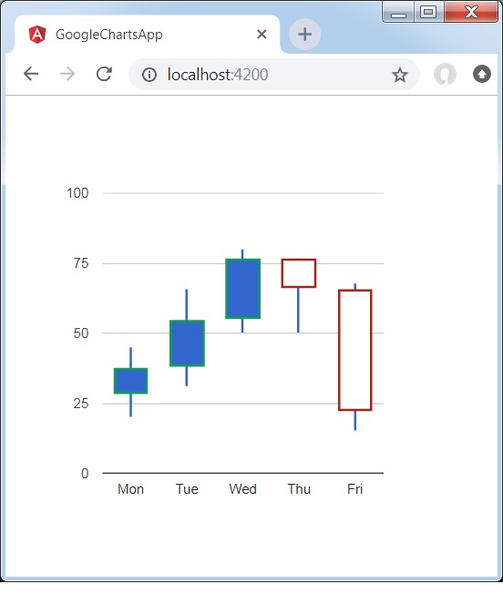
結果
驗證結果。
angular_googlecharts_candlestick_charts.htm
廣告