Angular Google Charts - 組合圖表
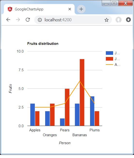
組合圖有助於將每個系列渲染為以下列表中的不同標記型別:折線、面積、柱狀、蠟燭和分層面積。要為系列分配預設標記型別,請使用 seriesType 屬性。Series 屬性用於分別指定每個系列的屬性。以下是一個顯示差異的柱形圖示例。
我們已經在 Google Charts 配置語法 章節中看到了用於繪製圖表的配置。現在,讓我們看一個顯示差異的柱形圖示例。
配置
我們已經使用 **ComboChart** 類來顯示組合圖。
type='ComboChart';
示例
app.component.ts
import { Component } from '@angular/core';
@Component({
   selector: 'app-root',
   templateUrl: './app.component.html',
   styleUrls: ['./app.component.css']
})
export class AppComponent {
   title = 'Fruits distribution';
   type = 'ComboChart';
   data = [
      ["Apples", 3, 2, 2.5],
      ["Oranges",2, 3, 2.5],
      ["Pears", 1, 5, 3],
      ["Bananas", 3, 9, 6],
      ["Plums", 4, 2, 3]
   ];
   columnNames = ['Fruits', 'Jane','Jone','Average'];
   options = {
      hAxis: {
         title: 'Person'
      },
      vAxis:{
         title: 'Fruits'
      },
      seriesType: 'bars',
      series: {2: {type: 'line'}}
   };
   width = 550;
   height = 400;
}
結果
驗證結果。
廣告