Angular Google Charts - 組合條形圖
下面是組合條形圖的例項。
我們在 Google Charts 配置語法 章節中已瞭解用於繪製圖表的配置。現在,我們來看一個組合條形圖的例項。
配置
我們使用了 BarChart 類來顯示基於條形的圖表。
type = 'BarChart';
示例
app.component.ts
import { Component } from '@angular/core';
@Component({
selector: 'app-root',
templateUrl: './app.component.html',
styleUrls: ['./app.component.css']
})
export class AppComponent {
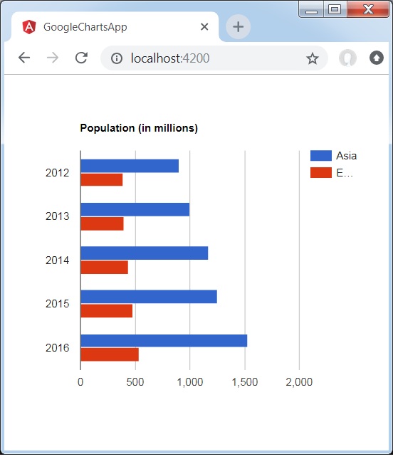
title = 'Population (in millions)';
type = 'BarChart';
data = [
["2012", 900, 390],
["2013", 1000, 400],
["2014", 1170, 440],
["2015", 1250, 480],
["2016", 1530, 540]
];
columnNames = ['Year', 'Asia','Europe'];
options = {
hAxis: {
title: 'Year'
},
vAxis:{
minValue:0
}
};
width = 550;
height = 400;
}
結果
驗證結果。
angular_googlecharts_bar_charts.htm
廣告