
 資料結構
資料結構 網路
網路 關係型資料庫管理系統 (RDBMS)
 作業系統
作業系統 Java
Java MS Excel
 iOS
iOS HTML
HTML CSS
CSS Android
 Python
 C語言程式設計
 C++
C++ C#
C# MongoDB
 MySQL
MySQL Javascript
 PHP
PHP 物理學
物理學 化學
化學 生物學
生物學 數學
數學 英語
英語 經濟學
經濟學 心理學
心理學 社會學
社會學 服裝學
服裝學 法學
法學Bootstrap 中響應式影片或幻燈片嵌入示例
Bootstrap 是一個免費的開源框架,也是最著名的 HTML、CSS 和 Javascript 框架之一。它用於使用者介面和主題,建立使用者在網站或應用程式中看到的內容,它在客戶端而不是伺服器端使用。
響應式 Web 應用程式會自動適應各種螢幕尺寸。它用於建立響應式移動優先的 Web 應用程式和網站;移動優先指的是先為較小的顯示器進行設計,然後再擴充套件到較大的顯示器。因此,您無需擔心您的應用程式在不同的裝置或不同的螢幕尺寸下無法正常工作。
在 Bootstrap 中,我們有一個名為“embed-responsive”的類用於建立嵌入。書寫規則直接應用於父類的元素,即<iframe>、<embed>、<video> 和 <object> 元素。
示例
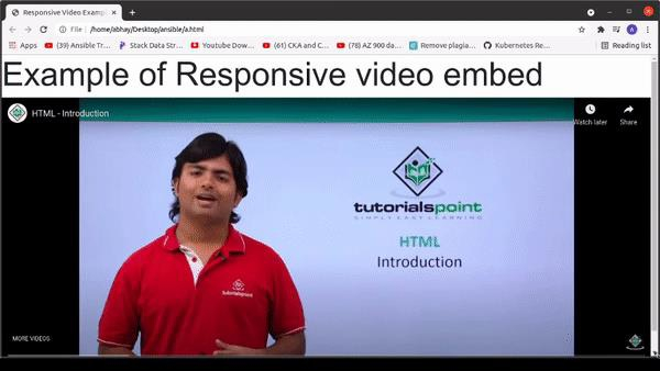
響應式影片嵌入程式
<!DOCTYPE html>
<html>
<head>
    <!-- Using Bootstrap CDN -->
    <link rel="stylesheet" href="https://stackpath.bootstrapcdn.com/bootstrap/4.3.1/css/bootstrap.min.css"
      crossorigin="anonymous">
    <title>
        Responsive Video Example
    </title>
</head>
<body>
    <h1 style="font-size:5vw;">Example of Responsive video embed</h1>
    <!--Using Class embed-responsive -->
    <div class="embed-responsive
    embed-responsive-21by9">
        <embed class="embed-responsive-item" src="https://www.youtube.com/embed/NAEHbzXMNpA" allowfullscreen>
        </video>
    </div>
</body>
</html>
輸出
以下是上述程式碼的結果
要修改縱橫比,Bootstrap 提供了一些修飾符類。
<!-- Aspect ratio 1:1>
<div class="embed-responsive embed-responsive-1by1"></div>

<!-- Aspect ratio 4:3>
<div class="embed-responsive embed-responsive-4by3"></div>

<!-- Aspect ratio 16:3>
<div class="embed-responsive embed-responsive-16by9"></div>

<!-- Aspect ratio 21:9>
<div class="embed-responsive embed-responsive-21by9"></div>
結論
在本教程中,我們討論了 Bootstrap 的定義以及如何在前端開發中使用它來建立響應式嵌入,以使應用程式與不同的螢幕尺寸相容。我們還查看了一個在 Bootstrap 中建立響應式嵌入的示例,其中我們討論了 Bootstrap 類“embed-responsive”。我們希望您覺得本教程有所幫助。

更新於:2021年11月26日
453 次檢視

廣告